Supergraphics is a unique mark of 1970s graphic design. Known for its boldness, color and size, Supergraphics takes a brighter, more optimistic view of solid monochrome European graphics. From the beginning, I found that these graphics were used as an essential element of road-finding and public space decoration, and were not just graphic gestures that crossed the boundaries of architecture. What I liked most about my usual preference for free design was that supergraphic was a movement of questions, challenges, and free thoughts, which challenged with the modern form and rigidity.

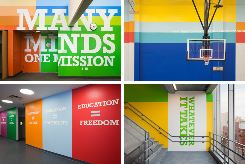
In this regard, Paula Scher, the first female principle of the design agency Pentagram, stood out the most. In fact, I made a presentation about her last semester. And while I was researching about her, I became interested in challenging spirit and fresh ideas in various fields rather than her style. Starting with album design in the 70s, her designs include supergraphics, post-industrial typography, and contemporary design, showing the movement of graphic design in general based on deep thinking.