Why I chose Hans Rudi Erdt and the Plakatstil movement:
I chose Hans Rudi Erdt mainly because I found his work inspiring and beautiful to view when I first saw it during our last lecture. The German Poster art style moved me as it was an interesting way to illustrate and create advertising posters, utilizing type and flat colors to catch the viewers eye. I personally loved the background bleeding into the figure in Hans’ work.
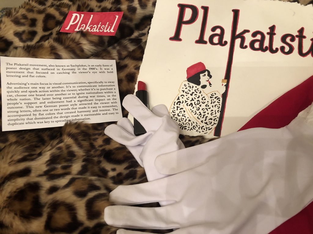
What I tried to incorporate:
I noticed that Hans’ work usually includes a figure, with clothing that disappears into the background, and type that looks hand-written and unique to each design. Since type was meant to be the centre of attention in the Plakatstil movement, I placed it at the top and outlined it in a bright red. I chose a minimal color palette, consisting of mostly red, because that was a color I noticed Hans use consistently. I also used one of Hans’ pieces as reference to create the figure and tried to include props that related to them to hint at a possible advertisement, as Hans did similarly in his own work. I also tried to make the edges ragged and natural to give it that aged feeling.
Overall conclusion:
Although I tried to incorporate Hans Rudi Erdt’s style and describe the impact of the Plakatstil movement on visual communication, I feel as though I could’ve executed it better. I do admit that this was rushed as there was a lot that I needed to focus on this past week (assignments and personal issues), however, I did try to put my best effort forward with the time that I had left. I would give myself a 7/10 for this assignment.
Leave a Reply