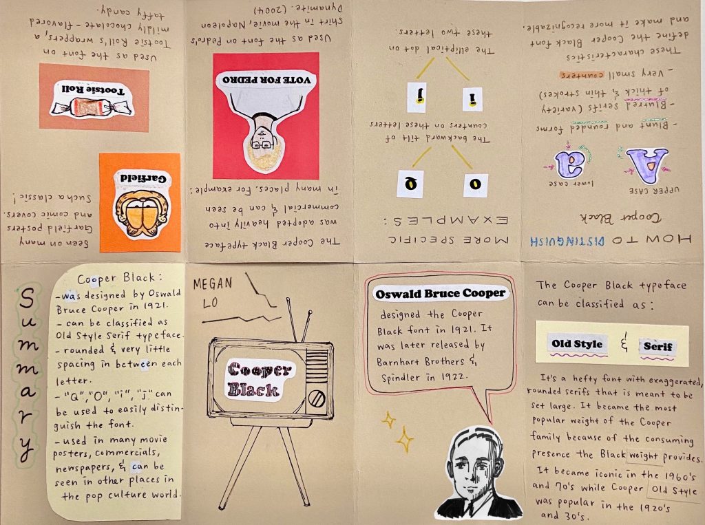
I’ve always liked the font Cooper Black and when I saw it was designed before 1939, I decided to do my typography zine project on it. I started by finding out as much information as I can and taking notes along the way. Then, I condensed all my notes into simple sentences because we only have eight pages including a title page. I roughly sketched out my layout and did two versions of my sketch. I chose a tan colour paper to use as my background because I knew I wanted to add some text and images using plain white paper and I really like the contrast between the two. Overall, I thought it was a fun and informative project. I learned a lot about how a typeface can stand out better and the details in the font really surprised me because I didn’t notice these elements before. I would give myself a 9/10. I really like how my zine turned out and how clean and organized it is. I did a lot of research and planning before I started working on a sketch and I took off one mark because I think I could have shortened the amount of information on each page and I made a few mistakes while writing my summary so I used whiteout to correct them but it turned out to be pretty noticeable.
Research citations:
https://medium.com/fgd1-the-archive/cooper-black-by-oswald-bruce-cooper-d5a3df7e5020
https://fontsinuse.com/typefaces/7357/cooper-black