Canadian Design Today

Theo Dimson

A Look Back at Theo Dimson | Inspiration | Applied Arts

Theo Dimson (1930-2012) was a world-renowned graphic designer best known for his Art Deco-style movie and theatre posters and had close ties to the theatre community in Toronto. Dimson was born in London, Ontario, on April 8, 1930. At an early age, he was already interested in design and ended up with a scholarship to the Ontario College of Art and Design. Afterwards, he went from a firm to freelancing, then rejoining the first firm. Then in 1965, he became president and director of Reeson, Dimson & Smith Ltd. He decided to create The Dimson Design Inc. where he was the president and creative director. He spent much of his career and life in Toronto and he produced amazing pieces for George Luscombe at Toronto Workshop Productions, Hart House etc.

GDC, graphic design, history of canadidan graphic design
A Look Back at Theo Dimson | Inspiration | Applied Arts

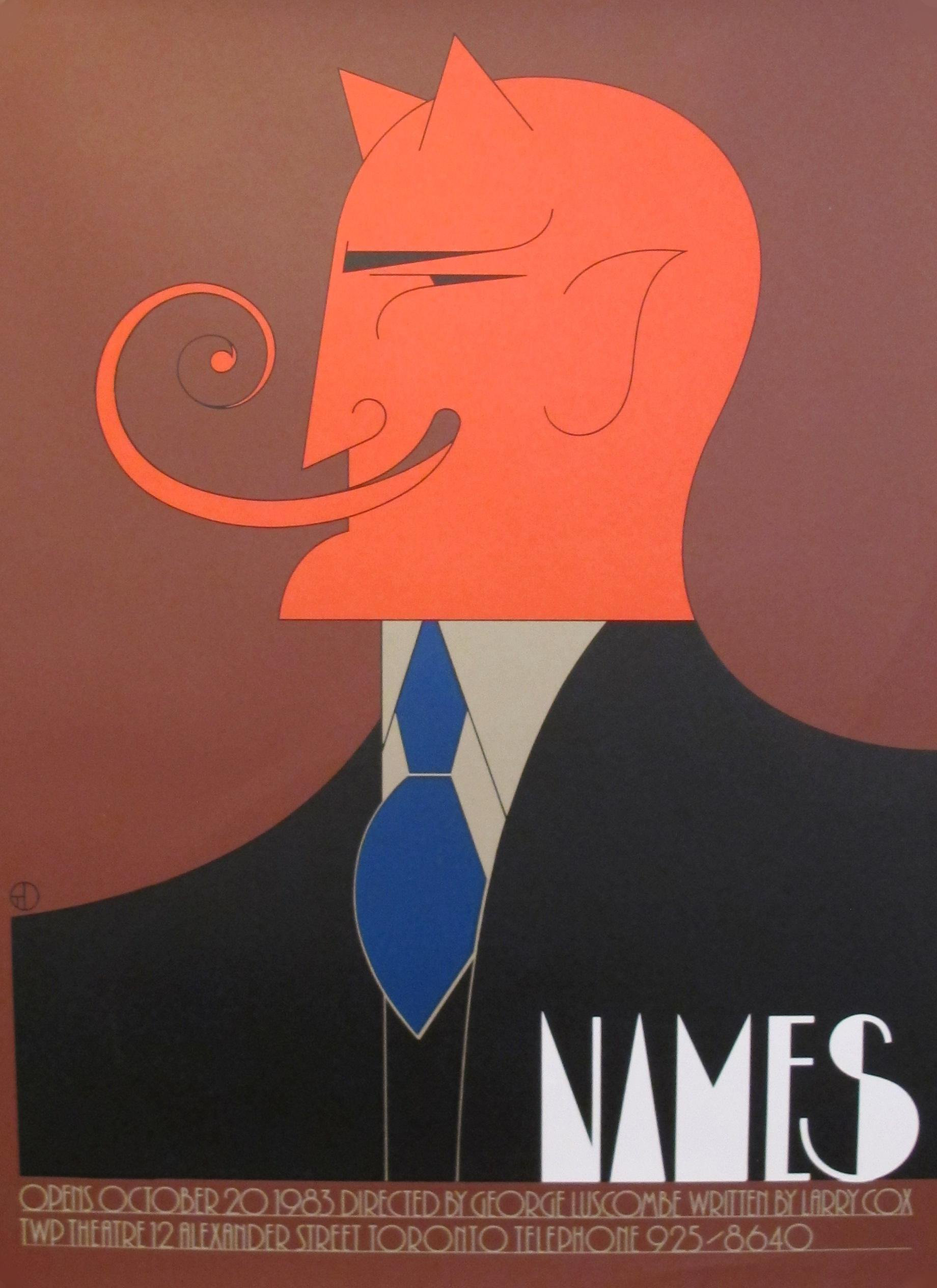
Dimson was internationally recognized and received awards and applause with exhibits in Finland, Poland, Germany, Japan, Switzerland, and the US. He used very thin lines in his work, fused with intriguing and wonderful use of colour, and included a lot of serifs and deco-looking sans serif.

Postmodernism in Europe

Dan Friedman

readymag stories : dan friedman

The New Wave era stretched limits of legibility; type broke from the grid structure. Not only was David Friedman known for his major contribution to the Postmodern and New Wave typography movements, but he was also a talented educator and furniture designer. From 1970 to 1973, he taught at Yale University and from 1972-1975, he was the chairman of the board for the design department at Purchase College. Friedman encouraged his students to push typography past legibility.

IMG_3495
Dan Friedman, Radical Modernist, Part 1: Design Observer

To make his designs distinctive, he used a lot of sans-serif and slab serif fonts to make them full of energy and eccentricity, despite often using black and white in his works. Friedman always chose to pursue projects that had a personal meaning and not professional interest. Unfortunately, Friedman passed away at the age of 49 in 1995. The design world lost a gifted icon but he left a legacy that has and will continue to inspire generations of artists and designers.

Supergraphics Innovator

Jamie Reid

NPG x31001; Jamie Reid - Portrait - National Portrait Gallery

Born in England in 1947, Jamie Reid is an artist whose goal has always been to create a collective conscience through his art. He developed his unique and iconic style of cut-up graphics and sloganeering while producing material for anarchists and women’s groups. His work continues to convey very bold and politically relevant messages.

Jamie Reid. Sex Pistols, God Save the Queen. 1977 | MoMA

Little did Reid know that the artwork he created would become what is known today as the most iconic punk rock album artwork of all time. Creating ‘God Save the Queen’ was a groundbreaking part of Reid’s career. It was such a controversial artwork that there wasn’t a person in the world that hadn’t heard of the audacious recreation of Queen Elizabeth II’s portrait. It brought up this idea of rebellion against the Queen that no one had dared to ever endure in such a public way. He earned the right to be seen as a prominent figure of both anarchism and activism.

Jamie Reid, The Sex Pistols, 1977 | Rock Paper Film
Jamie Reid, Virgin Records. Album cover for Sex Pistols, Never Mind the  Bollocks. 1977 | MoMA

Aside from creating artwork for the Sex Pistols, Jamie Reid has created art that is represented by many galleries. To this day Jamie Reid remains a highly respected political figure due to artwork displaying his radical ideas and opinions. He influenced a great number of people through his activism.

Psychedelic Hero: Seymour Chwast

Seymour Chwast : ADC • Global Awards & Club
Seymour Chwast

I first heard about Chwast when researching for a school project on his partner, Paula Scher. What drew me to him wasn’t their relationship but his playful, expressive approach to type and layout.

The Push Pin Graphic: A Quarter Century of Innovative Design and  Illustration: Chwast, Seymour, Heller, Steven, Venezky, Martin:  9780811841030: Books - Amazon.ca

Out of the many illustrations Chwast has done, I found the book cover of “The Push Pin Graphic: A Quarter Century of Innovative Design and Illustration” to be one of the most iconic designs. The polka dot patterned background is unique but not too prominent. The blue and orange complementary colours also help make the image visually appealing.

Imprint: The Best Design Blog Written by top Illustrators & Designers. | Seymour  chwast, Illustration quotes, Design quotes
190 Seymour Chwast ideas | seymour chwast, seymour, milton glaser

Personally, I love Chwast’s colourful, flat illustration style and it feels very comforting and joyful. Another example of his works is his “Chwast Quotes”. These lively satire illustrations are casual and engaging even when some of them include political statements. I think this is one of the things that makes this collection of Chwast’s work so exceptional and recognizable.

Advertising Art Director: George Lois

HOME

A great design should inspire curiosity and communicate a powerful message. An art director that meets this standard is George Lois. His works speak to me with his unpredictable designs while still making a revolutionary political statement. The most well-known work that Lois has done is probably his 92 Esquire magazine covers. He brilliantly integrates current issues and a unique design aesthetic that immediately catches the audience’s eyes.

Reading Feminism into George Lois' Esquire Covers — Julian Adoff
Quick Design History: George Lois #ThrowbackThursday - Shillington Design  Blog

Lois effectively uses design principles to make his covers look more captivating and dynamic. The human figures are reaching their legs/arms up but still look restricted and somewhat helpless. He uses proximity to associate the graphics with the headlines. The visual hierarchy is also working well so that the audience notices their faces first and then the magazine title.

December 1963 | Esquire cover, Esquire magazine cover, Magazine cover

One of the most unforgettable Esquire covers is this one depicting Sonny Liston as America’s first black Santa. I love the colour contrast and how simple this design is, focusing on Liston’s solemn character. Aside from the art directing, the theme that this cover conveys is so inspirational to contemporary American society at the time and this shows that Lois is a designer who isn’t afraid to speak his mind and turn his ideas into art.

Contemporary Art

Francesco Clemente (1952-present)

Francesco Clemente is a contemporary Italian artist known for his dreamlike paintings based on esoteric themes of sexuality and spirituality. Working across oil painting, installation, and watercolour, Clemente’s works are characterized by their formal experimentation with symbols, portraiture, and the human figure.

After an early academic background in classical languages and literature, he briefly enrolled as an architecture student at the University of Rome, in 1970. Throughout the 1970s, he exhibited drawings, altered photographs and conceptual works across Europe. Since 1973 he has frequently resided and worked in India. In 1981 Clemente moved to New York City, where he currently lives with his wife and children. 

Fascinated with Indian art and mysticism, his gouache paintings and pastel drawings are especially noted for their intense and arcane quasi-religious content that has grown increasingly surreal in his later works. Though large in scale, I think Clemente’s work often conveys an uncanny and unabashed intimacy and he helped reinvigorate painting by using recognizable human figures as his primary subject. I especially love the pastel color palette and blended brush strokes!

Francesco Clemente - 173 Artworks, Bio & Shows on Artsy
Alba, 2017
Francesco Clemente | Canosa extatic (2016) | Available for Sale | Artsy
Canosa extatic, 2016
Francesco Clemente (b. 1952) | Self-Portrait Without the Mask | 20th  Century, Drawings & Watercolors | Christie's
Self portrait without the mask, 2011

Images:

https://d7hftxdivxxvm.cloudfront.net/?resize_to=fit&width=413&height=300&quality=80&src=https%3A%2F%2Fd32dm0rphc51dk.cloudfront.net%2FZogcUtRNg0cJsSLmoOm1jg%2Flarge.jpg

https://d7hftxdivxxvm.cloudfront.net/?resize_to=fit&width=640&height=485&quality=80&src=https%3A%2F%2Fd32dm0rphc51dk.cloudfront.net%2FYsDvQ-pWrja3Kac1bPPX6w%2Flarge.jpg

Survey 9: Bauhaus Furniture

Image result for bauhaus furniture
well known examples of Bauhaus furniture

The Bauhaus (1913-1933) was a school of art and design that existed in pre-war Germany before being shut down by the Nazi party in the face of World War II.  Founded by Walter Gropius, the primary objective of the Bauhaus was to redefine the relationship between function and design. In other words, as stated by metmuseum.com, the objective was to “reimagine the material world to reflect the unity of all the arts.”

Image result for bauhaus furniture
Nesting tables designed by Josef Albers

The Bauhaus housed a multidisciplinary focus. Students learned painting, architecture, sculpture, and design, as well as specialized workshops like cabinet making, among others. Their coursework was intensive and diverse, allowing students to make creations that drew on a large vocabulary of historical and artistic references. Students themselves were diverse as well, bringing their own cultural influences and social-economic lenses to each discipline.

An excellent example is this chair shown below. The extremely basic design is complemented by the unique use of material, contrast, colour and essence of extremist minimalism. In contrast to the arts and crafts/art nouveau movement of the previous decades, the modern qualities of the Bauhaus designs were refreshing to say the least. This had an especially profound effect in its homeland of Germany, notorious for its heavy gothic design style during the early 20th century.

Image result for bauhaus furniture
chair designed by Walter Gropius

Sources:

https://www.metmuseum.org/toah/hd/bauh/hd_bauh.htm

https://i.pinimg.com/originals/9a/ff/fc/9afffc258132091576588ad0ec82d94a.jpg

https://dengarden.com/interior-design/Bauhaus-Furniture

https://www.widewalls.ch/bauhaus-design/

Typographic Infographic Rationale

For this assignment, I first started with researching the events I wanted to include in my timeline and then I sketched out all my ideas ahead of time to plan out the text composition and graphics. Unfortunately, I threw out all my sketches so I won’t be able to include them in this blog post. After sketching out all my ideas, I refined them and picked one that would fit the information I had previously researched. I took inspiration from the poster down below and added my own ideas.

I knew I wanted to keep my poster mostly black and white because with the information I have written on it, vibrant colours would not be pleasing to the eyes and the audience would not know where to look. I chose to add red because I think it’s a colour that stands out on its own but also matches well with black and white. With my decision to include the “A” graphic at the top, I made several columns to separate my information and I think it works quite well. Towards the end, I realized that I still had space at the bottom of the poster so I decided to include the well-known typographers under each typeface. It was last-minute research but I’m satisfied with my choice. I would give myself an 8.5/10 on this project because I actually like how my poster turned out and I think I’ve met all the criteria in the project brief but I could have used my time better. Overall, it was a fun assignment and a good review for things we learned in class.

Expressionism

Otto Dix (1891-1969)

Otto Dix was a German painter and printmaker, known for his grotesque portrait paintings, brutal depictions of war and the Weimer society. Exposed to artwork at an early age, Dix spent a lot of time in his older cousin’s art studio, Fritz Amman who was a landscape painter. Between 1906 and 1910, he served an apprenticeship with painter Carl Senff, learning to paint landscapes. In 1910, he entered the Kunstgewerbeschule in Dresden (Academy of Applied Arts), where Richard Guhr was among his teachers. 

Why the Nazis Accused Otto Dix of Plotting to Kill Hitler - Artsy
To Beauty (1922)

WWI was an event that profoundly shaped Dix’s artwork. He volunteered for the War in 1915 and was discharged in 1918. Throughout the war, Dix kept a diary and sketchbook to record his experiences. His sketches served as material for a major series called, “The War” which was published in 1924. Most of these experiences were horrific and therefore many of his illustrations expressed some form of trauma. WW1 affected the development of Expressionism because many artists wanted to convey their emotional experience that affected them during the war. Whether because they were a soldier or not, they were emotionally scarred and wanted to show the emotional violence or hatred of the war.  

Stormtroopers Advance Under Gas by Otto Dix, Digital, 1924 :  ImagesOfThe1920s
Stormtroopers Advancing Under Gas (1924)

Dix later became a founder of the Dresden Secession group in 1919, during his expressionist phase. In 1920 he met George Grosz. Influenced by Dada, he began incorporating collage elements into his works, some of which he exhibited in the first Dada Fair in Berlin. 

MoMA | The Collection | Otto Dix. The Nun. 1914
The Nun (1914)
Otto Dix's Sylvia von Harden - Artsy
Portrait of the Journalist Sylvia von Harden (1928)

Sources:

https://www.moma.org/artists/1559

https://www.wikiart.org/en/otto-dix

http://www.artnet.com/artists/otto-dix/

http://www.visual-arts-cork.com/famous-artists/otto-dix.htm

Images:

https://external-preview.redd.it/3-Ep_W-Wxic3LohNaDK2lT9udfXltVKl0vr4UZl2EgQ.jpg?auto=webp&s=6e2c1e5d3db39b981bc6819973c4f1eff77ef5e2

https://d32dm0rphc51dk.cloudfront.net/KuIEly7iZ2MBLs0HexS0yw/larger.jpg

https://www.moma.org/s/ge/collection_images/enlarge/84/79284.jpg

https://d7hftxdivxxvm.cloudfront.net/?resize_to=width&src=https%3A%2F%2Fd32dm0rphc51dk.cloudfront.net%2FXaxXLxrL4ipezufYSODIoQ%2Flarger.jpg&width=1200&quality=80

Historical Artifact

For this project, I originally chose to make a twenty-sided die but I realized that it doesn’t have anything to do with visual communication and I would have a hard time making a connection so instead, I ended up making chopines.

After deciding my choice of artifact, I began to do some research about it and wrote down my paragraph separately in a Word document. I then used clay to make the shoe and it took a while to get the shape right although it still doesn’t look exactly like a real chopine (see photo reference down below). This was actually my first time working with clay which is probably why I struggled to make the artifact. I wrote the paragraph description on a ripped paper and included the velvet and lace fabric in the background to give the photo more texture.

These Chopines Weren't Made for Walking: Precarious Platforms for  Aristocratic Feet | Collectors Weekly
https://d3h6k4kfl8m9p0.cloudfront.net/uploads/2014/04/mfa-1740s-chopines.jpg

This assignment honestly isn’t one of my favourites and I felt unmotivated to finish it but it was interesting to learn about the history. I definitely should have made better use of my time and planned the photo out more efficiently because I’m not very satisfied with the end product and it even took me way longer than it could have. Therefore, I would give myself a 5/10 on this project.