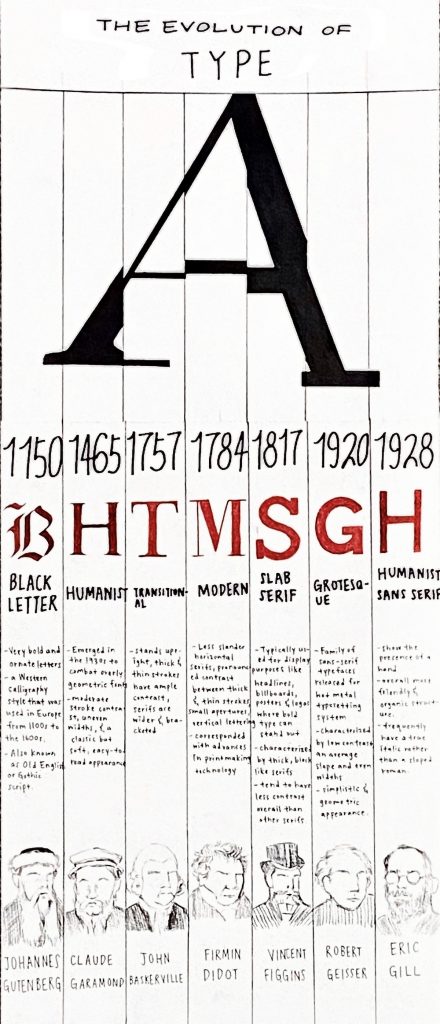
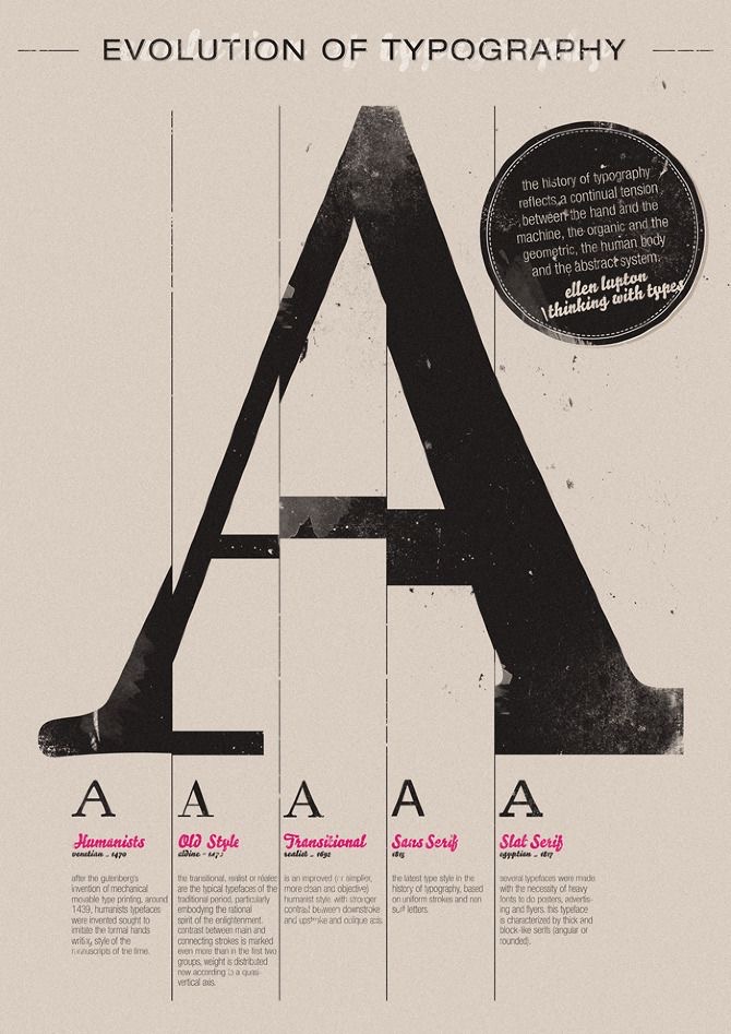
For this assignment, I first started with researching the events I wanted to include in my timeline and then I sketched out all my ideas ahead of time to plan out the text composition and graphics. Unfortunately, I threw out all my sketches so I won’t be able to include them in this blog post. After sketching out all my ideas, I refined them and picked one that would fit the information I had previously researched. I took inspiration from the poster down below and added my own ideas.
I knew I wanted to keep my poster mostly black and white because with the information I have written on it, vibrant colours would not be pleasing to the eyes and the audience would not know where to look. I chose to add red because I think it’s a colour that stands out on its own but also matches well with black and white. With my decision to include the “A” graphic at the top, I made several columns to separate my information and I think it works quite well. Towards the end, I realized that I still had space at the bottom of the poster so I decided to include the well-known typographers under each typeface. It was last-minute research but I’m satisfied with my choice. I would give myself an 8.5/10 on this project because I actually like how my poster turned out and I think I’ve met all the criteria in the project brief but I could have used my time better. Overall, it was a fun assignment and a good review for things we learned in class.