Gestalt’s principle, proximity explained

Despite the three primary colours used, which would normally separate the group of elements, this design successfully communicates the appearance of an old man’s size profile using the principle of proximity.
Despite the three primary colours used, which would normally separate the group of elements, this design successfully communicates the appearance of an old man’s size profile using the principle of proximity.

Utilizing the principle of closure, Nychuk’s design shows a variety in the sizing of dots and pushes the audience to group the individual elements to visualize an image of an eye.
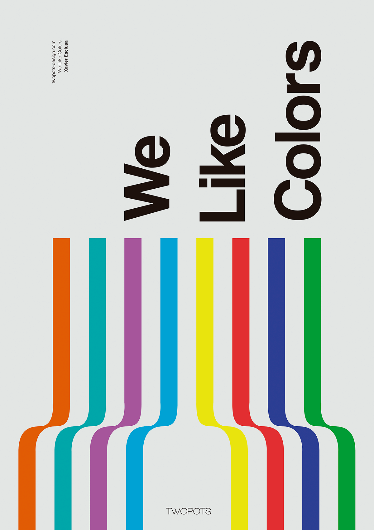
By Xavier Esclusa Trias
Line is used in the poster design shown above. The direction of the lines guide emphasis towards the title and by making the typography rotated vertically, the designer employs the principles of alignment and composition.
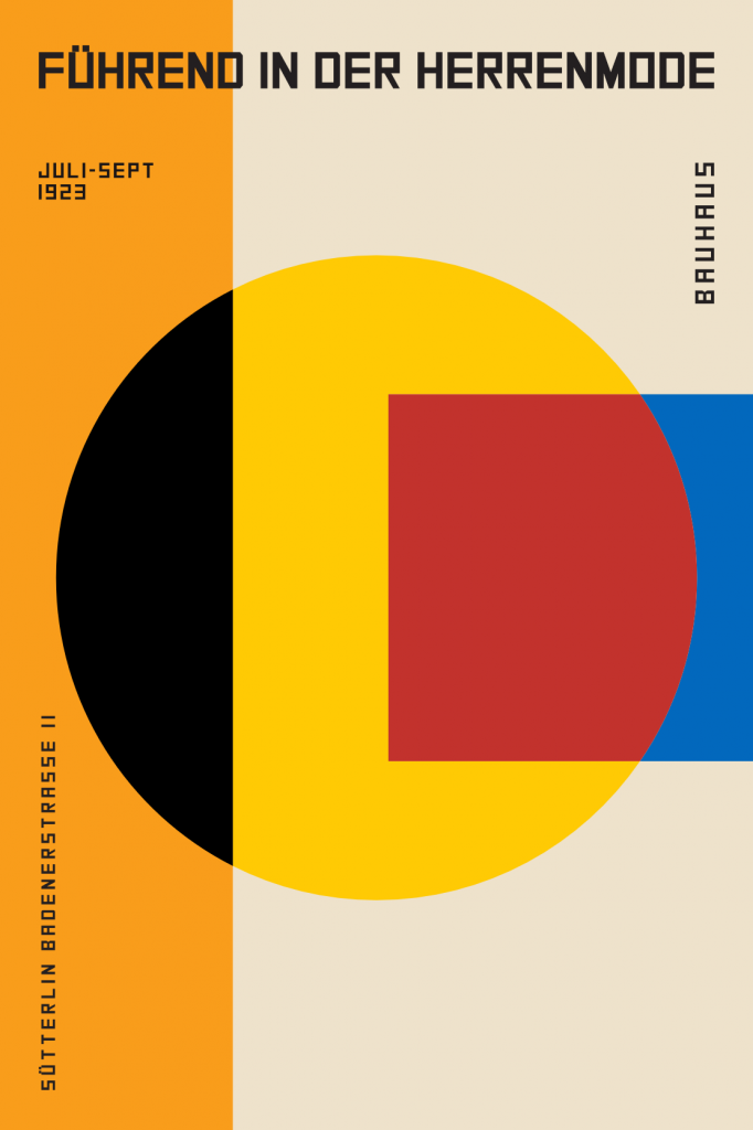
By German Bauhaus for an exhibition (1923)
This abstract poster design is an example of shape. The bold variety of shapes contrast each other and gives vitality and modernism to the design. This influential and recognizable design style from the Bauhaus movement plays a huge role in today’s understanding of the element of shape.

Movie poster for Black Swan by unknown
This design judiciously uses space, especially negative space and white space to support the proximity and emphasize the shape of the “swan face”. This makes it easier for the audience to analyze and remember the graphics and information when there is an organized and clean layout.

From a magazine cover by Pierre Mendel (1993)
In the example above, Mendel layers tactile textured paper to convey a wrinkled surface. Adding texture gives this design more character when compared with the minimalistic style and this can help attract the viewer’s attention to a particular area.