Monthly Archives: March 2021

Postmodernism in Europe

Dan Friedman

readymag stories : dan friedman

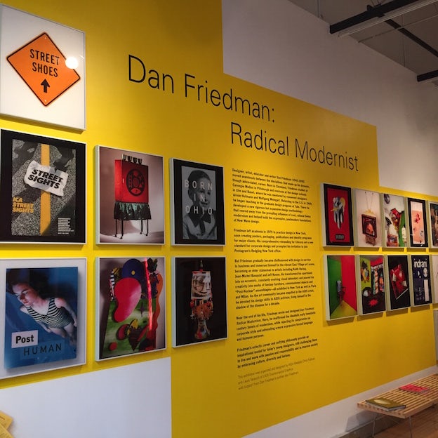
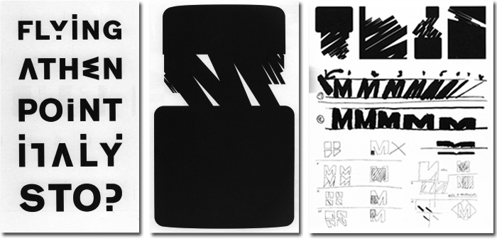
The New Wave era stretched limits of legibility; type broke from the grid structure. Not only was David Friedman known for his major contribution to the Postmodern and New Wave typography movements, but he was also a talented educator and furniture designer. From 1970 to 1973, he taught at Yale University and from 1972-1975, he was the chairman of the board for the design department at Purchase College. Friedman encouraged his students to push typography past legibility.
IMG_3495
Dan Friedman, Radical Modernist, Part 1: Design Observer

To make his designs distinctive, he used a lot of sans-serif and slab serif fonts to make them full of energy and eccentricity, despite often using black and white in his works. Friedman always chose to pursue projects that had a personal meaning and not professional interest. Unfortunately, Friedman passed away at the age of 49 in 1995. The design world lost a gifted icon but he left a legacy that has and will continue to inspire generations of artists and designers.

Supergraphics Innovator

Jamie Reid

NPG x31001; Jamie Reid - Portrait - National Portrait Gallery

Born in England in 1947, Jamie Reid is an artist whose goal has always been to create a collective conscience through his art. He developed his unique and iconic style of cut-up graphics and sloganeering while producing material for anarchists and women’s groups. His work continues to convey very bold and politically relevant messages.

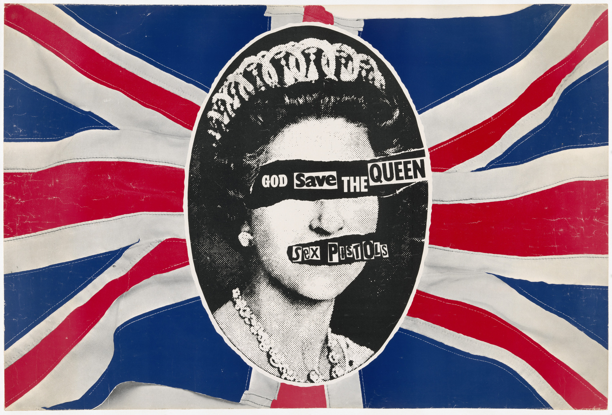
Jamie Reid. Sex Pistols, God Save the Queen. 1977 | MoMA

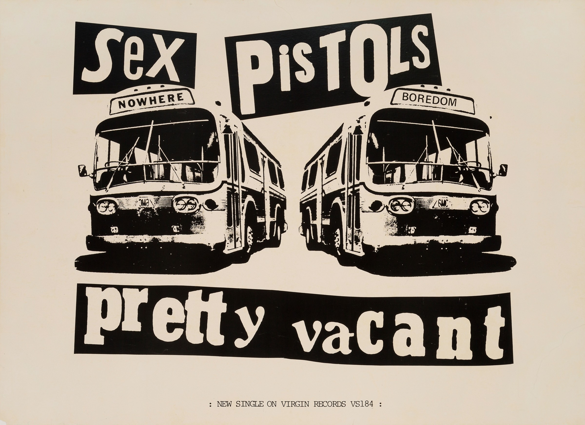
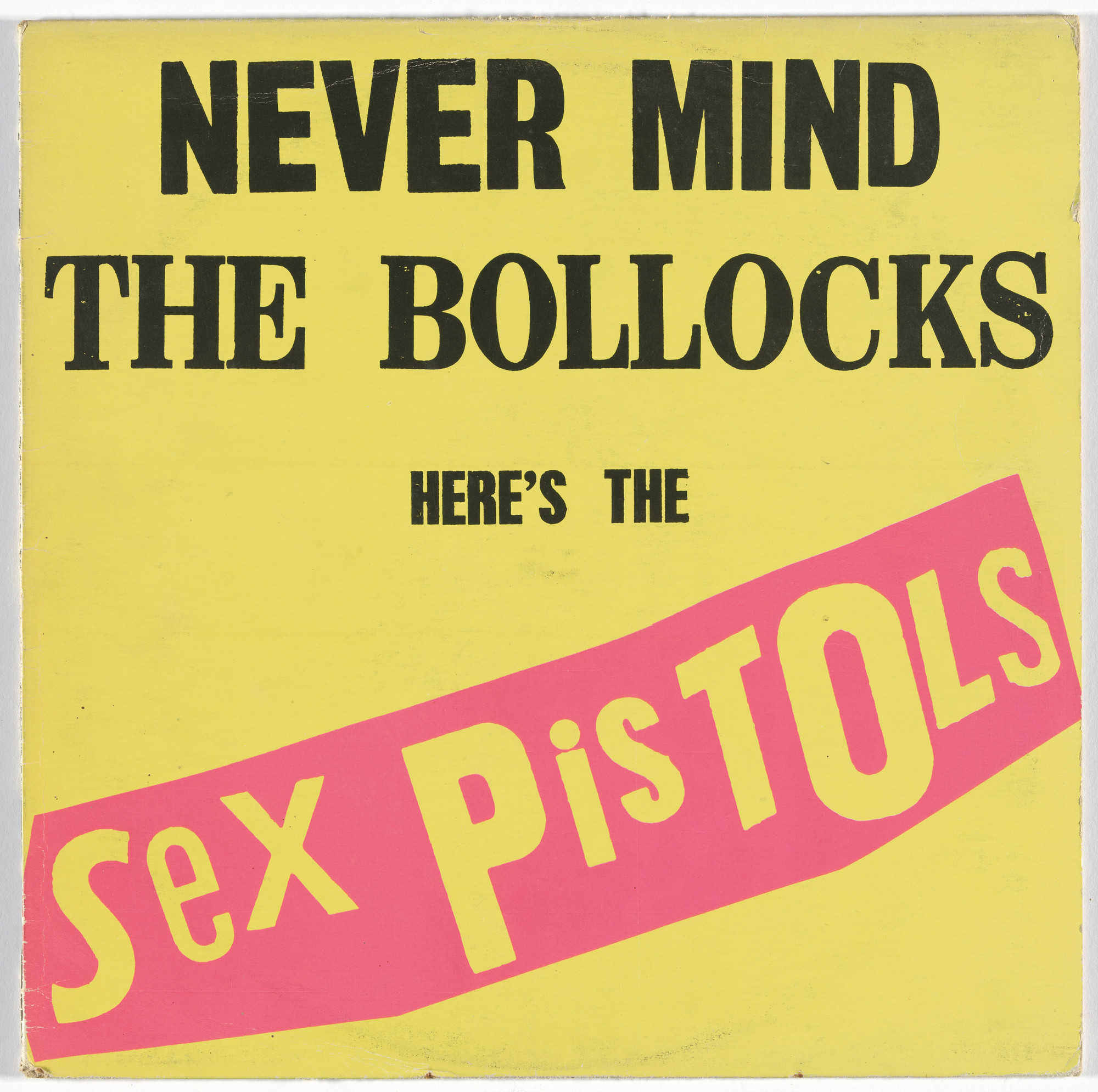
Little did Reid know that the artwork he created would become what is known today as the most iconic punk rock album artwork of all time. Creating ‘God Save the Queen’ was a groundbreaking part of Reid’s career. It was such a controversial artwork that there wasn’t a person in the world that hadn’t heard of the audacious recreation of Queen Elizabeth II’s portrait. It brought up this idea of rebellion against the Queen that no one had dared to ever endure in such a public way. He earned the right to be seen as a prominent figure of both anarchism and activism.

Jamie Reid, The Sex Pistols, 1977 | Rock Paper Film
Jamie Reid, Virgin Records. Album cover for Sex Pistols, Never Mind the  Bollocks. 1977 | MoMA

Aside from creating artwork for the Sex Pistols, Jamie Reid has created art that is represented by many galleries. To this day Jamie Reid remains a highly respected political figure due to artwork displaying his radical ideas and opinions. He influenced a great number of people through his activism.

Psychedelic Hero: Seymour Chwast

Seymour Chwast : ADC • Global Awards & Club
Seymour Chwast

I first heard about Chwast when researching for a school project on his partner, Paula Scher. What drew me to him wasn’t their relationship but his playful, expressive approach to type and layout.

The Push Pin Graphic: A Quarter Century of Innovative Design and  Illustration: Chwast, Seymour, Heller, Steven, Venezky, Martin:  9780811841030: Books - Amazon.ca

Out of the many illustrations Chwast has done, I found the book cover of “The Push Pin Graphic: A Quarter Century of Innovative Design and Illustration” to be one of the most iconic designs. The polka dot patterned background is unique but not too prominent. The blue and orange complementary colours also help make the image visually appealing.

Imprint: The Best Design Blog Written by top Illustrators & Designers. | Seymour  chwast, Illustration quotes, Design quotes
190 Seymour Chwast ideas | seymour chwast, seymour, milton glaser

Personally, I love Chwast’s colourful, flat illustration style and it feels very comforting and joyful. Another example of his works is his “Chwast Quotes”. These lively satire illustrations are casual and engaging even when some of them include political statements. I think this is one of the things that makes this collection of Chwast’s work so exceptional and recognizable.

Advertising Art Director: George Lois

HOME

A great design should inspire curiosity and communicate a powerful message. An art director that meets this standard is George Lois. His works speak to me with his unpredictable designs while still making a revolutionary political statement. The most well-known work that Lois has done is probably his 92 Esquire magazine covers. He brilliantly integrates current issues and a unique design aesthetic that immediately catches the audience’s eyes.

Reading Feminism into George Lois' Esquire Covers — Julian Adoff
Quick Design History: George Lois #ThrowbackThursday - Shillington Design  Blog

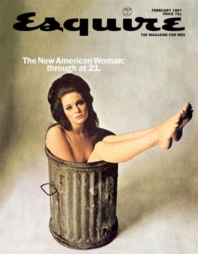
Lois effectively uses design principles to make his covers look more captivating and dynamic. The human figures are reaching their legs/arms up but still look restricted and somewhat helpless. He uses proximity to associate the graphics with the headlines. The visual hierarchy is also working well so that the audience notices their faces first and then the magazine title.

December 1963 | Esquire cover, Esquire magazine cover, Magazine cover

One of the most unforgettable Esquire covers is this one depicting Sonny Liston as America’s first black Santa. I love the colour contrast and how simple this design is, focusing on Liston’s solemn character. Aside from the art directing, the theme that this cover conveys is so inspirational to contemporary American society at the time and this shows that Lois is a designer who isn’t afraid to speak his mind and turn his ideas into art.