Amy Fleming’s article “The Importance of Urban Forests: Why Money Really Does Grow on Trees” (2016) addresses the benefits and impact of trees on our society and ecosystem. Fleming mentions an agreement that “references to green spaces being essential for mental and physical health, community building and performing urgent ecological tasks.” (qtd. In Fleming 2) Her point is that planting trees will not only improve our air quality and help fight climate change, it will encourage and improve human wellness. Moreover, research shows that humans are less hostile around trees and they can help calm us down. Trees also provide many ecological services in our urban environments. For example, “trees can cool cities by between 2C and 8C. When planted near buildings, trees can cut air conditioning use by 30%, and, according to the UN Urban Forestry office, reduce heating energy use by a further 20-50%.” (qtd. In Fleming 2) These numbers tell us that green spaces are greatly beneficial in urban cities. The economic impacts of trees could also become a reason for city officials to consider using trees as monetization, as Jill Jones states. Through her writing, Fleming raises awareness about the deficiency of trees in our environment and provides facts and examples to support her ideas.
Post-Impressionism
Odilon Redon (1840-1916)
Odilon Redon was a leading French artist of the Symbolism movement, a European movement at the end of the nineteenth century. He depicted a variety of motifs, including dreams, floral still lifes, landscapes, and mythological scenes. Early in his career, he worked almost exclusively in charcoal and lithography, works referred to as noirs. He made some 30 etchings and 170 lithographs over a period of twenty years his life and from 1870 to 1890, he predominantly worked with charcoal. The noirs exemplify Redon’s fascination with the impact and resonance of black. As with this lithograph, he printed almost exclusively using chine appliqué. Starting in the 1890s, he began to use pastel to add color to his charcoal works.
https://mltshp.com/r/5HQ1

Redon was a symbolist, not a surrealist. He was connected to literature such as Stéphane Mallarmé, Edgar Allan Poe and Charles Baudelaire and influenced by artists like Gustave Moreau and Goya, to whom in fact he dedicated a series of prints. He also developed a keen interest in Hindu and Buddhist religion and culture, which increasingly showed in his work. He was an unsuccessful art student at first. Very slowly, however, he taught himself the discipline of printmaking. It was his atmospheric and symbolist prints, with their dark and cloudy ground and their enigmatic figures, that finally began to win him some public attention. Today, his works are held in the collections of the Art Institute of Chicago, the Musée d’Orsay in Paris, The Museum of Modern Art in New York, and the National Gallery in London.

I was immediately drawn to his mysterious and disturbing art style and aesthetics because of how his work was so original and different from what other artists were creating during his time. Redon was a great artist who was a contemporary of the Impressionists without being one; who was close to Symbolism without letting himself become trapped by their lively aesthetic approach. I definitely did not expect to see this creepy and ominous yet stunning psychedelic art style from the Post-Impressionism time period. Although I probably would be too scared to look at his drawings in the middle of the night!

https://puamloris.aws.princeton.edu/loris/y1944-64.jp2/full/!650,650/0/default.jpg
Sources:
https://www.theartstory.org/artist/redon-odilon/
http://www.visual-arts-cork.com/famous-artists/odilon-redon.htm
http://www.artnet.com/artists/odilon-redon/
Survey 6: A Turning Point for Women
The women’s suffrage movement was one of the most important global events in not only women’s history but history as a whole. It actually began in 1848, when a women’s rights convention was held in Seneca Falls, New York and 68 women and 32 men signed the Declaration of Sentiments. It basically stated that women wanted equal treatment as men and the same voting rights; the movement continued until 1920. There were many reasons why the movement began and was such a serious matter. Women protested for better wages so they feed their families and wanted the rich to start paying for the poor. Additionally, the factories and warehouses they were working in had poor sanitation and safety. Women wanted to work somewhere safe and clean. Many women did not have many opportunities to get a job. If they had a job then they would get paid very poorly and worked in horrible conditions. They never had a chance to finish their education or pursue a professional career. From 1777 to 1784, women lost their right to vote in many states. Some women and girls couldn’t even go out without the supervision of a man! However, they had no voice in the government so they weren’t able to make important decisions and changes to benefit themselves.


During the movement, many posters were designed and shown in magazines, newspapers etc. to further advocate for equal suffrage among men and women. This united women and many felt that they had the power to speak up for once.
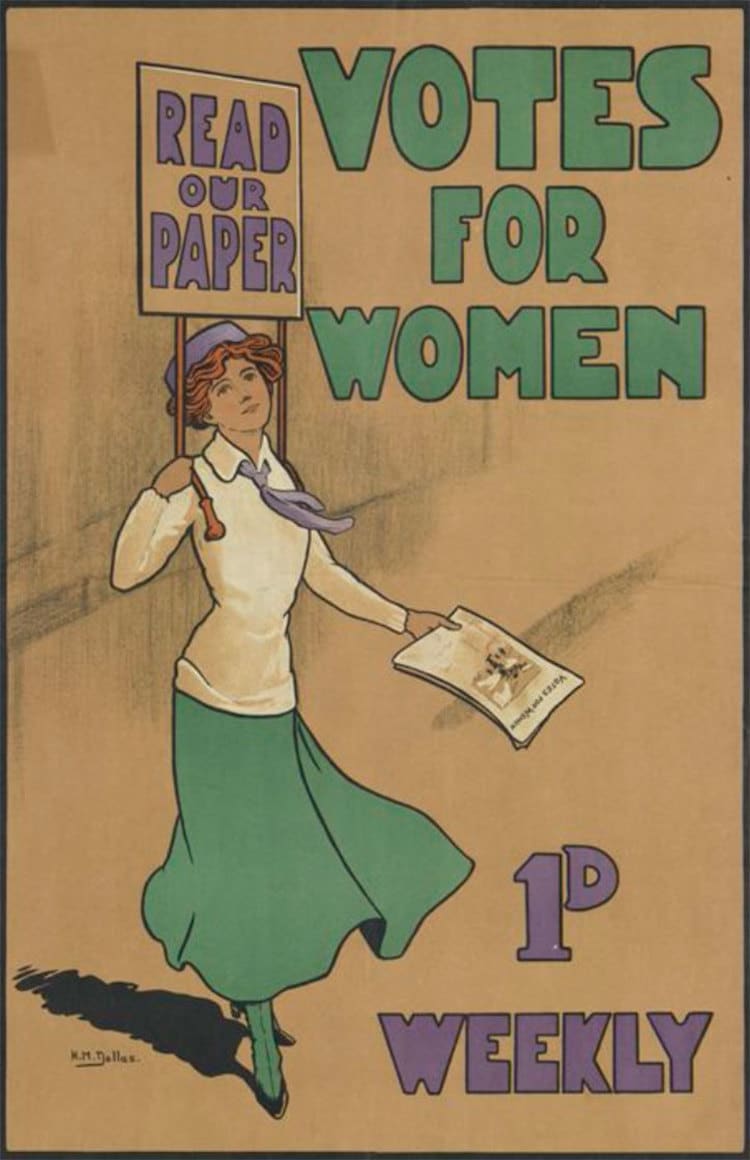

Through the efforts of many important women, there were also good news and many changes were allowed to be made, including the creation of the 19th amendment to the constitution was signed into law on August 26th, 1920 which gave all women the right to vote. Four years prior on November 7th, 1916 the first female member of Congress, Jeanette Rankin was elected to the House of Representatives. Rankin was a beacon and symbol of what women could achieve with determination and equality. Personally, this is especially relevant to me because the 2020 US election is just around the corner and researching about this significant event has been very inspiring and helped me gain hope for the election outcome which will determine the rights for many Americans.
Sources:
https://history.house.gov/Exhibitions-and-Publications/WIC/Historical-Essays/No-Lady/Womens-Rights/
Images:
https://www.womansuffragema.com/uploads/2/8/4/3/28437531/830_orig.jpg
Typography Zine Rationale

I’ve always liked the font Cooper Black and when I saw it was designed before 1939, I decided to do my typography zine project on it. I started by finding out as much information as I can and taking notes along the way. Then, I condensed all my notes into simple sentences because we only have eight pages including a title page. I roughly sketched out my layout and did two versions of my sketch. I chose a tan colour paper to use as my background because I knew I wanted to add some text and images using plain white paper and I really like the contrast between the two. Overall, I thought it was a fun and informative project. I learned a lot about how a typeface can stand out better and the details in the font really surprised me because I didn’t notice these elements before. I would give myself a 9/10. I really like how my zine turned out and how clean and organized it is. I did a lot of research and planning before I started working on a sketch and I took off one mark because I think I could have shortened the amount of information on each page and I made a few mistakes while writing my summary so I used whiteout to correct them but it turned out to be pretty noticeable.
Research citations:
https://medium.com/fgd1-the-archive/cooper-black-by-oswald-bruce-cooper-d5a3df7e5020
https://fontsinuse.com/typefaces/7357/cooper-black
Neoclassicalcism
Jean-Auguste Ingres

Jean-Auguste-Dominique Ingres (1780-1867) was a seminal French painter who championed Neoclassicism during a period that saw the rise of Romantic painters like Eugène Delacroix.
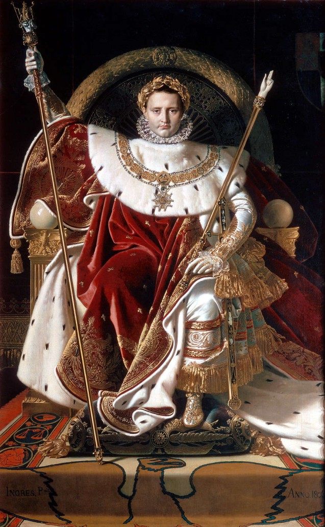
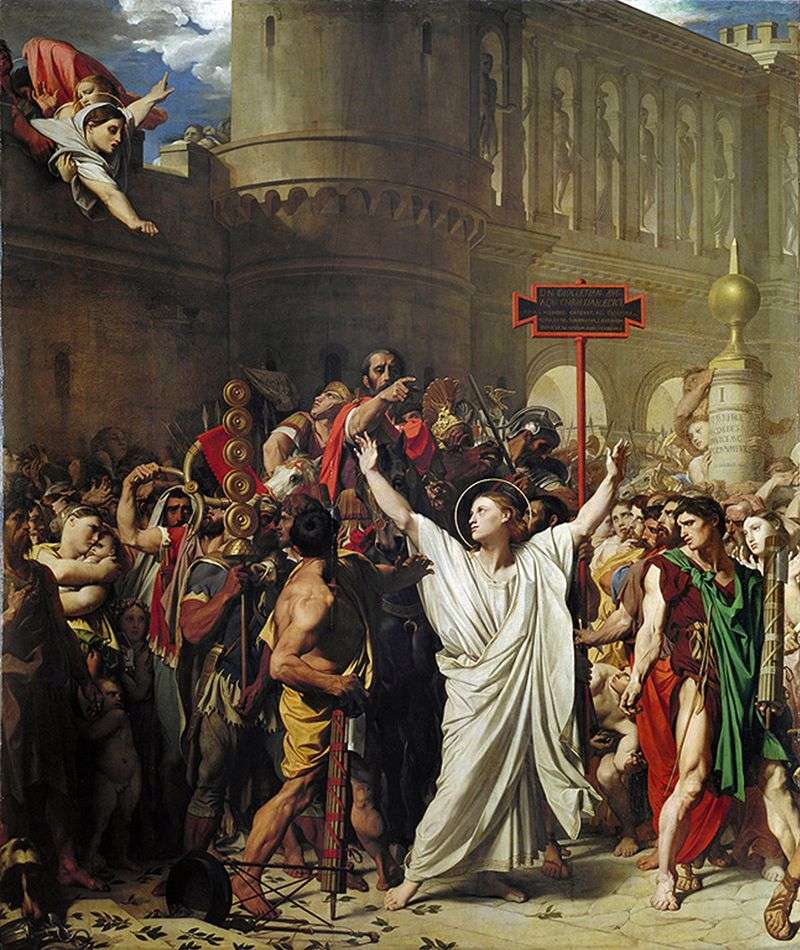
Though Ingres was an artist known to follow his own impulses he was still a devout student of cultural conservatism, never straying completely from Neoclassical’s new but traditional beliefs. As his father was an artist, Ingres likely began training at an early age. He studied under Jacques-Louis David for four years and was profoundly influenced by him, as well as by the works of antiquity he saw in the Louvre. Ingres considered himself the protector of French academic orthodoxy and fought against the rising popularity of Romanticism. He did not enjoy painting violent battle scenes like others during his time did. Instead, he took inspiration from Orientalism and he saw himself as a history painter, the highest goal of academic art which centered on study from the nude and classical art. Under the influence of Italian art, particularly Raphael, Ingres mastered portraiture. After his death in 1867, Ingres left behind many fans but no pupils to carry on the Neoclassicism legacy.
My first impression of Ingres’ work was that it seemed very dramatic, eventful, and passionate. It appears very monotone, but I think Ingres created great depth with his values and uses great contrast between subject and background. The attention to detail put into the pieces amazes me and I thoroughly adore the way he paints fabric and clothing in general.
Sources:
https://en.wikipedia.org/wiki/Jean-Auguste-Dominique_Ingres
https://www.britannica.com/biography/J-A-D-Ingres
https://www.theartstory.org/artist/ingres-jean-auguste-dominique/artworks/
https://www.jeanaugustedominiqueingres.org/
https://www.artble.com/artists/jean_auguste_dominique_ingres
Images:
https://upload.wikimedia.org/wikipedia/commons/9/94/Ingres%2C_Self-portrait.jpg
https://painting-planet.com/images/7/image893.jpg
https://upload.wikimedia.org/wikipedia/commons/b/be/The_Virgin_Adoring_the_Host.PNG
https://collectionapi.metmuseum.org/api/collection/v1/iiif/459106/1964622/main-image
Survey 4: The First Shot Ever
Today, photography can be used to capture a memory. This is all thanks to Joseph Nicéphore Niépce, a French inventor who used the process of heliography to create the world’s first permanent photographic image.

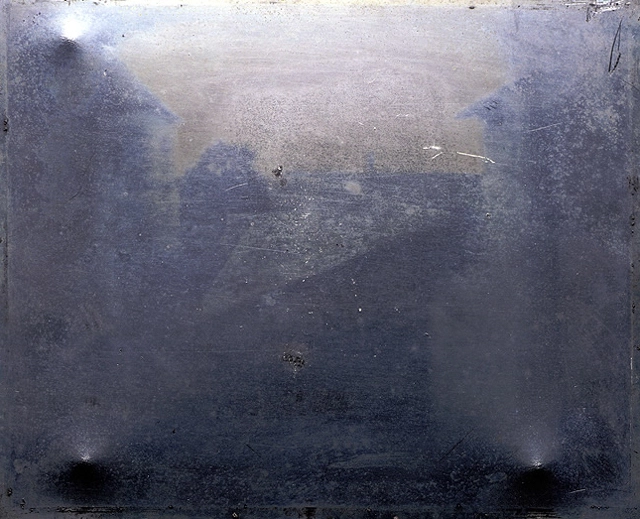
Niépce’s View from the Window at Le Gras (1826 or 1827) is the earliest surviving photograph of a view of Niépce’s estate in Burgundy, France. It was made using a camera obscura. As heliography produces one-of-a-kind images, there are no duplicates of the piece. Niépce used a very small camera of his own making and a pinhole acting as the lens. He coated Bitumen of Judea onto a piece of glass or metal; the Bitumen then hardened in proportion to the amount of light that hit it. The exposure took at least eight hours. Eight whole hours! Niépce’s patience and dedication amazes me! Obviously, the photo is very low quality and difficult to see. The grayish-hued plate containing hardened bitumen looks like a blur. During the exposure, different areas of the bitumen had hardened by different amounts, and the chemical wash removed some of the coating more than in other areas, leaving the image behind.
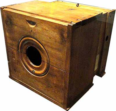
When the picture was taken, he fixed the image with lavender oil and white petroleum. He then created enhanced versions of the photo which is much easier to see. If you look at the photograph carefully, you can observe the results of the very long exposure. Both the building wing on the left and the one on the right were illuminated. The colours are showing up more in the enhanced photo and in the black and white one, the contrast is very obvious so we’re able to clearly see the buildings.
It truly is a revolutionary invention that not many people know about. The first photograph is now sealed in an oxygen-free case at the Harry Ransom Center in Austin. I hope I’ll be able to see it with my own eyes someday.

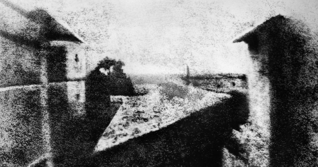
Image Sources:
https://petapixel.com/assets/uploads/2015/05/process2_large-2.jpg
https://www.thefamouspeople.com/profiles/images/nicphore-nipce-1.jpg
https://science4fun.info/wp-content/uploads/2016/12/Nicephore-Niepce-Camera.jpg
Sources:
https://www.thefamouspeople.com/profiles/nicphore-nipce-31741.php
https://www.insider.com/first-photograph-in-history-2016-8
http://100photos.time.com/photos/joseph-niepce-first-photograph-window-le-gras
Survey 3: Thirty Years of Beef
The Thirty Years’ War was primarily fought in Central Europe between 1618 and 1648. It was a brutal period in history, deadlier than the Black Death and World War II, in terms of the proportion of the population lost. However, I won’t be rambling on about the boring historical facts and dates during this war. No need to thank me. Instead, let’s talk about how the armies dressed and the weapons and strategies they used. Uniforms were rare in at least the Swedish army, although there may have been a few exceptions for officers and some elite troops. Soldiers were however supposed to make or buy their own clothes usually brought from home. Although some things such as hats, feathers, socks and armour were granted by the army to all soldiers. The feather was worn on the hats of Swedish soldiers to make them recognizable to their own. Color was too expensive even for a small part of cloth for every soldier. Undyed cloth was probably often used and brown, grey, off-white coats and breeches would be commonly seen. If they had the materials at hand, the men would try and brighten their array by adding coloured ribbons.
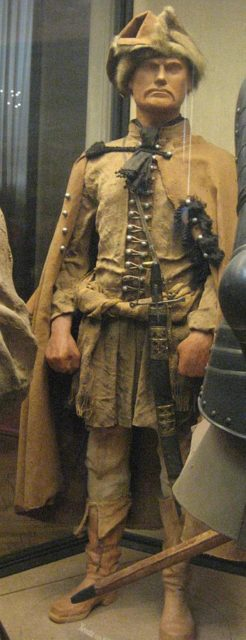
Officers might have had more extravagant and colourful clothes though. Blue and red were most used for them. Soldiers used many kinds of weapons primarily pikes in formations called Tercios.

The arquebus was the main firearm during the 16th century and was used in the 17th century and they were so heavy, a support stand was needed. Crossbows from the earlier period were still in use from the beginning of the war, as well as daggers and buckler and rapiers.
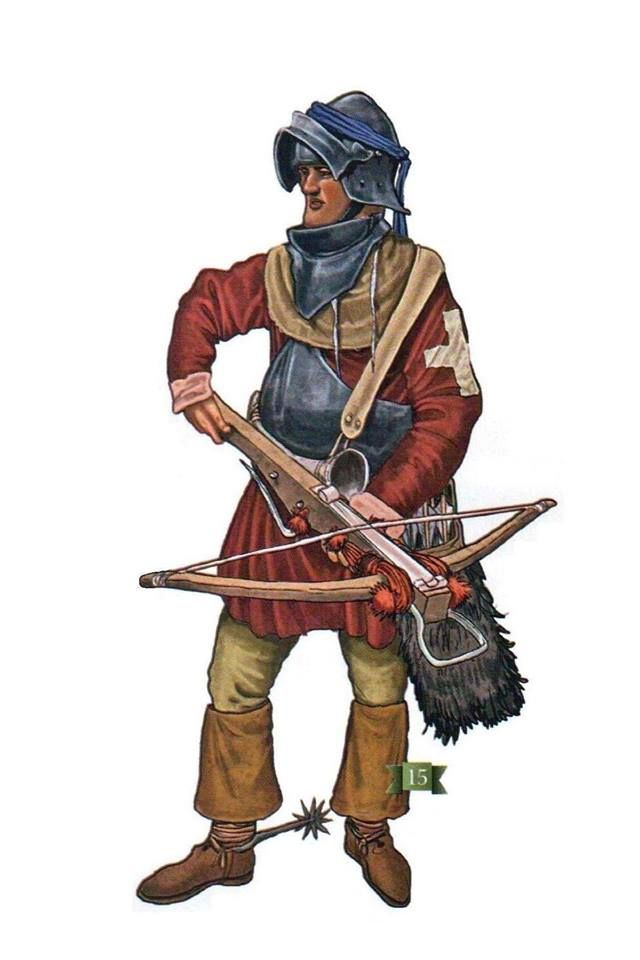

The most recent innovation was the matchlock musket. There were few rifles in use until the mid-18th century primarily because they were slow to load. Swords were still used throughout. Some were curved while others were thin and straight. Some German troops used two-handed great swords.
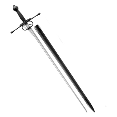
Battle tactics and strategies also helped many countries win in the war. The most common tactic used was the caracole – a combined cavalry charge assisted by firearms. Eventually, this was replaced by a full-scale cavalry charge. Such tactics needed well trained and disciplined troops.
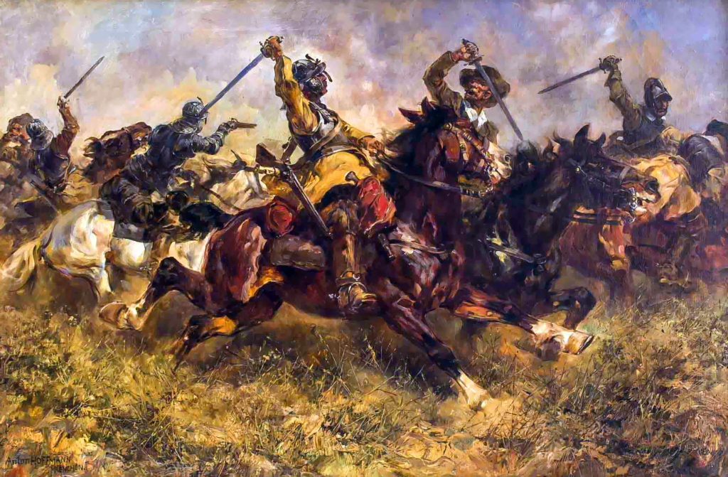
The developments of war strategies throughout the Thirty Years’ War influenced the style of warfare in future wars. Although fashion didn’t play a huge role in earning victory during the war, it is still interesting (I hope) to look at the clothing and armour they were provided to fight in this huge battle.
Sources:
http://www.faszination-geschichte.de/Bewaffnung/weapons/Firearms.html
https://www.britannica.com/event/Thirty-Years-War
https://www.sciencedirect.com/topics/social-sciences/thirty-years-war
Images:
https://i.pinimg.com/originals/92/1b/cc/921bcce21e3e8bd7048d7d7deaccc503.jpg
https://qph.fs.quoracdn.net/main-qimg-e2266ada6c67dc8d914dabd02dcd867a.webp
https://i.pinimg.com/originals/48/0d/76/480d7691c267ceb43639130aaf1e019e.jpg
https://www.swordsoftheeast.com/images/products/detail/swordofthethirtyyearswar3.jpg
Survey 9: Mood Board Rationale

Mood boards organize ideas and convey feelings about a topic. It took me a while to become familiar with Invision as this was my first time using it. I started out by listing possible events I could research about in a notebook page. Then, I eliminated the ones which didn’t connect to each topic groups.
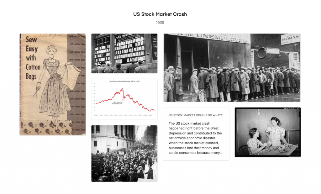
It was quite difficult to think of connections between events and topics, so this took me a long time to plan. I wish I had known we could choose topics outside of the three groups before I finished the mood board. I also had to be mindful of the significance of the events I chose because I couldn’t find too much information on minor events. Which is why I ended up with the three events: Bauhaus, Charles Lindbergh and US Stock Market Crash. They all had a great impact on the world, whether positively or negatively.

I thought the overall experience with Invision was a little confusing but stimulating. Despite the time and effort I took on this assignment, it was still very informative, and I learned a lot about different aspects of history. Finally, I would give myself a 9/10. I misunderstood part of the project criteria and ended up redoing the assignment halfway. But I planned the assignment well and worked very hard on the research and curating the mood board. If I reached out to my classmates or professor sooner, I could have probably avoided the confusion upon the project brief and take less time completing the project.
High Renaissance and Mannerism
Hieronymus Bosch
Bosch is a well-known Dutch 15th century artist, known for his surrealistic depictions of scenes derived from religious beliefs. Although little is known about his life, we know that he was born sometime between 1450–1456 and that his birth name was Jheronimus Van Aken. Bosch was very well-known throughout Europe in his lifetime. He is also believed to have been a well-educated man and relatively affluent. And after his death, his art was widely imitated and copied. He received many commissions relating to religious themes while staying in Hertogenbosch, a city located in North Brabant, Netherlands. His early work was very conventional, and the unusual style and biblical references developed later. As his city belonged to the Roman Empire, we can speculate that he might have had access to classical Roman art and would have been somewhat influenced by the art of the Renaissance.
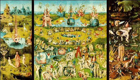

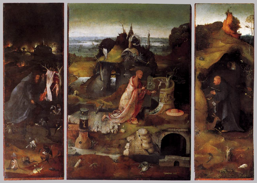
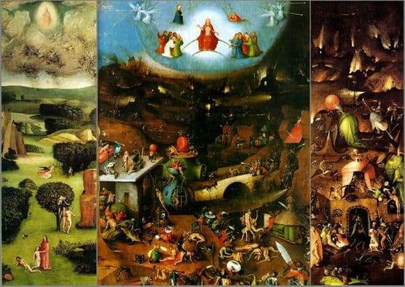

I gravitate towards the surrealistic and sinister style Bosch beautifully achieves. No other artist from that period (from what I’ve seen) consistently created non-traditional images throughout every painting. Although only twenty-five paintings and eight drawings remain, his creative imagery and his use of earthy, warm-toned colours really attracted me to his paintings. An interesting thing I noticed is that he creates many triptych paintings and effectively use this layout to communicate a story. Bosch was successful with the Habsburgs, who found his work desirable and collected it. Therefore, today his masterworks can be found in Madrid and Vienna.
Image Sources:
https://www.wga.hu/art/b/bosch/6venice/hermit.jpg
Survey 1: The Mayan Geniuses
During my senior year of high school, I took a Comparative Cultures class and I vividly remember a culture that really interested me, Mayan civilization, one of the longest existing and most advanced Pre-Columbian civilizations. Due to the Spanish conquest of the Maya, most historical evidence was destroyed, except for the cities and buildings. The walls of the Mayan buildings were covered in writings about over 4000 years of history. Therefore, their architecture is one of the most significant documents that remain. Mayan city-states built and intricately designed pyramids, temples, palaces, walls etc.

Their pyramids are perhaps the most well-known structures in history. They were utilized not just for religious practices where offerings were made to the divine beings but also as burial chambers for deceased rulers, their partners etc. They are decorated with limestone carving and geometrical patterns. I remember reading a page about how the shapes of pyramids are triangular because by getting closer to the sky, it symbolizes that they are also reaching closer to their god and goddesses. I also found it interesting that many times, new pyramids were built on top of old pyramids. Archeologists have found several more pyramids inside and under existing ones. The Mayan ruins still exist now and can be found in Mexico, Yucatan and Quintana Roo. If possible, I would like to visit them one day and see these remarkable buildings in real life.

The Mayans spent much of their time stargazing and making advanced astronomical calculations. Their calendar system consists of several complex cycles of different lengths that are surprisingly similar to our calendars today. Something I found quite amusing is that on December 21st, 2012, it was said that the world would end. However, one of the calendars used to measure long periods of time, the “Long Count Calendar” made by Mayans proved that it is just a silly theory, and everyone was basically freaking out for nothing! Not only did the calendars help the Mayans keep track of time, they were also used astrological cycles to aid in annual planting and harvesting.
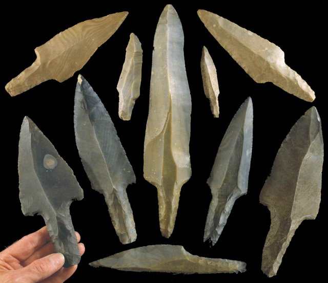
Their achievements are even more impressive considering they only had stone-age tools and didn’t have an available source of iron ore. They mainly used stone tools to complete daily tasks such as building projects, farming and hunting. The main materials used to create these tools were limestone, sandstone and fine-grained volcanic stone. Mayan settlements, temples and palaces were made largely from shaped stone blocks. I can’t imagine how much time and effort were put into building their advanced architecture just by using these simple yet useful instruments.
Despite Maya’s innovative scientific achievements, their culture began to decline toward the beginning of the late 8th century. Some say the downfall of Maya civilization could have been overpopulation, environmental degradation, warfare, or even extended drought. There is no definitive explanation.
![Confused in Maya | [Laughs In Spanish] | Know Your Meme](https://i.kym-cdn.com/photos/images/newsfeed/001/507/465/c4e.jpg)
However, we know that surely, their culture had a significant impact in our lifestyle today.
Sources
https://www.history.com/topics/ancient-americas/mayan-scientific-achievements
https://www.ancient.eu/Maya_Architecture/
https://people.howstuffworks.com/mayan-calendar4.htm
Images
https://i.kym-cdn.com/photos/images/original/001/507/465/c4e.jpg
https://i.pinimg.com/originals/76/20/4d/76204d6d4378020f5004e831ace1a527.jpg
https://www.geo.tv/assets/uploads/updates/2020-06-15/293235_5071968_updates.jpg