Gestalt’s principle, proximity explained

Despite the three primary colours used, which would normally separate the group of elements, this design successfully communicates the appearance of an old man’s size profile using the principle of proximity.

Despite the three primary colours used, which would normally separate the group of elements, this design successfully communicates the appearance of an old man’s size profile using the principle of proximity.

Utilizing the principle of closure, Nychuk’s design shows a variety in the sizing of dots and pushes the audience to group the individual elements to visualize an image of an eye.
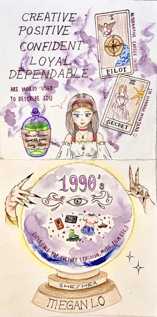
For this project, I chose to use fortune telling as my theme because I have recently been interested in spirituality, witchcraft, and astrology. I thought it would be interesting to draw myself as the fortune teller and using second person point of view.
I started out by listing out possible themes and ended up choosing fortune telling because I felt inspired by it and really liked the idea of addressing the audience as if I’m telling their fortune. Then, I made a separate list of the elements I want to include on the page to make sure I have enough space to fit everything.
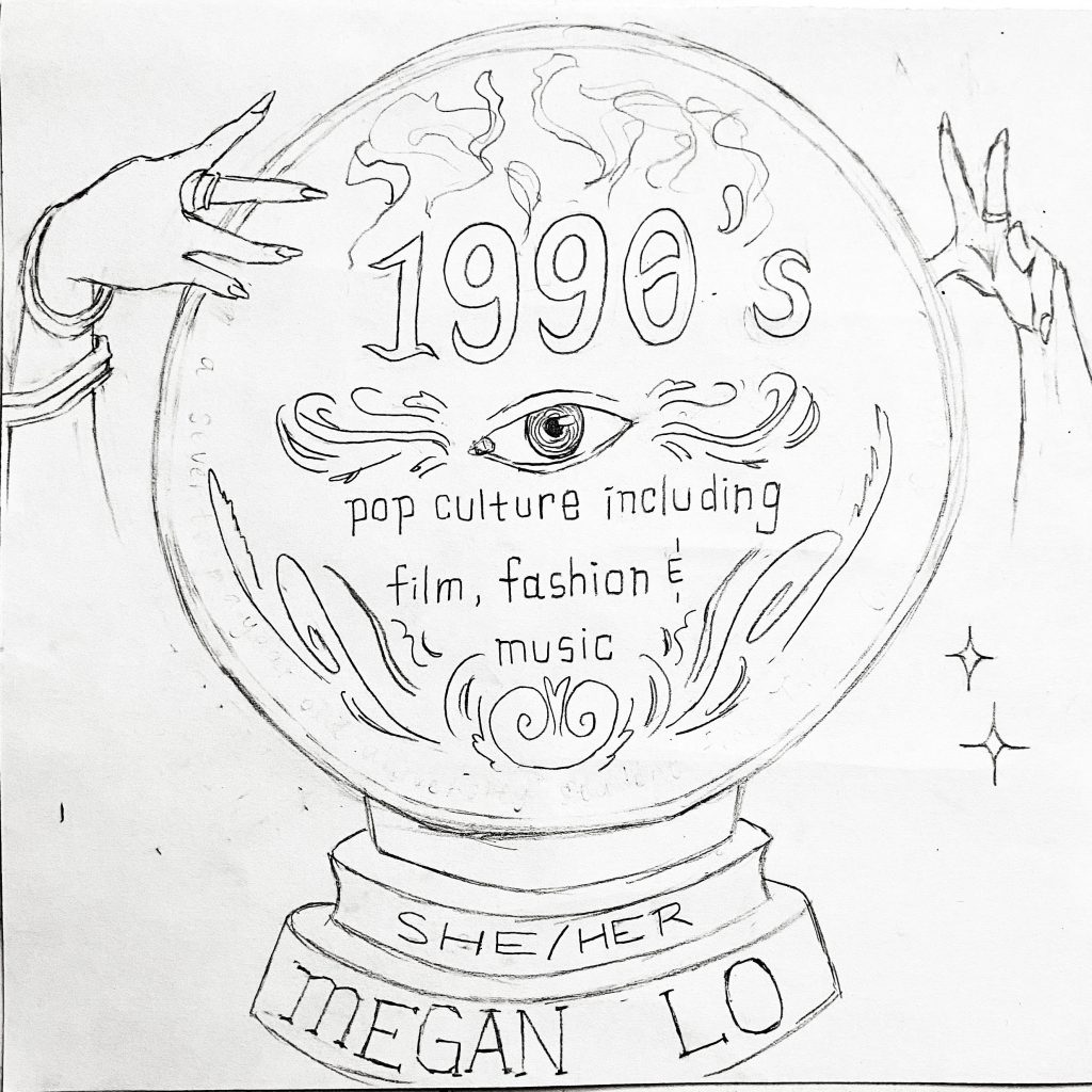
After planning out my yearbook spread, I began making a sketch of the page (see images attached down below) and you can see that the sketch is different from the final product. That is because after finishing my sketch, I went back and examined the elements to see which ones are unnecessary and how I can make the overall image look more mystical and captivating.

I tried to incorporate as many fortune telling tools as I could think of. For example, I added tarot cards to communicate my other choice of career and secret (of me being Hannah Montana LOL). As for the medium, I used pencil crayon, fine liner and watercolor. With watercolor, I painted smoke and fog purple to make the page seem more mysterious yet peaceful because I didn’t want it to seem gloomy or sinister. Aside from the purple, I tried using mostly warm and rich colors like yellow, orange, brown and burgundy.
I would grade myself an 8/10. Regarding my creative process, I could’ve managed my time better and maybe consider using more design elements. Additionally, I feel like my page is too crowded and could have limited the number of elements to avoid distractions. I realized afterwards that it might have been better if I only added smoke on the bottom page since that the top page is already quite busy. Nevertheless, I like how my theme is obvious and I used a balanced colour palette.
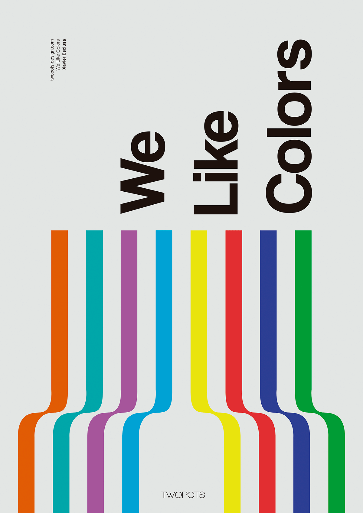
By Xavier Esclusa Trias
Line is used in the poster design shown above. The direction of the lines guide emphasis towards the title and by making the typography rotated vertically, the designer employs the principles of alignment and composition.
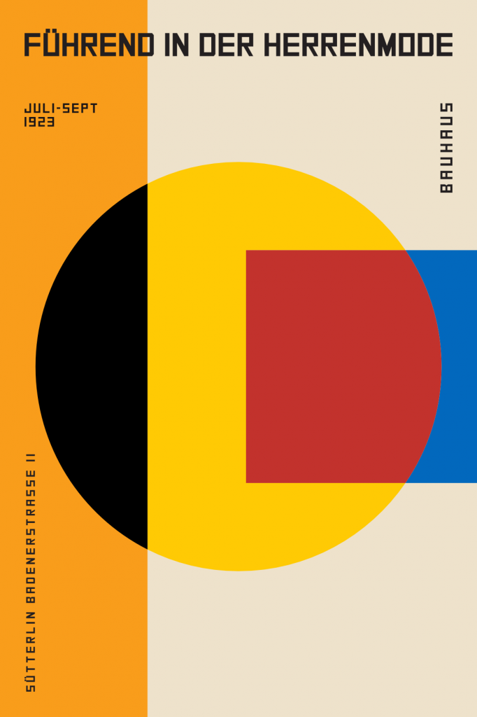
By German Bauhaus for an exhibition (1923)
This abstract poster design is an example of shape. The bold variety of shapes contrast each other and gives vitality and modernism to the design. This influential and recognizable design style from the Bauhaus movement plays a huge role in today’s understanding of the element of shape.
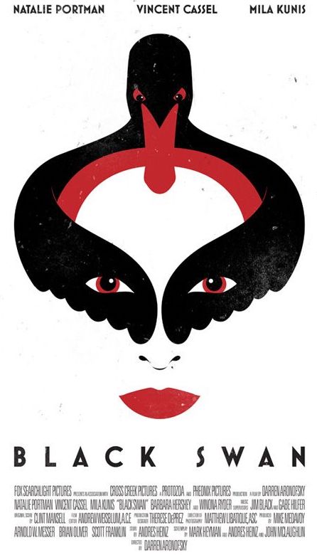
Movie poster for Black Swan by unknown
This design judiciously uses space, especially negative space and white space to support the proximity and emphasize the shape of the “swan face”. This makes it easier for the audience to analyze and remember the graphics and information when there is an organized and clean layout.

From a magazine cover by Pierre Mendel (1993)
In the example above, Mendel layers tactile textured paper to convey a wrinkled surface. Adding texture gives this design more character when compared with the minimalistic style and this can help attract the viewer’s attention to a particular area.
Megan Lo is a first-year student at Capilano University’s IDEA School of Design program. She and her family moved to Canada six years ago from Taiwan and they lived in Burnaby for a year. Currently, she resides in Coquitlam where she recently graduated from Gleneagle Secondary School. She plans to pursue graphic design and branding as her chosen career path. Nevertheless, She is still looking forward to learning more about other creative subjects in the next four years at Capilano University. Aside from making art, she enjoys listening to music, watching anime, travelling and fashion during leisure time. She also loves hanging out with friends even though that isn’t an option right now due to the pandemic.