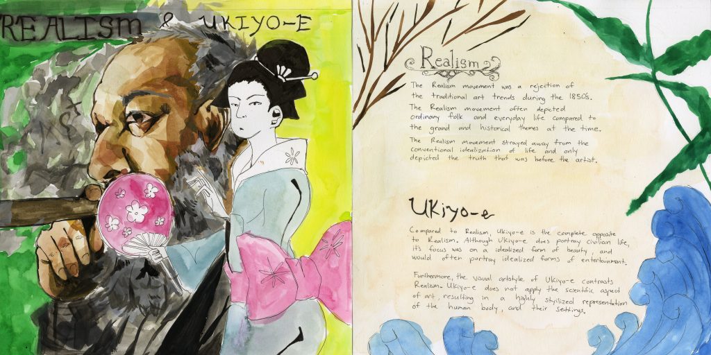
For this yearbook spread I was placed in Art and Colour for Survey 4. I had a compare and contrast spread, so I decided to compare the differences between two art movements happening around the same time, Realism and Ukiyo-e. I think in terms of the illustration, I did well on that regard showcasing the two art styles side by side. The background could’ve been a bit less…. ugly looking but other than that I think it looks solid. I used the big calligraphy marker for the realism wording, however unbeknownst to me I actually didn’t realize it wasn’t water-proof so it got all dark around the title (oops).
The other page looks a bit plain, but I was planning to fill the spread with information. I think the amount of info I put in regarding the two movements is enough, however I wrote it too small so I should try to print out the text or use something like InDesign or Illustrator to type out the text.
Overall I would give myself a 8/10. There’s some kinks that could be changed but it looks nice (I hope lol)
Leave a Reply