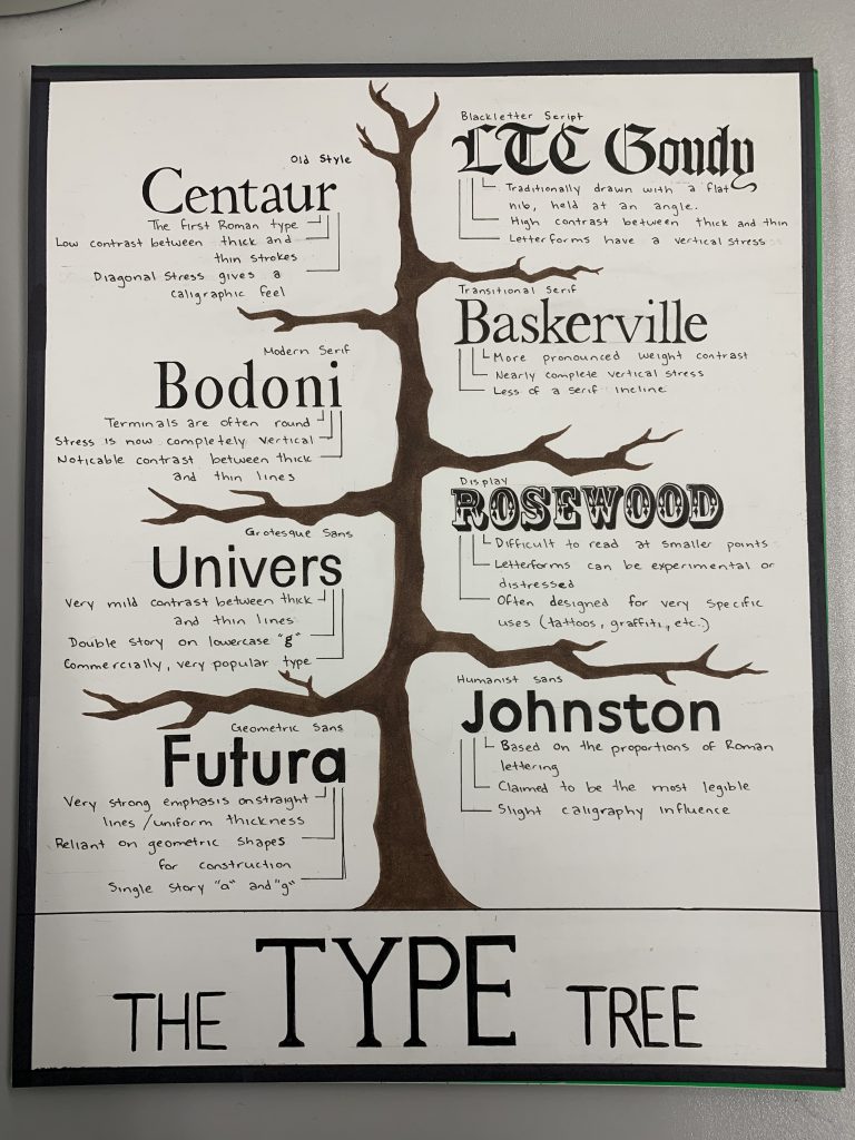
For my typography poster, I decided to go with the idea of a “type tree.” I felt that the use of a tree helped to display each section of type in an orderly fashion which was simple, but yet understandable. For colour, I originally planned to add some more variety on the bottom text and the background though, I felt this would be much more overwhelming. I decided to stick with the simple colour tone and planned to focus mainly on the type itself.
I feel that my idea could have been a little bit more creative so I rank myself an overall 7/10. I spent approximately 6 to 7 hours finishing the entire thing, the majority of the time spent in writing on the typefaces themselves.