Shape

Poster by, Ollie Moss

This poster has a very “aggressive” use of shape, I may argue it also has a strong element of size. Although shape has the biggest impression, it feels like it is implying an apocalyptic universe where the dead are emerging. This image presents an aggressive and an eerie vibe, the giant hand outstretching from the surface below provides a feeling of destruction. The silhouette of the house, the man next to the gravestone, and the intensely orange sky emphasizes on that eerie vibe, almost as if presenting that the destruction either is about to happen or has already happened.

Shape

Texture

This poster presents a strong sense of texture and expresses almost a darker tone in itself. The phrase “time may change me,” definitely is a phrase that after it is read, will stick with the reader for an extended period of time and will make you think about it. After I came across this poster, it almost made me feel a little uneasy and portrayed life and time itself to be a little daunting, it made me more aware about the looming feeling of change that is constantly occurring.

Texture

My Yearbook Spread

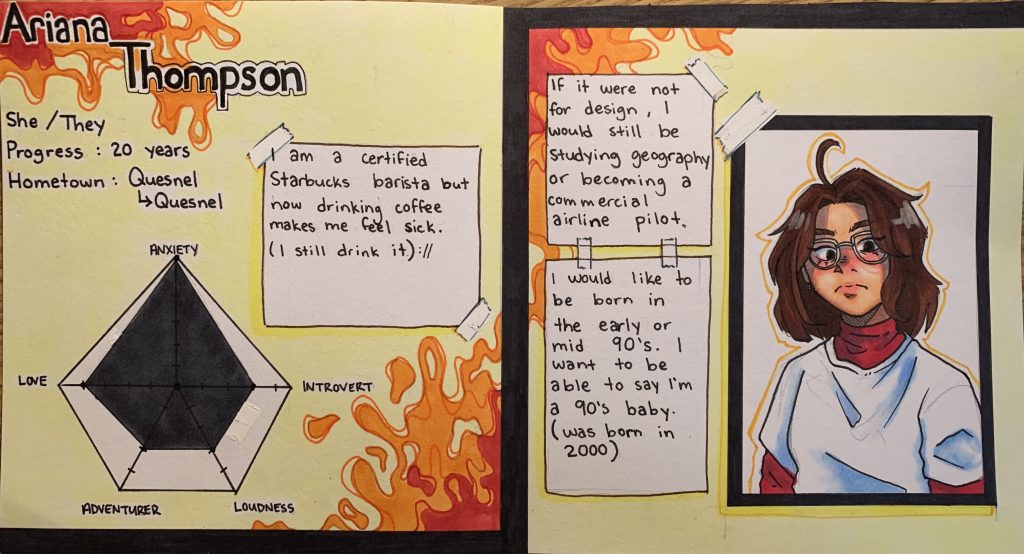
The media I am using are inks and alcohol markers. I made my yearbook spreadsheet to resemble the look of a character reference or a stats sheet. The overall layout is not overly serious and a little bit messy or disorganised as I often tend to lack that seriousness in my own personality. My idea was to reflect some of my energy by using warm but vibrant colours in the background, I like to try to welcome the warmer side of my personality and then convey it with the bright and bubbly side of it to coexist as one. My self-portrait isn’t 110% accurate but it is how I see myself and, in a way, hope it’s how other view me as an individual. I want people reading it to feel like it isn’t something overly serous and is a little bit more fun or interesting to look at.

If I were to give myself a mark on a 10-point scale, I would grade myself a 7 perhaps. Although I spend a total of around 4 hours, I do feel like my use of colour could’ve been thought out a little bit more.

My Yearbook Spread