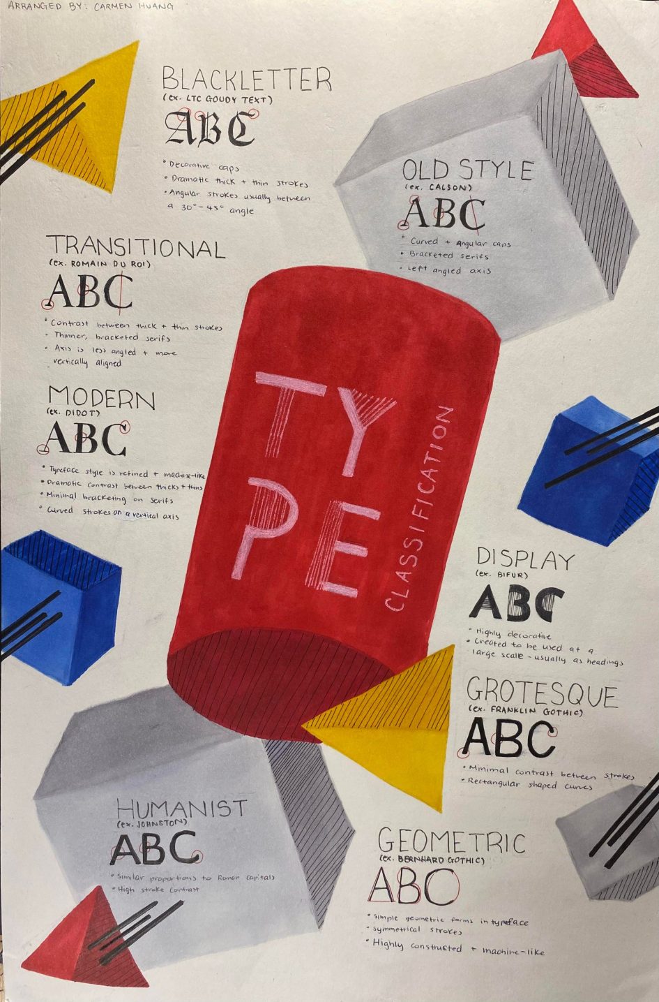
While researching the characteristics of the different typefaces, I stumbled upon Bifur and got inspired to incorporate its elements into my poster.
Initially, I had created a rough draft of the poster with a basic layout of the information and primary shapes and colours. However, after receiving feedback on the idea, I realized the design was not compelling enough. As a result, I began experimenting with three-dimensional shapes to make the poster more engaging, as suggested during my critique.
Using basic shapes and primary colours, I wanted to showcase the ideas of foundations and how these type categories used in the poster are often used to identify different typefaces. I also used lines throughout the design to enhance the visual interest and to tie it back into the Bifur typeface that inspired the poster.
In total, I spent around 13 hours researching and compiling information for this project and overall, I would give myself a 14/15 for the poster. One of the challenges that I faced while creating this project was finding a way to incorporate all the information while also making it visually interesting. Because of this, I found that the format of the information that I have on my poster seems a bit disorganized, with gaps of white space between graphics and text. If I could go back and improve this poster, I would go back and try and rearrange different elements to minimize the empty space present in the design.
Overall, this project was difficult in finding solutions to fit everything in, but I had fun being challenged and stepping out of my comfort zone to create the final end product.
Sources:
Leave a Reply