Survey 11: Women In Art – Cindy Sherman (1954 – present)

Magic Time, 1975/2014.

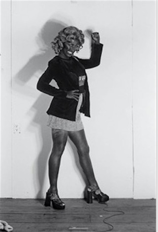
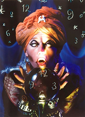
Cindy Sherman was born on January 19, 1954, in Glen Ridge, New Jersey. She is an American photographer and she is well known for her self portraits where she dresses up as stereotypical versions of other people, most often women. She attended the State University of New York in 1972 and majored in painting before switching to photography. One of her most well known works is Untitled Film Stills (1977 – 1980), where she dresses in wigs and outfits that fit the stereotypical depictions of women in media during the time. She says that the piece is meant to be “about the fakeness of role-playing as well as contempt for the domineering ‘male’ audience who would mistakenly read the images as sexy.” She continues to take photographs of her own self dressed up in costume and shares many of them online.

I understand her desire to explore the stereotyping and the generalization of women in media as well as attacking the normalcy of it all. I admire that aspect of her work, however I can’t say I am completely comfortable with viewing the photos, as they have very uncomfortable and unnerving looks to them, However, that’s the whole point of her work so I understand why her pieces need to shock and disturb. Acknowledging all of this, I have to say that I do not like her. Some of her work is nice, but I also think that some of her work is extremely distasteful. She has a series called Bus Riders (1976) where she takes multiple photos in blackface. I can’t agree with her work, and I haven’t seen any type of apology or explanation from her either that would help me understand her perspective on the issue. So while I can acknowledge some of her art, I can’t say that I support her.

Untitled, from Bus Riders, 1976.
Untitled, 1993.
Untitled.
Untitled, 2010–2013.
Sources:

Survey 9: Abstract Expressionism and Pop Art – Jim Dine (1935 – present)

Untitled (Head), 1959.

Jim Dine is an American Pop Artist born on June 16th, 1935 in Cincinnati, Ohio. Dine studied at the Boston Museum of Fine Arts School and at Ohio University where he received his Bachelor of Fine Arts in 1957. Later on in 1958 Dine moved to New York and began working with other artists such as Allan Kaprow, Robert Whitman, and Claes Oldenburg to create performance art that they called “Happenings”. He has been a guest lecturer at Yale University and was an artist-in-residence at Cornell University. His first solo exhibit was at the Ruben Gallery, New York, in 1960.

Dine’s work includes painting, sculpture, poetry, and photography. Common motifs in his pieces are hearts, Pinocchio, bathrobes, and tools. Common themes of his works are personal identity, memory, and the body. His work uses bright colours and many scratchy, textural qualities. It is interesting to me that Dine seems to be able to take one subject and create so many variations of the piece. I like some of his more graphic works, but I find the constant use of hearts and bathrobes to be too repetitive for my tastes. I think the process of making his pieces is more interesting than the end result. I do like his sculptures though.

Walla Walla Robe, 1984.
Study for “Garrity Necklace, Number 1”, 1985.
Awl, 1965.
Orgasm, 1970 – 1980.
Sources

Survey 10: Contemporary and Post Modernism – David Hockney (1937 – present)

Dog Painting 41, 1995.

David Hockney was born July 9th, 1937 in Bradford, West Yorkshire, in Britain. He attended the Bradford School of Art from 1953 – 1957 and the Royal College of Art from 1959 – 1962 in London, England. He later moved to the U.S. to teach at universities in Iowa, Colorado, and California from 1964 – 1967. After his experience teaching, he moved to Los Angeles in 1978. His work ranges from paintings of landscapes and portraits to costume and stage design in opera and theatre productions. Hockney is currently one of the most influential artist because his work’s popularity continues to spread, with one of his most well-known pieces selling for $90 million USD at an auction. He was also appointed an Order of Merit by Queen Elizabeth II.

I find his work especially appealing, I love the bright colours, interesting use of space and perspective, as well as his Dog Days (1998) series. I saw one of his Dog Days paintings for the first time recently and have been obsessed with it ever since. It is an extremely simple painting, with the subject of his dog sitting upright on a pillow. However, something about the way he uses colour and the way he handles the paint in his brushstrokes give the dog a charming character that I cannot get enough of. While his other works, especially his large landscapes such as A Bigger Grand Canyon (1998), are beautiful to look at, I find his smaller and more personal pieces to be more interesting. I also really enjoy seeing his costume design and stage design sketches.

A Bigger Grand Canyon, 1998.
Portrait of an Artist (Pool with Two Figures), 1972.
“Papageno” from “The Magic Flute”, 1977.
David Hockney “Act II, Scene VIII. The Triumph of Light” from “The Magic Flute” 1977
Sources

Survey 8: Cubism, Dadaism, and Surrealism – Paul Klee (1879 – 1940)

Three Houses, 1922.

Paul Klee was born on December 18, 1879, in Münchenbuchsee, Switzerland. He was a painter and draftsman best known for his use of colour and hue in simple and abstract shapes. He was influenced by Renaissance prints, Impressionist artists, and especially by the North African landscape which was the reason for his unrestricted use of colour. He produced many child-like pieces that appealed to the public and depicted different landscapes and emotions he experienced during WWI. From 1920 – 1931 Klee was hired at the Bauhaus school of modern design to lecture about the mechanics of art. After 1931, Klee resigned to the Dusseldorf Academy until 1933 when Hitler came into power.

While I don’t usually enjoy cubism or abstract art, I find that Klee has a unique art style that combines a number of movements that makes his work unique and appealing. I enjoy his use of colour and the shapes he creates in his pieces. Some of his pieces portray clearer subjects, such as in Three Houses and One Who Understands. I love the abstraction of fruit in his piece Suspended Fruit and the colour scheme of dark green and dull grey-red. His use of shades in Three Houses and the way he creates distance and a horizon just by using colour. The blue shades in the background look like they are fading into mountains and they whole piece has a very calm albeit melancholic feeling.

One Who Understands, 1934.
Suspended Fruit, 1921.
Tower in Orange and Green, 1922.
Hilterfingen, July 19, 1895.
Rough-Cut Head, 1935.
Sources

Survey 7: Expressionism, Fauvism, and Early 20th Century – George Grosz (1893 – 1959)

The Eclipse of the Sun, 1926.

George Grosz was a German New Objectivity and Dadaist artist born in Berlin on July 26th, 1893. He is best known for his criticism of society through caricatures and art with themes from his experiences during WWII. Grosz’s work depicted the greed of war by capitalists and the bourgeoisie through warped caricatures of military figures and other benefactors of war. 

The way Grosz uses light and colour in his work gives each piece a dramatic and drastic feeling that exemplifies the grotesque and evil depictions of military and bourgeoisie in Grosz’s work. In Bonhams he depicts a man of the bourgeoisie who is maniacal in his facial expression and is seen chopping up meat for himself to eat while surrounded by skeletons of those who worked hard to give him the food he is greedily consuming. His work is poignant and represents the feelings of the proletariat during the German Depression. I think his work is important for understanding how the terrible conditions people lived in and how unfair the workers were treated and his work is an important part of history. I admire how he did not shy away from his subjects or themes, and he used different visual elements such as skewed perspective and caricature to get his message across.

Fairy Tale, 1942.
Remembering, 1937.
Explosion, 1917.
The Agitator, 1928.
Source