DSGN142: Canadian Design Today – Marian Bantjes

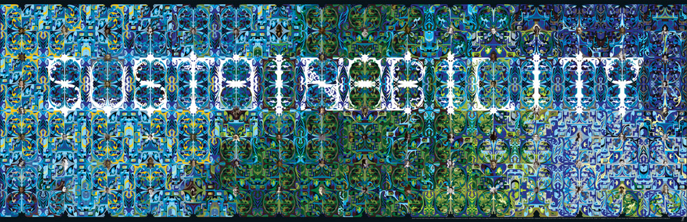
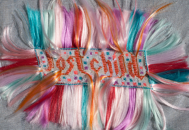
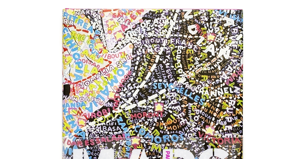
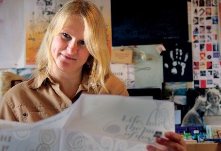
Marian Bantjes is a Canadian typographer and designer who is best known for her intricate typography work including her annual Valentine’s day cards which are featured in her Ted Talk. She does beautiful work and uses a variety of interesting mediums, ranging from salt to household objects, to create unique patterns that frame her typography.

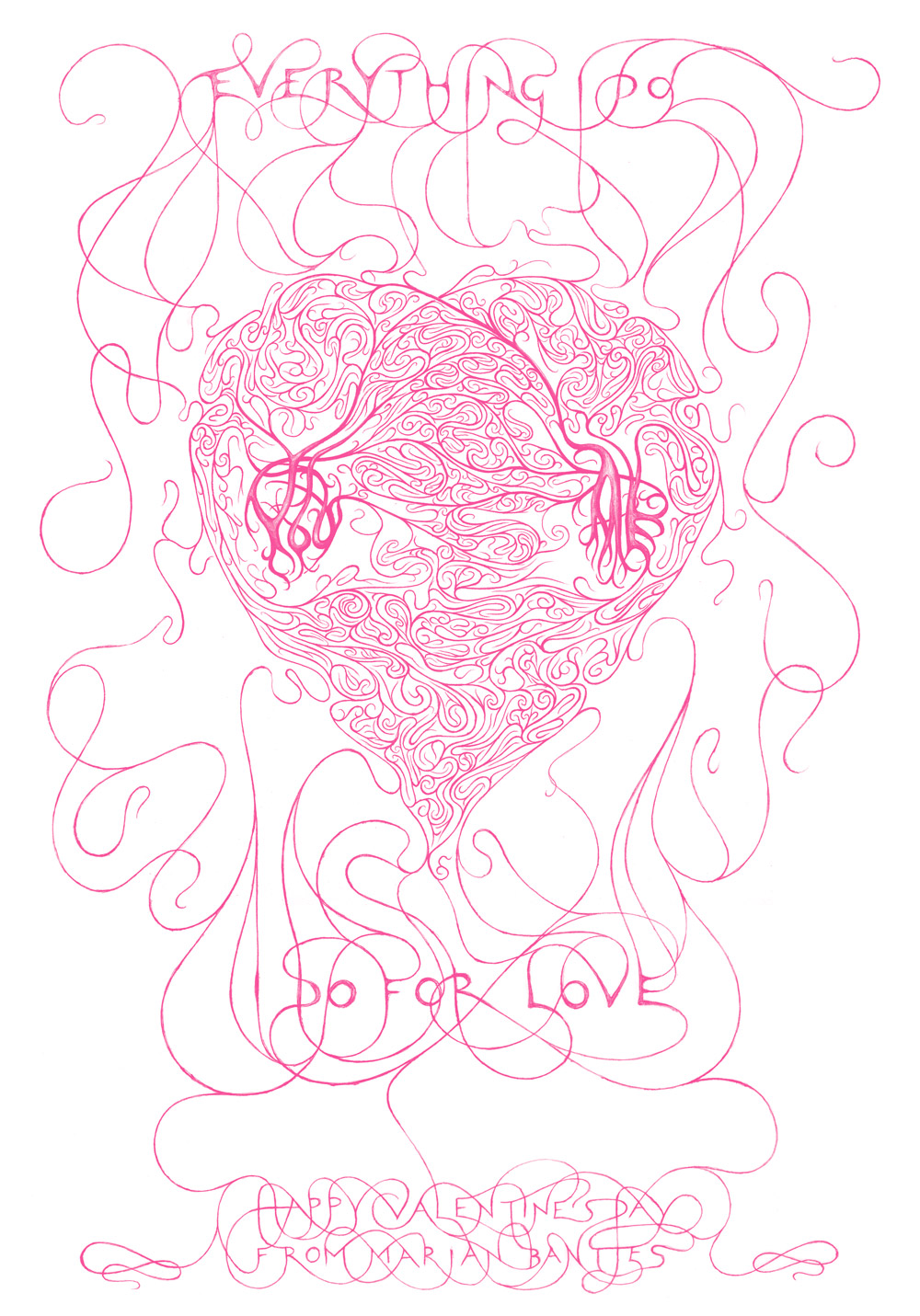
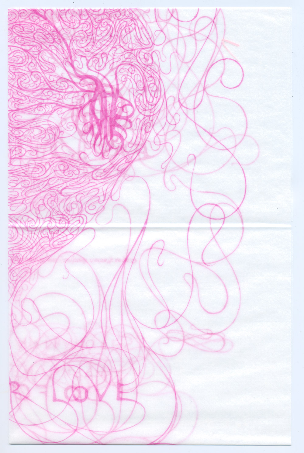
I especially like her Valentine from 2005, which is a heart design that almost looks like arteries. I find that the type is not always legible, but I think that the overall design excuses it. I admire her ability to create unique patterns.

I find it interesting that despite her large portfolio of work in all kinds of mediums, each piece still has a certain design sensibility that makes it a Marian Bantjes piece. Each piece has a sense of exploration, fun, and wonder that is especially welcome during this time.

Sources:

DSGN 142: Supergraphics Innovator – Paula Scher

Paula Scher is an American graphic designer, painter, and educator who works as the principal of Pentagram. She is an accomplished designer and has worked at Random House Publishing, CBS Records, and Koppel & Scher.

She’s done a lot of innovative work during her career and I think her work is a good resource to look to learn from and be inspired by. I think her maps are particularly interesting because they are so visually dynamic and unique. I think maps are often really boring and uninteresting to look at since they need so much information and have to be easily legible but her maps have a much more artistic take that makes the same information infinitely more engaging.

Despite the fact that her maps are so busy and that there is writing in every space— even in the spaces that appear to be all black— she uses colour and size to draw attention to the landmasses themselves and manages to create a balance amongst all the chaos.

Sources:

DSGN 142: Psychedelic Design Hero – Victor Moscoso

Victor Moscoso

Victor Moscoso is a prominent psychedelic artist who is beste known for rock music art and underground comics- such as ZAP Comix.

He has a very fun and humorous art style and I think his comics are really interesting in the way he transitions between different comic panels. Some of my favourite pieces of his are the various advertisements and posters he created, in particular this one about a poetry reading night. Looking at this poster inspired my design for the 1960’s album cover assignment and I layered the lips in blue and pink in the same manner as Victor Moscoso.

Moscoso has an interesting range of work and compared to other designers during the time his font choices and typography is much easier to read which I think helps his work stay more relevant.

ZAP comix cover art by Victor Moscoso
comic strip by Victor Moscoso
poetry night poster by Victor Moscoso
‘The San Francisco Poster’ by VIctor Moscoso
poster by Victor Moscoso

Sources:

DSGN 142: Advertising Art Director – Cipe Pineles

Image result for cipe pineles portrait
Cipe Pineles

Cipe Pineles was an editorial designer that was most well known for her wok on Seventeen magazine, Vogue, Charm, and Vanity Fair. She was the first women to be asked into the all-male New York Art Directors Club. Pineles career lasted over 60 years and elevated the magazine industry through her innovative design work.

I really like her work and the muted, romantic colours that are used in her covers for Seventeen magazine and Charm magazine. I also really love her illustrations that she did in her cookbook. Her illustrations are charming and I enjoy the usage of texture in her organic forms. I also like how she’s treated the type, including it in her illustrations and integrating it into her designs.

Image result for cipe pineles
Seventeen Magazine Cover March 1948 Issue
Image result for cipe pineles
Seventeen Magazine Cover November 1958 Issue
Image result for cipe pineles illustration
Cipe Pineles Illustrated Cookbook

Sources