Degenerate Art: The Silencing of Expressionism (1905 – 1915)

Refugees and First Snow, Lee Jung Seob. 1916/1952.

Before WWI the Expressionist movement was beginning to spread throughout the arts. However, because of Hitler’s distaste and renouncing of modern art, the Expressionist movement was quickly snuffed out in Europe and the derogatory term “Degenerate Art” was placed onto these artworks.

WHAT IS EXPRESSIONISM?

Expressionism began in 1905 because of four architect students in Germany by the names of Ernst Ludwig Kirchner, Fritz Bleyl, Erich Heckel, and Karl Schmidt Rottluff. The four of them wanted a new style of art to express themselves, including their dissatisfaction with the bourgeoisie and their desire for individuality. Expressionism reflected the artists inner feelings through abstract and exaggerated imagery with unrealistic colours and distortion. It was heavily inspired by the works of Vincent van Gogh, Edvard Munch, and James Ensor.

Mountains at Saint-Rémy, Vincent Van Gogh. 1853.
EXPRESSIONIST ARTISTS

The Expressionist movement was filled with artists who explored their abstract emotions through art. They expressed their anxiety and their desires through distorted and unrealistic imagery, often using distorted human figures.

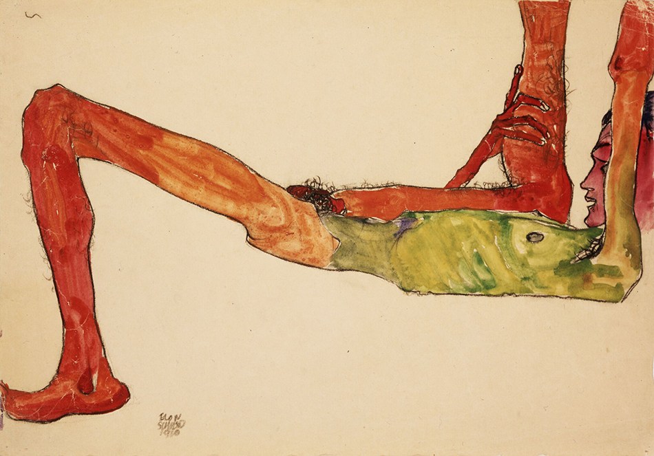
Egon Schiele was an Austrian artist who painted nude self portraits with elongated proportions. His work was often intense and sexual.

Reclining Male Nude, Egon Schiele. 1910.

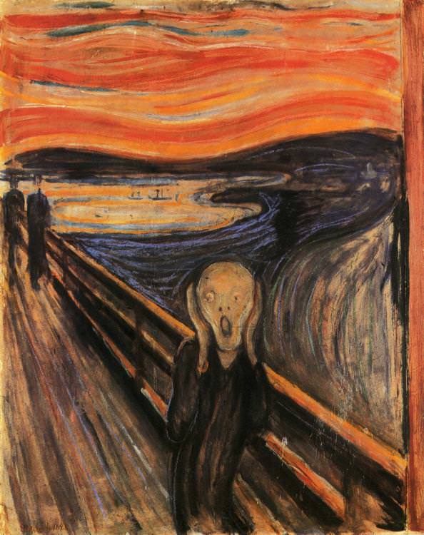
Edvard Munch was a Norwegian painter who painted anxious and fearful portraits depicting his own worries.

The Scream, Edvard Munch. 1893.

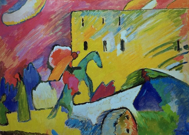
Wassily Kandinsky was a Russian painter who focused on expressing music through colourful and abstract landscapes.

Blue Rider, Wassily Kandinsky. 1909.

HOW DID IT BECOME DEGENERATE ART?

As Hitler rose to power, he began to eliminate and condemn anything opposing his Nazi ideas. This included controlling the art that was accepted by the general public of Germany. He and his party organized an art exhibit in 1937 called “Degenerate Art” which showed many examples of expressionist art. This alienated and demonized the artists who created these images, causing many of them to flee Europe in fear. This caused the end of the main era of the Expressionist movement.

Adolf Hitler and Adolf Ziegler visit the Degenerate Art Exhibition, 1937.
Sources:

Rise of Colour: Alphonse Mucha’s Art Nouveau Posters (1895 – 1905)

Zodiac Calendar, Alphonse Mucha, 1896.

Colour printing in the late 19th century was cheaper and easier to mass-produce. This meant that the use of colour in advertisements was suddenly much more common throughout the industry, and in turn it allowed artists and designers to utilize colour more thoughtfully in their work. Combined with a desire to bring art away from the exhibitons and into daily life, bold and colourful designs began to surface in the Art Nouveau movement.

WHO WAS ALPHONSE MUCHA?

Alphonse Mucha was an Austrian designer born on July 24, 1860. He designed costumes, sets, and posters for theatre which allowed is unique approach to poster design to take Art Nouveau to the next level. His work was strongly influenced by Dante Gabriel Rossetti and his paintings which subjects were often women.

Lady Lilith, Dante Gabriel Rossetti, 1873.
HOW WAS COLOUR USED?

The invention of chromolithography allowed designers to make their work colourful and attractive to the eye. Art Nouveau used many colours found in nature because the common motifs used in the style were flowers, organic patterns, and women. The most commonly used colours were mustard yellow, dark red, olive, pink, and brown, and the warm colours created an approachable and idyllic appearance for consumers to want to buy a company’s products. The outlines of the art were often done in brown rather than a harsh black. Light shades of blue and green were often used in the background to contrast with the female figure in the foreground.

HOW DID MUCHA DIFFER FROM OTHER DESIGNERS AT THE TIME?

While other designers used bold and eye catching colours, Mucha stood out from the rest by using pastel colours instead. His work was also heavily influenced by Japanese prints, he copied the long vertical scroll formatting for many of his posters. His work is also timeless, the posters are still admired above others because of his unique pastel and idyllic designs.

Gismonda, Alphonse Mucha, 1894.
Rêverie, Alphonse Mucha, 1897.
Sources:

The Rise and Fall of Chromolithography (1750 – 1850)

Lithographic stone used to print ten colour “Social Smoke” label
WHAT IS CHROMOLITHOGRAPHY?

Chromolithography is the process of colour printing using limestone and various chemicals. It evolved from lithography, where the prints were only black ink on paper and all colour had to be added afterwards by hand. Chromolithography printing was considered “the democracy of art” as it was able to provide beautiful colour printing for the middle-class at an affordable price.

Portrait of James Herbert Gustavus Meredyth Somerville, 2nd Baron Athlumney
WHY WAS CHROMOLITHOGRAPHY POPULAR?

Chromolithography layered colours to create depth that looked exactly like oil paintings to the untrained eye. This made the use of chromolithography great for the replication of oil paintings and the printing of artwork. It was also the main printing method to make the posters during World War I. Advertising, books, and newsprint used the chromolithographs to speed up the colouring process, as they no longer had to have people hand-paint each image. The use of limestone also meant that printing blocks didn’t need to be replaced as they did not wear down or lose detail, so companies could save on money in that way.

Keyline drawing for the “Harbor Light” cigar label
THE PROCESS OF CHROMOLITHOLOGY
  1. Keyline drawing is approved and registered for printing
  2. Drawings are applied to limestone slab using grease-based crayons or ink
  3. The drawing is covered with gum arabic and a weak nitric solution to desensitize the surface and preserve the drawing
  4. Drawing is inked with oil-based transfer or ink
  5. The drawing is pressed into paper using a flat-bed press
  6. Repeat with each different colour needed  for the image on the same paper, closely following the registration so colours are not off
  7. Fading or blending of colours would be edited with airbrushing if needed
Proof for the “Harbor Light” cigar label with colour bar on left documenting use of eleven colors
WHY DID CHROMOLITHOLOGY FADE OUT?

After the invention of chromolithography and its use had spread though out the printing industry, more business-oriented companies began mass producing colour prints of extremely poor quality. This brought down the price of chromolithographs overall, as so many of them were being printed. This meant that artists who used the chromolithographs to create their detailed prints with deep colours were unable to sell their prints or to keep up with the market. Chromolithography, while resulting in beautiful prints, could not keep up with the demand and was slowly replaced by new printing methods and is only used by artisans.

Sources: