Survey 4: Neoclassicism, Romanticism, and Rococo – Jean-Baptiste Chardin (1699 – 1779)

Soap Bubbles, 1733–34.

Jean-Baptiste Chardin was born in 1699, in Paris, France. His work was oil portaits and still lifes of everyday objects and people, and he is considered the master of still lifes. Chardin worked with Pierre-Jacques Cazes and Noël-Nicolas Coypel and attended the Academy of Saint Luc. In 1728, he became a member of the Royal Academy of Painting thanks to Nicolas de Largillière. Later on in his life, his work was shown to Louis XV, and he was paid 1500 livres (about $1936 USD) for his painting Lady with a bird organ. Chardin was also made officially responsible for the hanging pieces in the academy Salon to showcase paintings. Unfortunately, the later years of his life were not successful and he faced many misfortunes including the loss of his eyesight and the loss of his only son to suicide in 1767. His work was no longer well-sought after because of the changing public opinion. It wasn’t until later on in 19th century that his work was found by critics Edmond and Jules de Goncourt, who brought Chardin back out of obscurity and placed his works in the Louvre.

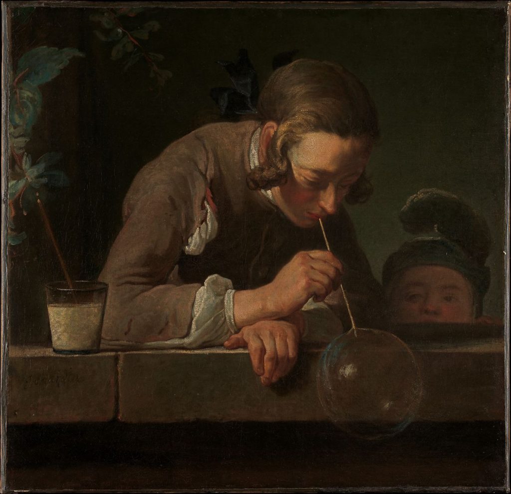
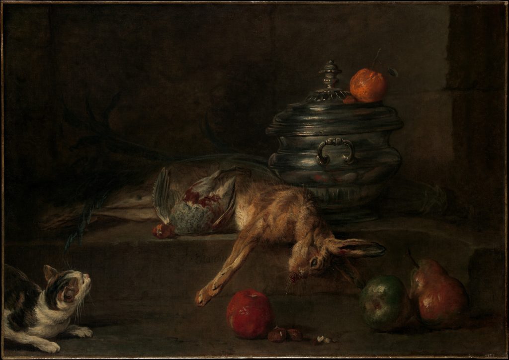
Chardin’s still lifes and portraits are described as “luminous” and “visceral” due to his use of light and his subjects of dead animals. He painted many fish, rabbits, and chicken that had been slaughtered and were either handing or slumped on a table. The suspension of the animals and the detail he put into their wounds gives the viewer a very striking reaction. These still lifes also give a sense of anticipation, I wonder if the fish hanging is swinging back and forth or if the animals will be eaten soon after or if they are going to fall off the table they are leaning off of. The same happens with his portraits, the subjects in his portraits are blowing bubbles, washing clothes, and throwing objects. The anticipation is when the bubble will burst, or when the ball will begin to fall from its point in the air.

The Silver Tureen, 1728-30.
The Game of Knucklebones, 1734.
Still Life with Ray and Basket of Onions, 1731.
Still Life with Fish, Vegetables, Gougères, Pots, and Cruets on a Table, 1769.
Sources:

The Rise and Fall of Chromolithography (1750 – 1850)

Lithographic stone used to print ten colour “Social Smoke” label
WHAT IS CHROMOLITHOGRAPHY?

Chromolithography is the process of colour printing using limestone and various chemicals. It evolved from lithography, where the prints were only black ink on paper and all colour had to be added afterwards by hand. Chromolithography printing was considered “the democracy of art” as it was able to provide beautiful colour printing for the middle-class at an affordable price.

Portrait of James Herbert Gustavus Meredyth Somerville, 2nd Baron Athlumney
WHY WAS CHROMOLITHOGRAPHY POPULAR?

Chromolithography layered colours to create depth that looked exactly like oil paintings to the untrained eye. This made the use of chromolithography great for the replication of oil paintings and the printing of artwork. It was also the main printing method to make the posters during World War I. Advertising, books, and newsprint used the chromolithographs to speed up the colouring process, as they no longer had to have people hand-paint each image. The use of limestone also meant that printing blocks didn’t need to be replaced as they did not wear down or lose detail, so companies could save on money in that way.

Keyline drawing for the “Harbor Light” cigar label
THE PROCESS OF CHROMOLITHOLOGY
  1. Keyline drawing is approved and registered for printing
  2. Drawings are applied to limestone slab using grease-based crayons or ink
  3. The drawing is covered with gum arabic and a weak nitric solution to desensitize the surface and preserve the drawing
  4. Drawing is inked with oil-based transfer or ink
  5. The drawing is pressed into paper using a flat-bed press
  6. Repeat with each different colour needed  for the image on the same paper, closely following the registration so colours are not off
  7. Fading or blending of colours would be edited with airbrushing if needed
Proof for the “Harbor Light” cigar label with colour bar on left documenting use of eleven colors
WHY DID CHROMOLITHOLOGY FADE OUT?

After the invention of chromolithography and its use had spread though out the printing industry, more business-oriented companies began mass producing colour prints of extremely poor quality. This brought down the price of chromolithographs overall, as so many of them were being printed. This meant that artists who used the chromolithographs to create their detailed prints with deep colours were unable to sell their prints or to keep up with the market. Chromolithography, while resulting in beautiful prints, could not keep up with the demand and was slowly replaced by new printing methods and is only used by artisans.

Sources:

Survey 2: Science and Discovery (0-1450) Rationale

The spread that I made for survey 2 is about the four temperaments, which is the first attempt at giving reasons to why a person becomes sick. I copied an illustration from a book about the four tempers. I used the round formatting found in some books written about the four humors as well. I expanded on the two figures towards the edges to make sure that the bleed would not ruin the illustrations at the edges. I also kept the writing away from the center to prevent it getting lost in the centerfold.

Some things that I could improve on would be the size and colour of the title and the headings. It is not clear that the inner parts of the circle fall under the categories of the four tempers. The title is also very small, and I could have made it more distinct so that it wouldn’t get lost within the other elements of the spread.

Overall, I think I made a very interesting spread and I am happy with the result. I would give myself an 7/10 for the strong composition and overall look of the piece, but I could have put more information about what the temperaments were and give more context to the reader.

In the Closet of Queen Elizabeth I: Seventeenth Century Fashion (1450 – 1750)

The fashion of seventeenth century Europe was opulent and extravagant. Trading in Europe and across Asia introduced new fabrics, dyes, and textiles to Europe, which caused a large variety of fashions to be produced. These new fashions were worn flamboyantly by the women of Europe– especially by Queen Elizabeth I.

The ‘Phoenix’ Portrait, Queen Elizabeth I, 1575
WHY WAS FASHION SO IMPORTANT?

Clothing played a large part of a person’s status and people were expected to wear certain types of clothing dependent on their social status. The gowns worn by royalty were elaborately decorated while the lower class would be unable to afford these luxuries, and would wear plain gowns. Dressing up this way showed off a person’s wealth and status and even gave them more opportunities. Many women dressed up to go to special events, such as parties or going to court. Job opportunities would also be improved if an individual was well dressed. They also dressed up to gain attention from suitors and try to find a husband. The same went for men, they wore corsets and padding to get small waists with potbellies. Fashion was so important, that even laws were put in place for what people were allowed to wear. For example, only certain nobility were allowed to wear gold cloth.

The ‘Armada’ Portrait, Queen Elizabeth I, 1588
FASHION AND QUEEN ELIZABETH’S INFLUENCE

The Queen, of course, wore the most elaborate clothing pieces with large collars, detailed embroidery, and many colourful gemstones. Lace was used throughout the neckline and added refinement and beauty. Black and white were often used in making her gowns because the colours symbolized virginity. Farthingales were large skirts with hoops made of osieres, bents, or whale bones and were worn underneath the gown to give it shape and make the hips wider and the waist smaller. Accessories like rings, necklaces, pomanders, and earrings were worn to perfect the Elizabethan look. Queen Elizabeth would be a huge influence of fashion in England and the surrounding areas, because everyone wanted to emulate the Queen. This even extended past her clothing choices and into her physical features.

portrait of Queen Elizabeth I in a ruby and gold ring
drawings of farthingales
EMULATING QUEEN ELIZABETH

The beauty standards of the seventeenth century included fair skin, bright eyes, and light hair. Queen Elizabeth fit well into these ideals, and many women wore makeup and wigs to emulate her appearance. Red wigs, white face paint, and red rouge and lips were extremely popular for women. They even plucked their eyebrows and hairlines to make their eyebrows arched and their foreheads longer. When her teeth had fallen out, she filled her mouth with rags to prevent them from looking hollow and sullen.

CLOSING THE CLOSET

The beautiful and opulent fashions of the seventeenth century and Queen Elizabeth I are an important part of fashion history. The interest in fashion of Queen Elizabeth helped the fashion culture to flourish, and was a vital part of their culture thanks to her influence. Many aspects of their fashion mimic our current culture when it comes to fashion. Dressing up for certain events like job interviews is still regularly practiced. While some fashion trends like– rags in mouths– are not as aligned with our current fashions, we can still appreciate the strange trends of the 1600s. Just as we appreciate the old trends as strange, I am certain that the fashions we find irreplaceable now will be seen as odd in the future.

Sources

Survey 3: Baroque – Anthony van Dyck (1599 – 1641)

Lord John Stuart and Lord Bernard Stuart, about 1638

Anthony van Dyck was a Flemish painter born in 1599. He studied under Peter Paul Rubens, and was considered his greatest pupil. He was best known for his portraits of nobility. He worked for Charles I on and off for a number of years and was titled “principalle Paynter in ordinary of their Majesties”. Van Dyck was considered precocious, and he was eager to visit different places and work with different patrons. He even left the palace of Charles I where he earned £100 a year (equivalent to about $28,139.34 USD) in order to go work in Genoa, Antwerp, and Italy. Charles I increased the salary to £200 a year in 1632, yet Van Dyck still left again just a year later. Some might consider him flighty or restless because he never stayed in one place for long. However, Van Dyck painted over five hundred portraits through out his career- dying at only 42 years old. This is a testament to his precocious character because he was clearly focused on his work if he was able to finish so many pieces in his short lifetime.

Van Dyck’s portraits are rendered with great detail, and they show nobility in dignified and elegant fashions. I was drawn to his piece Lord John and Lord Bernard Stuart because of his portrayal of the two lords. Lord John Stuart (right) looks into the distance rather than at the viewer, giving him an air of importance and sophistication. Lord Bernard Stuart (left) is posed in a pompous way, and his satin clothing is beautifully rendered to give the lord an elegant appearance. The simple background allows the focus to stay on the two Lords and makes them feel important.

The Balbi Children, about 1625-7
Equestrian Portrait of Charles I, about 1637-8
Prince Charles Louis, Count Palatine, about 1637
The Emperor Theodosius is forbidden by Saint Ambrose to enter Milan Cathedral, about 1619-20
Sources: