Lee Krasner was an American Abstract Expressionist known for her unique contribution to the advent of Abstract Expressionism. She was a key transitional figure within abstraction and did this by connecting early twentieth-century art with new ideas of postwar America. As a significant postwar American painter, she had great artistic versatility and advanced skill with intensive training in art theory. She helped devise the “all-over” technique which influenced her husband’s, Jackson Pollock, “drip paintings”. Another technique/strategy she used was to take “breaks” in order to revise her aesthetic, allowing her to improvise her art style. For example, her paintings/collages show her exploration of colours and graceful rhythmic forms.
Krasner developed her own style of geometric abstraction that was grounded in floral motifs and rhythmic gestures. She was unique in terms of her commitment to using hard-edged figurative elements and a certain amount of cerebral control. This is contrastive to the less-controlled automatism that was practiced by her contemporaries.
Cy Twombly was an American painter whose character painting style comprised of expressive drips and active, scribbled, and scratched lines on solid fields of mostly neutral colours (grey, tan, or off-white). A sophisticated and emotional painter, his art situates itself in the context of the history of Western civilization and the process-orientated aspects of Abstract Expressionism. He balanced the static history of the past with his own sensual and emotional responses to it, focussing on his immediate surroundings and combining aspects of both traditional European sources and new American painting. Examples of these inspirations included French neoclassicism, contemporary graffiti on ancient local walls, and Greek and Roman mythology, history, and places.
A major conceptual foundation of his abstract art was writing and language; he was focussed on the written word and the process of writing. These qualities took on forms of identifiable doodles and splotches or words directly on the canvas or line-based compositions that were usually inspired by handwriting. These creations suggested subtle narratives that lied beneath the surfaces of his paintings and coincided with his interest in layering time and history, painting and drawing, and various meanings and associations.
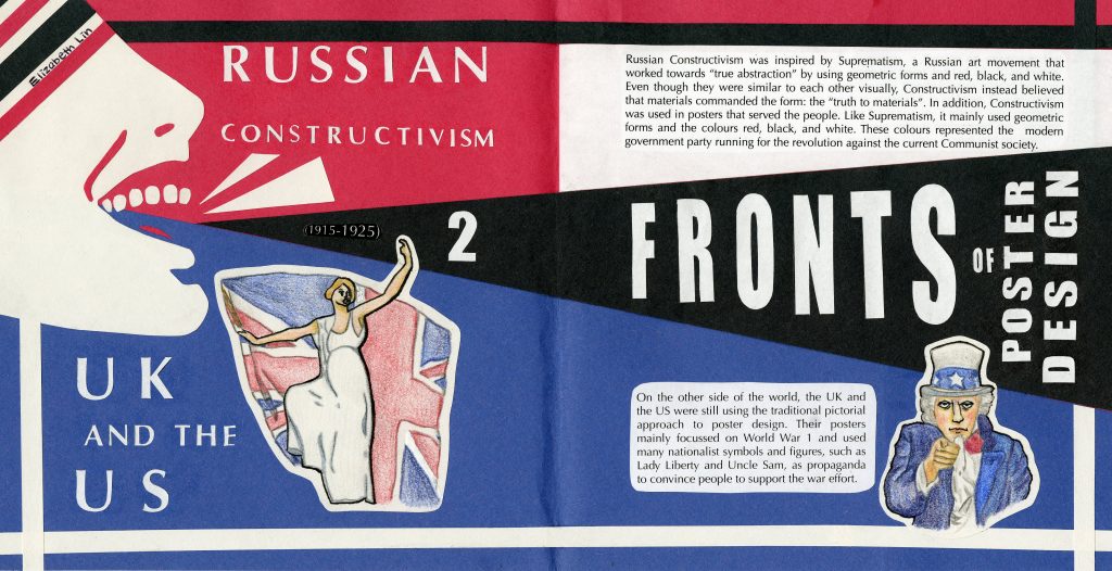
For this history book spread, I was assigned to create a comparative spread for the time period 1915-1925 on the subject of “design/type”. Thus, I decided to create a spread comparing the traditional pictorial approach that the UK and the UK continued to use versus the Constructivist style that the Russians used in their posters.
While both styles were drastically different, they did have one thing in common. Both design styles were used as a call for action: the Russians and their revolution against Communism, and the UK/US and their demand for support in World War 1. By using the shouting figure on the left side of the spread, I have emulated this call for action and created movement in relation to the intense events that happened during this time period.
One of the major decisions I made was the use of papercraft to create the spread. Since Russian Constructivist posters used bold colours and shapes, I decided to use construction paper for the entire spread to keep in sync with the style. However, since the UK/US’ pictorial approach mainly used drawing mediums such as watercolour, I decided to draw the images for the UK/US side with pencil crayon to keep with that style while adding a border around each image so that it could fit with the construction paper approach.
The use of the shouting figure in Constructivism was one of the most popular motifs and so I used this image to represent Constructivism. I used Lady Liberty and Uncle Sam to represent the UK/US as they are also popular and important figures in their poster designs. In terms of colour, I only used red, black, and white for Constructivism just as the Constructivists did. For the Western powers, I used the colours of red, blue, and white- both the colours of the US and the UK. In addition, I wanted to contrast the difference between the two sides so by using the red vs blue concept I have created more emphasis on the idea of opposing sides. This is also present in the black and white borders around the differing sides.
Overall, I think I did a good job with this spread. I had a lot of fun with making this spread (such as cutting out every letter and shape) and by only using papercraft, I have kept consistent throughout the spread. I am especially pleased with the use of the figure and connecting it to the borders. I would have liked to add more motifs around the text but at the same time, I also think that that would have made the spread too busy when the poster design back then only used a few important figures/motifs. I give myself a 9/10 for this spread.
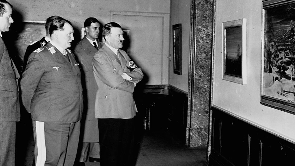
In this week’s lecture, we learned about the Great Depression, the Second World War, and European designers in America. During the Great Depression in America, many jobs were created by the US Works Progress Administration in an attempt to stimulate the economy. These included the Farm Security Administration (an organization that tried to improve the lifestyle of American farmers during the depression) and commissioning artists to create posters for public services/events. In 1933, the Nazi party was elected in Germany and they used extensive propaganda to spread their racist goals and ideals. Artists, such as Helmut Franz Josef Herzfield aka John Heartfield, were named Degenerate artists as Hitler believed that modern art was bad.
Several European designers including Herbert Bayer and Jan Tschichold fled to America when World War 2 broke out. Edward McKnight Kauffer, as well as many other artists, were involved in creating posters for World War 2. Walter Paepcke, the son of a German immigrant, founded the Container Corporation of America (CCA) and hired many European designers to design his posters. Such as A.M. Cassandre, Jean Carlu, and Herbert Bayer. Fortunato Depero was another designer who moved to the US.
Ad Reinhardt was an American abstract artist who was a major influence on conceptual art, minimal art, and monochrome painting. He was a member of the American Abstract Artists and The Club, a meeting place for the New York School’s abstract expressionist artists during the 1940s to the 1950s. Although Reinhardt was associated with Abstract Expressionists, his works had origins in geometric abstraction. In his exploration of geometric abstraction, he sought to purify his paintings of everything he saw as extraneous to art. He believed that the ultimate in abstract paintings were concerned with art alone and bore no reference to anything outside the paintings themselves. Thus, he sought to remove all references from the external world from his pictures- even the hints of soul and angst typically found in Abstract Expressionists pictures. He maintained an interest in various types of mysticism, as shown in his barely delineated forms in his Black Paintings that viewers struggled to understand.
In this week’s lecture, we learned about Art Deco, the Bauhaus school, and the leap forward into modern typography. The Dasstaatliche Bauhaus opened in 1919 in Weimar, Germany. Their goal was to create useful objects and designs. Walter Gropius was named the Bauhaus’ first director in 1919 and he had a new way of teaching design where students would be able to learn, but also able to make prototypes and sell them. He hired numerous famous and respectable artists to teach at his school. These include Johannes Itten, Josef Albers, Gerhard Marcks, Paul Klee, Wassily Kandinsky, Lázló Moholy-Nagy, Oskar Schlemmer, Marcel Breuer, and Herbert Bayer. However, due to the eccentricity of the school, the government and public believed that the Bauhaus provided no value and wanted to cut their funding. In response to this negativity, Gropius moved the Bauhaus to Dessau instead, allowing the school to gain more freedom.
Jan Tschichold never went to Bauhaus but he was inspired by their exhibition. He was very interested in typography and wrote an essay that set out rules about using type and layout effectively. He invented in Sabon type in the 1960’s and Paul Renner created his Steile Futura type in 1927. Kurt Schwitters was the leader of the Ring of New Advertising Designers, Piet Zwart thought himself as a typotekt (typographer and architect), and Paul Schuitema was another modern typographer.
Other notable events that occurred were the art movement Art Deco, the creation of the Chrysler and Empire State building, and Charles “Lindy” Lindberg’s crossing the Atlantic by plane.
In this week’s lecture, we learned about the first World War, Dadaism, and the Russian Revolutions and constructivism. World War 1 was the main subject in advertising and poster design. Much propaganda focussed on recruiting able-bodied men to the war, women to join the workforce and factories to make supplies for war, and people to invest their money in war bonds so that governments could fund for the war. In the US and UK, their poster designs were mostly the traditional pictorial approach while in other areas, such as Germany, their posters were still following neo-classical designs with heavy gothic type.
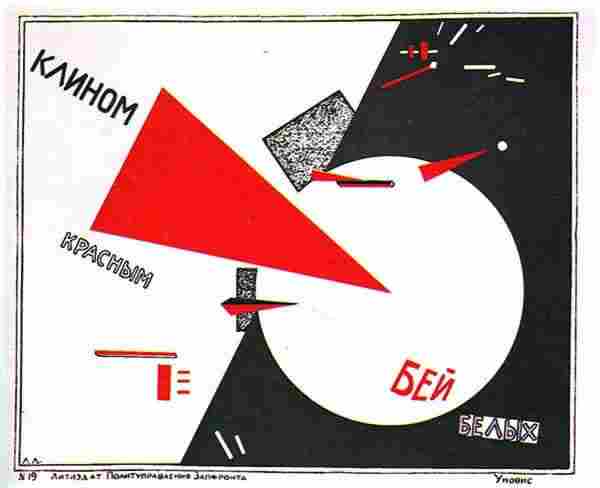
Art movements were also prominent at this time. Dadaism artists mocked a society that had gone insane and their art was a reaction to the senseless suffering and loss of life they saw during the war. Surrealism emerged from Paris and its artists searched for the “more real than real-world beyond the real”. The Dutch De Stijl movement was a complete opposition to Dadaism and was an abstract geometric style seeking balance and harmony during the war. In Russia, the Suprematist movement focussed on the idea that geometry was the highest form of beauty. Constructivism derived from the Suprematist movement and featured basic, abstract geometric forms and the use of red, black, and white.
Life in the 1920’s was a difficult time. Many families were hurt by the emotional and physical trauma soldiers suffered when they came home. From 1920-1933, Canada and the US’ alcohol Prohibition was in effect. In 1920, Canada began forcing indigenous children to attend residential schools. However, not all was negative. This was also the time of the “Golden Age of Radio”, the age of jazz, and many famous figures such as Coco Chanel and Josephine Baker.
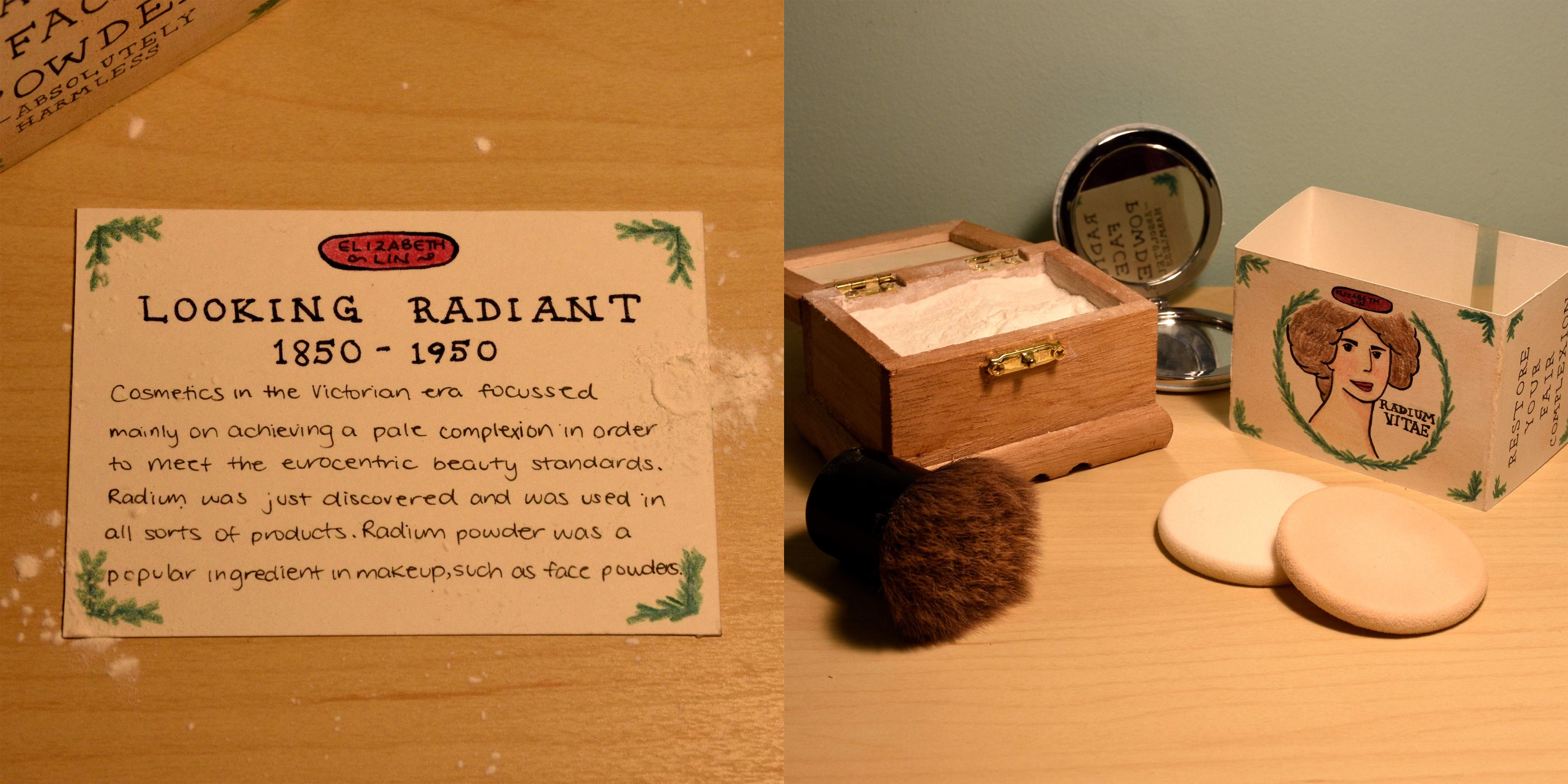
For this history book spread, I was assigned to create an artifact for the time period 1850-1950 with “fashion” as the focus. Thus, I decided to create packaging for Victorian makeup products as my artifact.
Piet Mondrian was a Dutch painter who was recognized for the purity in his abstractions and the methodical practices he used to get to them. As an advocator of pure abstraction, he was also one of the founders of the Dutch modern movement, De Stijl. He believed that art reflected the underlying spirituality of nature and simplified elements of his paintings in order to show this, creating a clear universal aesthetic language on his canvases. To do this, he reduced shapes to lines and right angles, and his palette to the primary colours as well as black, white, and grey.
Mondrian also distilled representations of the world to basic vertical and horizontal elements, representing two essential forces (ex. positive vs negative, dynamic vs static, masculine vs feminine… etc.). This dynamic balance of his compositions reflected what he saw as the universal balance of these forces. His uses of asymmetrical balance and simplified pictorial elements were crucial in the development of modern art.
In this week’s lecture, we learned about the impact of modern art, plakatstil, and the origins of corporate identity. Modern art was developing. Artists such as Paul Cezanne, Pablo Picasso, Georges Braque, and Marcel Duchamp were all part of the art movement known as cubism. The Armory Show in New York City was an international exhibition of modern art that changed the way Americans thought about modern art. Hundreds of artists participated in this exhibition and The Armory was called the most important exhibition ever held in the US.
In 1905, Lucian Bernhard designed a poster for Priester Matches, creating the plakatstil style (poster style). This style consisted of only two basic elements, the product name and the product image, and conveyed a message that was both impactful and effective.
The AEG turbine factory designed by Peter Behrens was the first to have a logo and a corporate identity, making Behrens the first logo/corporate identity designer. This designer was also the first to design a typeface for a specific company where the company only used this typeface- the Behrens Schrift typeface designed for AEG.
Many other inventions were also created during this time. The first Model T was produced by Ford Motor Company and invented the factory line, cutting costs of production. In 1909, an early Autochrome colour photograph was invented by the Lumiere Brothers, Gertie the Dinosaur by Winsor McCay introduced keyframe animation, and in 1914, the American Institue of Graphic Arts (AIGA) was founded.