Block Books and Baroque (1450-1750)
Summary:
In this week’s class, we learned about the Renaissance, Baroque, Rococo, and the golden age of type, as well as the arrival of newspapers, novels, and dictionaries. During the Renaissance, humanism, art, and science was flourishing as they started to break away from biblical subjects and the Church. It was also in the fifteenth century that it was the golden age of type. After Fust’s 42 line Bible in 1455, printing progressed very quickly. Germany became the centre of printing, but due to political unrest, many German printers moved to other European nations to develop and continue printing. Those who moved to Rome had a lot of business as the Pope was in Rome, rich, and interested in printing Bibles to encourage the spread of the Church. Many “Roman-style” typefaces (typefaces that came out post-Gothic period) -also called Antique, Venetian or Old Style- were created during this period.
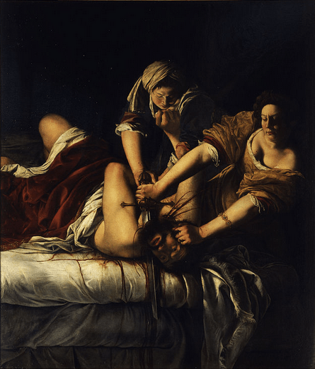
During the Baroque period (the 1600s), where art had a serious heavy style that was inspired by what was happening in the Church, it was a relatively quiet time for graphic design innovation. In the 1700s, the first transitional typeface was created, the Romain du Roi, by King Louis XIV. Transitional typefaces represented the departure of Old Style typefaces and had a contrast between thick and thin strokes.
The Rococo period emerged from Louis XIV and had soft pastel colours, with a lot of whites, and fancy motifs. During this time, transitional typefaces continued to be created. Along with the development of transitional typefaces, the Caslon type specimen was invented by William Caslon. It had all the different sizes, letters, etc. of a type that would be gathered together with other typefaces to present as examples. Continue reading “Survey 3: That’s Some Serious Art”

