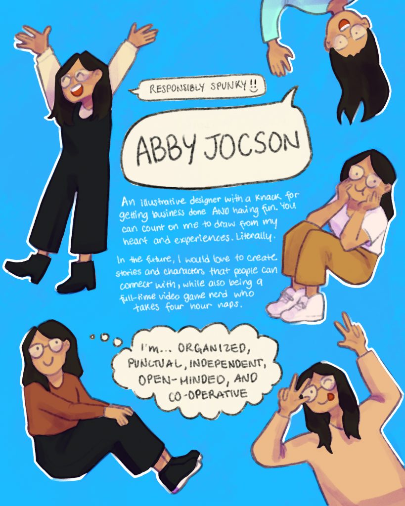
For my personal ad, I wanted to go for a style that was fun, while remaining organized and contained. I decided to do simple illustrations of myself scattered across the page to showcase my illustration skills, while still keeping in mind design principles by creating hierarchy in the middle of the page.
For my mood boards, I did not realize how much I value freedom, exploration, and comfort. It was interesting to see that there were many re-occurring themes in my mood board, and several images evoked similar emotions. Overall, creating the mood boards was a nice change of pace and helped me see a clearer version of the kind of illustrator and designer I want to work toward.
