Mentored Project: Phase 5

Finally, we have made it to the final phase! Hard to believe that months of working on this project are finally over. I could not possibly have imagined what would happen for the rest of the semester when we were just assigned this project, but now here we are, quarantined in our homes, and doing classes over zoom. As weird as the experience has been, I think the project has been fruitful in so many ways.

For starters, I’m incredibly grateful that I was able to have past IDEA grad, Susan Li, as my mentor. She gave superbly detailed and insightful feedback, and I wouldn’t have learned and improved as much were it not for her guidance! I’m also very thankful that she was flexible with her meetings and we were able to communicate despite the current situation.

Having a mentor has been really great, I now wish we had more projects where we can interact with people working in the industry and get their feedback! I think it was a lot nicer in my case as well to see an IDEA grad doing well in their field, and then using their free time outside of work to help students currently in the program. I would definitely love to mentor someone in the future because it seems to be a pretty rewarding experience for both parties involved.

Susan’s detailed feedback on my thumbnails

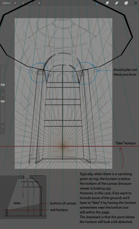
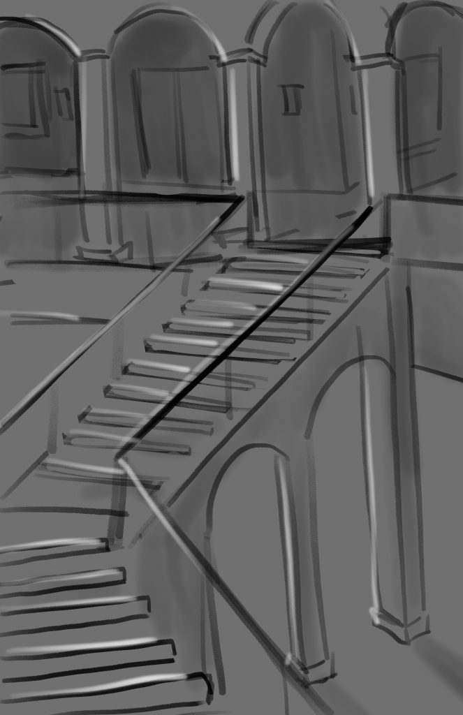
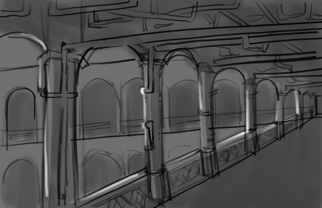
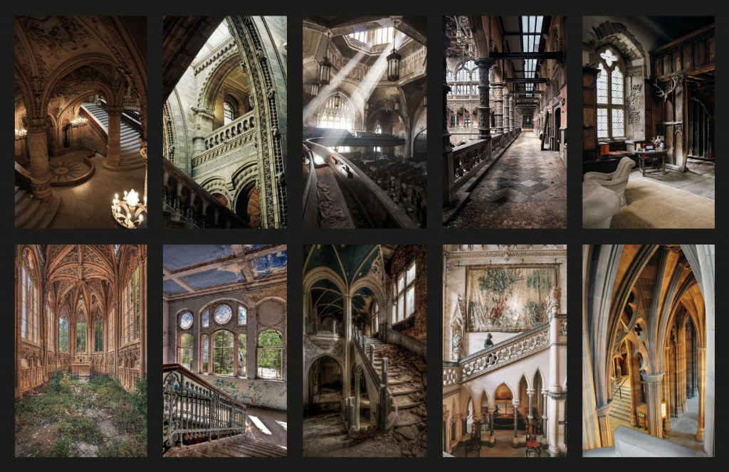
Despite the countless hiccups I encountered during this project, I am pretty proud of myself. I finally know how to set up perspective grids within Photoshop and I have also learned a bunch of cool new tricks to speed up my workflow. It is pretty rewarding to finally understand how perspective works in illustrations, I feel like I have this new superpower! I’m pretty excited to apply perspective drawing in more of my work and possibly revamp older pieces where I can easily include backgrounds.

Grids galore!

As for the results of the project, I honestly wish I worked a bit harder! I mean I did, but I also know for a fact that I could have made better use of my time so that my final illustrations would look portfolio worthy. Although I’m kind of dissatisfied with my performance, I’m still proud of myself for sticking with it despite the frustrations and missteps I had along the way. Now I’m not as intimidated with drawing backgrounds, and I definitely feel that I have improved as an illustrator. For that, I’m giving myself a 7.5/10 for my overall performance with this project.

Although COVID-19 put a bit of a damper on this project and classes as a whole, I felt like I got a bit of a taste of what it would be like to work remotely or freelance. I do not think it is bad at all, but I would for sure need to establish better habits if I want to be more productive!

Final illustration of the Assemblance Meeting Room

Mentored Project: Phase 4

Creating the presentation wasn’t too hard as I already had existing content prior to this class that I could re-use. Although I wanted to make sure that my presentation was clear and concise, so I addressed what it was for, included context about the story and its world, and most importantly showed my progress from thumbnail to the finished illustration.

Unfortunately due to the current pandemic, I decided to lighten my final deliverables for the project and settled that one piece would be a completely coloured environment, the second would be brought to the greyscale stage, and the last would stay as a sketch. While this isn’t ideally what I wanted to hand-in at the end, I still learned a lot from the process.

Shifting my focus to only three pieces instead of five ended up being quite beneficial. I was able to take more time with each piece and assess what needed to be done to compose them well. While I don’t feel completely satisfied with the final illustrations, I am confident that I could refine them more in the summer, and work on the ones I had to ignore for this project.

That being said, I’m giving myself a 6.5/10 for this phase. While I’m proud that I was able to make a cohesive presentation and three finished pieces, I still feel that I definitely could have pushed my illustrations more. I did not spend my time as efficiently as I could have, and it’s a bit disappointing that even in my third year I am still struggling with time management. Although I suppose that’s what school is all about, failing as much as you can now so you can improve and be ready to work once you graduate!

Here are a few slides from my presentation:

Mentored Project: Phase 3

After deciding on which thumbnails to go forward with from the previous phase, I proceeded with refining them. This meant figuring out what kind of perspective each background was using, setting up that grid, and making sure the angles matched up. Needless to say, it took a lot of fumbling and looking up video tutorials, and of course, asking Susan for much-needed help on the matter.

I honestly struggled a lot during this phase. I knew what I was getting myself into with deciding to do environments for this project, but I didn’t expect how rusty I would be at perspective drawing! When any of my drawings included backgrounds, which they rarely do, I would normally wing the perspective and just draw until it looked right. But once I started to refine my thumbnail sketches I realized that just winging the perspective wouldn’t get my pieces to where I wanted them to be.

I had the most trouble with this particular environment because of what I wanted to show. As Susan mentioned in her feedback, I would have to create a “fake” horizon line to show the angle I wanted. Before this, I had no idea what fake horizon lines were or that they even existed. Although this piece was the most difficult to get looking right, once it finally did it was extremely satisfying.

Sketch of environment two

The next two environments were much easier to draw since they both followed a simple two-point perspective. There wasn’t much trouble getting these sorted out.

Sketch of environment three

Susan’s only feedback for the three pieces overall was that they lacked set dressing. Set dressing is just as important as perspective, it adds character and personality to the environment, and can also set the mood and tone. By adding props to the environments, they become more believable and it is easier to imagine the characters living in those spaces.

For this phase, I would give myself a 9/10. While I don’t think my sketches look the best, I definitely felt that I put a lot of work into researching perspective grids and how to use them. There were lots of times I felt discouraged because things weren’t looking the way I imagined them in my head, but I pushed through until I was confident about my sketches.

As a side note, I found this incredible channel that helped me get a better grasp on what perspective grids are and how to apply them to illustrations. They also cover a plethora of other topics such as character design, how to get clean line art, and even creating a budget PC specifically for doing digital art.

https://www.youtube.com/watch?v=upxBGNcryRs

Mentored Project: Phase 2

My first task with Susan was to create mood boards and thumbnails of the five backgrounds. In total, I ended up with around three mood boards, one focused on interiors, another on exteriors, and an extra one with additional building references.

One out of three mood boards, this one focusing on interiors

Taking inspiration from my mood boards I was able to sketch out five thumbnails. For most of the thumbnails, I directly referenced pictures I found interesting. Although there are a few that I ended up being more creative with or mixing elements from several photos.

Thumbnails of the first environment

For each environment thumbnail, I made sure to include context so that Susan could have a better understanding of its role in the story. Creating these descriptions also helped me to have a better idea of how I could compose these backgrounds in actual scenes within the comic.

With each thumbnail, I tried to see different angles that I could explore, but because I’m not accustomed to drawing backgrounds, let alone drawing them in perspective, they turned out relatively simple in terms of compositional layout. That being said, it was still good practice to think about where things would go, how I wanted to set dress the scene, and what kind of shape elements I wanted to include.

Susan’s feedback

Susan’s feedback was incredibly detailed and it gave me a better grasp of how to bring these thumbnails to the next stage. Her additional sketches and references also helped me to better visualize what she was trying to describe. I really appreciated that she drew over my sketches to show me what I could improve on, or how I could approach the background in a different way.

Overall for this phase, I would give myself an 8/10, while I was able to provide thumbnails and descriptions of the environments to my mentor, I definitely feel that I could have done even more sketches exploring things from different angles or even trying to different structures or layouts.

Mentored Project: Phase 1

Mentorship Creative Brief

For my mentorship project, I am fortunate to have IDEA alumni Susan Li as my mentor, she currently works at IUGO games. I decided to expand on a project I started in one of my previous classes, Portfolio Bootcamp with Dominic Prevost. The project revolves around a story titled “Re-Fracture”, I have plans of publishing the story as a webcomic on a platform called Webtoons. The plot revolves around four characters and it’s essentially an amalgamation of story elements I have loved in other series such as elemental magic, legendary weapons, a rivals-to-friends-to-lovers trope, and much more.

Concept designs of Amaeris, one of the protagonists

In Dominic’s class, I began working on character designs for the story’s four protagonists. Since I already did character designs, I wanted to have a clearer vision of the world these characters exist in.

I rarely create backgrounds for most of my pieces and I know that I can’t keep avoiding them forever. This project is the perfect opportunity to tackle that fear and become more accustomed to drawing backgrounds and really elevate my illustrations. Susan also creates background environments at her current job, so I knew she would be able to give me insightful feedback on my work.

Background art Susan created for The Walking Dead: Road to Survival

To stay on track but still have a good chunk of work to do, Susan and I decided that one background would be fully rendered, and four additional backgrounds would be tightly sketched. While I still feel hesitant about actually having to draw backgrounds, I’m up to the challenge and excited to continue fleshing out “Re-Fracture”.

For this phase of the project I would give myself a 9/10. Since I already had previous assets to expand on, it was easy to come up with a project plan and present my idea to Susan.

Final Logo

As mentioned in my previous post with all three logo concepts, I was leaning toward the idea of a video game controller the most. In the end, I decided to go in this direction as it’s the one I felt the most confident in, I also liked how the concept was directed toward a specific audience. I find that it strikes a good balance between illustration and design, while also showing a bit of my personality and interests.

Overall I’m pleased with the logo that I came up with this. Whether or not I stay with this logo in fourth year, I am really glad I went through this process and came out of it knowing myself better.

Three Logo Concepts

Concept One

This concept draws on my love for macaroni and cheese. It’s playful and shows off a bit more of my illustration side.

Concept Two

The second concept is geared toward my design side. The logo uses a simple handwritten script, but incorporates a face to be more fun and inviting.

Concept Three

This final concept takes inspiration from my love of video games. Even if people do not understand that this is visually referencing game controllers, my name is still easy to read.

Out of the three, I personally feel most attached to the third concept, as I can continue to play with the concept visually in business cards and on my website. Although I could definitely see myself using the other two as well.

200 Logo Sketches

The first round of logo sketches I started out with using my legal name “Gabriela Jocson”, after ten or so sketches I decided to stick with using “Abby Jocson” as it’s a name I’m more familiar with. I tried to explore different routes, but mostly stuck to using the initials AJ and trying to find ways to represent my brand essence while still having readability.

The second round was more of an extension of the sketches chosen from the previous round (shown in the first picture on the left). While my three concepts all ended up being chosen from the first round, this was still a good exercise to ideate and explore different ideas and to practice more conceptual thinking.

Personal Ad + Moodboards

For my personal ad, I wanted to go for a style that was fun, while remaining organized and contained. I decided to do simple illustrations of myself scattered across the page to showcase my illustration skills, while still keeping in mind design principles by creating hierarchy in the middle of the page.

For my mood boards, I did not realize how much I value freedom, exploration, and comfort. It was interesting to see that there were many re-occurring themes in my mood board, and several images evoked similar emotions. Overall, creating the mood boards was a nice change of pace and helped me see a clearer version of the kind of illustrator and designer I want to work toward.