GDC Cross Platform Project

This cross platform project was done for GDC. GDC is a non-profit Canadian design organization where design students and professionals can interact with one another, use design resources, and obtain certification.

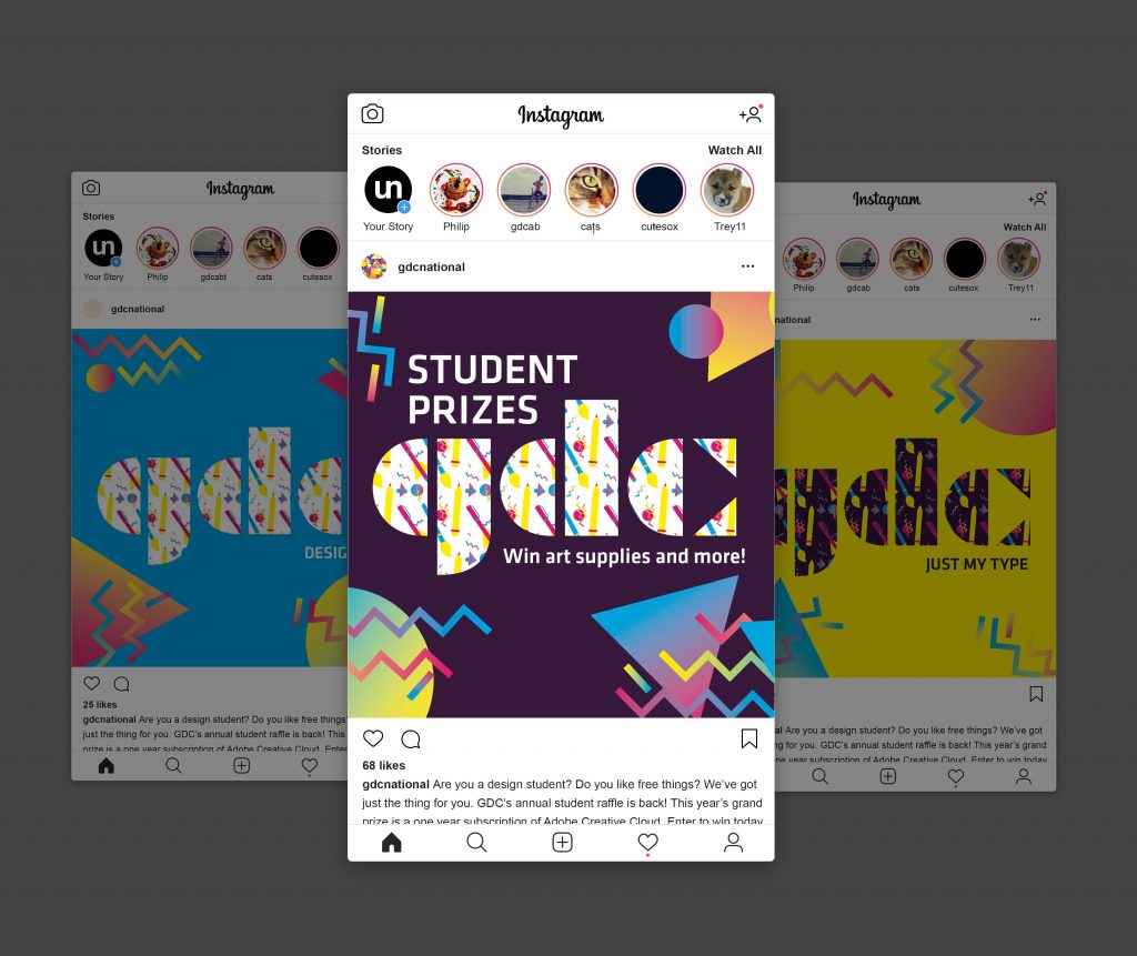
While GDC offers many valuable resources, they sorely lack the advertising to make students and professionals aware that they exist. Our group focused on keeping students aware of GDC’s presence, while also encouraging more interaction between the organization and students. To do so, we decided to create a recurring event that would happen once or twice per semester.

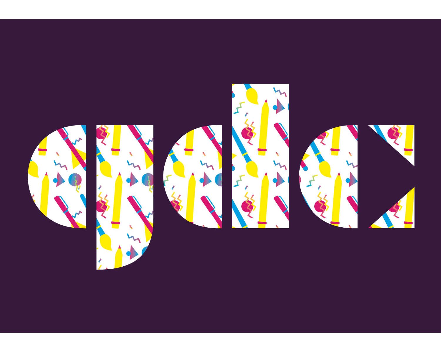
For this project, my group chose to go with an 80s aesthetic as that specific design style is currently trendy with today’s generation. It’s very nostalgic and goes with the theme of going back to GDC’s roots.

As for the event itself, Student Ambassadors would enter university classrooms, where they would give small presentations where they talk about what GDC is and any events or scholarships they currently offer. To help keep students engaged and to make the presentation memorable, Student Ambassadors will host various games. These games are based on existing ones to avoid any confusion, they are also all catered toward design and make them both educational and entertaining.

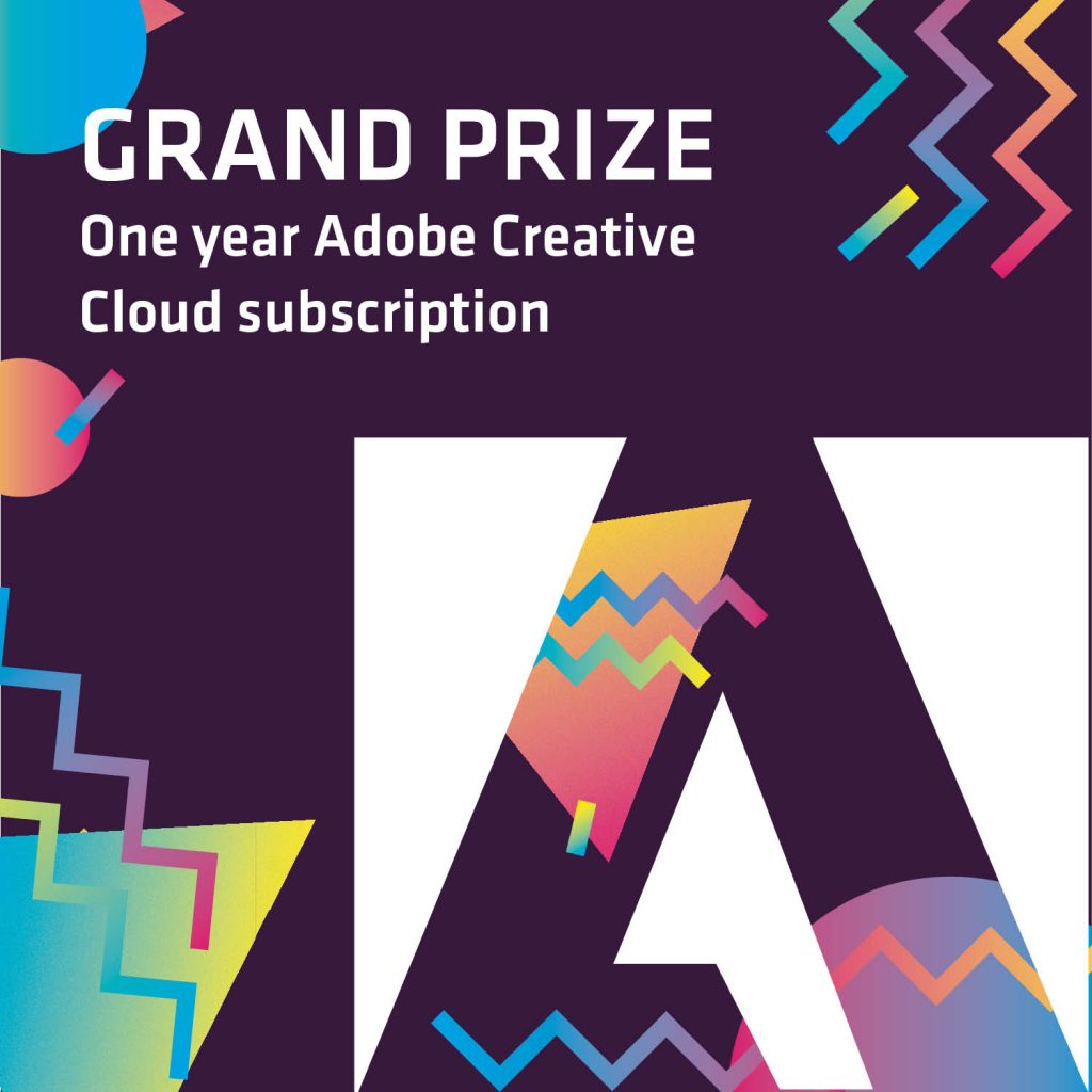
Students can win small prizes such as various art supplies. Afterwards, Student Ambassadors can take the names and emails of students who want to enter for the grand prize, which can be a one year subscription to Adobe Creative Cloud, or anything of the same value.

I would give my group members, Logan and Anna, a 10/10. Communication was very open, and if I ever ran into problems I could easily send my group a message and ask for feedback or clarification. As for myself, I would give myself an 8.5/10. While I feel that I contributed an equal amount of work to the group, I definitely feel like I could have organized my time better. I left a few things last minute, and if I had started on them earlier there may have been more time to go over designs and ideas to fix them up.

Decolonising IDEA: Intertwined

For our Decolonizing IDEA project, Anna and I decided to do a poetry zine. The poetry zine is a collaboration between Indigenous writers and non-Indigenous artists. We specifically chose non-Indigenous artists to create the illustrations for the poems, as this would avoid any instances where artists may try to replicate Indigenous art styles. Anna and I also chose to focus on Indigenous poetry as we noticed that Indigenous writing in general is not as publicly recognized in comparison to their music, art, or dances.

Another reason why we chose to do a poetry zine is because there are other ways to teach people about Indigenous history and culture. Poetry is an amazing way to connect to other people no matter the age or culture.

“Intertwined” was chosen as the title of the zine to signify how art and writing are coming together, as well as the fact that Indigenous writers and non-Indigenous artists are collaborating to create the zine. The cover uses the second “t” as a sort of knot, to further the concept of the zine, which is joining two different mediums and people.

The colours blue and red were chosen as they were the easiest colours to work with. Though they also represent the joining of two different sides of art, as the red and blue blend together to create a calming purple, the poetry and illustrations come together to create a unique experience.

In the future if this project were to become real, instead of using existing works, I would prefer to ask Indigenous students to send in their submissions to this zine. By doing so, this avoids having to ask the original authors for permission to publish the poetry and interpreting it visually. This would also encourage Indigenous youth to use writing as a creative outlet and get their voices out there.

Overall I would give myself an 8/10 for this project. I am proud of the concept Anna and I were able to create. Although there are a few areas that I definitely feel could have been executed better, specifically with regards to the layouts of the zine.

Resume for Kitfox Games

The resume I have designed is catered to Kitfox Games, a games company based in Montreal. Kitfox creates a variety of games and pride themselves on exploring and creating new and different worlds.

I decided to make the theme of my resume based on video games, using fonts similar to older video games, as well as using icons reminiscent of early computers. The headings and sub-headings use video game terminology to further the concept. I chose to use teal as the main colour to keep things simple and consistent, as well as the fact that it is my favourite colour.

Based on the organization of the layout and how I have executed my concept to fit the company’s brand, I would give myself a 9/10.

Sustainability 101

Initial ideas and rough drafts

Final Product

Rationale

The concept of this poster is based on the idea of the different paths designers can take to achieve sustainable design. To push this concept I wanted the visuals to resemble that of a map, hence the layering colours to represent the height of mountains. The four dashed lines are meant to symbolize the four pillars of sustainability. A more rounded type was chosen to make the poster welcoming and modern. The shades of green were used to represent the environmental and global impact of design, as well as the fact that it works with the type to create a calming visual.

Self Evaluation

For this project I am giving myself an 8/10. Visually, I feel that I have done well on this poster. Although I can see how my concept of a map and diverging paths may not be obvious to people right away. For that reason I believe I could have pushed my visuals more to make the idea behind the poster more apparent.