
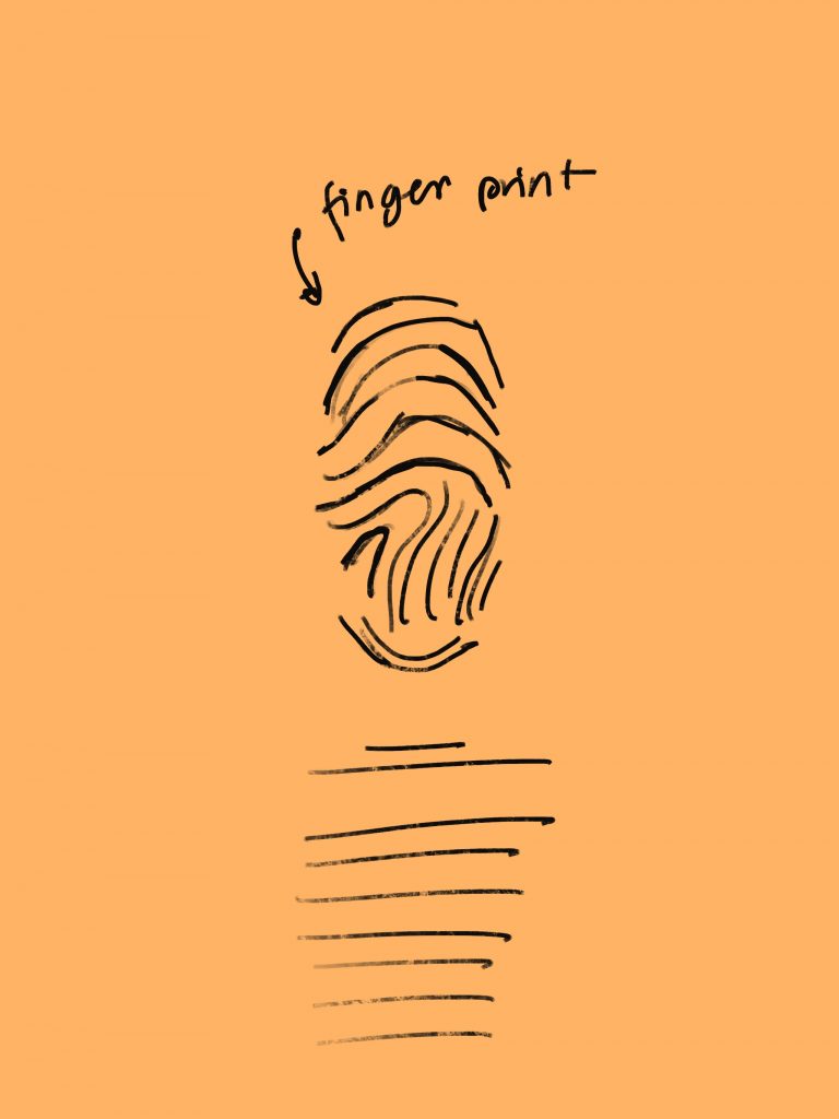
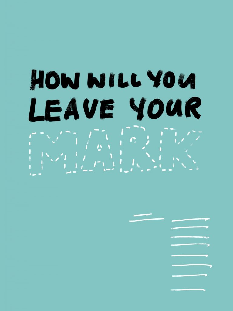
Initial ideas and rough drafts
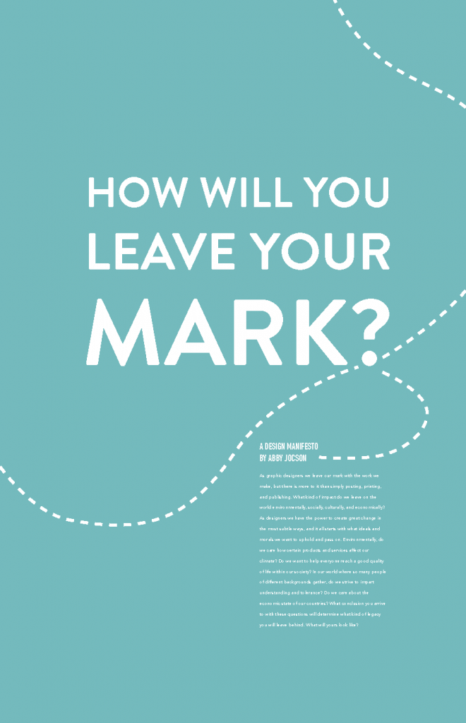
Final Product
Rationale
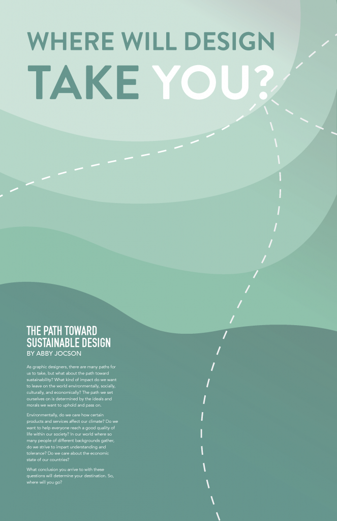
The concept of this poster is based on the idea of the different paths designers can take to achieve sustainable design. To push this concept I wanted the visuals to resemble that of a map, hence the layering colours to represent the height of mountains. The four dashed lines are meant to symbolize the four pillars of sustainability. A more rounded type was chosen to make the poster welcoming and modern. The shades of green were used to represent the environmental and global impact of design, as well as the fact that it works with the type to create a calming visual.
Self Evaluation
For this project I am giving myself an 8/10. Visually, I feel that I have done well on this poster. Although I can see how my concept of a map and diverging paths may not be obvious to people right away. For that reason I believe I could have pushed my visuals more to make the idea behind the poster more apparent.