Concept One
This concept draws on my love for macaroni and cheese. It’s playful and shows off a bit more of my illustration side.

Concept Two
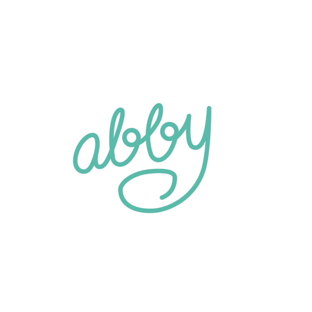
The second concept is geared toward my design side. The logo uses a simple handwritten script, but incorporates a face to be more fun and inviting.

Concept Three
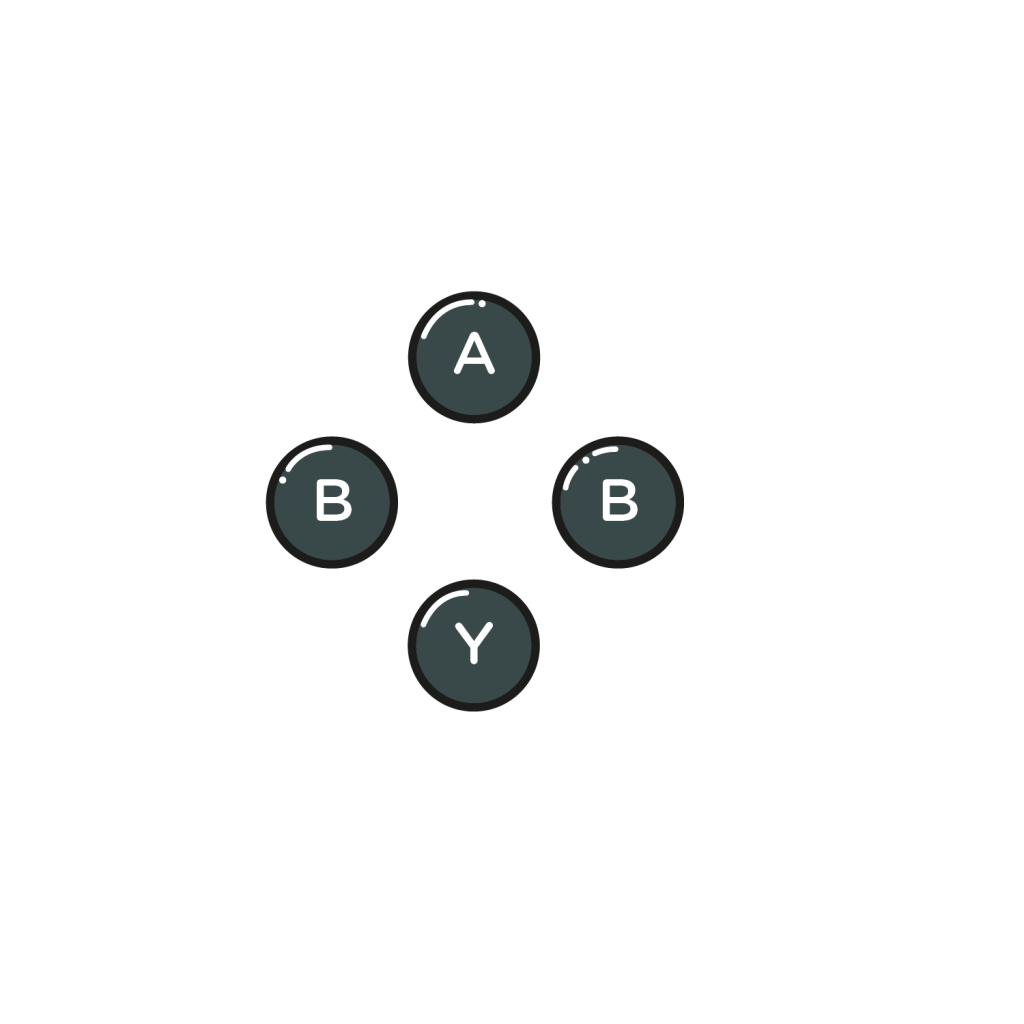
This final concept takes inspiration from my love of video games. Even if people do not understand that this is visually referencing game controllers, my name is still easy to read.
Out of the three, I personally feel most attached to the third concept, as I can continue to play with the concept visually in business cards and on my website. Although I could definitely see myself using the other two as well.
