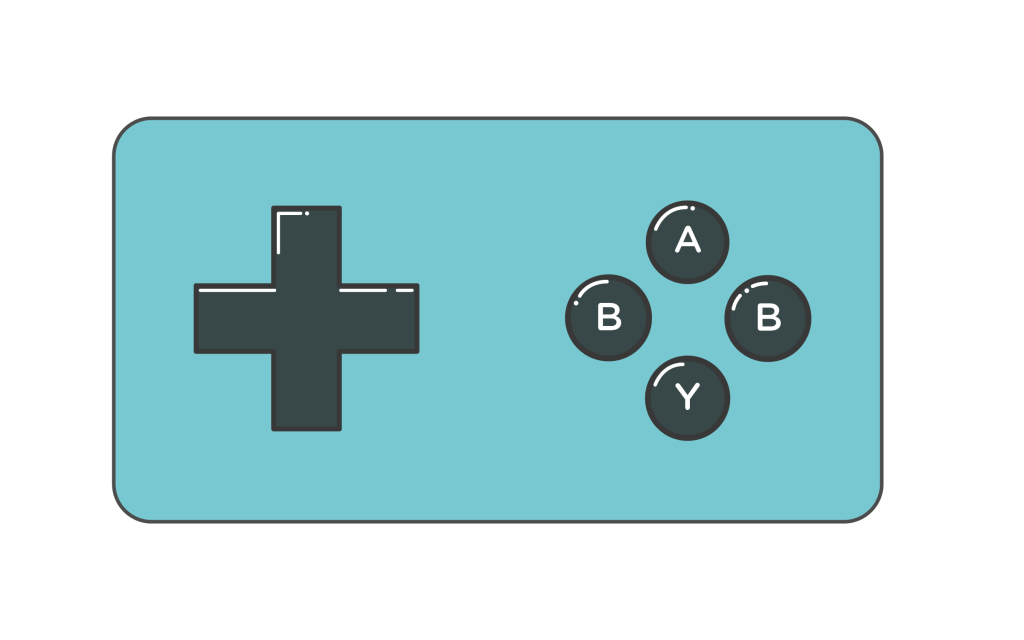

As mentioned in my previous post with all three logo concepts, I was leaning toward the idea of a video game controller the most. In the end, I decided to go in this direction as it’s the one I felt the most confident in, I also liked how the concept was directed toward a specific audience. I find that it strikes a good balance between illustration and design, while also showing a bit of my personality and interests.
Overall I’m pleased with the logo that I came up with this. Whether or not I stay with this logo in fourth year, I am really glad I went through this process and came out of it knowing myself better.
