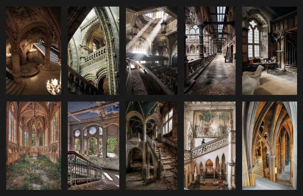
My first task with Susan was to create mood boards and thumbnails of the five backgrounds. In total, I ended up with around three mood boards, one focused on interiors, another on exteriors, and an extra one with additional building references.

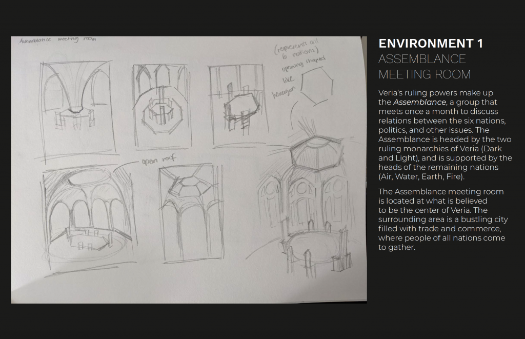
Taking inspiration from my mood boards I was able to sketch out five thumbnails. For most of the thumbnails, I directly referenced pictures I found interesting. Although there are a few that I ended up being more creative with or mixing elements from several photos.

For each environment thumbnail, I made sure to include context so that Susan could have a better understanding of its role in the story. Creating these descriptions also helped me to have a better idea of how I could compose these backgrounds in actual scenes within the comic.
With each thumbnail, I tried to see different angles that I could explore, but because I’m not accustomed to drawing backgrounds, let alone drawing them in perspective, they turned out relatively simple in terms of compositional layout. That being said, it was still good practice to think about where things would go, how I wanted to set dress the scene, and what kind of shape elements I wanted to include.

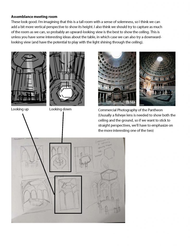
Susan’s feedback was incredibly detailed and it gave me a better grasp of how to bring these thumbnails to the next stage. Her additional sketches and references also helped me to better visualize what she was trying to describe. I really appreciated that she drew over my sketches to show me what I could improve on, or how I could approach the background in a different way.
Overall for this phase, I would give myself an 8/10, while I was able to provide thumbnails and descriptions of the environments to my mentor, I definitely feel that I could have done even more sketches exploring things from different angles or even trying to different structures or layouts.
