For this project, our class was tasked with creating a character with a strong silhouette, by focusing on things such as shape language and posing.
Whenever I created characters, I never really started out by thinking of the overall shape or silhouette, I always jumped right into designing a cool outfit for them to wear. I really wanted to challenge myself this time around by relying on the ink blots we created in class, as well as making a character with a body shape I wasn’t used to drawing.
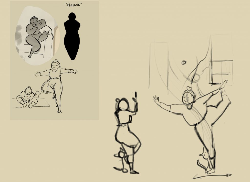
“Malorie” was the character I ended up creating in the process. I imagined her to be a twenty-something yoga enthusiast with a carefree personality. In the initial ink blot I also ended up creating a cat out of the negative space that was formed, and decided to add it to the final silhouette. Because of how I characterized her, I wanted to use a very iconic yoga pose to represent her, as well as to create a very strong shape for the piece.
Composing the Piece
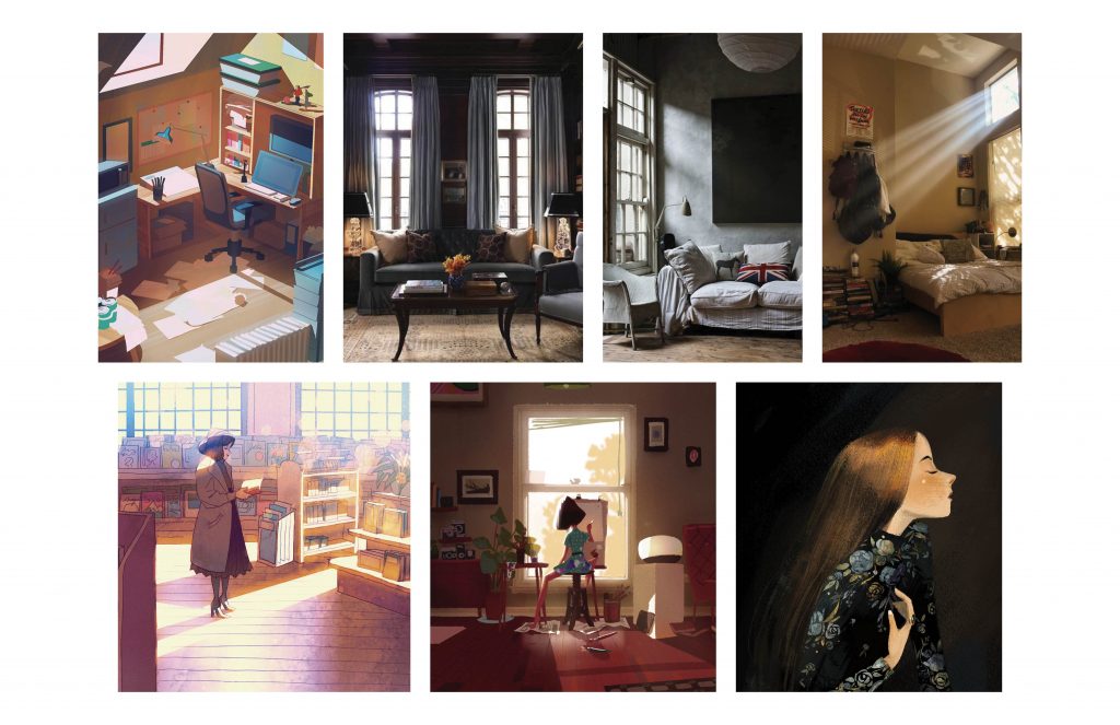
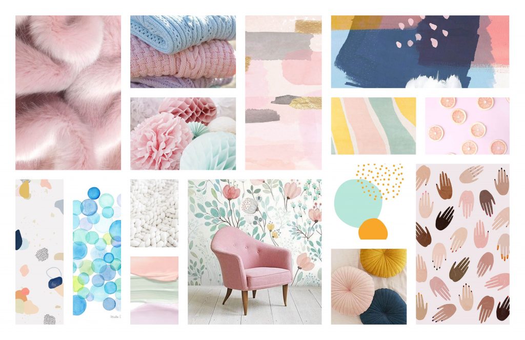
This board focused primarily on the kind of atmosphere and tone I wanted to set for the piece, I wanted to push myself with lighting this time around. In many of my past illustrations, I would struggle with creating a good contrast for the overall piece, so I wanted to make sure that I paid more attention to my values this time around.
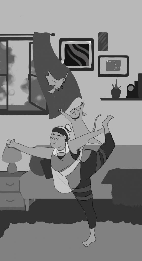
When it came to composing the rest of the drawing, the placement of most of the background items followed the natural line of Malorie’s figure. I wanted to ensure that the viewer’s eyes would lead right to Malore instead of away from her.
As for the colours and lighting, I wanted both to give off the feeling that this was happening in the afternoon, probably just right after 12 or 1PM, as shown in the inspiration board. I also wanted the colours to be calm despite the ruckus going on between the cat and the bird.
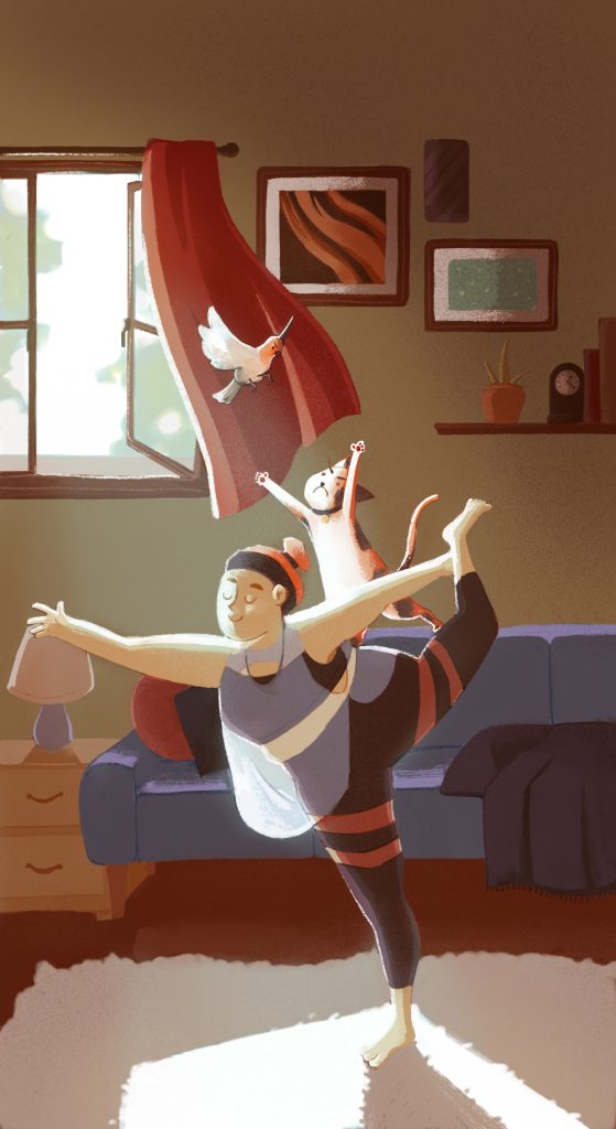
Overall I’m very satisfied with the piece I created. I learned a lot of valuable character design techniques, as well as discovered other methods to colour and get better tonal values in Photoshop. I’m very excited to apply what I’ve learned in this class to future projects involving illustration!


