Illustration in Motion Animation

For my 30 second animation, I wanted to depict how old clothes from thrift shops can be re-purposed to combat fashion waste.

The theme for this project was fashion sustainability. We live in a very fast-paced world where trends are constantly changing, especially in the fashion industry. Every season there seems to be a new piece that everyone needs to get before it’s replaced by another style. As you can imagine, this kind of cycle produces a lot of waste for our environment.

Luckily there are lots of creative ways to be kinder to the earth while still being fashionable. I took inspiration directly from people on Youtube who do “thrift flips”, a term used to describe taking clothes from thrift stores and improving on it or making something new. This allows people to recycle already existing material while also creating something that’s one-of-a-kind!

I initially wanted to depict thrift flipping in my animation quite literally, show someone shopping at a thrift store and sewing to transform what they had found. Because I’m not so skilled at sewing myself, watching videos of people taking something old and making it something different seems almost magical! So I thought, why not set the story in a magical world? That’s how I ended up with a witch who uses some hocus pocus to make the coat she found at a store fit perfectly.

Storyboard

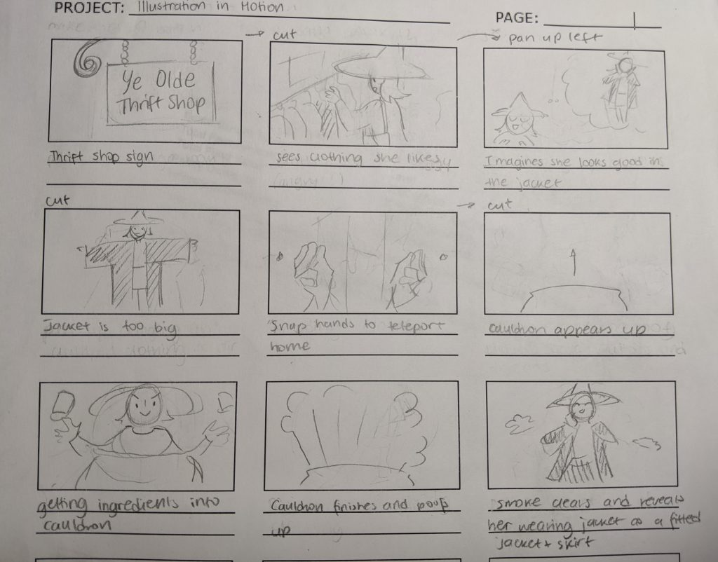
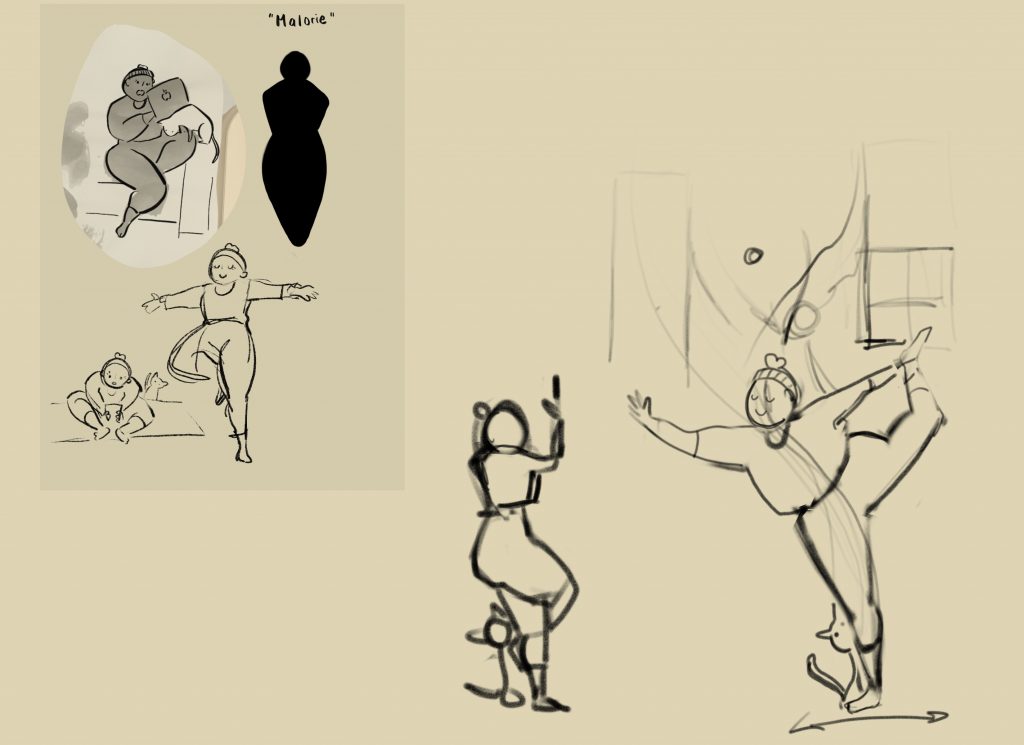
Like any animation project, it’s a good idea to start with a storyboard to get the scenes laid out. I pretty much had a solid idea of how I wanted things to look like, but I did have trouble thinking of how scenes would transition. If I had to do this project again, I would definitely spend more time thinking of transitions at this stage, rather than having to figure it out when I started to work in After Effects.

Style Frame 1
Style Frame 2

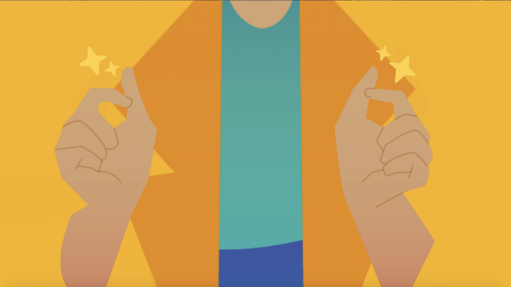
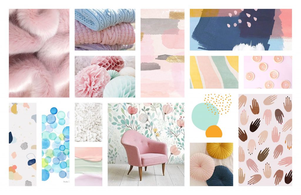
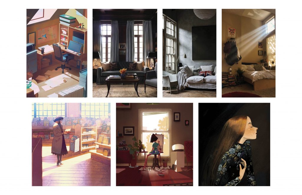
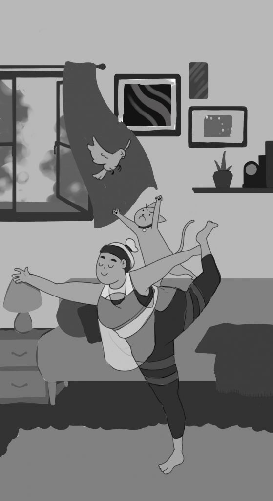
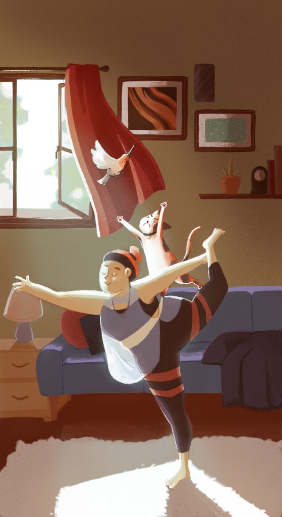
As for the visual style of the animation, for time’s sake and my own sanity, I decided to keep it fairly graphic and simple. Using gradients and minimal shading to make each frame visually interesting. If I could rework this, it would have been nice to maybe add more textures to add more dimension, but as it is, the graphic style works well.

Overall, this project was a great learning experience in learning how to use After Effects and becoming more proficient at Illustrator. I can definitely take what I’ve learned from this project and apply it to future work, and maybe even see if I can add some motion to past illustration projects!

Final Animation

Mentored Project: Phase 2

My first task with Susan was to create mood boards and thumbnails of the five backgrounds. In total, I ended up with around three mood boards, one focused on interiors, another on exteriors, and an extra one with additional building references.

One out of three mood boards, this one focusing on interiors

Taking inspiration from my mood boards I was able to sketch out five thumbnails. For most of the thumbnails, I directly referenced pictures I found interesting. Although there are a few that I ended up being more creative with or mixing elements from several photos.

Thumbnails of the first environment

For each environment thumbnail, I made sure to include context so that Susan could have a better understanding of its role in the story. Creating these descriptions also helped me to have a better idea of how I could compose these backgrounds in actual scenes within the comic.

With each thumbnail, I tried to see different angles that I could explore, but because I’m not accustomed to drawing backgrounds, let alone drawing them in perspective, they turned out relatively simple in terms of compositional layout. That being said, it was still good practice to think about where things would go, how I wanted to set dress the scene, and what kind of shape elements I wanted to include.

Susan’s feedback

Susan’s feedback was incredibly detailed and it gave me a better grasp of how to bring these thumbnails to the next stage. Her additional sketches and references also helped me to better visualize what she was trying to describe. I really appreciated that she drew over my sketches to show me what I could improve on, or how I could approach the background in a different way.

Overall for this phase, I would give myself an 8/10, while I was able to provide thumbnails and descriptions of the environments to my mentor, I definitely feel that I could have done even more sketches exploring things from different angles or even trying to different structures or layouts.

Mentored Project: Phase 1

Mentorship Creative Brief

For my mentorship project, I am fortunate to have IDEA alumni Susan Li as my mentor, she currently works at IUGO games. I decided to expand on a project I started in one of my previous classes, Portfolio Bootcamp with Dominic Prevost. The project revolves around a story titled “Re-Fracture”, I have plans of publishing the story as a webcomic on a platform called Webtoons. The plot revolves around four characters and it’s essentially an amalgamation of story elements I have loved in other series such as elemental magic, legendary weapons, a rivals-to-friends-to-lovers trope, and much more.

Concept designs of Amaeris, one of the protagonists

In Dominic’s class, I began working on character designs for the story’s four protagonists. Since I already did character designs, I wanted to have a clearer vision of the world these characters exist in.

I rarely create backgrounds for most of my pieces and I know that I can’t keep avoiding them forever. This project is the perfect opportunity to tackle that fear and become more accustomed to drawing backgrounds and really elevate my illustrations. Susan also creates background environments at her current job, so I knew she would be able to give me insightful feedback on my work.

Background art Susan created for The Walking Dead: Road to Survival

To stay on track but still have a good chunk of work to do, Susan and I decided that one background would be fully rendered, and four additional backgrounds would be tightly sketched. While I still feel hesitant about actually having to draw backgrounds, I’m up to the challenge and excited to continue fleshing out “Re-Fracture”.

For this phase of the project I would give myself a 9/10. Since I already had previous assets to expand on, it was easy to come up with a project plan and present my idea to Susan.

Final Logo

As mentioned in my previous post with all three logo concepts, I was leaning toward the idea of a video game controller the most. In the end, I decided to go in this direction as it’s the one I felt the most confident in, I also liked how the concept was directed toward a specific audience. I find that it strikes a good balance between illustration and design, while also showing a bit of my personality and interests.

Overall I’m pleased with the logo that I came up with this. Whether or not I stay with this logo in fourth year, I am really glad I went through this process and came out of it knowing myself better.

Three Logo Concepts

Concept One

This concept draws on my love for macaroni and cheese. It’s playful and shows off a bit more of my illustration side.

Concept Two

The second concept is geared toward my design side. The logo uses a simple handwritten script, but incorporates a face to be more fun and inviting.

Concept Three

This final concept takes inspiration from my love of video games. Even if people do not understand that this is visually referencing game controllers, my name is still easy to read.

Out of the three, I personally feel most attached to the third concept, as I can continue to play with the concept visually in business cards and on my website. Although I could definitely see myself using the other two as well.

200 Logo Sketches

The first round of logo sketches I started out with using my legal name “Gabriela Jocson”, after ten or so sketches I decided to stick with using “Abby Jocson” as it’s a name I’m more familiar with. I tried to explore different routes, but mostly stuck to using the initials AJ and trying to find ways to represent my brand essence while still having readability.

The second round was more of an extension of the sketches chosen from the previous round (shown in the first picture on the left). While my three concepts all ended up being chosen from the first round, this was still a good exercise to ideate and explore different ideas and to practice more conceptual thinking.

Personal Ad + Moodboards

For my personal ad, I wanted to go for a style that was fun, while remaining organized and contained. I decided to do simple illustrations of myself scattered across the page to showcase my illustration skills, while still keeping in mind design principles by creating hierarchy in the middle of the page.

For my mood boards, I did not realize how much I value freedom, exploration, and comfort. It was interesting to see that there were many re-occurring themes in my mood board, and several images evoked similar emotions. Overall, creating the mood boards was a nice change of pace and helped me see a clearer version of the kind of illustrator and designer I want to work toward.

Character Development: Creating Malorie

For this project, our class was tasked with creating a character with a strong silhouette, by focusing on things such as shape language and posing.

Whenever I created characters, I never really started out by thinking of the overall shape or silhouette, I always jumped right into designing a cool outfit for them to wear. I really wanted to challenge myself this time around by relying on the ink blots we created in class, as well as making a character with a body shape I wasn’t used to drawing.

Sketches of Malorie
Character moodboard

“Malorie” was the character I ended up creating in the process. I imagined her to be a twenty-something yoga enthusiast with a carefree personality. In the initial ink blot I also ended up creating a cat out of the negative space that was formed, and decided to add it to the final silhouette. Because of how I characterized her, I wanted to use a very iconic yoga pose to represent her, as well as to create a very strong shape for the piece.

Composing the Piece

Inspiration Board

This board focused primarily on the kind of atmosphere and tone I wanted to set for the piece, I wanted to push myself with lighting this time around. In many of my past illustrations, I would struggle with creating a good contrast for the overall piece, so I wanted to make sure that I paid more attention to my values this time around.

Malorie Greyscale

When it came to composing the rest of the drawing, the placement of most of the background items followed the natural line of Malorie’s figure. I wanted to ensure that the viewer’s eyes would lead right to Malore instead of away from her.

As for the colours and lighting, I wanted both to give off the feeling that this was happening in the afternoon, probably just right after 12 or 1PM, as shown in the inspiration board. I also wanted the colours to be calm despite the ruckus going on between the cat and the bird.

Finished Piece

Overall I’m very satisfied with the piece I created. I learned a lot of valuable character design techniques, as well as discovered other methods to colour and get better tonal values in Photoshop. I’m very excited to apply what I’ve learned in this class to future projects involving illustration!

GDC Cross Platform Project

This cross platform project was done for GDC. GDC is a non-profit Canadian design organization where design students and professionals can interact with one another, use design resources, and obtain certification.

While GDC offers many valuable resources, they sorely lack the advertising to make students and professionals aware that they exist. Our group focused on keeping students aware of GDC’s presence, while also encouraging more interaction between the organization and students. To do so, we decided to create a recurring event that would happen once or twice per semester.

For this project, my group chose to go with an 80s aesthetic as that specific design style is currently trendy with today’s generation. It’s very nostalgic and goes with the theme of going back to GDC’s roots.

As for the event itself, Student Ambassadors would enter university classrooms, where they would give small presentations where they talk about what GDC is and any events or scholarships they currently offer. To help keep students engaged and to make the presentation memorable, Student Ambassadors will host various games. These games are based on existing ones to avoid any confusion, they are also all catered toward design and make them both educational and entertaining.

Students can win small prizes such as various art supplies. Afterwards, Student Ambassadors can take the names and emails of students who want to enter for the grand prize, which can be a one year subscription to Adobe Creative Cloud, or anything of the same value.

I would give my group members, Logan and Anna, a 10/10. Communication was very open, and if I ever ran into problems I could easily send my group a message and ask for feedback or clarification. As for myself, I would give myself an 8.5/10. While I feel that I contributed an equal amount of work to the group, I definitely feel like I could have organized my time better. I left a few things last minute, and if I had started on them earlier there may have been more time to go over designs and ideas to fix them up.

Decolonising IDEA: Intertwined

For our Decolonizing IDEA project, Anna and I decided to do a poetry zine. The poetry zine is a collaboration between Indigenous writers and non-Indigenous artists. We specifically chose non-Indigenous artists to create the illustrations for the poems, as this would avoid any instances where artists may try to replicate Indigenous art styles. Anna and I also chose to focus on Indigenous poetry as we noticed that Indigenous writing in general is not as publicly recognized in comparison to their music, art, or dances.

Another reason why we chose to do a poetry zine is because there are other ways to teach people about Indigenous history and culture. Poetry is an amazing way to connect to other people no matter the age or culture.

“Intertwined” was chosen as the title of the zine to signify how art and writing are coming together, as well as the fact that Indigenous writers and non-Indigenous artists are collaborating to create the zine. The cover uses the second “t” as a sort of knot, to further the concept of the zine, which is joining two different mediums and people.

The colours blue and red were chosen as they were the easiest colours to work with. Though they also represent the joining of two different sides of art, as the red and blue blend together to create a calming purple, the poetry and illustrations come together to create a unique experience.

In the future if this project were to become real, instead of using existing works, I would prefer to ask Indigenous students to send in their submissions to this zine. By doing so, this avoids having to ask the original authors for permission to publish the poetry and interpreting it visually. This would also encourage Indigenous youth to use writing as a creative outlet and get their voices out there.

Overall I would give myself an 8/10 for this project. I am proud of the concept Anna and I were able to create. Although there are a few areas that I definitely feel could have been executed better, specifically with regards to the layouts of the zine.