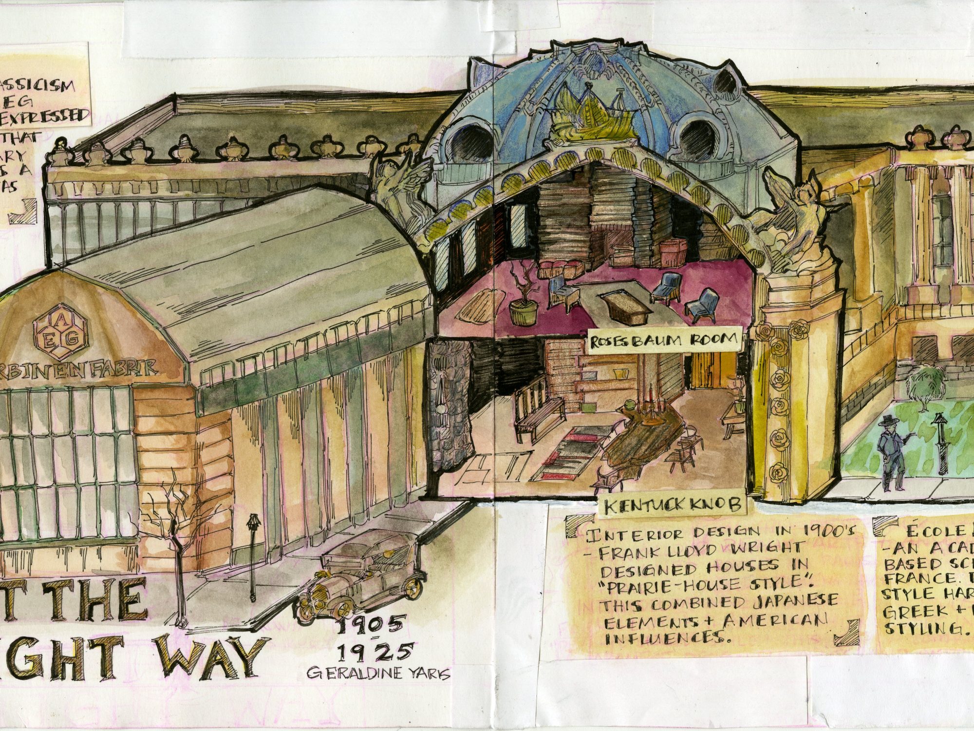
For my yearbook spread, I decided to combine 3 different architectural styles. Two individuals in my group dedicated research to two designers, Frank Lloyd Wright and Peter Behrens while I focused on The Beaux Arts architectural style as a whole. Since our survey group was architecture, I thought it would be interesting to create a building that implemented all styles. The exterior showed the Beaux Arts Style as the main foundation, taking inspiration from the Petit Palais in Paris and protruding outwards was the AEG Turbine factory, showing off Peter Behren’s most notable example of industrial classicism. Separating them is a cross section that shows the interior, taken directly from two of Frank Lloyd Wright’s own room designs. I believe I did well in incorporating all the different styles together in an interesting way. The line work ended up alot darker than I wanted but I found out later that it actually worked well and made it pop. Compositionally, I’m also very happy with how the text filled the negative space in the spread. Presentation-wise, I’m only unhappy about how some of the pen and pencil bleeding stained the white around the spread. I later tried to fix it with paper but its not as clean as I wanted so I give myself an 8.5/10.