Rationale:
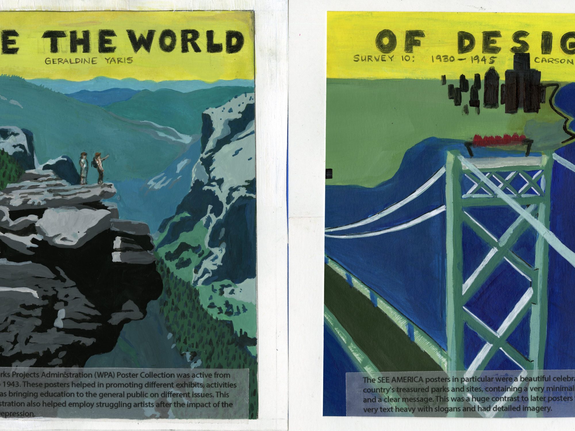
For survey 10, Carson and I were in the design group and decided to pay homage to the simplistic design of the WPA SEE AMERICA posters and show research about the program’s impact. To tie the two sides of the spread together, we decided to go for similar colour palettes with a yellow joining the title on the top. Aesthetically, I believe the spread works quite well even though it was difficult to make a collaborative project and the easiest way was to split it half and half which leads to some disconnect on the spread. The colours on each side isn’t exact and the details aren’t balanced as well as they could be, its very detail heavy on my side. With more effort, the spread could transition more seamlessly onto the other. After a few critiques, there were also some issues with placements of the title and readability, as well as with the text at the bottom. However the paint is rendered quite well and even and overall they both work as great renditions as WPA posters, especially individually. Due to these reasons, with my effort into the spread in mind, I would give my self an 8/10.