
Phase 3: Push/Refine March 19-April 22
After pitching four concepts to my mentors, we selected two pathways to digitally execute: one around the concept of pathways, and one around the concept of connection. Ironically, one was a logo I sketched in the first batch, and one was a logo I sketched in the last batch. (This really proves the 1 to 100 theory!)
Phase 3 was a lot of fun, being able to see my sketches come alive with colour, photography, and typography. The challenge was to digitally execute the two concepts at once, as I wasn’t used to double the typical workload. This is what would happen in real life when pitching to a client in real life, so it was good practice for myself, as well as a good opportunity to test the ideas against each other.
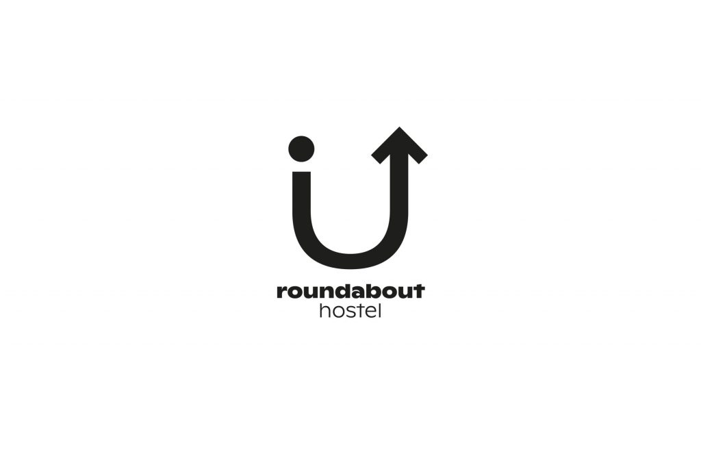
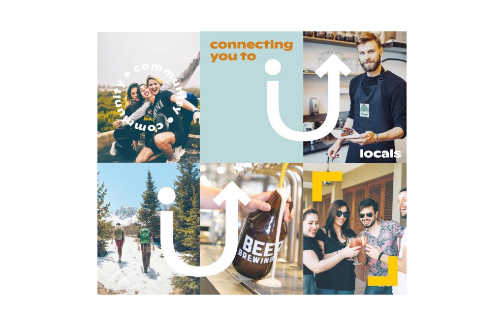
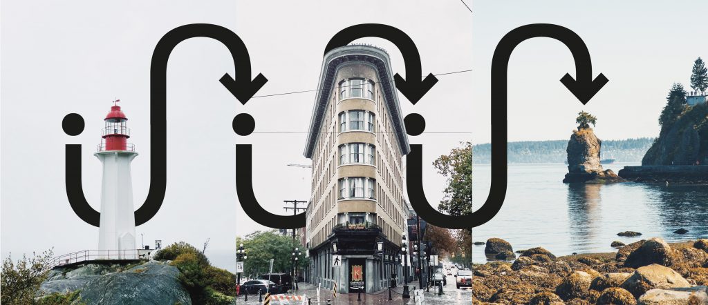
Concept 1: Connections
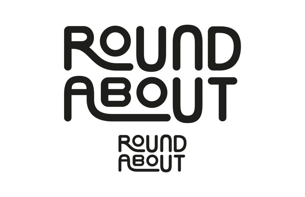
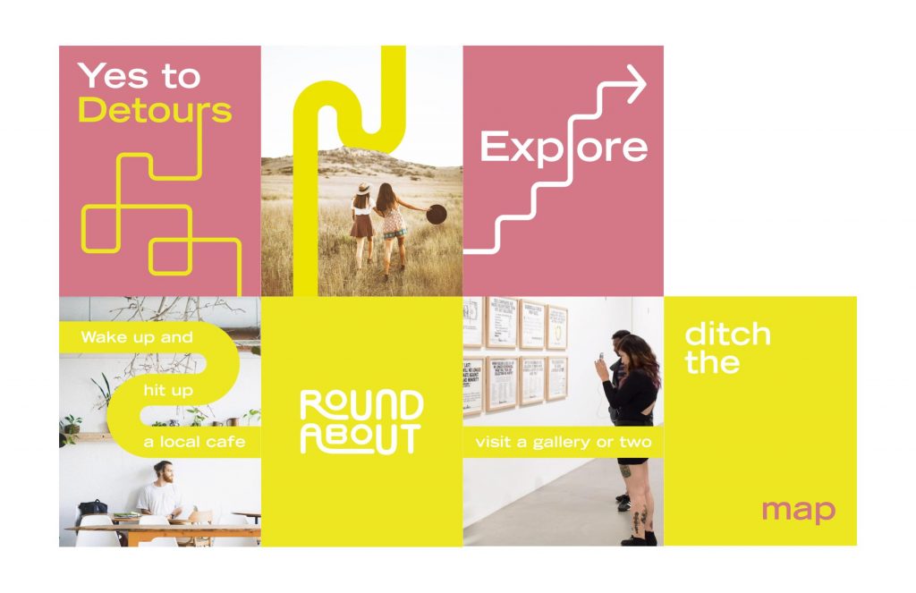
Concept 2: Pathways
The majority of phase 3 had me exploring both concepts in-depth, while I held the constant uncertainty of whether I would be bringing two concepts to the table at the end of this mentorship, or if I had to be the one to speak out on pursing just one direction. My indecisive self thought that maybe both could work for the longest time until the point came where I could see that one concept was stronger than the other.
After going through multiple rounds of digital exploration for each pathway, I decided to move forward with the concept of connection, which my mentors also agreed with saying that it was my stronger idea. It was nice to narrow down into one concept, as I could now spend 100% of my time on perfecting it.
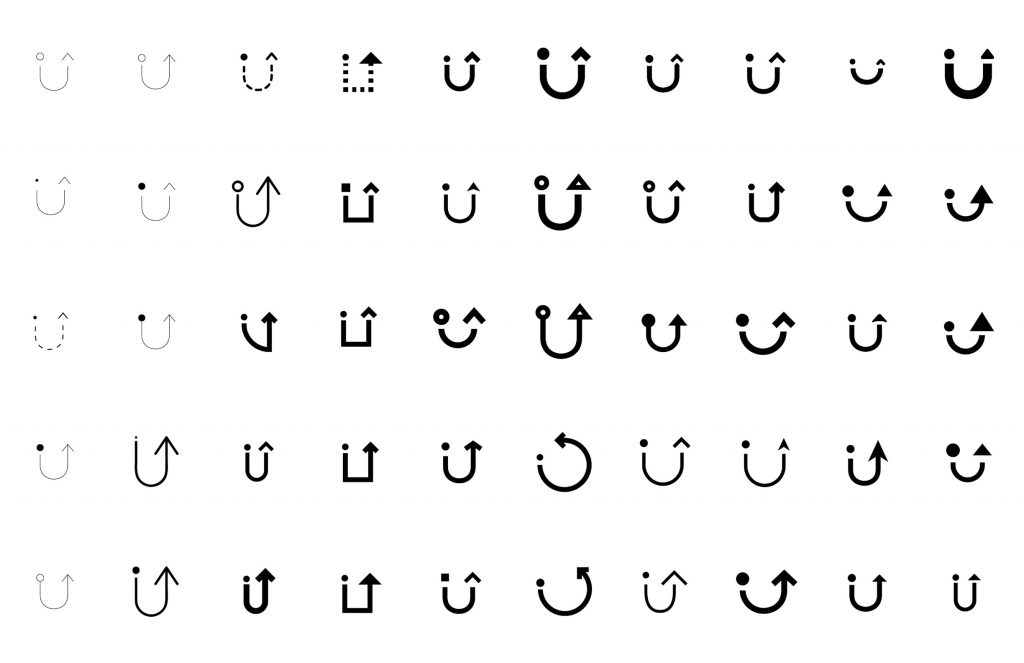
Some notes I had on improving concept 1 were:
- to change the typeface; the current one looks vintage and this brand leans more towards being modern
- colours also look a little muted, which creates a vintage tone
- getting rid of the weaker brand visual language I tried out (the type in the circle, the frame) as they don’t relay the concept of connection
After choosing the final direction for this project, I worked with Shanene on finding the right font for the brand, and with Janice on developing the visual language. It was great to sit down one on one with both of them to really nail the brand’s base components.
Shanene and I hunted online for the perfect sans serif typeface, which was difficult as they either had too much personality, or none at all.
Janice and I explored the art direction of the brand, brainstorming how “connections” could be portrayed using the brand’s assets. We also looked into how the logo could translate to the icons used by the brands as well
For this phase, I give myself an 8.5/10. I think I could’ve executed more iterations for everything, but under the circumstance of having other projects, I think I did an okay amount. I particularly struggled with nailing the typeface and colours in this project, which did slow down some of my work processes. Overall though, I’m excited to see how far I can push this project out before the end of this mentorship, now that I can focus just on perfecting one concept! Again, lots of thanks to Car, Janice, and Shanene who are the best mentors I could’ve asked for.