Our need to communicate is second to none: the ability to tell stories, to share ideas, and to teach one another is done through communication and, most importantly, through language– conveyed with speech and writing. Many languages have been gained and lost throughout time, which brings us to our chosen topic for this project.
14. We call upon the federal government to enact an Aboriginal Languages Act that incorporates the following principles:
- Aboriginal languages are a fundamental and valued element of Canadian culture and society, and there is an urgency to preserve them.
- Aboriginal language rights are reinforced by the Treaties.
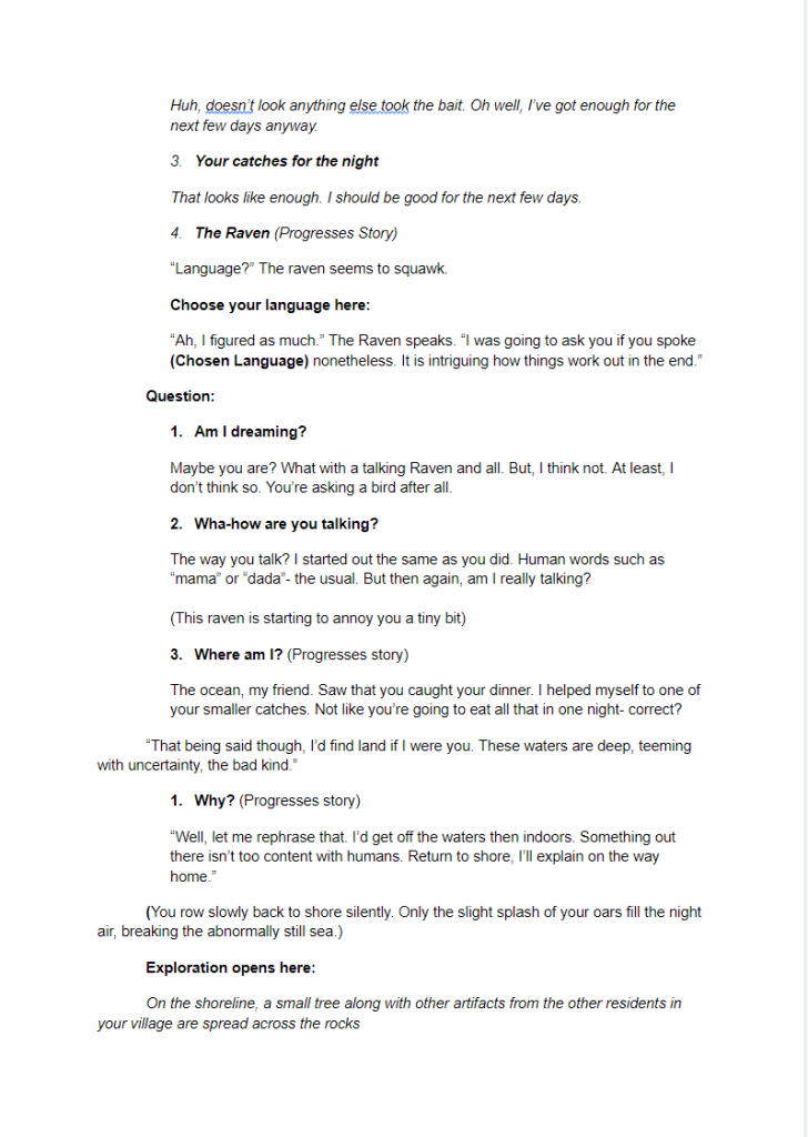
- The federal government has a responsibility to provide sufficient funds for Aboriginal-language revitalization and preservation.
- The preservation, revitalization, and strengthening of Aboriginal languages and cultures are best managed by Aboriginal people and communities.
- Funding for Aboriginal language initiatives must reflect the diversity of Aboriginal languages.
We had chosen #14 of the Calls to Action. Essentially, the call states that on a number of fronts, many Indigenous languages are facing extinction due to the heinousness of the Residential School system that scarred a generation. A scar that was felt throughout the ages as many Indigenous languages have been forced out of a potential new generation of speakers. Rendering many of them as either dead languages or endangered.
To attempt to help rectify this challenge, we had to somehow convey a message to the public to teach them about this challenge. Therefor, before we did anything else, we decided to work on a game that will inform any players about past languages. Hoping to spark curiosity in any players on Indigenous Languages.
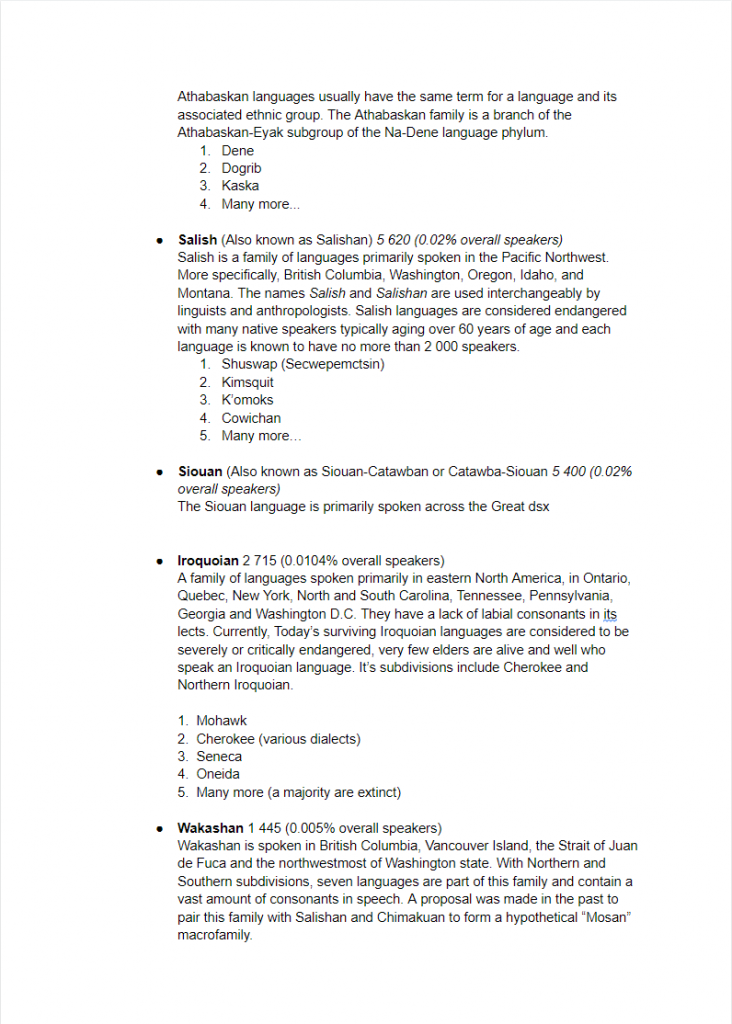
Through extensive study of current languages spoke throughout Canada, we had determined what languages were to be included within our potential game. At this point, we didn’t have too much information on what the game would actually look like or how it would play. All we knew at this point, was that the game would be made in Scratch. However, this would eventually turn out to be fruitless.
As time went on, we had started to formulate some potential ideas regarding what and how the game would play like by using our research as basis. Firstly, we had gone through many storyline ideas…
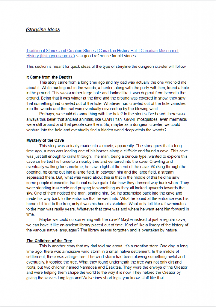
Each storyline was developed with major inspiration from actual Traditional Indigenous Stories. Each story ranging from stories of mythical creatures, creation stories, and simply stories that parents would tell their children. Through trial and error, we settled on using these stories as a basis for one larger narrative that would drive the game forward. Throughout the ideation process, we had always used the preservation or finding of endangered languages as a basis for the story. No matter what we came up with, at the core of the story was the teaching of language. Using the proposed narratives, we had developed a story by taking interesting elements from the proposed stories above…
The refined idea would jumpstart the gameplay and branch off into new ideas for how the game would actually play. We eventually decided on a point and click exploratory visual novel. A visual novel that tells the story of a fisherman looking for their lost family with the help of a Raven.
Throughout the refinement of the story, we had started to think about what each character would look like, the types of environments we would visit, and how the overall sound would be like.
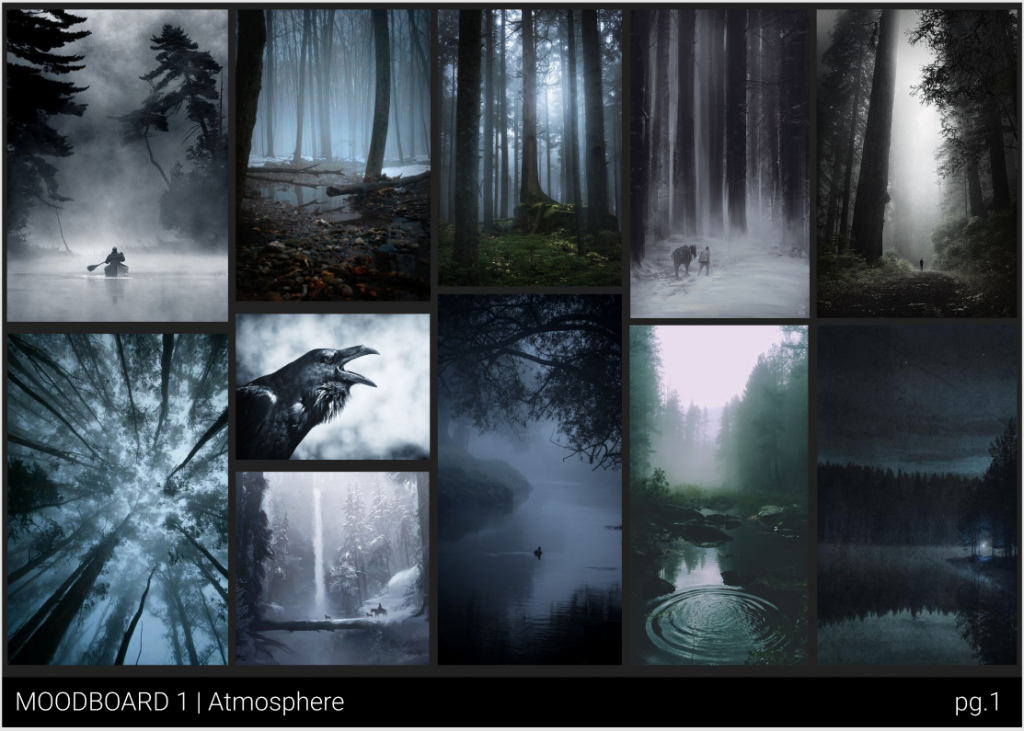
Before the story was eventually finished, we had developed a single concept art piece to help in the creation of the world and what everything would look like. This piece of developed with the aid of moodboards posted on Figma. Using this art piece and multiple moodboards, we had developed a style of music, sound, and even look of the UI for what the game would look like.
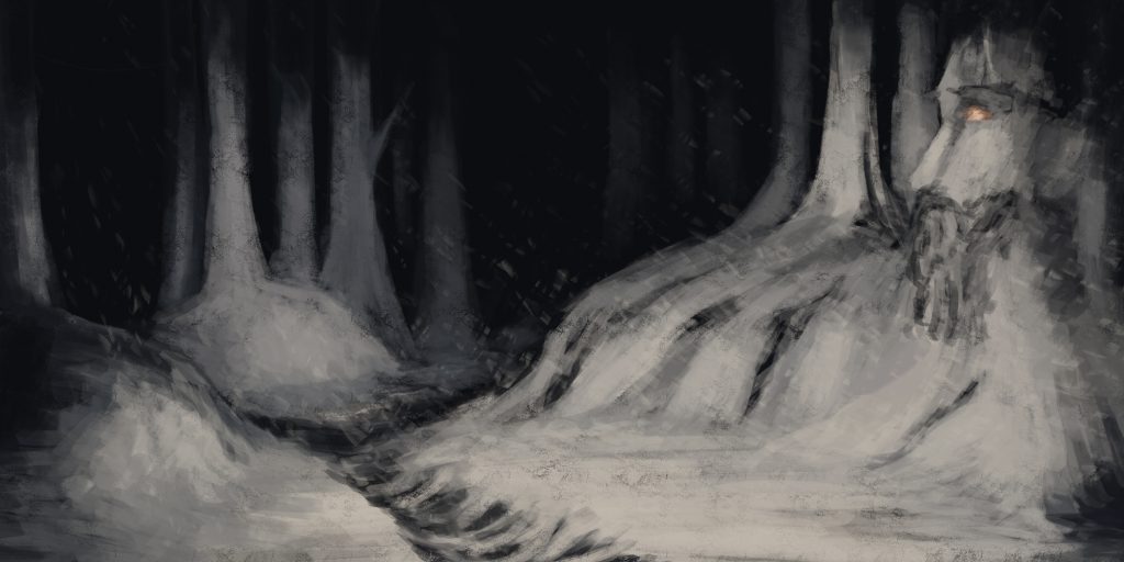
The mentioned pieces would essentially help us shape the world as we saw it.
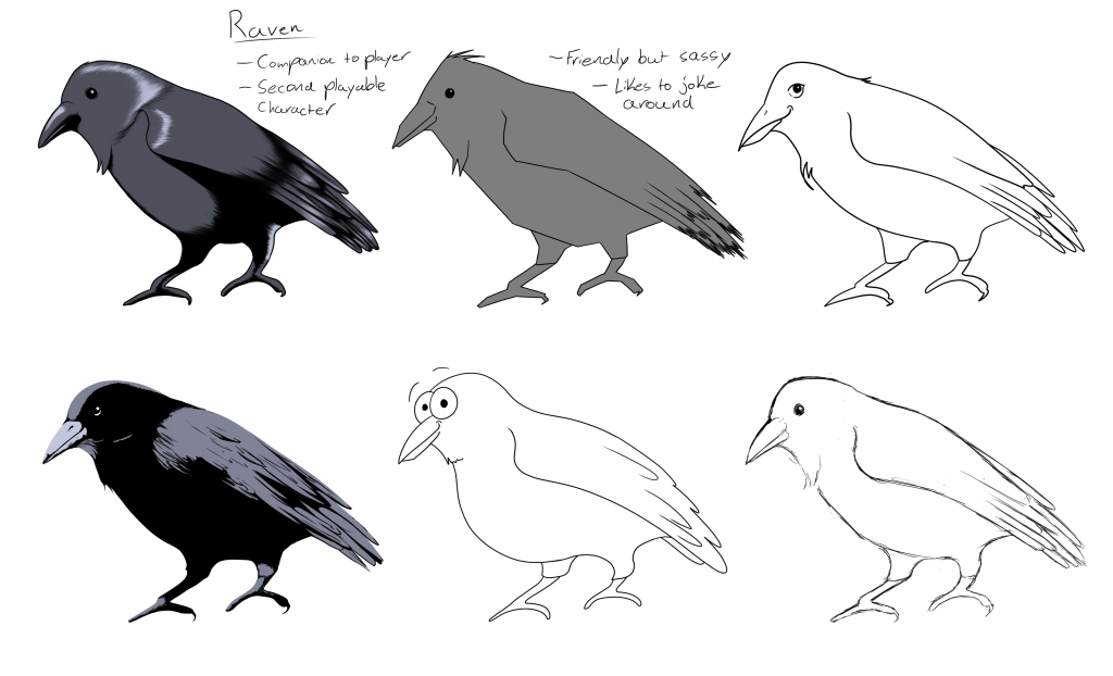
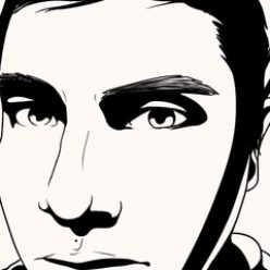
Next, we had to decide what the actual characters would look like. Being that a majority of the game is spent in the company of a Raven, we had decided to use a Raven as a basis for other characters and the overall art style. Through discussion, we had decided on a combination of two different examples…
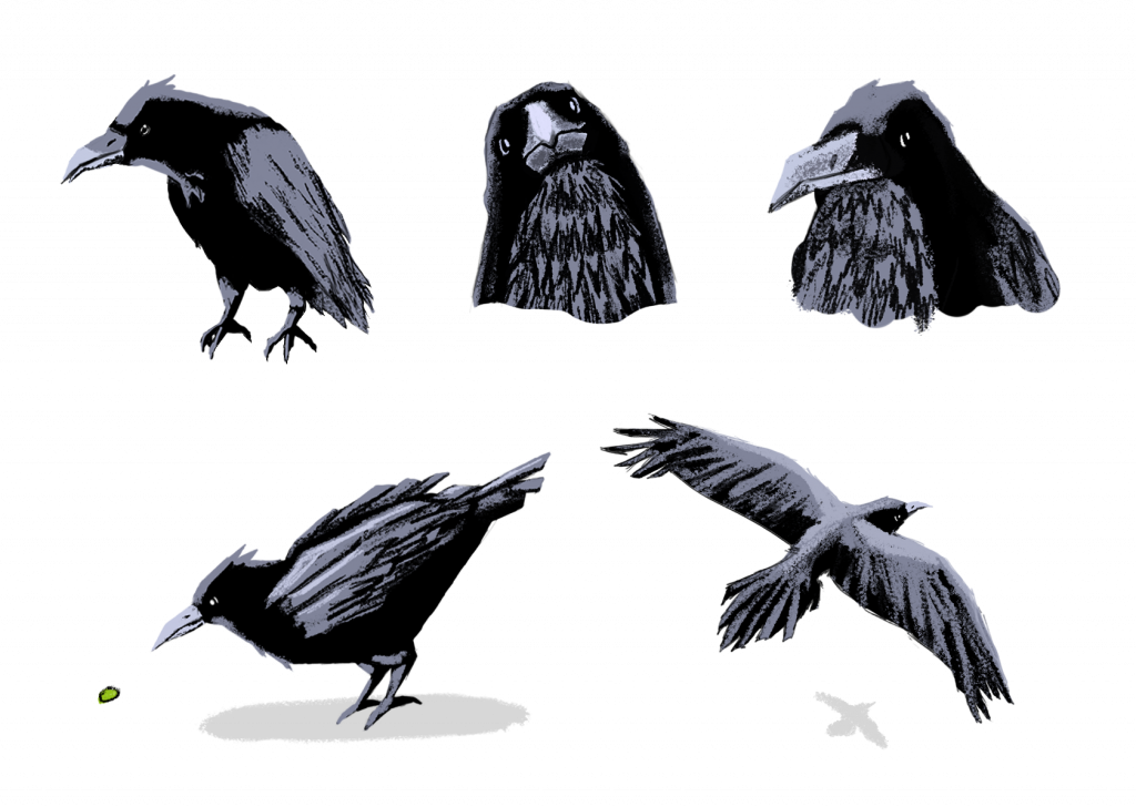
A combination of the dark graphic look along with the almost geometric look to the characters would prove to be the most popular choice so that’s what was decided on.
While the characters were being developed, the UI of the game was being considered. Through moodboards posted on Figma…
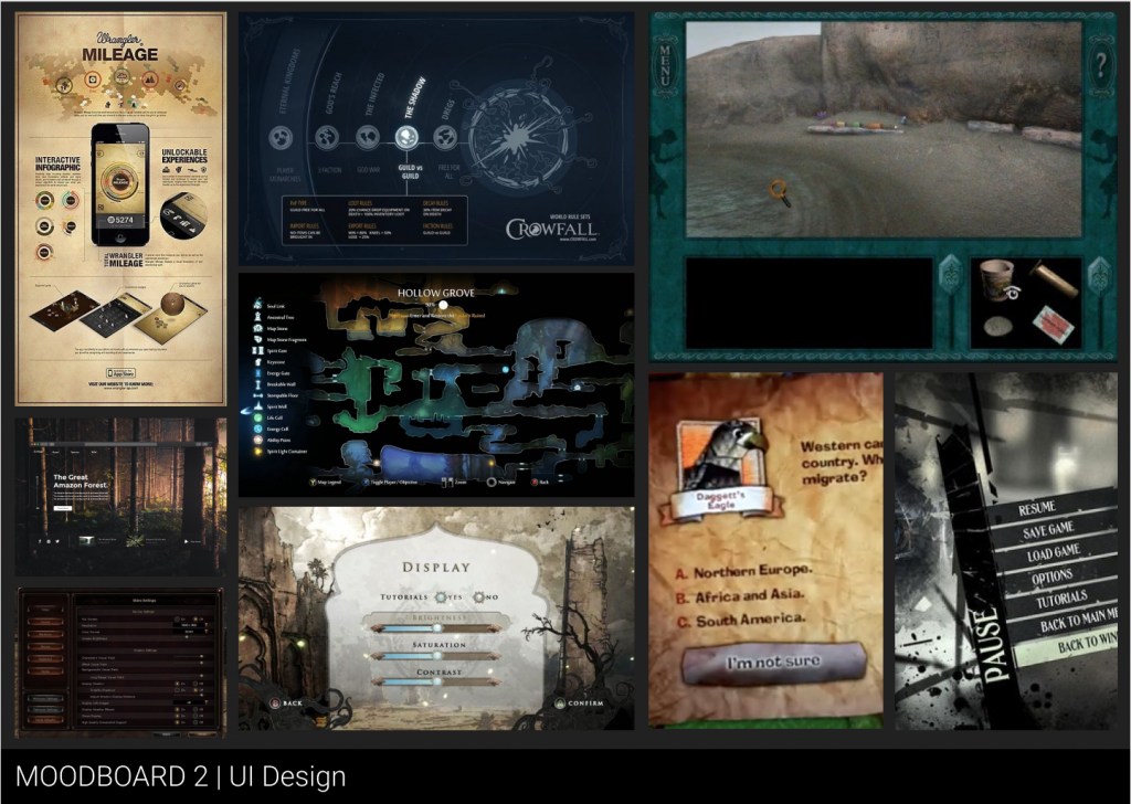
We had developed a feel for the game and how the user would interact with the world that we were creating. Using the mentioned moodboard of the world above, the character art, and the concept art piece we had developed a cohesive understanding of the world that we were creating to fit the story that we had developed.
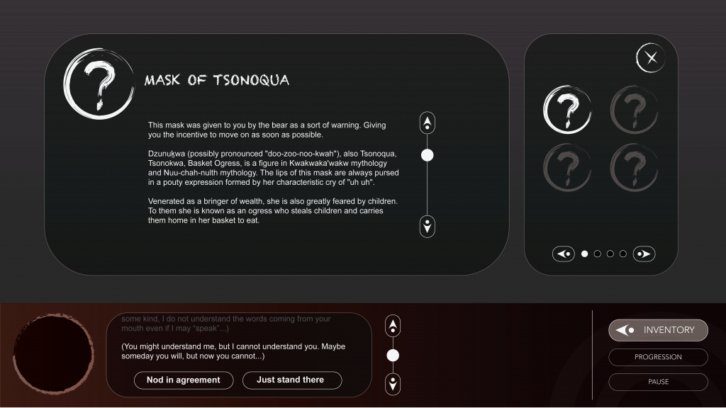
Once the characters and environment were decided upon, we had taken to create some UI pieces that would play essential to the users journey through the world we were crafting. Above is an example of one such menu that the user would interact with. This also showcases a key element of the overall gameplay. The teaching of Indigenous Languages.
With all of the assets in development, we had started to think about showcasing what the game would look like in it’s final form. The scope of the project would grow beyond Scratch and we would then have to search for more powerful engines to run our proposed project. However, due to limitations outside our control, we eventually had decided upon creating a mockup of what a final game would look and play like.
As the project was being developed with new environment concepts, character art, and UI elements being created all following the proposed story and the chosen Calls to Action, we had eventually finished a final video showcasing our idea.
And thus, ending our project for the time being.
As for myself in this whole process, I handled the creation of the video and concept art pieces along with assisting in research. For the video, I had scoured the internet for any interesting sound pieces that I think would fit the world that we had crafted. Even going as far as creating some sound pieces for the video itself ranging from music to UI sounds. As mentioned, I had created the environment art pieces shown as a background in the proposed video using photoshop. In addition, I had also helped in creation of the narrative as well. However, I cannot take credit for the presentation in itself. Only with minor edits to it did I prove useful in that regard.
Overall, I think we both did a wonderful job on something that I am actually proud of. I do hope to eventually turn this project into a fully realized project one day when more time is available.
