Categories
142

Ray Larabie: The Creative Influence of Gaming

Pricedown, as seen in the Grand Theft Auto wordmark

Being someone who’s pretty interested in video games, Grand Theft Auto is a game that I have had my eye on since 2015. I loved watching gameplay on it back then and to this day since many ridiculous moments can be had while playing even though it’s based in reality, you can pretty much do anything you want as an open world kind of game. 

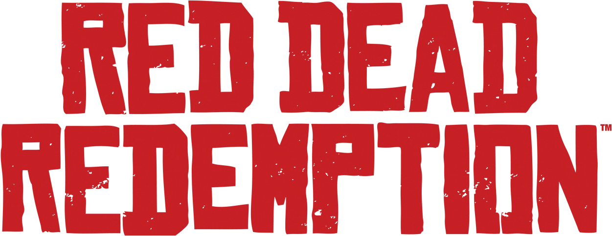
So you can imagine my excitement when I discovered that a font designer from Canada named Ray Larabie helped design the font for the game. Not only that, but upon further research, he designed more fonts for other popular games like Red Dead Redemption and Mass Effect. 

Font of Red Dead Redemption - forum | dafont.com

Young Ray Larabie actually took inspiration from video games himself at arcades and became fascinated with the bitmap made fonts surrounding him. He then tried remaking them at home on a TRS-80, a desktop microcomputer that was launched in 1977. It’s awesome to see how video games can inspire people in different ways creatively, for Larabie it was typefaces and myself with illustration, in a way I can connect with his experience and I hope that people continue to find inspiration through games.

Categories
142

Jamie Reid: Rock and Ragged Edges

Jamie Reid - Wikipedia

I would like to start this blog post off with a disclaimer that I am not a huge fan of punk rock music however, I do respect it along with the grunge aesthetic of some album covers, most notably Jamie Reid’s work. 

Reid was most known for his work for an English punk rock band named the “Sex Pistols”, which by the way, is a pretty awesome name in my opinion. He was able to match the vibe of their music with his unique style of collage work, torn up edges, lettering using cut outs from newspapers, kind of like an edgy scrapbook. 

Jamie Reid — God Save the Queen. Born in 1947, Jamie Reid lived during… |  by Dan Brady | FGD1 The Archive | Medium

Being born into a politically active family, he became involved with politics himself and was drawn towards socio-political reform and opposed the right. He discovered rock music which influenced him greatly and created works that included political ideas. This was viewed as quite scandalous from other individuals. 

Although like I mentioned earlier, not a fan of punk rock, but just the concept of going against the grain and standing up for what you believe in, is incredibly inspiring to me.

Categories
142

Lisa Strausfeld: A Digital Super Graphic Master

Going into this lecture, I was more than happy to find that there were a lot more female designers popping up. One person that caught my attention however, was Lisa Strausfeld. Although she wasn’t talked about much, her work fascinated me by combining architecture and graphic design. 

With a background of graduating with a master’s degree in architecture from the prestigious school of Harvard, along with a media arts and sciences degree there’s no wonder she was able to create some incredible pieces. She partnered with Pentagon in 2002 which launched her into the world of digital information projects along with a team. 

Strausfeld was fascinated with visualizing data in a three dimensional space. She states that “The screen is a space. “For me, it was always a space. It was a space you can enter.” It’s thanks to designers like her, we truly get to see digital design on an even larger scale and appreciate it.

Categories
142

Stay Groovy Baby

Iconic 60s Album Covers – Mental Itch

The 60s poster aesthetic was most definitely a change of pace from the whole clean cut modern design style, but in a good, funky and fresh way. Although I’m one for some good sleek designs with more muted and pastel colour palettes, I have to say, getting hit in the face with bright colours and crazy, melty graphics scratches an itch in my brain I never thought I had. 

When I was searching for inspiration while doing the 60s album cover project, I came across quite a few newer designs done digitally that were inspired by this iconic aesthetic. Originally, these posters were mostly done by hand using all sorts of traditional mediums like spray paints. This made me wonder how much the psychedelic era inspired design today. 

Fanta Ad psychedelic Art

Advertisers today use this trippy style to promote the positive ideas that the 60s put forward, peace, free love and all that fun stuff. In addition to this, posters were normally made to promote bands at the time along with the style for albums, which has inspired bands today to mimic that.

Categories
142

Paul Rand: My New Source of Inspiration

Paul Rand, everything is design! The man who changed the face of the USA

Paul Rand’s name is one that tends to pop up a lot during my time here in IDEA. Yet I still feel like I’m only scratching the surface and this blog finally gives me an opportunity to look into his career more deeply and the story behind him being one of the biggest influencers behind bringing modern design to America. 

Now everyone knows about his work at IBM and NeXT, I mean it’s pretty iconic, how could you not? “But how did he get here?” I asked myself after hearing his name pop up for the 50th time finally peaking my curiosity. 

After some research I found that when him and his family moved to Brooklyn, He first became inspired by figures on posters and comics and attempted to redraw them, however, drawing figures was against his parents’ beliefs. This resorted to him having to draw at the back of his father’s grocery store in secret and would probably explain why he had to take night classes for art on top of school and even learning art history through a magazine he found in a Macy’s bookstore. His dedication to the craft is truly motivating and inspiring.