As the first assignment of the year, as well as an introductory statement of myself to the rest of the class, I wanted my yearbook spread to embody all aspects of my personality.
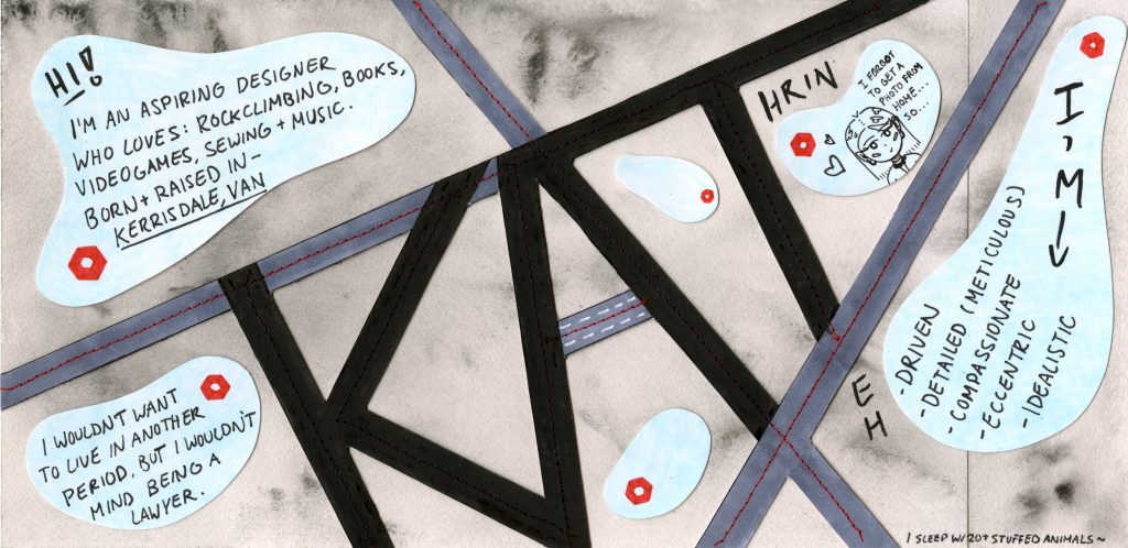
Before conceptualizing and drawing thumbnails, I decided to centre my spread on five key words: compassionate, eccentric, idealistic, driven, and meticulous; each feature assimilated into the work in a different fashion. The bold and askew typography signifies my eccentricity, while the straight lines and sewing details demonstrate my meticulous qualities, as well as my affinity for sewing. The blue abstract shapes present a duality – they allude to compassion, while also resembling climbing holds. To show my driven personality I used a road to serve as the crossbar of the “A”, and the hazy, dreamy background denotes my idealism.
I would give myself an 8 on this assignment – I spent a ton of time on it (the core typography was done on a completely different sheet of paper, cut out precisely and applied overtop the watercolour paper), though I know I could’ve done better. With the turbulence of the first few weeks of university and the moving out of home, etc, I was forced to allocate my time wisely on each project we were given. Even so, I spent about 7-8 hours on the spread in total, testing many different iterations before discovering what worked for me. My comfort zone lies almost solely within design, so I was challenged with creating a spread without the use of drawings, as many of my peers employed. Despite this, I’m quite satisfied with the result, though I can’t help but think it would’ve looked a lot nicer if done digitally, through InDesign or Illustrator.