The golden age of type – a time filled with wonder, talented designers, and new typefaces around every corner. Among the many font developed in this time, a personal favourite of mine (historical context and design elements considered) is the dependable font we call Baskerville.
To alleviate confusion, I will be referring to John Baskerville as John throughout this survey – his punchcutter was also named John, but all uses of the unaccompanied name should be assumed to describe John Baskerville himself, rather than his assistant. The eponymous font will be referred to as Baskerville.
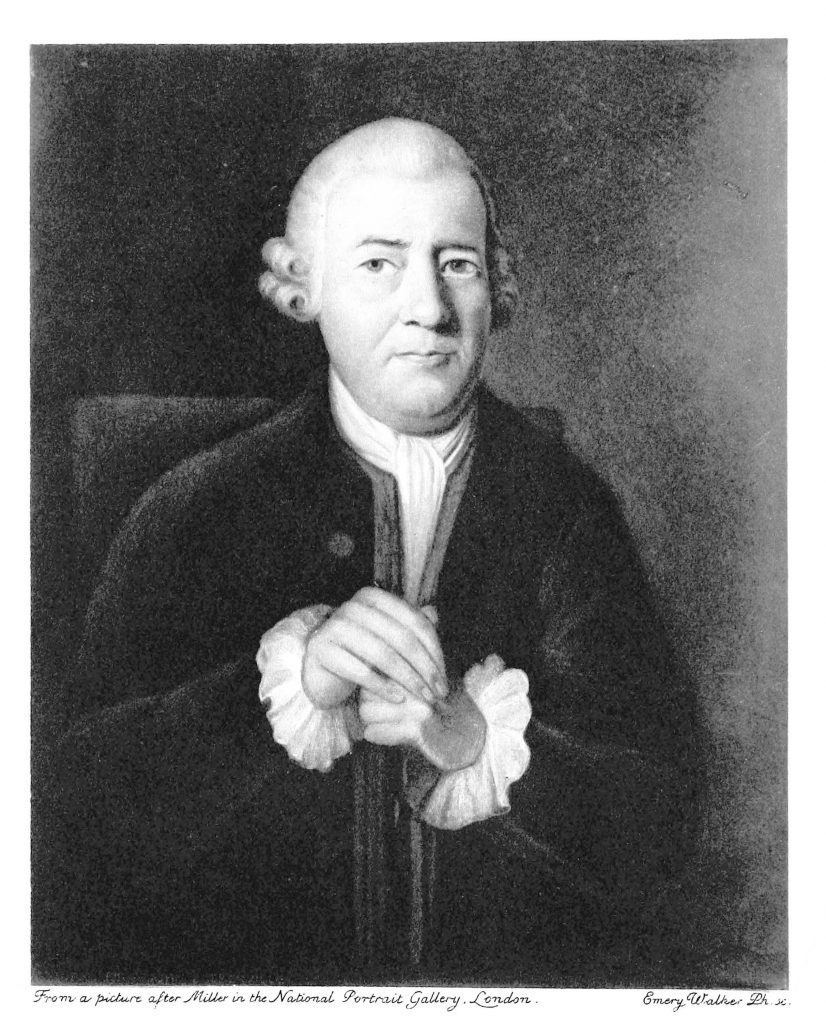
It all begins with John Baskerville – a writer turned type designer, living in Birmingham, England. John wore many hats before landing on the career that would perpetuate his name for centuries: he was a footman, calligrapher, teacher, engraver for gravestones, and founder of a japanning business. Japanning is a form of varnishing, in which one applies finishing coats on different materials in an attempt to imitate the Japanese’s lacquerwork. The success of this business gave John enough of a financial surplus to experiment in his personal interests; thus he established a printing house and immediately got to work.

After much experimentation with different iterations (thanks to his punchcutter John Handy – who was indeed, quite handy), John Baskerville published Virgil in 1757, gaining much notoriety and being appointed printer of the University of Cambridge. This led to the dissemination of his fonts – even Benjamin Franklin wrote him a letter of support, including an anecdote showing the falsities stitched in the comments of John’s critics, of which there were many.
Despite being warmly welcomed in America, Baskerville was not as easily assimilated in John’s home country. The typeface had been designed as a direct response to William Caslon’s eponymous font, made a few decades before. John sought to create a thinner and more elegant typeface one that could be used instead of the basic Caslon that was ubiquitous throughout print at the time. In this he succeeded, though many printers – whether out of envy for his success or a genuine dislike of the font – openly disparaged Baskerville, complaining that the thin lettering was hard on the eyes and lessened readability. Even so, the typeface has endured.
John’s contribution to the history of typography wasn’t solely in the creation of Baskerville – he conceived other innovations in the publication industry. With James Whatman, he created the a white paper that excelled in luminosity and smoothness, showcasing typography as the focal point. John also pioneered a printing style with wider margins and leading, which I believe to have aided greatly in readability – some printed historical texts are so condensed, it’s as if the letters are penguins huddling in the arctic!

Today, Baskerville remains a classic and is still among the most popular fonts – inspiring many variations including Mrs. Eaves, an inspired typeface named after John’s wife, Sarah Eaves. After all these centuries, Baskerville lives on as a prolific font, used by people all over the world.
Sources:
https://www.britannica.com/biography/John-Baskerville
https://www.huffingtonpost.ca/entry/baskerville-font-history_n_58e7fe09e4b058f0a02f4e30?ri18n=true
https://www.britannica.com/art/japanning