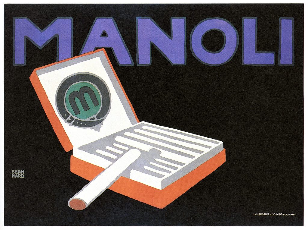
Advertisements – they’re everywhere; we find ourselves submerged in them on a day to day basis. Poster design is one huge facet of this industry, and though ads via the use of posters have been around for a quite a while, it wasn’t until the early 20th century that the modern, simplified posters we see so often today were born.

This form of poster design was called “Sachplakat” or “Plakatstil”, meaning “poster style” in German. The style was conceived in 1905, when Berlin based graphic designer Lucien Bernhard entered a poster design contest last minute – and won. His simplified design seen above was praised by critics, as it lacked the superfluities of typical “art nouveau” posters at the time. This form of advertisement with only the name of the corporation and an image of what they’re selling is a type of commercial poster design, where the main goal is to get consumers to associate a product with a brand (rather than try to sell the product itself).
Lucien not only created plakatstil, but also inspired a new era of modernist advertising – and modernism as a whole. After the intricate and crowded designs of the art nouveau movement, the public was refreshed to see such a simple, basic take on poster design.

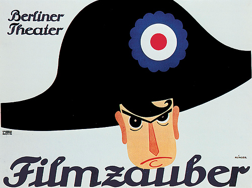
Many designers proceeded Lucien in this style – the most renowned being Julius Klinger. Klinger began as a poster designer very much assimilated into the art nouveau trend; he frequented decorative fonts and intricate floral motifs. Eventually, however, he grew sick of the style which could sometimes be so overly ornate as to hide the true message of the poster completely – which is ridiculous considering the predominant point of posters is to communicate. With most of his clients being corporations, legibility needed to be at the forefront of his work, which also influenced his shift into a plakatstil style.

Plakatstil posters are simplified – containing the bare minimum as to direct the audience’s focus, instead of adorning the page with decorations (that only serve to distract and pull attention from the subject). They consider negative space an asset, rather than a detriment to be filled with gaudy patterns. They know people see advertisements in fleeting moments – during a commute to work or in a magazine – and they exploit this by stripping down the poster to a basic, memorable image.
Sources:
https://www.internationalposter.com/style-primers/plakatstil-the-poster-style/
https://www.britannica.com/topic/Plakatstil
https://en.m.wikipedia.org/wiki/Plakatstil