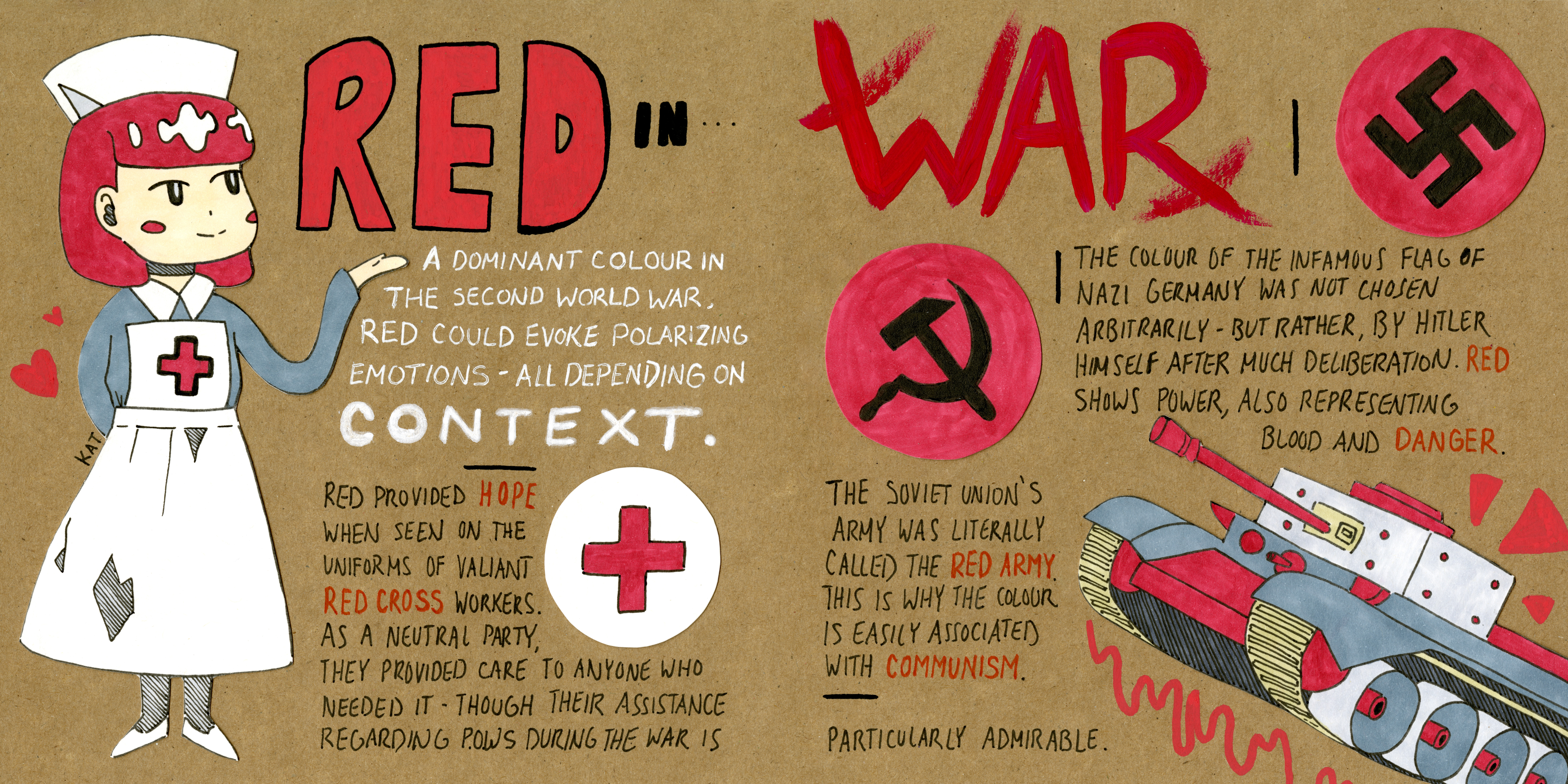
I have an affinity for reading historical fiction novels – particularly ones based in Europe or Russia during WWII. This affinity unsurprisingly led to my immediate decision to base my spread on colour use during the war.
All can agree that the most dominant colour of WWII was red. It was seen in propaganda everywhere, in both the Nazi and USSR flags, in the perpetual blood shed, and in the heroic Red Cross. I always found it interesting how two groups standing for such drastically opposing causes used the same colour as a part of their identity. A colour can evoke polarizing emotions – it all depends on context. Both the Nazi flag and the Red Cross insignia employ the colour red, though in one case it strikes fear into the heart of citizens, while the other stands as a totem of hope for all that see it. This dichotomy is what I wanted to express in my spread.
I’m extremely satisfied with the outcome; the final product is exactly what I had imagined (a rare occurrence!). I would give myself a 9.8 on this spread, as I am super happy with it, though as always, there is forever room to improve.
Sources:
https://www.britannica.com/topic/Red-Army
https://www.historylearningsite.co.uk/world-war-two/the-red-cross-and-world-war-two/