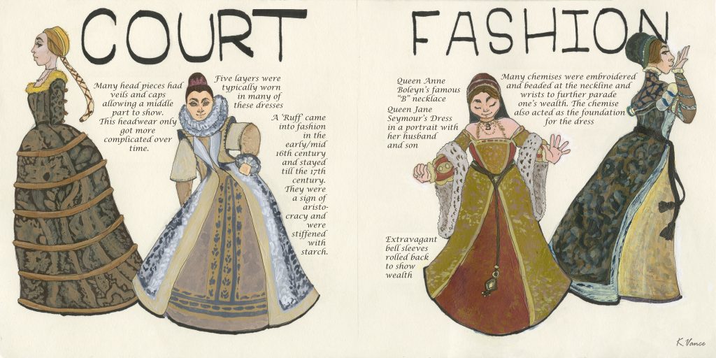
Category: 141 P

Survey 6 Infographic: Tools & Technology

Rationale

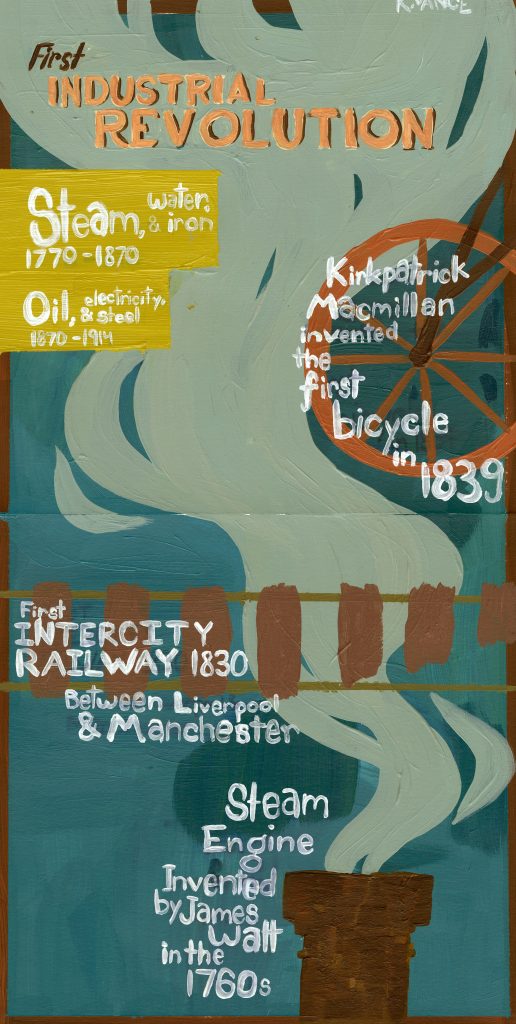
Being assigned tools & technology, I decided to focus on key inventions during the industrial revolution. I got most of my facts from https://www.biographyonline.net/facts-about-the-industrial-revolution/ and researched them further to simplify them to suit the Infographic. Taking inspiration from contemporary Infographic and industrial revolution posters, I took the colours used in the time and simplified the symbols to better communicate the Infographic format. I worked out the composition beforehand in photoshop and rendered it in acrylic later. Though colour matching failed a couple times, I don’t think it impairs the poster. I do wish the lettering was more opaque but I didn’t want to overwork the type In fear it would out rank the title.

Self Evaluation:

I’m quite happy with how my spread worked out, regardless of minor slip ups with the paint and I would give myself a 8.5/10 as I put in many hours into this and I feel my work paid off.

Survey 3 Spread Rationale:

Court fashion during King Henry the VIII’s reign changed rapidly due to the many queens he went through. I wanted to use a relatively symmetrical spread so I could slip the words in between. To get the words so tight between the figures I scanned it first, fitted the words, erased the background and printed the text. I illustrated the figures with acrylic due to the wide colour range I could achieve. The paper I used was not built for inks or any water based pigment so I had to do quite a bit of touch up after.

The women illustrated are wearing a mix of different pieces pictured in many different paintings from the time. I rather enjoyed painting them as acrylic is my medium of choice in any assignment, though I wish I painted bigger to accomplish more of that detail work featured in fashion at time.

Grade:

Though I spent a lot of time painting and aligning the type, I don’t love it. Overall, I would give myself a 7.5/10 as I wish I had painted this bigger to achieve more detail in the fabrics, but I’m happy with the effort I put in.

Yearbook Spread

(photo to be added)

September 18th, 2019

My favourite colour is red. I collaged my spread to convey a chaotic creativity in both my work and personality. All the information is written in my messy handwriting as clean script has never described me. The portrait grabs the eye first, then to the K in the top left corner. I wanted the viewer’s eye to go back and forth from visual to information so among the illustrations. Golden insects peek out of corners adding a different texture and shimmer to the piece. The two self portraits are in a different style as they represent different aspects of my life. The ¾ larger portrait is closer to realism than the other as this version of myself is bigger than my love of performance art. Also, the brown coffee stain in the bottom left corner was not intentional but, it is an accurate representation of myself and my work. I also don’t feel that the stain disrupts the piece at all, rather it blends in with the natural tears of the magazine edges.