Typography/1905-1915
The most popular typeface released in 1905 was French Script, designed by Monotype Staff, then in 1915 it was Goudy, designed by Frederic W. Goudy. Art nouveau was in full swing and the typography was often integrated into posters of the time. Many copycats had tired the genre by this point; the repetition and imitation had worn Art Nouveau down. The lively colours became darker and muted.
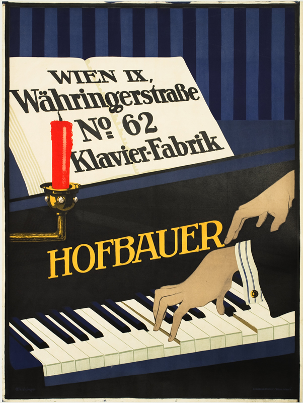
Hofbauer Klavier- Fabrik, 1910 ca.
The strong red and the elegantly stretched hands make this design stand out among its peers of the day. The suspenseful composition struck me especially.
Artists such as Mucha and Cheret had abandoned poster design for painting and had cleared the way for the young Leonetto Cappiello (said to have been the father of modern advertising). He rejected the fussy feminine style of the previous movement and his work was often bizarre and humorous.

Biscotines Union, 1906 ca.
The Sachplakat Poster, 1906
The Poster Style started by Bernhard further emphasized flat colours and abstracted visual language to achieve clean communicative designs. Though this style was to be quickly changed for the war effort in 1914. Posters became tools of propaganda.
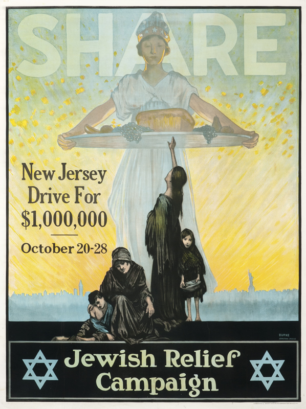
Share Jewish Relief Campaign , 1915
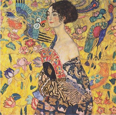
The combination of dark flat colours and the strong female figure tie together both Art Nouveau and the emerging Poster Style. The Art Nouveau resonated with me more than Early Modernism did due to the natural curves and the softness of the illustrations. The type feels more integrated and a part of the composition and even today, a female face in front of a magazine title is almost completely standard.
https://www.internationalposter.com/a-brief-history-of-the-poster/