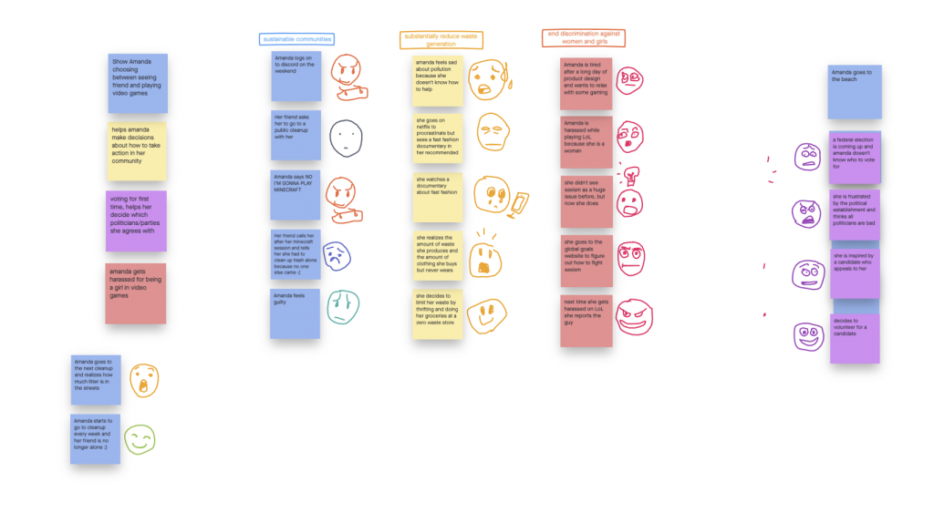
To start, Megan, Raha, Natasha, Kat, and myself concepted a few storylines and added some poorly drawn emojis to illustrate the character in the story. We landed on the yellow story line due to its visual simplicity.
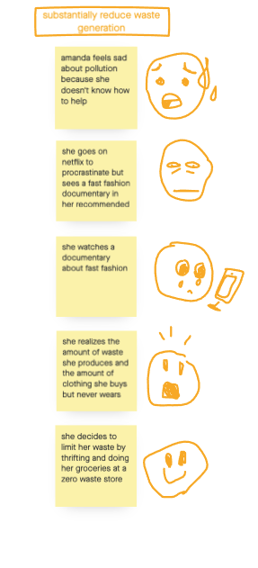
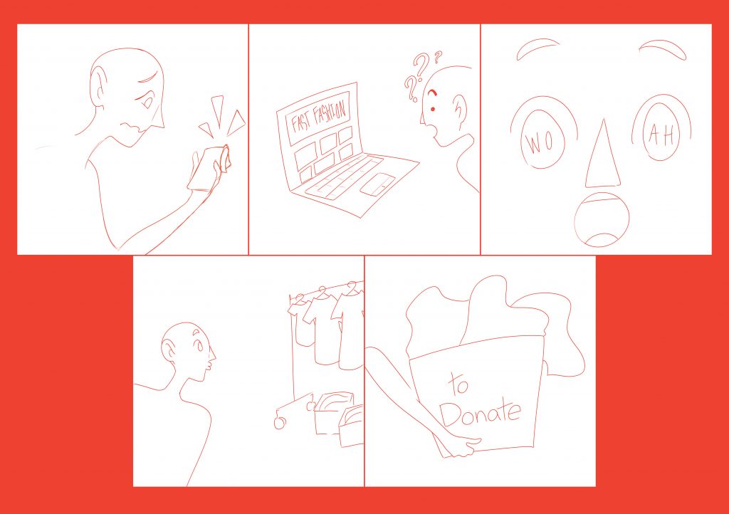
This is my storyboard and visual partner to the storyline we created. I kept it very minimal to not overwhelm the reader. I slightly shifted the last panel to something very clear and simple.
Watteau began training with Claude Gillot around 1704 and influenced his style greatly. They split ways four years later after Watteau surpassed him. Soon after, he joined one of the king’s painters: Claude Audran III. These connections were essential to his success as an artist. These years progressed him as a decorative artist but after leaving Audran’s studio, he abandoned the style.
Le Faun and L’Enjôleur (1707-1708)
Jean-Antoine Watteau was a French painter in the Rococo period. He was born October 10, 1684 – Valenciennes, France and died July 18, 1721 – Nogent-sur-Marne, France though he didn’t begin painting till the turn of the century. This piece comprised of two panels was originally a commission of eight, and these panels are the only remaining pieces.
The Scale of Love (1715-1718)
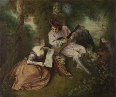
Studies of a Woman Playing a Guitar, or Holding a Musical Score (c.1717)
Watteau was an exceptional draftsman and completed many more sketches than paintings; his friends claimed that he preferred it of the two. My appreciation for paintings can only go so far as my experience with the medium is lacking; although, I marvel at his sketches as they speak to me more than his painted work.
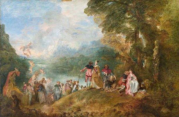
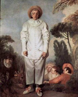
The Pilgrimage to the Island of Cythera (1717)Pierrot, formerly known as Gilles (1718-1719)
This piece stood out to me as the subject matter and composition are oddly presented. The Rococo style is often light and romantic where this piece contrasts that with a stale, rather sad expression that draws one in.
The most popular typeface released in 1905 was French Script, designed by Monotype Staff, then in 1915 it was Goudy, designed by Frederic W. Goudy. Art nouveau was in full swing and the typography was often integrated into posters of the time. Many copycats had tired the genre by this point; the repetition and imitation had worn Art Nouveau down. The lively colours became darker and muted.
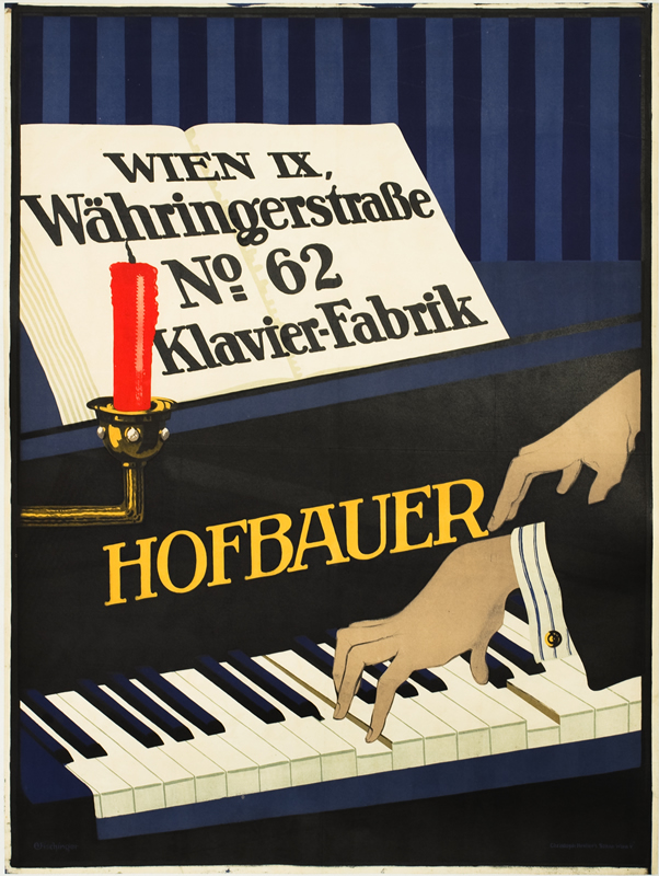
Fischinger, August Hofbauer Klavier- Fabrik, 1910 ca.
The strong red and the elegantly stretched hands make this design stand out among its peers of the day. The suspenseful composition struck me especially.
Artists such as Mucha and Cheret had abandoned poster design for painting and had cleared the way for the young Leonetto Cappiello (said to have been the father of modern advertising). He rejected the fussy feminine style of the previous movement and his work was often bizarre and humorous.
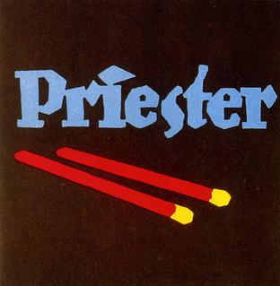
The Poster Style started by Bernhard further emphasized flat colours and abstracted visual language to achieve clean communicative designs. Though this style was to be quickly changed for the war effort in 1914. Posters became tools of propaganda.
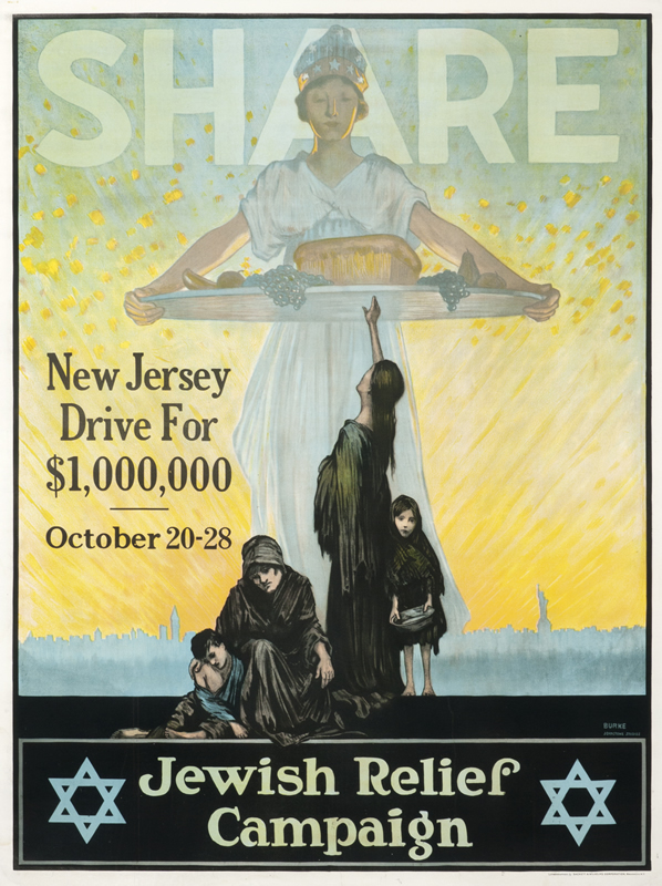
The combination of dark flat colours and the strong female figure tie together both Art Nouveau and the emerging Poster Style. The Art Nouveau resonated with me more than Early Modernism did due to the natural curves and the softness of the illustrations. The type feels more integrated and a part of the composition and even today, a female face in front of a magazine title is almost completely standard.