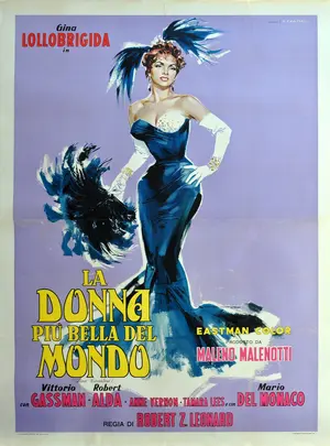
Renato Fratini was born in Civitavecchia, Italy in 1932. During his career, he worked at a couple different studio, he was the one turned Favalli brothers studio into one of the worlds’ most prolific producers of film posters. Fratini produced iconic American and Italian movie posters such as Invaders from Mars ( 1953), La Donna Piu Bella Del Mondo ( 1995) and The Sweet Smell of Success( 1957).

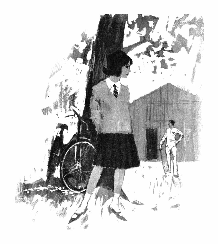
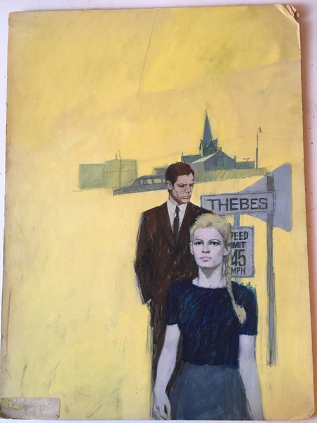
Fratini worked as a magazine illustrator for journals such as Homes and Garden, Woman’s Journal and Woman. He also worked for a number of London publishers, such as Coronet, Hodder, Corgi and Pan. He was commissioned by the legendary art director, Germano Facetti at Penguin to create new covers for the best selling romance novels. He also had a long- term cooperation with Eric Fulford on several film posters commissions. Pulford would specify the design, layout and graphics with Fratini distinctive illustrations style. There is a bold, graphic quality to his work that is very characteristic of Sixties art. Fratini’s illustrations would capture the essence of the film or book and in the process create unique artwork. Before artists like Fratini, film posters would often simply depict a scene from the film and be fairly formulaic. After Fratini, film poster illustration attempted to capture the essence of the film, establishing a visual style definitively associated with each film.

The narrative element of his work is also a reflection in his success as a comic strip artist, which continued throughout his career. In the late 1950s, he was commissioned work on a number of covers for the Sexton Blake comic and novel series. In 1965, he was also asked to work on Modesty Blaise, for King magazine, over four issues. Modesty Blaise, a long running British newspaper cartoon, followed the adventures of a fictional action heroine in her spoof spy-fi adventures.


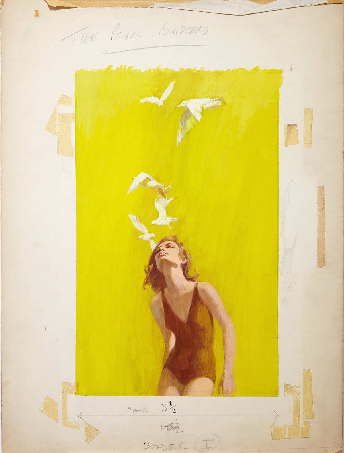
In addition to the strong narrative elements, Fratini artwork has an almost tangible sense of atmosphere, which helps explain his popular appeal. Fratini also experimented with mixed media to create contrast and texture which adds depth and. He would often create the background in acrylic and then use mixed acrylic inks over the top and finish with gouache.


