Survey#10 The second case of sex reassignment surgery


         Lili Ilse Elvenes ( 1882-1931) or Lili Elbe, was a Danish transgender woman and one of the first identifiable recipient of sex reassignment. Elbe originally named Einar Magnus and was a successful painter under that name.

Image result for Einar Magnus Andreas Wegener
photograph of Einar Magnus an
Einar Magnus Andreas Wegener ‘s painting

Elbe went to Germany for sex reassignment surgery which was quite risky at the time since she was the second transgender woman to undergo Gohrbandt’s vaginoplasty technique. A series of four operations were carried out four operations over a two year period. The first surgery was to remove the testicles which were under the supervision of sexologist Magnus Hirchfeld in Berlin and the rest of it were carried out by doctor Kurt Warnekros. The Second operation was to implant an ovary onto Lili’s abdominal musculature and the third was to remove the penis and the scrotum. The last surgery was to transplant a uterus and construct a vaginal canal.

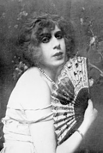
At the time of Elbe last operation, her story was all over the newspapers in Denmark and Germany. Unfortunately, her immune system rejected the transplanted uterus and she developed an infection. She died on September 13, 1931, three months after the surgery.

Source:https://en.wikipedia.org/wiki/Lili_Elbe

              Lecture summary: 

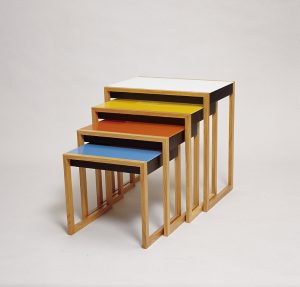
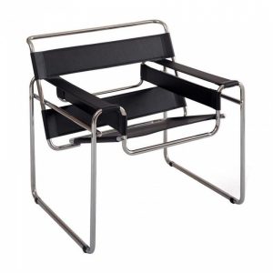
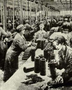
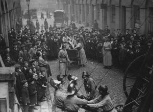
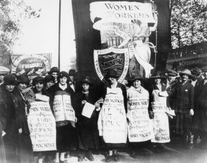
                   For this week lecture, we learn more what happened during the Second World War . Since Nazi came to power in German, bringing an end to the democracy established after WWI, many designer do not agree with Nazi idea so they came to America to continue their work. Designer like Jan Tschichold deisgnes paperbacks for Penguin books. Walter Paepcke founed the Container Corporation of America in Chicago. The U.S Works Progress Ad- ministration created jobs for artist produce approximately 2000 poster between 1936 and 1943. Also we were introduce to the Baby Brownie camera and Polaroid which I think is two great inventions.

Survey#9 IKEA inspiration


Bauhaus Nesting Tables Set

             Bauhaus is the house to some of the most iconic  furniture pieces  in the world . Their furniture designs are modern, minimum and practical which were loved by many people during their time and its still has a strong influence on 21st century furniture design as we can see the similarity between Bauhaus and IKEA appliance.

              Bauhaus furniture are simple, light and it do not have any additional decoration.  All designs was often made with practical material such as wood, metal, plastics and glass. Moreover, Bauhaus designers focus on what their costumer can benefit from their product, they avoid bulky and over decoration design and they also restrict their color palette to three primary colour: red, blue, yellow. Bauhaus aim to create beautiful object but they also want it to be availible to the mass public.

The Wassily Chair

           The famous Wassily Chair by Marcel Breuer is a great example of  a design that was able to deliver advances in material and technology. It was first created in 1926 which also opened the beginning of a new era in modern furniture that we are still familiar with nowadays. The chair design was inspired from the bicycle handlebar which explain its complex appearance but simple in construction.


1922: Peter Keler, Cradle.

            Another good example would be the Cradle by Peter Keler. The design has an angled form supported by large circles instead of rockers and it is painted with red, yellow and blue accents.

Source : https://study.com/academy/lesson/history-of-bauhaus-furniture.html

https://dengarden.com/interior-design/Bauhaus-Furniture

https://www.thecoolist.com/wassily-chair-by-marcel-breuer/

Lecture summary: German gradually recovered from WWI. Weimar Arts & Craft school and Weimar Art Academy merged and became the Das Staatliche Bauhaus which last from 1919 to 1933. The student in Bauhaus learn a fusion of art and crafts and  together they form their own distinct Bauhaus style. I am really into the Bauhaus movement how they were able to produce products that we can still use in the modern day, their typography is also interesting especially the Futura typeface . Their design are quite practical and way different from other movement in this current time.


Survey#8 Women power up during the great war

Everyone work to serve the great war


Factory female

                Before the war, a woman role is to stay home taking care of the kid and do the cooking. However, when the men go to war, with not enough people working, the woman began to go to work in offices, factories, shops, transport and on the farm. The young teenager in the city was forced to assist with harvesting in the countryside. There were more jobs than it used to such as working for munitions factories to sever the high demand for weapons. Even Though there was a variety of different opinion about the idea of women do man job, the introduction of conscription in 1916 made the need for women worker urgent. 

                  As a result, Women in that time was able to be a railway guard, ticket collector, poster worker or they can take part in the challenging job such as police, firefighter and back employee. The figure of woman’s employment rates increased significantly, from 23.6% in 1914 to 46.6% in 1918. Also, the employment of married woman also increased up to nearly 40% of all woman workers. However, they received lower wages compared to the man who started the movement of demanding for equal pay among female.

Women firefighters in action, 1916

                By the year 1917, the majority of the worker in multiple factories was women, and they produced approximately 80% of weapons and shells for the British Army. Unfortunately, women had to work without any protective clothing which leads them exposed to many chemical substances such as trinitrotoluene, and it made theirs since turn yellow. Not only these chemicals affect their appearance, but it also had a negative impact on their health, around 400 women died from overexposure to trinitrotoluene during the great war.

Women campaigning against the Unemployment Insurance Act in 1920

                     Lecture summary: During this particular period after the war ,we get to know about many art movements such as the Dada movement, Surrealist movement, and De Stijl. The Dada movement was lead by Tristan Tzara, a Romanian poet, and performance artist. The horror and cruelty of the were affect people actively, and some of them decided to go crazy with their art to mock society. The Data movement used their craziness in the art to help people heal from what they had gone through during the WW1. Besides the Data movement, people were introduced to readymade art by Marcel Duchamp which means writing your name on something and call it art. The Germany Data movement developed a technique of photomontage. The surrealist movement founded by Andre Breton aiming to tap into the ” superior reality” of the subconscious mind:” More real than the real world beyond the real”. Lastly, the De Stijl movement also aims to heal people from their trauma from the war like Data movement, but it approached a completely different method of rebuilding, creating harmonic order with the geometric shape and mathematical structure.

                Source : http://www.striking-women.org/module/women-and-work/world-war-i-1914-1918

               http://www.striking-women.org/module/women-and-work/inter-war-years-1918-1939

Survey#6 The art of Glass


Louis Comfort Tiffany, the man we think of whenever we see those colorful glass lamp in the white spot or our grandparent house. Tiffany is an iconic architecture figure during the Art Nouveau movement. His works included many things from stained glass to windows, lamps, glass mosaics, blown glass, ceramics, jewelry, enamels, and metalwork. He was the first Design Director at his family company, Tiffany&Co.

Autumn Landscape -Leaded Favrile glass

In 1885, Tiffany form his firm, he continued to take customer commission, and he also tried to develop his method of glass manufacture. After four years, he came up and registered a patent for opalescent window glass, a new formula of combining and manipulate colours to construct a unique range of hues and three- dimensional effects.

Louis’s design drawing

            One of Tiffany biggest inspiration is natural and luminous colour. He used colour that often associates with flowers and plants on his glass works. His passion with nature and glass making technique led to his invention of the second method of construct glass vases and bowls. In 1893, Tiffany introduced his first blown- glass vases and bowls which called ”Favrile” which quickly gained its international recognition due to its surface iridescence and fabulous colour.


Lamp Designed by Louis Comfort Tiffany (American, New York 1848–1933 New York)

Source: http://www.morsemuseum.org/louis-comfort-tiffany

              https://en.wikipedia.org/wiki/Louis_Comfort_Tiffany

Lecture summary:

This week we get to know more about the Art Nouveau Movement which happened in several places in the world. Art Nouveau was all about using of pattern and decoration, adding details from nature such as plants, flower, exotic animals and bird. During this time Mucha, a Czech illustrator who was influenced by Art Nouveau, he created a number of famous painting, illustrations, advertisement, postcards, and designs. We can also see Art Nouveau style in architecture, wallpaper and so on. Aubrey Beardsley in England was also famous for his Art Nouveau works and he was strongly influenced by the Japanese woodcuts. Moreover, we got to see some vital artist during this period such as Gustav Klimt ( Secessionist movement) and Egon Schiele. Finally, my favorite part in the lecture is the iconic sci-fi movie Journey to the moon which is a huge step forward in the movie industry.

Survey#7 20th century teakettle boy

Survey 7 research:

               Peter Behrens was a German architect and designer who have a significant role in his field from the 19th century to 20th century when it changed from decorative design to simple and functional design. He was known for some of his exclusive design for AEG including logo, poster and typeface. Further more, He taught three of the most influential modern designers: Ludwig Miles van der Rohe, Walter Gropius and Le Corbusier.


Peter Behrens portrait

                Peter Behrens was a principal designer of factories and office buildings in brick, steel and glass. In 1907, he and ten other people plus twelve companies created German Werkbund, an organization of artist, architects, designers, and industrialists which had a crucial role in the development of modern architecture. Moreover, in that same year, he was commissioned to design the entire visual identity of AEG.

The AEG building


Peter Behrens, Poster for Allgemeine Elektricitäts Gesellschaft (AEG), 1912

                     Before we were introduced to Peter Behrens’s tea kettle design, the 1890s version was not widely used due to its potential of electric hazardous and impractical. When his design appeared on the market, it had shown an outstanding improvement. He designed three version of the tea kettle ( oval, bulb-shaped, and octagonal). Each of them was available in three different surface finishes with the heating elements hidden inside and ebonised wood handle. However, the kettle was quite expensive and slow burner comparing to the routine kettle on a gas or wood burner, but it still dominates of the market because of the successful marketing. AEG used materials that were in high caliber and present-day styling created by the Germany modern architect which attract people interested.

Peter Behrens tea kettle design


 Source: https://www.khanacademy.org/humanities/art-1010/architecture-20c/a/peter-behrens-turbine-factory

                                      https://en.wikipedia.org/wiki/Peter_Behrens

                                      https://myassignmenthelp.com/free-samples/peter-behrens-                               electric-kettle-in-1909

                     Lecture summary: In this week survey, we get to know two important architecture of the century, Frank Lloyd Wright and Peter Behrens, the Munich Glaspalast exhibition, the development of advertising poster, the first contemporary automobile company in German and how the first colour photograph was introduced. In details, while Frank Lloyd Wright became a pioneering architecture in the US and opened his printer, Petter Baehrens designed the AEG factory in Berlin, and he also went one to create several logos exclusive for AEG. Further more, Like Lloyd Wright, Behrens was interested in book design and typeface design. During this time, the Munich Glaspalast Exhibition became famous for wildly colourful cabaret and theatre posters which shock all audience. Artists in the 20th century began to experience with lack of perspective, lack of realism and more abstract art. In America, the Armory show had changed how people think about modern art  and was seen as one of the most important exhibitions in the US

Surrey#5 Making something new!!!

                Nowadays, various kind of posters can be seen anywhere, from indoor promo graphics to large-sized billboard. Originally served as a method of governmental public notification, America’s poster from the past were so different from what we know in contemporary time.

               The earliest type of “artistic” posters in America were those used by travelling circuses to tell the people of their upcoming performance. A circus agent would come ahead to each town or village, spreading them around a few days before arrival of the circus. Those in the 1850s were made from wood veneer by hand drill and router, in the way of panto graph, usually portrayed the circus crow in bright colors with exaggerated wording. These posters worked extremely well to attract customers, but often ridiculed by critics of the same period.


Circus Posters & Performers 1890-1900 courtesy


                  From the 1880s onward, when lithographic became available for commercial use, poster from this method bloomed all over Europe, even boosted itself into the level of fine arts. The trend quickly catched up in America after a few years, with big contributions from Edward Penfield and William Bradley, whose style blended features of the British Arts and Crafts Movement, the Japanese block printing and the popular Art Nouveau. As the poster was produced by drawing with greasy color crayons onto a fine “mold” surface, the offsetting it to the paper, this method open opportunity for more beautiful typing detailed graphic.


Will Bradley poster for His Book

                 On the other hand, traditional posters with pure-text contents continued to grow with the help of typographic. Designed to be viewed from distance, broadsides-as their name at that time- had a few different type sizes, and type styles from one single piece.  Headlines or key details would have bigger typing and looked more attractive.

                  Lecture summary:  During this period, there are many interesting event happens. The lecture introduced us  to the beginning of the great exhibition and  its effect on people, the origin of Morris, Marshall, Faulkner and co, art and craft movement, poster ( specifically the French’s poster), part of the photography evolution and the father of the Eiffel towel . World fair opened people eyes to the future with technology and culture around the world. The art and craft movement developed in short amount of time with a significant improvement in creating exquisite items. I am especially interested with illustrated poster and I can see it had came a long way comparing to the previous poster. Artist still indicate lots of detains but they organized it to please the audience eyes.More over, they also tried to be more creative with typography which make poster looks way more interesting.

Survey#4 The beauty of Edo’s fashion

             Lecture summary :

This week we get to learn about how the design develops during the industrial revolution. The appearance of the modern front like Bodoni and Didot which commonly used in the fashion magazine ( Bazaar magazine). The increasing need for cheaper printing which leading to the jobbing printer and also the downfall of craftsmen. Wooden type was invented and became popular since it is cheaper and lighter to use. Moreover, we also see the first comic book which created as a newspaper supplement. I was interested in the Ukoyo-e woodblock print of Japan since it is so different compared to the Europe illustration style. The Japanese have their interpretation of using perspective, colours which make their artwork look fascinating. Moreover, I love how they simplify everything down to please the eye. To my knowledge, The Japanese art style strongly influenced European artists as we began to see some western artwork with Japanese’s clothing pattern and abstract details.


                                Woman fashion during the Edo period 

             *When we think about a costume we have to consider the undergarment first. 

             Many undergarments and accessories are required to wear kimono and in Japan the undergarment called hadajuban and it also known as ” asetori” (soak up sweat). There are two type of hadajuban, the first one is one- piece type and the second one is separate to two pieces. People tend to like the second type more but the first type also really popular among kimono beginner.

In order to feel more comfortable while wearing kimono, Japanese also have different hadajuban’s fabric for the four season. In the summer, people would likely to wear more breezy, breathable hadajuban and a warmer, heat-retaining  material during the winter

The two types of hadajuban

.* Accessories 

During the Edo period (1603-1868), fashion was significant for both women and men in Japan. Kimonos made from silk and brocade and to add more details to the entire outfit they would also wear Kanzashi ( woman hair ornament). Also, the creation of Kanzashi started from The Jomon period, but the real development of Kanzashi began during the Edo period with an enormous variety of styles and designs.


Kanzashi ( the back)
Women Ornament ( Kanzashi – the front )


Geta or Japanese footwear  gained its popularity during the Edo period as people started to wear it for fashion. As the result,the skill of making Geta improved and more stores started selling them in high number. We now have many types of Geta to choose from such as Ippon Geta, Tengu Geta, Okobo Geta, and the list goes on.

Kubo Shunman: Shrine girl( miko ) wearing high Geta and holding robe over her


 Kimono evolution rose significantly during the Edo period, and it reached its maturity that we can see in the modern day kimono’s design . The Kosode or kimono with smaller sleeves got popular during this period even though it was considered as a form of undergarment. However, city people began to wear it as a form of outwear. Kosode then created a trend within the society which adapted by all ages, genders, and classes.

.

Brocades of Fashion of the East, print, Edo Period, Japan


                  Different types of Kosode with a variety of colours and designs on the fabric were adopted in this period and citizen’s kosode style was based on their class. Notably, the design on the fabric of kosode was dramatically altered in the middle of the Edo period since the dyeing technique called ”Yûzen dyeing” was invented during the Edo period. People suddenly able to use as many colours as they wanted on the fabric. As a result, designers started to produced more Kosobe with a vast range of patterns.

Yuzen dyeing

    Edo native  began to feel a need to create their own style, having a real aesthetics of a real city person . Japanese in this period prefer wearing solid colour, small pattern prints and vertical stripe designs as their regular day clothing. Colours such as browns, grays and indigo blues were famous. However, they would also spend a massive amount of money on clothing with lining fabric, vivid colors and textiles. Since the then government banned people from using expensive fabrics for clothing, the Japanese felt the need to be more rebellious, so they did the exact opposite and found a way to get away with it. Japanese would wear the modest clothing outside and have all the refined details in their inner garment which no one else can see.

The Japanese during the Edo period
Women of the middle Edo Period wearing stylish wide obi. Print by Kiyonaga


Kosode with butterfly and a twisted flower, 17th century, Tie-dyeing (kanoko-shibori, nui-shime) and stenciled gold leaves (surihaku) on black figured silk satin (rinzu) ground.

Source:

http://japanese-kimono.net/what-is-hadajuban/

Geta

https://www.library.metro.tokyo.jp/portals/0/edo/tokyo_library/english/fashion/page2-1.html

Tokyo-Edo Fashion

Survey#3 Why Europe got so fascinated with Chinese’s pottery?

Blue and white glazed pottery (14th century – early 17th century )

              Getting to know pottery:

Blue and white pottery are often decorated with blue pigment (cobalt oxide), and then the maker would glaze it to protect the blue colour from fading. Pottery would typically be painted by hand with brush painting, but people also develop some other alternative methods such as stenciling or transfer printing to push the  production. The reason why cobalt pigment is so comment pottery decoration is that it can resist high temperatures during the firing process. For other colours, pottery would need over glaze decoration and a second firing at low temperature to preserve its pigment.


A Ming vase from the Yongle dynasty when the porcelain reached its most refined form.]

               Blue glazed pottery was originated in Iraq from the 14th century to replicate the colour of Lapis Lazuli (a type of deep blue expensive rock) after they learned how to make pottery from Chinese people. Decorating with cobalt blue became well known during the Yuan Dynasty and remained famous until now.  Furthermore, blue and white pottery became the mainstream pottery during the Ming area and reached its  peak during the time of Kangxi emperor of the Qing Dynasty. Also, during the 15th century,  Europe start to became interested in the beauty of pottery, and it then became the symbol of wealth to western people.

       So, what type of decorate style was developed from the 14th century to 17th century?

The evolution of blue and white pottery began during the beginning of the 14th century, and it gradually replaced the blush white ware pottery (Qingbai). The European came to China then got interested in these blue and white pottery and brought it into the international trade market. From the 14th to 15th century,  pottery would be decorated with flower or pattern; some would also add the dragon image ( representing power and wealth).

Early blue and white pottery from the first half of 14th century


               Going to the 16th century, we get to see the character of the Persian and Arabic script on pottery as   decoration which was influenced by the Islamic and Muslim

Blue and white pottery with Arabic and Persian script from the beginning of 15th century


                            During the 17th century, the Chinese began to produce pottery to export the European market. We start to see English, and Latin letter on blue and white pottery and the decorating style also got highly inspired by  Europe. People began to illustrate western scene or symbol on the pottery.

Blue and white export plate

                   Lecture summary : 

In this week lecture, we get to know more about the evolution of typography with Roman style with show a great progress comparing to want we learn last week. Roman style typography using thick line but still quite humanist. This time we also see the first book ever printed in English William Caxton and later on we also see the ” On the Revolutions of the Heavenly Spheres” which marking the beginning of the scientific revolution. In art, we see the Baroque art style with dramatic lighting and composition. One thing that I really like about this lecture is Baskerville typeface and punch cuter who pull of some impressive work.


\


Survey#2 How Mongol invaded over Europe

                 Genghis Khan, the leader of the Mongol empire leaved his throne to one of his son Ogeide Khan. Since then, Ogedei Khan decided to follow his father footstep, finishing his work of establish a world of empire. He then conquered the rest of Persia, Korea and witnessing the destruction of the Jinn dynasty. In the year 1235, he began to build a plan to invade Europe (Battle of Mohi). The entire conquest lasted for two decade long.

                 Shubuta was the one who in charge for the Mongol invasion. In order to secure his victory, Shubuta sent several spies around the central of Europe area. After having a clear vision of Europe and their army, he divided his soldiers in to three army which head to Poland, crossed the Carpathian Mountains and the Danube. The three armies then eliminate the opponent in a short amount of times, regroup and defeat Hungary at the Battle of Mohi in 1241.

     The invasion of Hungary

           In the beginning, the Hungary made their first mistake of defy the Mongol army since they did not acknowledge  how serious the situation is, some even expected that the royal army would handle everything. On top of that,  Mongol army was a real risk while Hungary was unprepared for the invasion after such a long time living in peace.

           The Mongol army used a strategy of attacking during the night time when the Hungary left their guard of. While  the king was able to escaped with the help of his bodyguard, his army was brutally killed.

          As a result, Mongol army killed up to half of the population and burn down most of the settles. Furthermore,    they even destroyed all record of cultural and economic.

Mongols defeat Christian knights at the battle of Liegnitz
Battle of Legnica
The invasion movement

            Lecture summary : This Wednesday lecture was a descriptive summary about printing and typography. We got to know the evolution of typography and a little bit about illustration in bibles from a long period of time. Furthermore, the lecture also included more information about the paper making process and how people know about it all over the world. I am personally really interested in all the example of old bibles especially ” the Book of hour ” which the designer had put a huge amount of detail to finish the entire book. I love the way they organized all the information in the book and making it interesting to the reader.


Survey#1 Egyptian architecture


Early temples aka everything are giantic and it is all about worshiping god.

Architecture of the ancient Egypt. Kom ombo Temple


  • History background of temples
  • The Egyptian built temples with the purpose to honor their pharaohs and worship their god by holding festivals and rituals during the ancient time. It is also a link to communicate between Egyptian and their god. The pharaoh also built temples( mortuary temples) which linked to their tomb in order to maintain their spiritual after they pass away.
  • The temple exact location usually chose base on religious reason such as mythical birthplace or to be use as monument for their god.
  • In order to separate the noble house of god and pharaohs with the mortal’s shelter, Egyptian used stone as the main material to build their temple. They used limestone or sandstone which was easier to carve compare to others type of stone.
The Valley of the Kings
  • Design and decoration
  • The Egyptian temple design during this specific time period tend to be symmetry and monumentality since it is such a spiritual place.
  • Relief and free-standing sculpture were the two main decorations in all temple. They covered walls, ceilings, columns, and beams with reliefs (bas relief or sunken relief) using fundamental colours to illustrate information such as festival calendars, myths and rituals depiction. It could be symbol or texts to tell others about all the rituals held in the temple.
Sunk relief
  • Sculptures often created in a large size of pharaoh’s figure and gods figured as figurative guardian of the place. The most common type of sculptured would be monumental sculpture which often made in pair to place in front of the pylons. A great example of these spectacular sculptures would be the status of Ramses the Great at the Great Temple of Abu Simbel which is 20-meter height.
The status of Ramses the Great at the Great Temple of Abu Simbel
  • Summary of week 3 lecture 

The lecture includes lots of information about how the ancient people developed their own way to communicate through times. At first, people from different parts of the world used a range of symbols(pictograph and ideograph ) to note important messages then gradually they created their own alphabet which we are now using in the modern world. I am especially interested in Egyptian’s symbol, how they were able to combine several symbols to note someone name. Moreover, I also amazed by how they organized all those symbols for the others to read.