Blogpost#10 Contemporary & Post Modernism

Related image
Ivan portrait

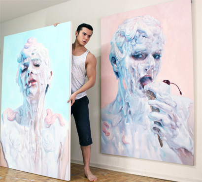
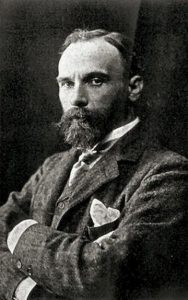
               Ivan Alifan Jdanov was born in 1989 in Russia. He graduated from the OCAD University in Toronto, Canada with a Bachelor in Fine Arts in Drawing and Painting. Recently he participates in the LA International art pair. He is famous for his process of hardening paint with wax and using cake icing tools to pipe paint onto his canvas.

Image result for ivan alifan
Ice cream sketch – I love his technique with the cake pipping tools and in some of his painting he made paint flower with the tools and sticked it to the canvas.

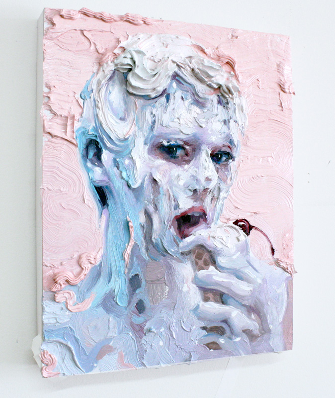
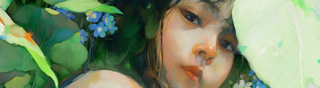
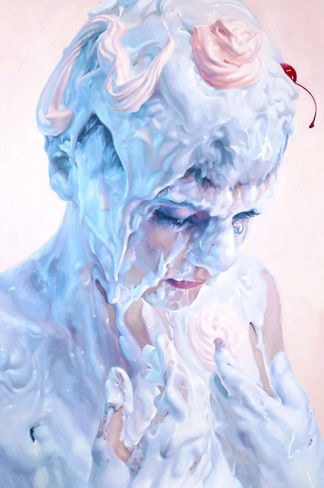
                 Ivan Alifan’s work often depicts human body to portrait the meanings of consumption about sexual taboos. He uses shocks tactics and provocative topic, where the erotic subtext is used to stroke the viewer and force them to examine their relationship to sexuality, questioning their prejudices about sex.  To be more specific, he would paint male of female heads, busts or bodies which are covered with dripping white- pastel liquid. He intentionally forms an exotic, explicit and even strange composition. Ivan’s palette consists of mostly turquoise and picks which resemble the baroque lavishness and decadent delight.

Meringue
Meringue

            Ivan said that:

             ” Art is beyond an image of perception and creativity. Art is part of the past present, future, where one can interpret their own view. Painting allows me as an artist to express my strengths or my vulnerability. Each brushstroke builds up a story, a life and, a passion.” 

            Ivan had always fascinated with the glossy surface of porcelain figures and marble statues. His current art style form during one time when he asked his friend to participate in a photo shoot where he would pour a bucket full of gesso over her. Ivan does not want to stick with the traditional brown painting method; he wants to represent the human flesh realistically to create images filled with sexual ambiguity.  Later on, he started to experiment with slime, milk-based creams and non-toxic paint.

Related image
The hand studyImage result for ivan alifan a study of hand

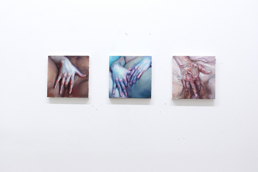
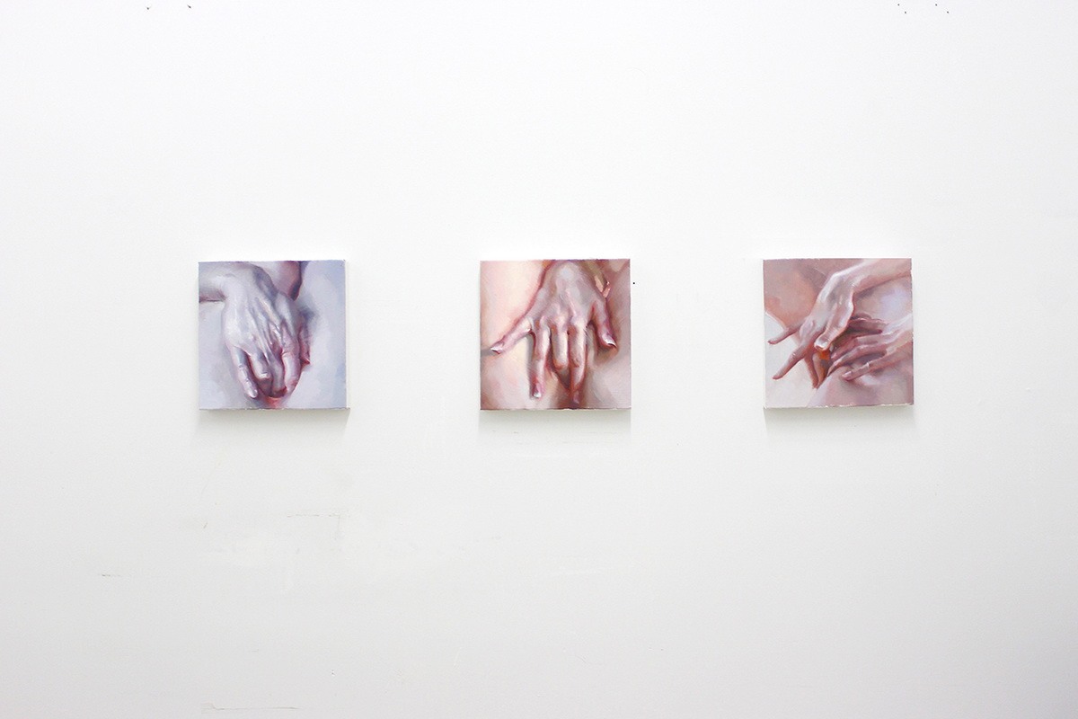
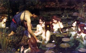
                  One of Ivan famous series is ”  The hand study” series which he aimed to portrait female intimacy. He did not portrait it as a sexual act but more like a moment of enlightenment, a pure bliss. Ivan wanted to accentuate the profundity of the female pleasure and self-awareness regardless of the omnipresent male gaze. This series of beautiful art hit you when you see it with fantastic work of illustrating delicate woman hand realistically. It might be the best hand paintings I have ever seen.

Image result for ivan alifan 2d love
2D Love – I think this painting is an accurate depiction of people with anime obsession, having an unhealthy life style . The way he handling paint looks phenomenal.

Source : I believe art is sex and sex is art’: Step into the dripping pastel world of Ivan Alifan.

                                    A study of Hands Like No Other, By Ivan Alifan.


Blogpost#9 Abtract Expressionism & Pop Art


                     Roy Lichtenstein pulled off his idea of irony comic illustration with one of his first popular art piece of Mickey Mouse and Donald Duck on a wooden jetty. Donald Duck raises his fishing rod and shouts out: ” Look Mickey, I’ve hooked a big one”. This painting somehow challenged  the Abstract Expressionism artists which was dominated American art during that time.

Look Mickey, I’ve hooked a big one

                    Lichtenstein was born in New York City, he showed his artistic really early. Lichtenstein drew, painted and sculpted as a teenager, and he also spent lots of his time in the American Museum of Natural History and the Museum of Modern Art. Later on, he spent sometimes in Europe but then returned home due to his father illness.

Wonder Woman Comic Art

                   Lichtenstein was identified with Pop art, he interested in industrial processes and mass consumerism. He form his career on creating simple works that appropriated from comic books, advertisements and pulp fiction, isolating, cropping and enlarging selected elements to form power-full composition. More over, he also imitate the crude printing processes of newspaper reproduction as you can see with the dots on his art works. Lichtenstein creates about more than 5000 painting, prints, drawings, sculptures, murals and other objects.

Drowning Girl (1963). On display at the Museum of Modern Art, New York

                 To be more specific, Lichtenstein’s works based on enlarged panels from comic books. Lichtenstein himself said ” I am nominally copying, but I am really restating the copied thing in other term. In doing that, the original acquires a totally different texture. It isn’t thick or thin brushstrokes, it’s dots and flat colours and unyielding lines”. He would took a tiny picture, smaller than the palm of the hand, printed in four colour inks on newsprint and blew it up to the conventional size and finished it by painting on canvas. He elevated comic art to something you would see in a gallery.

Ohhh…Alright…

                    His popularity reached it peak during the 1960s with Pop painting, he gravitated toward what he would refer as ” dumbest” or ” worst” visual item he could fins and then he would attempt to improve it. Paraphrasing, particularly the paraphrasing of despised images had become a unique trait ofLichtenstein art. People love his convention or permeated art, they called his works ” a purely American mythological subject matter”.

File:Bedroom at Arles.jpg
Lichtenstein’s Bedroom at Arles (1992)

          My comment on Liechtenstein’s art: His art really catch my eyes with the vibrant palette and interesting texture. Unlike the other, his creativity is about seeing a poetical image and elevate it. When I first look at his art, I immediately think about all those meme picture since his art tend to be zoom in to a girl face with emotional face expression.

Image result for Roy Lichtenstein meme

Source : https://lichtensteinfoundation.org/biography/

Blog post#8 Cubism, Dadaism, & Surrealism

Joan Miro

Joan Miro Ferra was a Spanish painter, sculptor, and ceramicist born in Barcelona. The Fundacio Joan Miro, a museum in Barcelona was built dedicated to his work and another named the Fundacio Pilar i Joan Miro was built with the same purpose in the city Palma de Mallorca .

           Miro was born in a family of a goldsmith and watchmaker. He started to draw since he was seven at a private school at Carrer del Regomir, a medieval mansion. He then continued to pursuit art at a fine art academy at La Llotja and had his first solo art show in 1918 at the Galeries Dalmau.During the year 1918 he began to focus more on line, form and structure and his composition became more direct, clear and often has little fine details.  .He was inspired by Fauve and Cubist exhibitions in Barcelona. Moreover Miro was also attracted to the Montparnasse arts community, he moved to Paris in 1920 for that reason, but later on he continued to spend his time in Catalonia. His early art style can be described as vivid and  brushy.

Joan Miró
Portrait of Enric Cristòfol Ricart
Winter or early spring 1917 I like what he did in the painting, the two object and the man looked seem to be painted with the different style but come together very nicely thanks to the green colour. I also like the heavy outline in the portrait, and the warm lighting on the shirt contrasts the dark colour on the man face.

Miro developed a distinctly symbolic language of simplified, biomorphic, or lifelike, forms. He was one of the artists contributed to give a visual definition to the young movement which influences the younger artist generation. He created over 250 illustrated book which is known as Livres d’ Artiste. He was among some of the first artists to develop automatic drawing which aiming to undo the earlier technique in painting and form new techniques. He and Andre Masson was the two major artist started the Surrealism art movement, but he chose not to become an official member of the Surrealist to avoid being forced to work with only one style. He wants to experiment with another style such as expressionism, lyrical abstraction and colour field painting as he, please.
                     Some of Miro works:
Jean Miro Dutch Interior II
I strangely into the composition in this painting and I also like the flat painting style .
Caress of a Bird (La Caresse d’un oiseau), 1967
Overall I find this painting is really funny looking. It can be a kid toy and I would buy it.
Women and Bird in the Moonlight (Femmes, oiseau au clair de lune), 1949. To be honest this look like something 5 year old me would draw with a bunch of smiley faces and cliche star symbol.

Source:https://en.wikipedia.org/wiki/Joan_Mir%C3%B3

https://www.artsy.net/article/artsy-editorial-joan-miro-pioneer-surrealism


Blog post#5 Pre impressionism & Pre Raphaelites

John William Waterhouse

JOHN William Waterhouse photograph

John William Waterhouse was an English painter of the Victorian era. His gain his popularity from series of large-scale Classical mythological subjects paintings. In 1970, He studied sculpture at the Royal Academy in London and then, later on, switched to painting. He was known for glowing colour, texture brush stroke, and visible surface. Like all other Pre Raphaelite artist, he had a strong passion for illustrating beautiful women portraits in a stunning outfit in the middle of some natural  English countryside scenes.


In The Peristyle 1874 – I really enjoy looking at this painting. The scene look natural, believable and it is a really interesting way to capture a ordinary scene. How he chose to pose the little girl feeds the bird makes the painting look somewhat like a photograph. More over, think that this painting has a really lovely color palette which many warm tones 

             Early in Waterhouse career, he was more like a Neo classical painter who would create painting of Greek and Roman scenes, as a result these painting would have the same subject, in some case it even have similar composition.


The Lady Of Shalott 1888

   Between 1890s and 1990s Waterhouse produced many works of the mythological and daily life scenes which was exhibited regularly at the Royal Academy. As a result, the academy made him as their associate member in 1885 and then a full Royal Acedemician in 1895.


Mariana In The South 1897
Boreas-1903– I like this woman expression and the way waterhouses illustrated her scarf. There are lots of texture in this painting which makes my eyes move around to really acknowledge all details. Because he painted this piece with mainly cool tone so the pink color on the girl cheek really pop out.

                           Waterhouse was really famous with his painting of ” The Lady Of Shalott”, he was inspired by the 1832 poem by Alfred about the the mysterious death of a beautiful woman death after looking directly at the Lancelot. He painted three different version of this poem. His series of painting about Ophelia before her death also gain its popularity but unfortunately Waterhouse did not get a chance to finish the series due to his cancer by 1915.


Waterhouse Hylas and the Nymph 1896 – the first thing I notice about this painting this the lavender highlight on the leaf which is really neat details. He put lots of effort to all these nymphs figure and they all look like fragile porcelain doll.

Source: http://linesandcolors.com/2006/04/01/john-william-waterhouse/

https://en.wikipedia.org/wiki/John_William_Waterhouse


Blog post#7 Expressionism, Fauvism,& early 20th century

Gustav Klimt

                    Gustav Klimt was an Austrian painter, and he was considered as one of the most outstanding members of the Vienna Secession movement. The female body is one of the most common subjects in his painting, and he also had some landscape piece. The Japanese art strongly influenced him, and it obviously showed through his artwork.

Gustav Klimt early year portrait

Gustav came from a low-income family of seven children which his father, a gold engraver can barely afford their living expense. Later on, at the age of 14,  Klimt went to the Vienna Kunstgewerbeschule, a school of applied arts and craft, where he studied architectural painting from 1876 to 1883. Klimt started his art career with painting interior murals and ceiling in the large public building including a successful series of ” Allegories and Emblems”. His talent quickly noticed, and in 1879 he forms an artist company with his brother and another student.

Klimt was known for his use of colour and pattern which strongly influenced by Japanese art, ancient Egypt and Byzantine Ravenna. His art is flat and stylized, often about woman figure or reigns supreme. His art is considered to be beautiful, luxurious and above all erotic. He created his version of a beautiful world through his art.

Danae – I saw this piece when I was in grade 8 and I immediately fall in love with the beauty of this piece. The woman in this painting look like she is sleeping peacefully in her own safety bubble which is a complete new way to approach the symbol Danae.


Bestand:Klimt – Kirche in Cassone – 1913


Portrait of Adele Bloch Bauer I (Luxury Line)

                             One of Klimt’s earliest drawing ” male nude waling facing right” show his skill as a painter with many great potential in his career.

Male Nude Walking Facing Right ( 1877-1879)

                       In Klimt studio, he kept girls available to him at all times by requesting them to wait for him in a room next door in case he decided to paint them. He would stand in silently in front of his easel, capturing the girl’s movement that appealed to his sense of beauty. To finalize his idea, Klimt would sketch the figure over and over. Sometimes there were over a hundred drawing for one painting, each showing different details. For the last ten years of Klimt life, he chose to use pattern, textile, and ornament to high light the erotic effect, emphasizing the nakedness of the body rather than cover it up. In my opinion, woman figure in his painting often look unreal, head and torsos are disintegrate, detach to their body. It looks like they might be trapped in a block which is decorated with textiles and ornaments. ( The Kiss and The Three Ages Of Woman)

                      Klimt himself made a statement about himself and his art:  “I am certain that there is nothing exceptional about me as a person. I am simply a painter who paints every day from morning till night. … I’m not much good at speaking and writing,especially when I have to discuss myself or my work. Just the idea of having to write a simple letter fills me with anguish. I am very much afraid that you will have to do without a portrait of me, either painted or in words, but that is no great loss. Whoever seeks to know me better, that is to say as an artist – and that’s the only thing worth knowing – should study my paintings and try to glean from them who I am and what I want.”


the three ages of Woman Gustav klimt 1905

Love Gustav Klimt- I like his approach for this painting with the background of gold paint and some with rose. To me the two figures look really peaceful and the blue color make it seem like they are sinking under the ocean.


The kiss 1907-1908 – This is one of my favorite piece from Gustav Klimt work. These two female and male figure looks so intimate as they had became one individual not two. The bright color of gold and the purple flower create a lovely atmosphere to this painting.

                          The kiss becomes one of Klimt best-known artwork. The art piece suggests a couple locked intimate space against gold, flat background. The pattern in the painting indicates the style of Art Nouveau and the form of the Art and Craft movement. The use of gold leaf is similar to medieval ” gold ground” painting, illuminated manuscript, earlier mosaics, the clothing pattern similar to the Bronze Age art and how he crop the art piece just right above the man head reflects the influence of Japanese print.

               Source: Gustav Klimt by Jane Rogoyska published 2005 Parkstone International

https://en.wikipedia.org/wiki/Gustav_Klimt

https://en.wikipedia.org/wiki/The_Kiss_(Klimt)

Blog post #6: Impressionism & Post Impressionism

Auguste Renoir

Auguste Renoir’s self portrait

                    Pierre Auguste Renoir or Auguste Renoir, in short, was leading French artist during the development of the Impressionist style . He was known with vibrant light and saturated colour in his paintings, and he often worked with the theme of female nude. Based on the characteristic of impressionist style, Renoir used brushwork and soft colours to blend his figures with other details. In addition,  He also was able to have the freedom to experience with his style which allow him to create some marvelous and unique painting.

The Theater Box, 1874, Courtauld Institute Galleries, London – I love his brush work and how he blur out the gentlemen’s face behind this lady. More over human expression in this piece looks really natural and the light source also looks believable.

           From 1881 to 1882, Renoir made several trips to Algeria, Italy, and Provence which created some significant influence on both his art and his life. He started to believe that all the previous Impressionistic technique was no longer suitable for him because using small brushstrokes with contrasting colours placed side by side did not allow him to paint the skin colour to his satisfaction. Moreover, he found out that the colour black prevents him from create a certain effect to his art works because it drowns other color and gives a intense mood to his art. He noticed that the color of shadows is not brown or black, it is the reflected color of the objects surrounding them.He began to use clear line to define a form, the expressive force of smooth painting when used to enhance the suppleness and modeling of a body.

The two sisters on the terrace, 1881
Dance at Le Moulin de la Galette’,1876 – I am amazed with the amount of details Renoir putted in to this piece of art. the entire scene looks natural and believable. It have this warm and positive atmosphere which I really enjoy to look at.

                    One of his best known early works is the ” Dance at Le Moulin de la Galette” piece which is also an excellent example of his method to depict the shadow. To be more specific, Renoir illustrated an open-air scene which packed with people at the Butte Montmartre, a famous dance garden near his house. We can see the Impressionist style with a real-life view, full of sparkling colours and light.


Young girls at the piano, 1892

                     Later year, under some influences Renoir change his art style again.To be more specific, He returned to using thinly brushed in some of his other art works and he also stared to paint more female nude.

 Example of Auguste Renoir works:

Nude in the Sun, 1875


La Grenouillère, 1868 – I really like his early art work especially this piece. He has this unique art style that can be mistaken with anyone else. I love the  bright color and loose brush strok in this painting.


the Luncheon of the Boating Party (1881)

Source: https://www.pierre-auguste-renoir.org/biography.html

https://en.wikipedia.org/wiki/Pierre-Auguste_Renoir


Blog post#5 Realism, Pre- Impressionism,&Pre-Raphaelites


                       Gabriel Charles Dante Rossetti or Dante Gabriel Rossetti was known as a British poet, illustrator, painter and translator. He was considered the most successful member of his family, the Rossetti family. Moreover, he was one of the founders of the Pre-Raphaelite Brotherhood, and he then became the main inspiration for the second generation of artists and writer influenced by the movement. 

Dante Gabriel Rossetti self portrait

In the beginning, Rossetti gained his popularity from his two portrait pieces of Maria as a young girl. These two art pieces were named ”Girlhood of Mary Virgin(1849)” and” Ecce Ancilla Domini( 1950)”. He highly inspired by the work of early Renaissance artists such as Botticelli and Fra Angelico, so he deiced to work with the Annunciation theme with his unique interpretation.  As Gombrich said in ” the story of art”, in the piece ” Ecce Ancilla Domini ” Rossetti want the audience to see the ancient story with a fresh mind. The piece illustrates the scene when Gabriel came to the Virgin and gave her a white lily. Rossetti successful painted the expression on the Virgin and her pose. The Virgin here look surprises and awkward since she was waking up from her sleep by an angel. Also, he also chose to paint this piece almost white and the three primary colours. Blue represents for heaven and it often associated with the Virgin. Red symbolized the blood of Christ.

The girlhood of Mary Virgin- I love how he took all the details in to consideration. It might looks not at natural at it should be but this piece have a really warm and peaceful atmosphere.However, the child here looks quite awkward so I would like it more if he change the child’s pose. 
Ecce Ancilla Domini! (The Annunciation) 1849-50- This piece looks amazing, He did a wonderful job at illustrate the angel by indicate the aura on his head and the yellow light under his feet which makes it look like he is floating.I think it would be better if Rossetti paid more attention in drawing their eyes which I think is a crucial part of most art piece.


Rossetti’s relationships with his models and muses including Elizabeth Siddal, Fanny Cornforth and Jane Morris had a significant effect on his works.

In 1850,he met Elizabeth, she became his muse, his pupil and his passion and they then married in 1860. We got to see a handful of Elizabeth portrait and one of the most well known portrait piece of her is the ‘‘ Venus Verticordia ”. 

           Venus Verticordia – I love the colour palette in this piece. He depicts her as the Venus Goddess which look tremendously breathtaking. The colour of the skin look really realistic and I love her face expression.        


During 1860, he got influence on the development of the European Symbolic movement. He started to stylize women in his artworks. He would portray his new lover Fanny Cornforth as the epitome of physical eroticism, and he would also illustrate Jane Burden, the wife of William Morris as glamorous as an ethereal goddess.

Lady Lilith based on Fanny Cornforth.
The Day Dream based on Jane Morris

Source: https://en.wikipedia.org/wiki/Dante_Gabriel_Rossetti

The story of art by E.H.Gombrich

Blog post #4 Neoclassicism, Romanticism, & Rococo

Sir Joshua Reynolds was an English painter specializing in portrait in the 18th century, and the first president of the Royal Academy of Art.
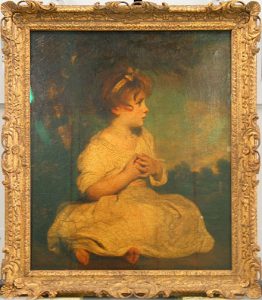
Beside creating large scale full body portrait, Reynolds also painted a large number of smaller works. During the late 1750s, in an average day he did about five to six portrait piece each for an hour. Moreover, he also did some other genre of drawing such as landscape and children portrait. To be more specific, his piece named the age of innocence was well known for emphasizing the child’s impression and her grace.


 the age of innocence -I love the use of colours in this piece of art which emphasize the innocent, and the adorable characteristic of the child.

Reynolds’s belief in art maybe somewhat boring to us, the modern people; but it had stood firmly in the neoclassicism period. He considered that an artist should carefully study and imitate the dignity of classic Italian masters; and the pieces that were worthy of the name of Art are only those that were grand and impressive, like those landscape painting that had even the smallest detail. However, his actual works were mainly portraits, the kind of painting that was always in high demand in England. Even though, with great elegance and gracefulness, his portraits still established a standard for its kind, that even painters of later generation wanted to reach. In one of his notable work, “Miss Bowles with her dog”, Reynolds brought out the impression of a sweet child and the affection between her and her little pet. Later, this way of setting up became a common concept among photographers, but it was quite original at his time, and cannot make light of due to imitation from the later time.

Miss Bowles with her dog- I love the child expression and how she hug the dog look so natural. However, I would love a brighter background which in this piece she look like she is sitting in the middle of nowhere in the wood at night.

For me personally, I can understand why he is so famous for his portrait pieces they all look so lively and the viewer can almost sense somewhat of the model’s personality. He putted lots of effort to illustrate human’s expression and  love how he painted  eyes in  all of his art work.

Cupid – I am especially adore this one art piece. Reynolds drew link boy as the cupid simply for his own pleasure. Cupid is a high god with somewhat powerful power but he had humanize this character to a poor boy that people would meet on the street. I love how he indicate small details to show this is a link boy: the background of London street, the boy cloth and the torch on his hand.


mrs Baldwin in eastern dress- I like the way he chose the colour palette for this piece and how he painted the woman face complete white which reminds me of the woman in Japanese art.


Blog post#3(Baroque)

          Frans Hals 

Franz Hals was a notable artist of the Baroque style in Holland during the seventeenth century. However, unlike some other, he had a financial unstable life. Franz started his career as a restorer of religious arts, then changed to portraiture when the market for religious theme started declining. Compare to the painting from previous decades, or even some of the same time, which felt like that the model had stayed for hours in a same neutral pose patiently; the portraits of Hals ware like camera snapshots that captured people “at a characteristic moment”, bringing emotional feeling into the canvas. This can be observed easily in many of his work, like “The Lute Player” in 1624, or “The Banquet of the Officers of the St George Militia Company in 1616”, a group portrait featuring a militia company at their diner hall. In addition, Hals’s portraits did not seem to be symmetrical as earlier ones often were. On the first glance, it could be perceived as a quick and easy-going approach; but actually, this impression could only be achieved through a very careful and calculated effort, to be able to keep the balance staying without following any visible rule. I personally love his new art style of simplify all the details, and using soft brush stroke. All these elements had made his work look natural and we can clearly  distinguished between a low class citizen and high class people in his works.


Firstly, I can see that he was able to replicate the dress texture in this piece. Moreover, by taking loose brush strokes he had made the human figures look soft and elegant which is what i really love about this art work.
I like the simple background of this piece, it has enough detail to create a natural scene and make the human figures look more outstanding. Furthermore, I love the white details on these man’s clothes which made them even look really powerful.
I love the colour palette in this piece. The way he used red in this piece made it look natural and lively. The way. However I feel like the gesture of the man here is a little bit inflexible and the hand is also a a little bit shot compare to normal human’ proportion.

Blog post#2(High Renaissance & Mannerism)

            Agnolo di Cosimo was an Italian painter who was create many breathtaking portraits during the High Renaissance period. Many people called him Bronzino due to his art style of adding dark complexion to the person in his portrait. Beside portrait painting, Agnolo also created several series of religious works such as The Resurrection of the Virgin Mary and The Martyrdom of San Lorenzo. For me personally, I think that Agnolo di Cosimo is a talented artist. For example, in the piece portrait of Bia de’ Medici he drew all the detail on the little girl’s dress so precisely, which gives the piece a three-dimension felling. However, he did not do a great job in capture the face expression because she looks sad and more mature than her real age. Moreover, I am not fond of the way he paints the eyes in some of his portraits, those figures in his piece look lifeless and dull. Overall, I can understand why Agnolo is so famous due to all his remain art works. It may have some errors in my opinion but he was able to achieve few things that others did not.

I love all the details he putted in to this piece. All the human figures look quite nature with their gestures and proportion`.
Again as I said, he got those details on her dress correctly but I do not like her face expression
I love how he drew the pose of this young boy and also how he drew the sculpture behind the boy