Oh boy did I have a lot of hiccup for this phrase? This was the first time I did a character turnaround so there was a lot of redraw and lots of tracing to keep the consistency throughout all five angles. I was lucky to have really quick feedback from Rhea to point out all my little mistakes like how some of the details were not aligned and keep paying attention to the clean line art
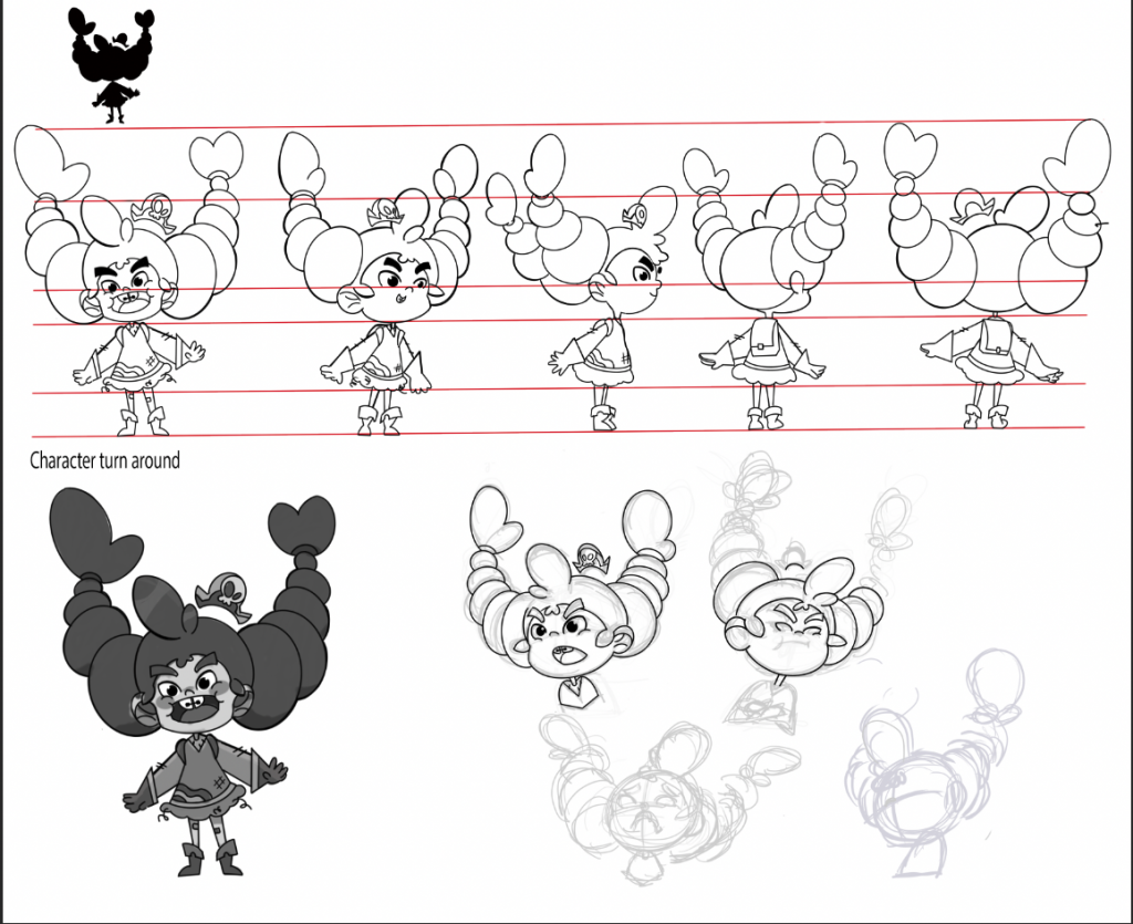
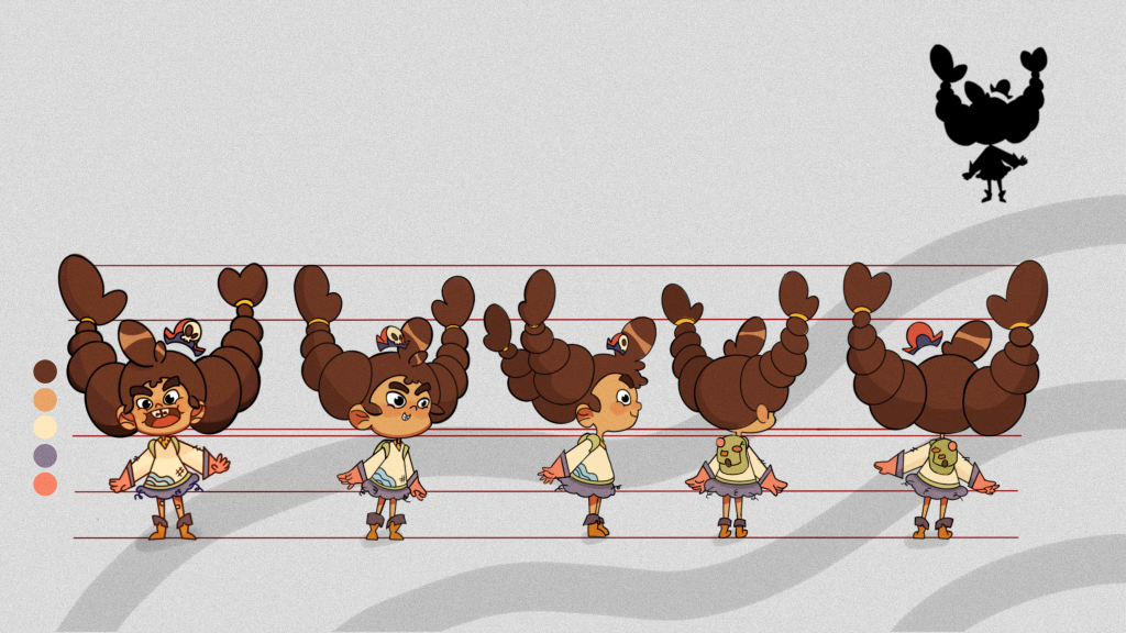
I was able to fix the height of where her ears are and fix all the hands to make it look correct anatomy-wise and also some fixing for the lighting to bring the character to life.
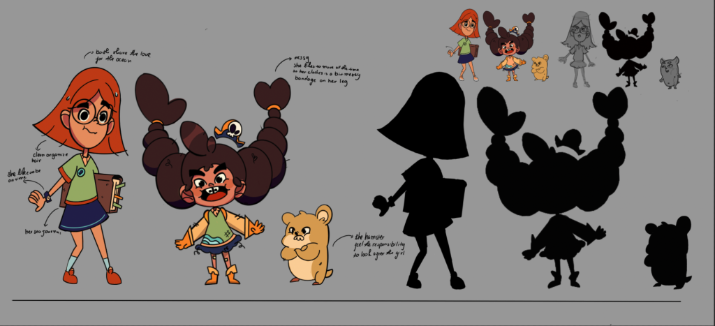
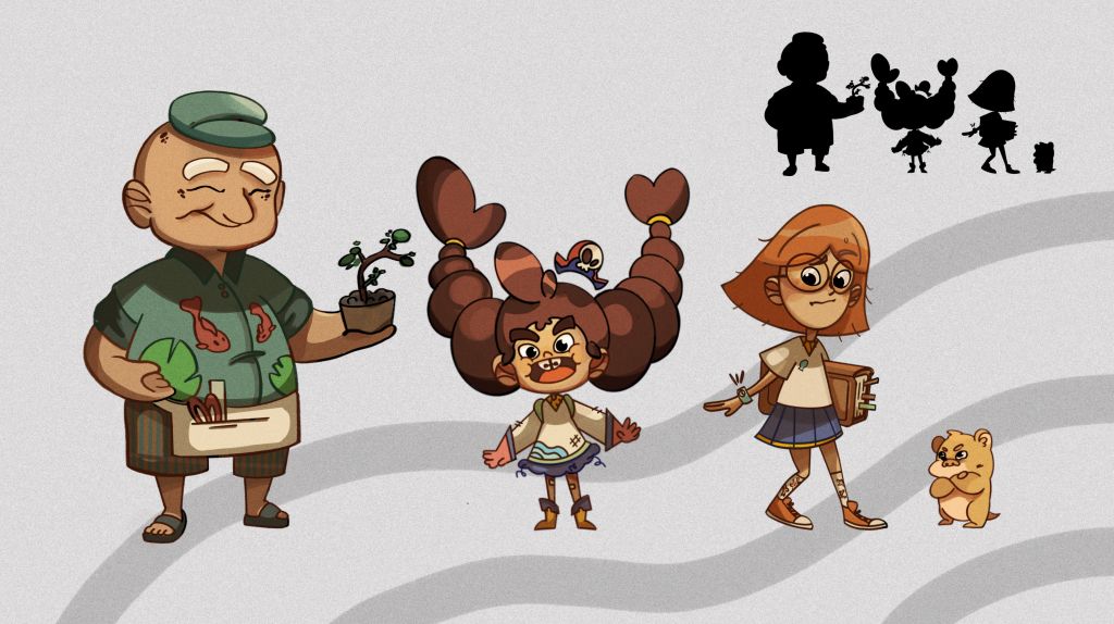
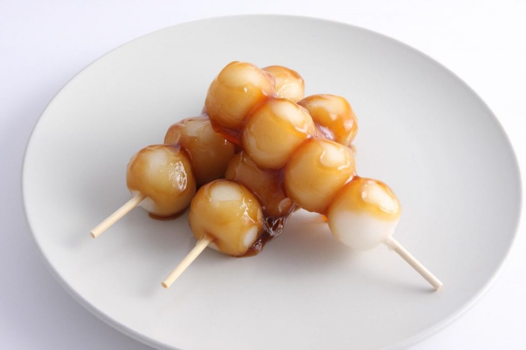
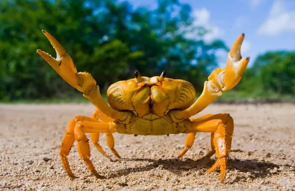
For the character lineup, I looked up some of my favourite movies like “Lilo and Stitch” and ” Bao” to learn how to express the character’s personalities through their pose and prop. All the characters have their own distinct personality. Niko is a rebellious child who refuses to stay still which is why her clothes are all thorn and messy. Her hairstyle was inspired by a Japanese dessert called Dango and the crab claw, sweet and mistrevious at the same time.
The first rough draft was too stiff with no lighting and just flat colour. Rhea gave me some suggestions on how to push the lighting to tell a story. I am really happy with how this lineup turned out.
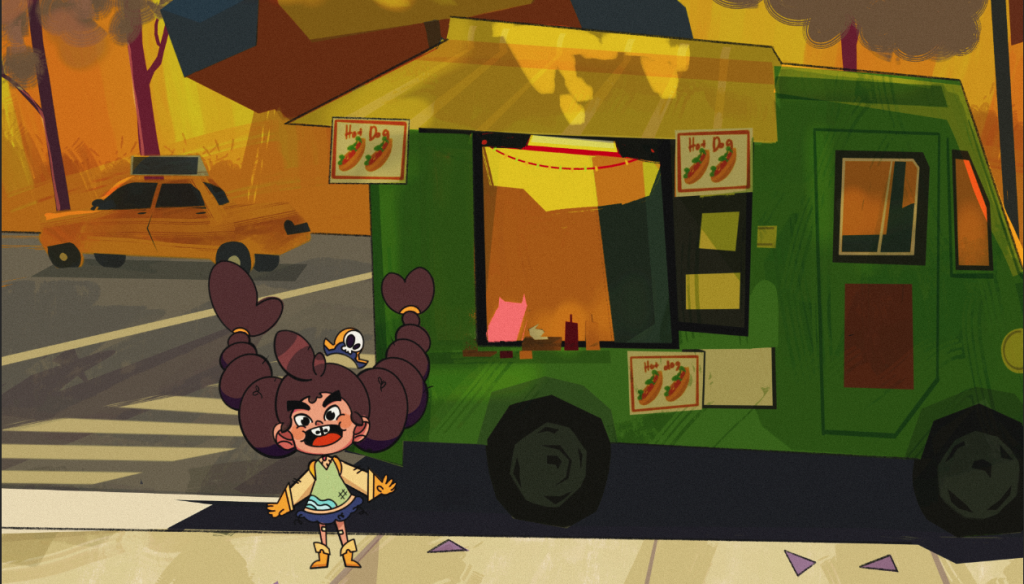
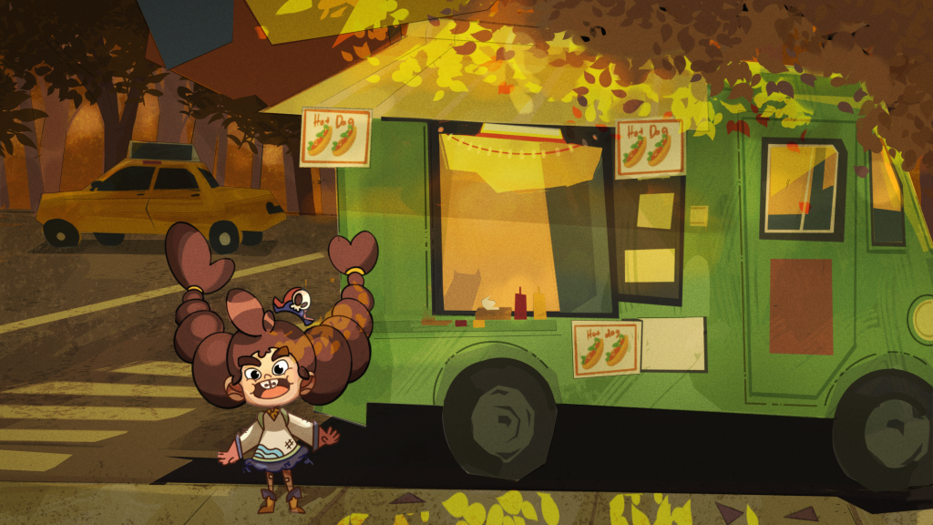
For this environment piece, it was tricky to show the depth from the foreground, middle ground and background. I want to showcase a drawing in ” the ghost and Molly McGhee” style with the vehicle which is a prop you often see in animation. After Rhea’s revision, I was able to add more realistic texture and highlights to make the background more believable.
There are some more revisions for the room layout that I’m looking forward to finishing it
It was really rewarding to push all my designs to a final look that is coherent and professional. I learn so much more about photoshop and how to use the tool to my own advantage. Overall I would give myself a 9/10
