GDC Campaign

For this assignment, we were tasked with providing the GDC with a means of attracting more students to their organization. As it stands, the GDC has much to offer for students, but it seems that students and young adults aren’t aware of the GDC and their resources or they simply don’t care. Our group chose to solve this issue with a guerrilla campaign that would not only educate students about the GDC, but create a fun and memorable experience that could be looked forward to.

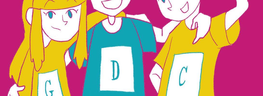
Our group proposed the idea of a GDC “spirit week” that could take place twice per semester as a means of informing students about recent GDC and design news. In order to make the experience more memorable, games would be played during breaks in between GDC lectures and talks. The games would be alternate versions of ones that already exist, but themed so that they can incorporate design themes and terms. Because the games are based on preexisting ones, they’re easily played without any complicated rules. Students can win prizes for winning and participating in these games, and the student ambassador could also collect the student’s names and enter them in a draw for a chance to win a grand prize.

Because this event celebrates design fundamentals, we decided to go with a “flashback” theme. Our moodboard was inspired by 80s and 90s retro design; the look of the event is fun, retro and energetic. Social media posts will be designed in this style to create a consistent feel leading up to the event. The games themselves will be appropriate for classroom participation and will be quick, easy and won’t interrupt class time. The GDC classroom ambassador would be responsible for gathering and distributing the appropriate materials (games are available as simple PDF print-outs).

We decided on games because they’re a fun, interactive and engaging way of making the GDC more memorable and present within classrooms. Rather than just having lectures and info sessions, games and a bigger social media presence would benefit the GDC and help them better connect with students. The aesthetic we chose is trendy and fun, but it doesn’t take itself too seriously, which makes the GDC seem more approachable to students.

Our group collaborated very well and we all had valuable input. We had regular check-ins and made sure to have everything done on time so that we weren’t holding each other back. Overall, I am pleased with the amount and quality of work that we were able to accomplish as a group and we had a lot of fun doing this project! In terms of group cooperation and distribution of work, I’d happily give our group a 10/10!

In terms of my own personal work on the assignment, I contributed to the ideation, game creation and copywriting for the project and final presentation. I feel like the work was evenly distributed and we all finished it in a timely manner with very few hiccups in between.

Reconciliation Social Campaign: Cultural Appropriation

For this assignment, we were tasked with making a self-directed design solution around the topic of reconciling with the First Nations peoples of Canada. It’s a topic that I’ve always held close to my heart, though have always been reluctant to approach out of fear of appropriation/offending others. It was important to me to handle this subject with care, and so I chose to focus on the topic of Cultural Appropriation so that I was less likely to misinterpret or misuse something from indigenous cultures. As a privileged white Canadian, I thought it best to educate other privileged white people on how they can be allies to indigenous groups.

In my research, I was startled to find that most attendees of festivals who wear appropriated clothing don’t actually realize what they’re doing, or they’re simply ignorant about the issues and do not care. A lack of education on appropriation as well as the normalization of appropriated “costumes” (through halloween, cultural events, etc.) have blurred the lines for festival goers. My goal was to challenge the decisions of these people and make them question why they chose to wear what they did in the first place. It’s intended to shame the wearer, and rightfully so because appropriation in itself is offensive and shameful towards the cultures that are being stolen from.

Because of this, my deliverables had to be easily accessed and forced onto the attendees. Social media is easily ignored, so if you deliver something along with the tickets, they’re forced to acknowledge it before the festival even starts. I chose to create a zine to be delivered with the tickets as well as a poster series that would be displayed at the festival itself. The tone and imagery are colourful and jarring, and intended to make the viewer uncomfortable with their decision-—much like how indigenous people and people of colour are faced with discomfort caused by appropriation.

The challenges that I faced, especially after meeting with the Indigenous studies class at Capilano University, were that I was afraid of crossing the line of appropriation myself. I had to choose my imagery very careful and I made sure to collect images of First Nations people that would’ve actually lived in the area that the festival takes place in—The Kutenai and Sinixt people. I was dissatisfied with my original design and restarted the posters from scratch after receiving helpful advice from the Indigenous studies class. Overall, I’m much happier with my designs now than I was at the beginning and I feel I’m successfully portrayed the tone and message while also maintaining respect for the First Nations referenced in my campaign.

Considering the amount of revisions I had to take in order to get to a place where I felt comfortable presenting, I feel very satisfied with my work. In the future, if I get the opportunity, I’d love to expand on my Zine concept and fill in the rest of the pages that I didn’t have time to create.

For this project, I’d give myself a solid 8.5/10.

Personal Resume

For my resume, I chose to cater it towards video game companies like EA. A goal of mine is to work in the gaming industry at some point in my life, so I thought it would be fun to base this resume on that! I chose a pixelated, retro aesthetic because I find it pairs well with the gaming industry, as well it captures my “geeky” personality.

Because I have a lot of work experience, I tried to be as succinct as possible so it wasn’t too text heavy. I thought I did a good job of balancing the space that I had available, while also adequately detailing my work experience.

Overall, I’m fairly happy with the result, but there is obviously some room for improvement. I would give myself a 7.5/10.

Sustainability Manifesto

For my Sustainability Manifesto, I took into consideration a theme that I believe is fundamental in sustainable design: transparency. We’re so often swayed by attractive design and aesthetics that we often forget to consider how sustainable a product or service may truly be. A foundation in truth is required to gain trust, and when paired with tasteful aesthetics, can help the product or service to succeed.

For my poster, I kept things minimal, writing included. I tried to be succinct with my beliefs, as my goal was to get the point across as simply as possible. Since my theme was transparency, it was an obvious choice to include transparency effects in my design. The Monstera leaf ties to the environmental sustainability, and it’s overlayed with the type to create a unique effect.

Overall, I would give myself an 8/10. I believe I got the point across, but more tweaking of the overall composition might help with getting the message across.

No references were used, as I chose to write the manifesto based on my personal beliefs.