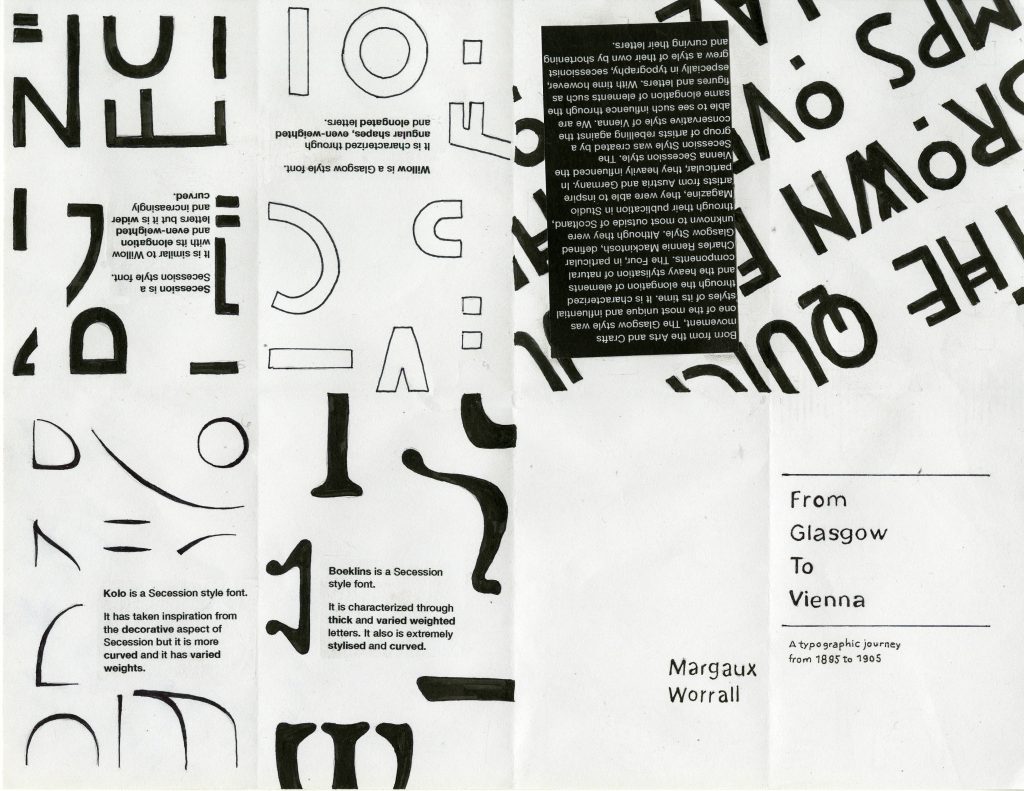
Alexa Meade
With Performance art on the rise, new and upcoming artists found interest in exploring new mediums and new canvases. One particular segment of performance art grew very popular; body art. The human body was seen as the ideal extreme canvas as a way to create a “configuration between artist & audience, producing a startling new way to experience art” (Body Art Movement Overview)
However, as performance arts became less credible, and perceived more as a gimmick of self-expression, body art’s reputation came down with it. Many know it now as a simple practice used during birthday parties or sporting events. Alexa Meade, in spite of pursuing body paint, has been able to make a name for herself, and for her medium in the world of fine arts.
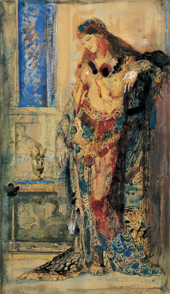
Born on the 3rd of September 1986, at the ripe age of 33, Alexa has had many exploits and has been able to reinvent the art genre of body paint. When you take one look at her art, you might be tempted to believe that it is an abstract figurative painting (fig.1). Take a second look, and you might realize that her “paintings” are only but an illusion created on both a live model and the surroundings (fig.2).


Meade has really owned an ability to create the perfect illusion, taking in consideration the light, shadow and background. Her artwork, blueprint (2010), is the perfect representation of her perfected technique that incorporates both deep knowledge of body painting and fine art.

It is her acquisition of both techniques, that she is able to merge ‘serious’/’fine art’ with body painting thus allowing her to be recognized not as a body painter, but as an artist. Her work had led her to collaborate with companies such as Mercedes Benz (fig.4), Toyota (fig.5), Buick (fig.6), Mini Cooper (fig.7) and most recently has been able to partake in the music video of star sensation Ariana Grande’s God is a woman.
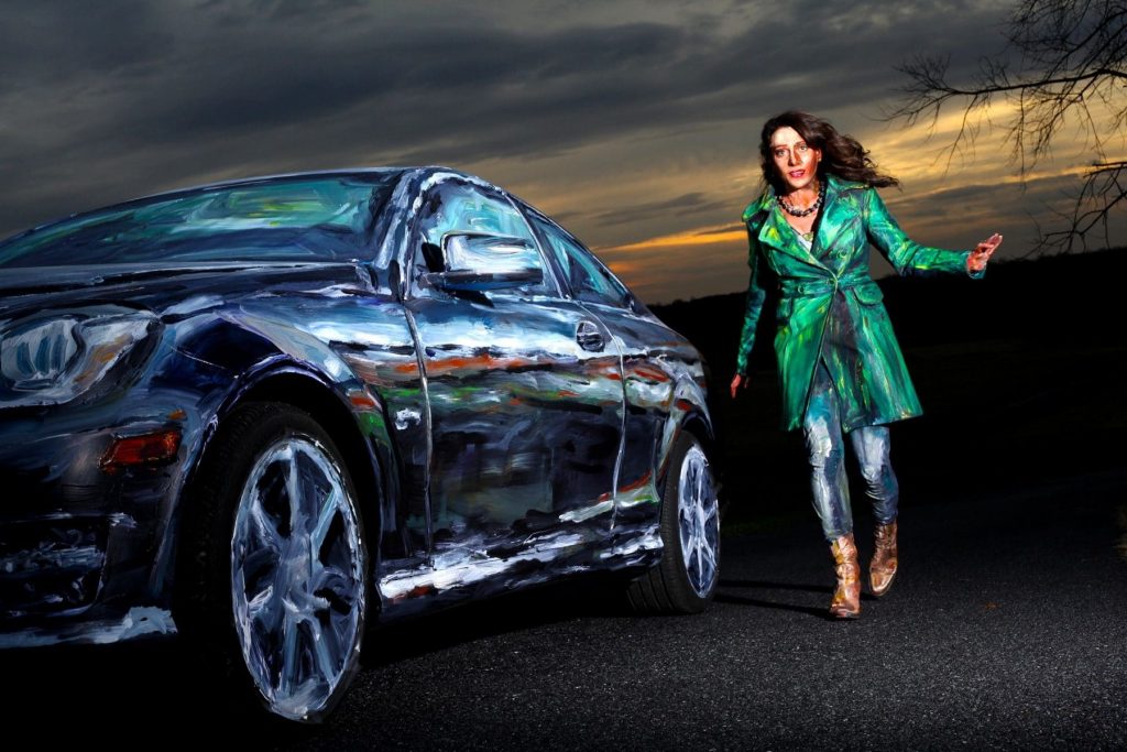
Fig.4 Mercedes Benz (2011) 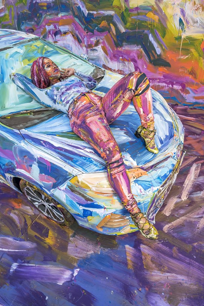
Fig.5 Toyota (2016) 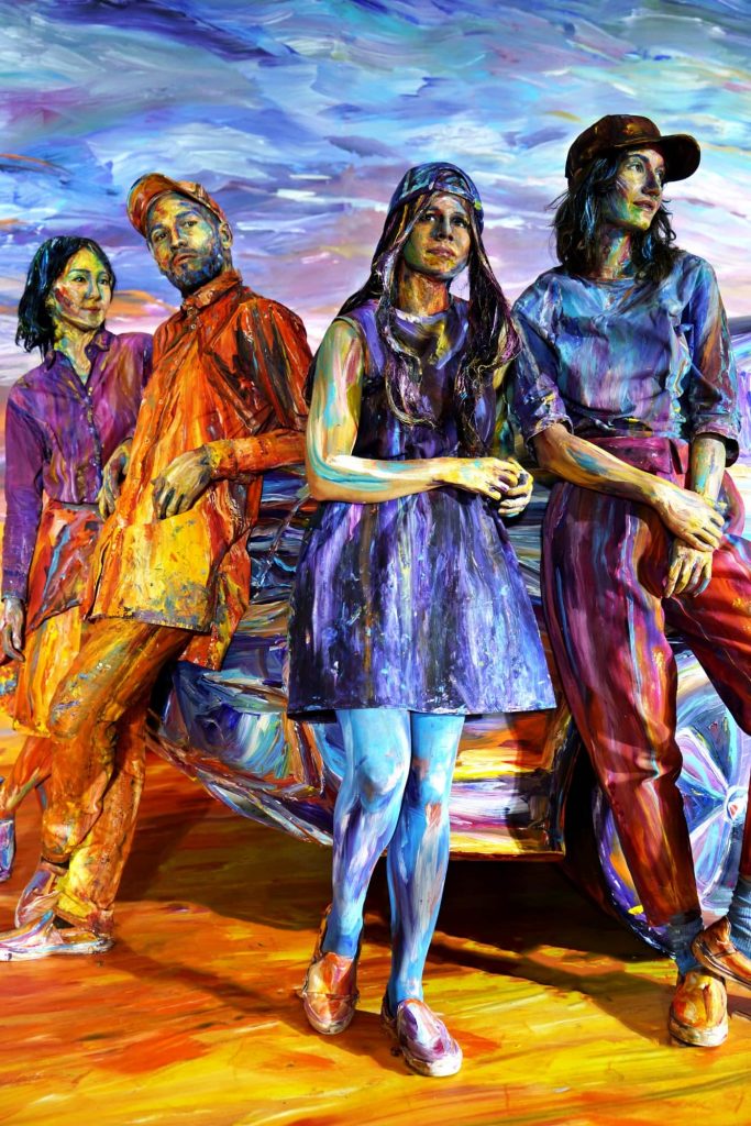
Fig.6 Buick (2017) 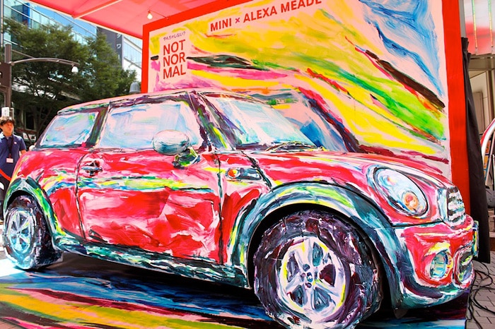
Fig. 7 Mini Cooper (2013)
Work Cited:
“Alexa Meade Art.” Alexa Meade Art, alexameade.com/.
“Alexa Meade.” Concept Artists, conceptartists.com/artist/alexa-meade-speaker/.
“Alexa Meade.” Wikipedia, Wikimedia Foundation, 7 Sept. 2019, en.wikipedia.org/wiki/Alexa_Meade.
“Body Art Movement Overview.” The Art Story, www.theartstory.org/movement/body-art/.
“Hypnotic, Perspective-Bending Body Art Film Brings Painted Portraits to Life.” Designboom, 12 Jan. 2017, www.designboom.com/art/alexa-meade-color-of-reality-body-painting-film-jon-boogz-lil-buck-01-12-2017/.
Images:
Fig.1 “Risen”. Alexa Meade Art, alexameade.com/.
Fig.2 “Behind the scenes of Risen”. Alexa Meade Art, alexameade.com/.
Fig.3 “Blueprint”. Alexa Meade Art, alexameade.com/.
Fig.4 “Coup D`Etat – Mercedes-Benz, 2011”. Alexa Meade Art, alexameade.com/.
Fig.5 “Rosa – Toyota, 2016”. Alexa Meade Art, alexameade.com/.
Fig.6 “Sunset Pack – Buick, 2017”. Alexa Meade Art, alexameade.com/.
Fig.7 “Mini Cooper Car – Mini Cooper”. Alexa Meade Art, alexameade.com/.