Lecture Summary: Today’s lecture was about the discoveries people made back in 15th – 18th centuries. There was a great number of changes- cultural, scientific, communicational – all happened within a relatively short period of time. One of the reasons for such drastic rate of development was the birth of humanism. Humanists were people that did not believe everything that the Bible and the Church were telling them. They looked for scientific and logical explanations for everything that surrounded them. Such passion for science led to scientists writing more books to pass on their knowledge to the generations to come. That, of course, inspired those of creative mind to develop new fonts and ways to illustrate and brighten up what was written on the pages of dry textbooks.
DESIGN & ILLUSTRATIONS
During the 15th century printing evolved from hand-printed fabrics to the production of books. The term incunable is used to refer to all books printed with metal type from the beginning of Gutenberg’s movable type printing press, around 1455, to the end of 1500. Most of the incunabula had very detailed illustrations that supported the message of the books. However, only the wealthiest people could afford to buy or print their own books. People of average income had block books instead, that had handmade watercolour illustrations.

TYPOGRAPHY
In the 1400’s books were made using handwritten Gothic style, until Gutenberg’s first carved typeface was developed. His font was based on the hand-lettered Gothic style, the technique, however, was completely different. After the movable type printing became popular across Europe, more fonts were created, most of which are still used to this day.
GEOFFROY TORY
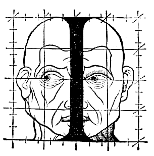
He was a French humanist and an engraver, best known for adding accents on letters in French. In Champ-fleury, auquel est contenu l’art et science de la vraie proportion des lettres antiques selon le corps et visage humain (Gilles de Gourmond, Paris, 1529), Geoffroy Tory compared the proportions in letters to proportions in the human body. In his book, Tory talks about Roman capitals and criticizes Durer’s work.

ROBERT GRANJON
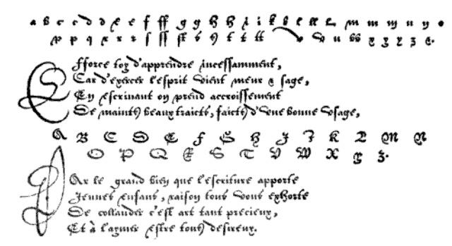
Robert Granjon was a French type designer and printer. He is best known for introducing the typeface Civilité and for his italic type form, the design of which in modern days is used in Garamond Italic. He started his career as a punch cutter which was a craft used in traditional typography to cut letter punches in steel as the first stage of making metal type. During his lifetime Granjon created 9 typefaces and a set of musical symbols. Whilst working as a punch cutter, Granjon designed c. 50 different alphabets, for which he cut c. 6,000 punches.

sources:
https://stjohnscollegelibrary.wordpress.com/2016/06/01/do-we-need-pictures-illustration-of-the-earliest-printed-books/
https://blog.spoongraphics.co.uk/articles/a-history-of-typeface-styles-type-classification
http://luc.devroye.org/fonts-32678.html