2000-Present: Noma Bar

Noma Bar (born in 1973) is an Israel-born graphic designer, illustrator and artist. His work has appeared in many media publications including: Time Out London, BBC, Random House, The Observer, The Economist and Wallpaper*. Bar has illustrated over one hundred magazine covers, published over 550 illustrations and released three books of his work: Guess Who – The Many Faces of Noma Bar in 2008, Negative Space in 2009 and Bittersweet 2017, a 680 page 5 volume monograph produced in a Limited Edition of 1000 published by Thames & Hudson.

Noma Bar at his studio

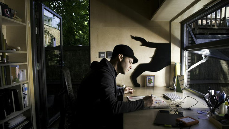
Noma Bar is a highly prolific artist whose graphic works are celebrated for their impact and simplicity. Each of his ideas are first drawn in a sketchbook and then transferred to the screen where he works on them digitally to come up with the final conceptualised solution.

Gun Crime

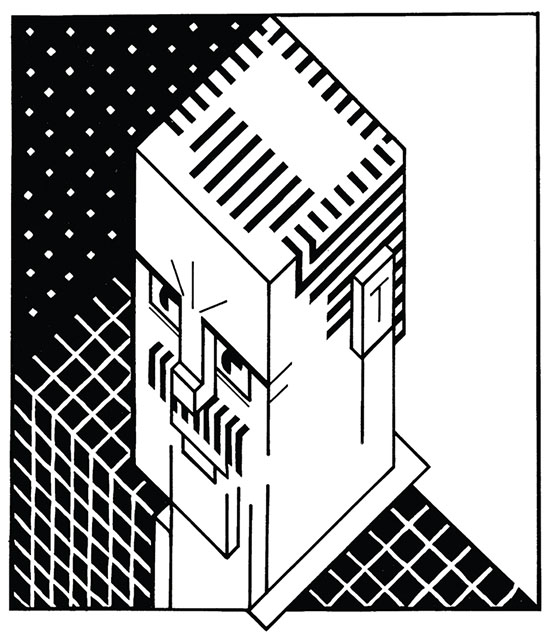
 The dual strategies of his practice are efficiency and humour, and these come from a deep understanding of how the brain percieves and understands imagery.

If Turkey Explodes

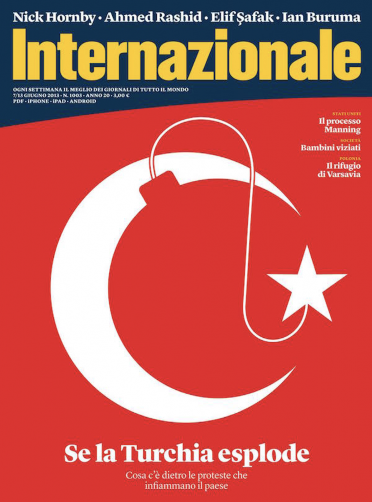
With a limited pallet he subtlety and precisely manipulates shape and form where familiar symbols and pictograms evolve to form new meaning. Negative and positive spaces tessellate creating several images in one, and sometimes a few moments are needed to see the embedded, often poignant, message.

Fashion Loves Art
Mad Men

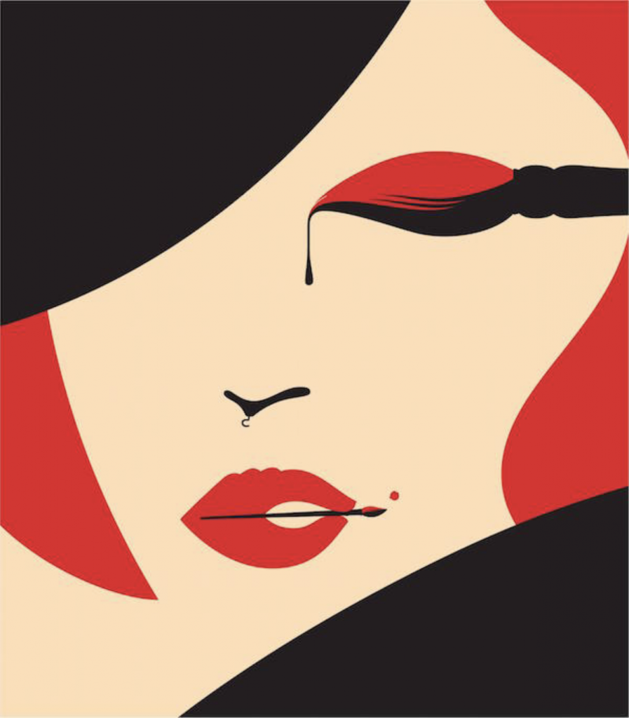
I enjoy Noma Bar’s work because unlike a lot of other illustrators, his works makes the viewer think. And when you realize what a piece is really about, it gives you a kind of satisfaction – as if you’ve just solved a rebus. His work is also very appealing visually because of clean shapes and limited colours.

Bad Hangover

Sources

https://www.dutchuncle.co.uk/noma-bar

http://www.eyestorm.com/Pages/Browse.aspx/Artist/Noma_Bar/49

https://digitalsynopsis.com/design/negative-space-art-illustrations-noma-bar/
2000-Present: Noma Bar

1990-2000 New Forms: Chris Ware

Franklin Christenson “Chris” Ware is an American cartoonist known for his Acme Novelty Library series and the graphic novels Jimmy Corrigan, the Smartest Kid on Earth and Building Stories. His works explore themes of social isolation, emotional torment and depression. He tends to use a vivid color palette and realistic, meticulous detail.

Chris Ware

Chris Ware was born in Omaha, Nebraska in 1967. Known for his New Yorkermagazine covers, he’s hailed as a master of the comic art form. Ware’s complex graphic novels tell stories about people in suburban Midwestern neighborhoods, poignantly reflecting on the role memory plays in constructing identity.

One of Chris Ware’s New Yorker magazine covers

Although his precise, geometrical layouts may appear to some to be computer-generated, Ware works almost exclusively with manual drawing tools such as paper and ink, rulers and T-squares. He does, however, sometimes use photocopies and transparencies, and he employs a computer to color his strips.

Illustration from “Building Stories”

The organizing principle of “Building Stories” is architecture, and — even more than he usually does — Ware renders places and events alike as architectural diagrams. He’s certain of every detail of these rooms, and tends to splay their furnishings out diagonally to show how they fit together.

from “Building Stories”

Ware’s daughter Clara was born in 2005. “It changed my life,” he says. “It gave my life a middle point that it hadn’t had before. Now everything is either before her or after her.”

Chip Kidd saw the difference. “I think the major thing that has changed him—and this is a large part of what ‘Building Stories’ is about—is having a child. From what I’ve seen, it really seemed to ground him. He’s a great dad, and a work-at-home dad, and I think it really did help him get a better view of the world, and of life. There’s just a lot less of the despair.”

Chris Ware and his daughter Clara riding a tandem bicycle through their neighborhood in Oak Park, Illinois 2015

Sources

https://www.1843magazine.com/content/features/simon-willis/chris-ware

https://www.drawnandquarterly.com/author/chris-ware

https://art21.org/artist/chris-ware/

http://www.barclayagency.com/site/speaker/chris-ware

1990-2000 New Forms: Chris Ware

1980-1990 New Voices: Vivienne Flesher

Vivienne Flesher creates a brilliant array of multi-textural illustrations and artwork, fusing a classic approach to technique and materials with a smart, modern visual sensibility. She is a frequent contributor to magazines and newspapers, especially The New York Times, and has illustrated an extraordinary series of book covers, many of them featuring powerful and graceful portraits. Flesher works is a wide variety of styles, using charcoal, inks, paint, and collage. In addition to her elegant illustration work, Flesher has created an eye-popping collection of psychedelic personal art that is astonishing in its layered graphics sophistication.

Poster

“I’d always appreciated the psychedelic-inspired photos Richard Avedon took of the Beatles, and they became the inspiration for some work I did combining my photography and the computer. I sent samples to three art directors I thought might use them, but only one responded: Kelly Doe of The New York Times. She was working on a personal project—a show mounted by the Japanese government. Kelly has often given me the chance to do experimental projects. She can see where I might take something even though I have little in my portfolio to prove it.”

Japan!The Kennedy Center for the Performing Arts

Vivienne does not believe in “staying current”. In on of her interviews she said that trying to stay current seems futile, like having plastic surgery to stay young—it never looks natural. We can’t help but be products of our time. 

New YearN Y Times

She uses a lot of vibrant colours in her work which is what attracts me the most. Although the works might seem like ordinary psychedelic posters, to me, they look way more clean and organized than the ones from the 60s. It might be because Flesher has access to current technology, but it also takes good sense of space and tension to create beautiful pieces like these.

Gallery Exhibit Stir Gallery, Shanghai. China
Japan! The Kennedy Center for the Performing Arts

Sources

https://www.ai-ap.com/publications/article/14852/illustrator-profile-vivienne-flesher-my-influe.html

http://vivienne-flesher.squarespace.com/

http://zeitgeist-art.com/vivienne-flesher

1980-1990 New Voices: Vivienne Flesher

1970-1980 Social Awakenings: George Hardie

George Hardie (born 1944) is an English graphic designer, illustrator and educator, best known for his work producing cover art for the albums of rock musicians and bands with the British art design group Hipgnosis.

George Hardie, self portrait, 1973

Hardie was trained at St Martin’s and the Royal College of Art and worked as a designer/illustrator for more than 40 years, making illustrations for clients around the world. He was the cover artist behind Led Zeppelin’s debut album Led Zeppelin and Pink Floyd’s Dark Side of the Moon.

Wish You Were Here, 1975

Over the years Hipgnosis produced artwork for some of the most influential bands of the era including Led ZeppelinGenesis, and Black Sabbath, but it was the bold graphic design for The Dark Side of the Moon which thrust the studio’s work into the public eye when it hit record stores in March 1973.

In the process of creating the album cover, the breakthrough moment was provided by Storm Thorgerson(member of Hipgnosis) who remembered an illustration from a photography book showing the process of light refraction through a glass prism; “An inspirational image in itself” as Hardie recalls. The concept seemed particularly fitting for Pink Floyd who were famous for their use of light shows.

The Dark Side of The Moon, 1973

He also created ‘Day’ and ‘night’ sticker inserts for Pink Floyd’s 1973 album Dark Side of the Moon, combining Hardie’s typography with a reworking of the album’s prism / pyramid theme.

Overall, I love George Hardie’s style because of how different he is from most artists of his time. His colour schemes and use of lines are very appealing to me.

Sources

https://www.westminsterinternationalshop.com/blogs/news-1/pink-floyds-the-dark-side-of-the-moon-the-story-behind-the-design

http://www.eyemagazine.com/feature/article/the-rules-of-the-game-extract

https://www.stormstudiosdesign.com/

1970-1980 Social Awakenings: George Hardie

1960-1970 Departures and Rumblings: Victor Moscoso

Victor Moscoso is a classically trained artist who applied an academic perspective to the psychedelic era. He studied at Yale with Joseph Albers whose theories on the use of color were a major influence in Moscoso’s later work.

Victor Moscoso, 2006

Most of his works have very vibrant colours and almost illegible “psychedelic” type. He seems to have thought of type as a design element, not just a way of communicating words.

Young Bloods, The Youngbloods, The Other Half, Mad River, 1967
The Cloud, 1967

The vibrant colours and symmetrical lines create a pattern which creates an optical illusion of depth and movement. “The Miller Blues Band” is one of my personal favourites because of how well Moscoso managed to interpret the type and the figure into one beautiful piece.

The Miller Blues Band, 1967

Another thing that I love about his style is the way he uses photography in his works. Given Moscoso’s artistic sophistication, it is not surprising that he was the first of the rock poster artists to use photographic collage.

Matrix/ San Francisco , 1967
Big Brother and the Holding Company, 1967

Sources

http://www.artnet.com/artists/victor-moscoso/

https://www.moma.org/artists/4117?=undefined&page=1&direction=

www.victormoscoso.com/

1960-1970 Departures and Rumblings: Victor Moscoso

1950-1960 Postwar Prosperities: Coby Whitmore

Maxwell Coburn Whitmore, better known as Coby Whitmore, was an American illustrator known for his Saturday Evening Post covers, and commercial artist whose work included advertisements for Gallo Wine and other national brands. He additionally became known as a race-car designer.

Coby Whitmore

Born in Dayton, Ohio, he studied at the Dayton Art Institute and honed his skills as an apprentice to illustrator Haddon Sundblom in Chicago before joining the Charles E. Cooper Studio in New York. Soon after, a steady stream of assignments for Ladies’ Home JournalMcCall’sRedbookCosmopolitan, and other women’s magazines brought him public acclaim.

Whitmore illustration for the March 28, 1953, issue of The Saturday Evening Post

Sophisticated, with imaginative compositions, brilliant use of color, superb draftsmanship, and good taste, his pictures represented the “Good Life” in the post-war U.S. They are nearly all most notable for their glamorous women–the ideal of American youth, sophistication and beauty. 

The ladies are feisty, independent, know their own minds…the product of the new found weath and leisure of America in the 1950s and 60s.

Sources

https://www.illustrationhistory.org/artists/coby-whitmore

https://www.saturdayeveningpost.com/2015/07/coby-whitmore/

1950-1960 Postwar Prosperities: Coby Whitmore

1940-1950 The Golden Age Part 2: Stevan Dohanos

Stevan Dohanos was an artist and illustrator of the social realism school, best known for his Saturday Evening Post covers, and responsible for several of the Don’t Talk set of World War II propaganda posters. He named Grant Wood and Edward Hopper as the greatest influences on his painting.

Stevan Dohanos in his studio.

He was in demand both for advertising and illustration assignments, and he was also commissioned to paint murals in public buildings in West Virginia, West Palm Beach, and St. Thomas, Virgin Islands. He was determined to try for the coveted job of creating covers for The Saturday Evening Post, and in 1943 he succeeded.

1951 The Saturday Evening Post cover by Stevan Dohanos
1948 he Saturday Evening Post cover by Stevan Dohanos

Dohanos was known for taking infinite pains in creating his illustrations. Often they reflected back to people and places from his childhood or incidents he observed in the countryside. Whatever scenes they represented, his paintings were illuminated by his kind humor and his passionate love for the American scene.

The Vacationers – 1951, Oil Illustration for The Saturday Evening Post

In addition to his more famous works, Dohanos oversaw the design of more than 300 commemorative postage stamps, including a 1959 stamp honouring the tenth anniversary of the North Atlantic Treaty Organization (NATO).

NATO’s 10th Anniversary postage stamp

Sources

https://www.illustrationhistory.org

https://connecticuthistory.org

http://artinstamps.blogspot.com/2015/11/stevan-dohanos-1st-part-19591970.html

1940-1950 The Golden Age Part 2: Stevan Dohanos

1920-1940 The Golden Age Part 1: Pruett Carter

Pruett Carter was an American illustrator who taught at the Grand Central Art School and Chouinard Art Institute. Carter was born in 1891 in Missouri and grew up on an Indian Reservation. He studied in Los Angeles at the Art Students’ League. After that, he moved to New York to study under Robert Henri.

Woman In An Interior. Carter’s early work.

It looks like in his early work Pruett Carter stuck to the more traditional style of painting, which is why it’s now very distinguishable from most other painters. However, in Woman In An Interior you can already see his love for painting female beauty, which later became the main feature in his paintings and illustrations.

Friends and Lovers. Carter’s later work.

Here, in Friends and Lovers, he pictures a man and a woman sitting on the rocks by the sea. We can only see the back of the man’s head but the woman is portrayed as an icon – a modern goddess.

He was known for doing illustrations for women’s magazines, working in mainly oil and gouache.

Summer Sands. Illustration for a magazine.

Most times Carter would be his own art director and layout designer.

Rough sketch of Summer Sands.

However, one of my favorite of his works has got to be this beautiful magazine spread for the story “Security”. The woman in this illustration looks beautiful yet very vulnerable. She needs security and her man is it.

Sources

http://gurneyjourney.blogspot.com/2014/06/pruett-carters-preliminaries.html

Tattered and Lost EPHEMERA: PRUETT CARTER lead me to a dead end

Pruett Carter (1891 – 1955) « AMERICAN GALLERY

https://en.wikipedia.org/wiki/Pruett_Carter

1920-1940 The Golden Age Part 1: Pruett Carter

1900-1920 Illustration’s Early Masters: Coles Phillips

Coles Philips was an American artist and illustrator who signed his early works C. Coles Phillips, but after 1911 worked under the abbreviated name, Coles Phillips. He is known for his stylish images of women and signature use of negative space in the paintings he created for advertisements and the covers of popular magazines.

Portrait of Coles Philips

The first two decades of the 1900’s saw dramatic changes in how artists portrayed American women in magazines and other media. Instead of the prim, proper, and idealized “Gibson girl” socialite of the 1890’s, the public was treated to an outpouring of more modern, active, and athletic images of women. Chief among the early creators of this “Golden Age of American Illustration” was Coles Phillips who popularized the “fade-away” style.

The work of Phillips quickly became popular with the Life readers. In May 1908, he created a cover for the magazine that featured his first “fadeaway girl” design with a figure whose clothing matched, and disappeared into, the background. Phillips developed this idea in many subsequent covers.

Coles Philips’ First “fadeaway” girl
Coles Philips’ Cover for LIFE magazine

Although Phillips was a cover artist, he saw no difference in painting for a magazine cover or painting for an advertisement.  His clients included Oneida silverware, Luxite Hosiery, Holeproof Hosiery, Palmolive, Wamsatta linens, and Naiad Dress Shields.

Advertisement by Coles Philips

Phillips also expanded by creating Fade Away Men.  Often these gentlemen were paired with a Fade Away Girl, especially in advertisements.

mghl_phillips 7

Ad for Oneia Community Silver, by Coles Phillips, Ladies’ Home Journal, November 1911

Occasionally, the men would be featured independently for advertisements for men’s wear.

mghl_phillips 8

Ad for Boston Garters, by C. Coles Phillips, Life, 1911

Sources

http://www.americanartarchives.com/phillips,c.htm

https://library.wustl.edu/his-impact-wont-fade-away-a-look-at-c-coles-phillips/

https://en.wikipedia.org/wiki/Coles_Phillips

1900-1920 Illustration’s Early Masters: Coles Phillips

1860- 1900 Beginnings of the Golden Age: Aubrey Beardsley

Aubrey Beardsley, 1894

Aubrey Beardsley’s artistic career was remarkably impactful for its conciseness. In the seven years, he was able to draw and write before dying of tuberculosis, Beardsley developed a reputation as one of the most controversial artists of his time. The linear elegance of his designs coupled with the artist’s bizarre sense of humor and fascination with the taboo simultaneously intrigued and repelled his Victorian audience. His illustrations comprised characteristics of Aestheticism, Decadence, Symbolism, and, most apparently, Art Nouveau.

Most Impactful Work

He was greatly influenced by the elegant, curvilinear style of Art Nouveau and the bold sense of design found in Japanese woodcuts. But what startled his critics and the public alike was the obvious sensuality of the women in his drawings, which usually contained an element of morbid eroticism. This tendency became pronounced in his openly licentious illustrations (1896) for Aristophanes’ Lystrata.

Beardsley’s Lystrata Drawing

Although Beardsley was not homosexual, he was dismissed from The Yellow Book as part of the general revulsion against Aestheticism that followed the scandal surrounding Wilde in 1895. He then became principal illustrator of another new magazine, The Savoy.

Beardsley’s Yellow Book Illustration

In this illustration of the deathbed of Pierrot the clown for The Savoy magazine in London, Beardsley depicts what he described as “strange hermaphroditic characters wandering about in Pierrot costume.” Characteristic of the decadent notion that life is a performance; here the artist creates a theatrical atmosphere to convey that message.

Beardsley’s Deathbed of Pierrot, the Clown for the Savoy magazine

Sources

https://www.theartstory.org/artist-beardsley-aubrey.htmhttps://www.theartstory.org/artist-beardsley-aubrey.htm

https://www.britannica.com/biography/Aubrey-Beardsley

https://arthive.com/…/61926~Aubrey_Beardsley/…/195725~The_Savoy_Magazine_c…

https://en.wikipedia.org/wiki/Aubrey_Beardsley

1860- 1900 Beginnings of the Golden Age: Aubrey Beardsley