Survey 10: Weegee and NYC

Weegee

Photograph of Weegee

Weegee was an iconic photographer throughout the Great Depression in the US. His main thing was capturing scenes of crime in New York City. He centered his practice around police headquarters and in 1938 obtained permission to install a police radio in his car. This allowed him to take the first and most sensational photographs of news events and offer them for sale to publications such as the Herald-Tribune, Daily News, Post, the Sun, and PM Weekly, among others. During the 1940s, Weegee’s photographs appeared outside the mainstream press and met success there as well.

The Beginning of His Career

Weegee worked at the PM Daily paper which established a new model of reportage that Weegee took full advantage of to introduce new subjects as well as expand his own repertoire of images to include crime scenes, street people, and circus performers. His photographs had their own meaning and served as a source for various kinds of photo-essays, which ultimately appear in his photo book Naked City.

Cover of Weegee’s photobook “Naked City”

Artwork Description & Analysis

In Marilyn Monroe Distortion, Weegee uses a kaleidoscope lens to manipulate a portrait he took of Marilyn Monroe. The distortion scrunches her facial features, making her puckering lips appear smaller, elongating her closed eyes, and turning her nose into a pig’s snout. The iconic beauty is transformed into a caricature.

Marilyn Monroe Distortion
Sources

https://www.theartstory.org/artist-weegee-artworks.htm#pnt_9

https://en.wikipedia.org/wiki/Weegee

https://www.icp.org/browse/archive/constituents/weegee

http://www.stevenkasher.com/artists/weegee

Survey 10: Weegee and NYC

Survey 9: Viewfinding the Leica

Lecture Summary

This week’s lecture covered the time period of 1925 – 1930. It was a great time for science and technology. Communication was greatly improved after the TV and portable cameras were invented.

Leica Cameras 1913 – 1930

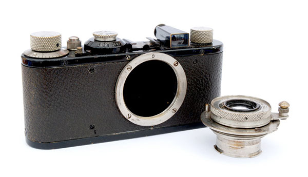
Leica I – was first introduced to the market at the 1925 spring fair in Leipzig, based on the Ur-Leica prototype developed by Barnack in 1913 and the Prototype 1 developed in 1923. Interchangeable lenses for these were introduced in 1930.

Ur Leica – 1914

The Leica was by no means the first 35mm camera, but it was the first to make 35mm truly viable, leading to the most popular film format ever. The camera was the brainchild of Oskar Barnack, who joined Leitz in 1911 as Director of Research. He soon began work on a movie camera, for use with 35mm film, the standard movie gauge of the time.

Leica Standard with Interchangable Lenses

Because emulsion speeds of then current films were unreliable and accurate metering was all but impossible, Barnack built a small device intended to test small batches of movie film. It became apparent, however, that what he had actually created was a miniature still camera, known today as the Ur-Leica. Specification was sparse. Shutter speeds, from the cloth focal plane shutter, covered 1/25 – 1/500 second. The lens was pulled out on a short metal tube and was pushed back almost flat with the body when not in use. It could not be detached. The viewfinder was mounted separately on the top plate, rather than built in, and there was no rangefinder, other than a separate accessory. The camera was covered with vulcanite, often mistaken for leather.

Sources

https://www.shutterbug.com/content/leica-i-camera-change-photography


Survey 9: Viewfinding the Leica

Survey 8: Suprematism 1915- 1925

Lecture Summary 

This week’s lecture covered the time period of 1915 – 1925 which immediately tells us that World War I happened during that time. It influenced everything and everybody in the world, including design. A lot of propaganda posters were created to get people to participate in the war and support one’s country. Although it had one of the deadliest outcomes, the world of art and design was changed forever.

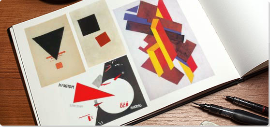
Suprematism is an art movement, focused on basic geometric forms, such as circles, squares, lines, and rectangles, painted in a limited range of colors. This was a completely new concept at the time – completely fascinated artists all over the world. It is also considered to be the beginning of conceptual art. The founder of this movement was a Russian artist Kazimir Malevich.

Examples of Suprematism

Kazimir Malevich 

He is most famous for his painting Black Square. The name pretty much sums up what the painting looks like, however, there is a lot more meaning behind it. Suprematism focused on the absence of any physical objects, and the Black Square communicated that perfectly.

Like Malevich explained once,

Under Suprematism, I understand the primacy of pure feeling in creative art. To the Suprematist, the visual phenomena of the objective world are, in themselves, meaningless; the significant thing is feeling, as such, quite apart from the environment in which it is called forth.”

Black Square, Kazimir Malevich

El Lissitzky

Lissitzky was one of the very successful Malevich’s students. His work greatly influenced the Bauhaus and constructivist movements, and he experimented with production techniques and stylistic devices that would go on to dominate the 20th-century graphic design. 


Beat the Whites with the Red Wedge, El Lissitzky
Contemporary Design Piece inspired by El Lissitzky

Sources

https://www.tate.org.uk/whats-on/tate-modern/exhibition/malevich
https://www.theartstory.org/artist-malevich-kasimir.htm
https://en.wikipedia.org/wiki/El_Lissitzky


Survey 8: Suprematism 1915- 1925

Survey 7: Russian government was just as bad in 1905…

BLOODY SUNDAY

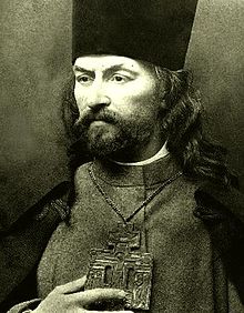
On the 22nd of January, 1905 Bloody Sunday Massacre took place in the Russian capital at the time, St Petersburg. Soldiers of the Imperial guard fired on protestors who were led by the Orthodox Priest Father Georgy Gapon as they marched towards the Winter Palace where they planned to present a petition to Tzar Nicholas II.

By 1905 there was growing dissatisfaction amongst the urban working class. Father Gapon had established the “Assembly of the Russian Factory and Mill Workers of the City of St. Petersburg” to promote workers’ rights in 1904. The workers wanted to have 8-hour long workdays but the owners of the factories rejected their request reason being that the factory would go bankrupt as all the other factories would still make their employees work 14 hours a day. But after four Assembly members from the Putilov ironworks were fired from their jobs in December 1904, workers across the city went on strike. Capitalizing on the situation Father Gapon drafted a petition to the Tsar calling for improved working conditions and other reforms that received 150,000 signatures.

Portrait of Father Gapon

Gapon had already notified the authorities of the petition and the march, and in response, approximately 10,000 troops from the Imperial Guard were placed around the palace. However, why they began firing on the peaceful march is unclear. Even the number killed or injured is uncertain with estimates ranging from the government’s official figure of 96 dead to revolutionary claims of more than 4,000.

Illustration of the Bloody Sunday massacre

The Tsar was not in the palace at the time, and did not give an order for the troops to fire, but was widely blamed for the massacre. In response strikes and protests spread around the country, and eventually developed into the 1905 Revolution.

After hundreds of strikes, October Manifesto was created. Officially “The Manifesto on the Improvement of the State Order”, is a document that served as a precursor to the Russian Empire’s first Russian Constitution of 1906. Duma was formed and was supposed to approve and disapprove any new laws. That was supposed to help develop a more democratic society, however, not much had changed, because all the members of the Duma were Tzar Nicholas’s puppets so he still got to make all decisions by himself.

Russian Imperial Duma and a life-size portrait of Nicholas II

Sources

Russian Revolution of 1905 | Britannica.com

https://www.spb.kp.ru/daily/26328.2/3210114/

https://spartacus-educational.com/RUSgapon.htm

http://www.bbc.co.uk/history/bloody_sunday

Lecture Summary

This lecture covered the period from 1905 until 1915 and discussed the philosophy and effects of modernism on our society, as well as some political events that would eventually be reasons for the First World War. I found it extremely interesting that the style that was born over a hundred years ago is still considered modern. Current designers still rely on the saying “form follows function” as the basis of their creative process.


Survey 7: Russian government was just as bad in 1905…

Survey 6: Fly Me to the Moon, Lumiere Brothers!

Lecture Summary

Throughout 1895 – 1905 a lot of events happened that were the foundation for the society we live in nowadays. Women started fighting for their rights for the very first time in history, the first Nobel Prizes were awarded, and new technologies like, cinematographe, were developed.

Annie Kenney and Christabel Pankhurst fighting for women’s right to vote

The Lumière Brothers: Pioneers of cinema

A lot of people are under the impression that the development of modern film technology is all thanks to the famous inventor, Thomas Edison, and his employee, William Dickson. Together, they developed two very first film technologies: kinethograph (basically a camera), and kinetoscope (a single viewer exhibition device that you use to watch kinethograph films). However, while they were busy inventing the two in the United States, people all over the world were going after a similar goal. In Lyon, France, the Lumiere brothers invented a lightweight all-in-one motion picture device that made movies and exhibited them. They called it Cinematographe. It played back the developed roll of film shining a bright light through it to show images.

Lumière Cinematographe, 1895

Voyage dans la Lune

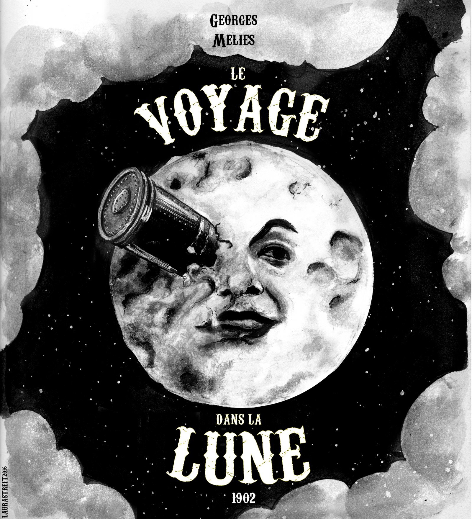
Georges Melies, a French magician, director, and theatrical special effects specialist, got invited to one of the Lumier brothes’ movie screenings. And it of course blew his mind. He tried to purchase the cinematographe on the spot but the Lumier brothers weren’t ready to sell. But Melies did not give up. After searching all over the world, he ended up buying an animatograph.  He now had the opportunity to direct the very first science fiction movie in 1902 called Le Voyage dans la Lune or A Trip to the Moon. Inspired by a wide variety of sources, including Jules Verne’s novels “From Earth to the Moon” and “Around the Moon”, the film follows a group of astronomers who travel to the Moon in a capsule, explore the Moon’s surface, escape from an underground group of aliens, and return in a splashdown to Earth. It features a cast of French theatrical performers, led by Méliès himself in the main role of Professor Barbenfouillis, and is filmed in the overtly theatrical style for which Méliès became famous.

Poster for Le Voyage Dans La Lune

https://www.youtube.com/watch?v=_FrdVdKlxUk

Sources:

https://en.wikipedia.org/wiki/A_Trip_to_the_Moon

https://www.britannica.com/biography/Lumiere-brothers

https://blog.scienceandmediamuseum.org.uk/the-lumiere-brothers-pioneers-of-cinema…


Survey 6: Fly Me to the Moon, Lumiere Brothers!

Survey 5: Posters & Advertisements

Lecture Summary: Wealthy people had starter traveling so a lot of new cultures were discovered by the western society which influenced the people’s perception of the world. Exhibitions were arranged for the average people to be able to experience things from all over the world. Europeans were fascinated with the Japanese culture which led to Japonism. The “Bible of Ornaments” was created which included a lot of new patterns adopted from different cultures. However, alongside the obsession with the unexplored, a lot of artists started looking back on the old patterns from the Renaissance and Rococo. Mass production was becoming a problem for artists – now things could be made a lot faster and cheaper. But newer things were also of poor quality. So, the arts and crafts movement was started.

Poster Design in France

For today’s designer, the Victorian era might seem like a complete nightmare. In both, interior and poster design, it was typical to add as many patterns and information as possible, leaving almost no empty places.

A lot of people say that the 1890’s was the golden age for posters. Most of the look very visually appealing. However, it took a while for the designers to get to that successful point. A French poster designer, Jules Chéret, was trying out newly explored patterns and ways of drawing in his early works. Some of it looks extremely busy and overcrowded – there is no specific point for the eye to focus on. 

Early Poster by Jules Cheret

The Improvement

It didn’t take Cheret a long tome to figure out what works and what doesn’t. His later work is what was the beginning of the posters we create nowdays. He made a lot of changes, and in opinion, they look like they were almost done by a completely different person. They were clean, lively, and easy to understand. Here’s an example of one of my favourite works by Jules Cheret.

Quinquina Dubonnet, 1895

Jules Cheret’s Influence

Before Jules Cheret’s work, posters weren’t influencing the audience nearly as well as they were after. The world of advertising was completely changed after Cheret. Now advertisements were more simple and straight-forward than ever.

Saxoleine by Jules Cheret

References:

https://www.antiqueposters.com/Saxoleine-Patrole-de-Surete-Maitres-13-p/1658.htm

http://www.pictorem.com/43218/Quinquina%20Dubonnet,%201895,%20Jules%20Cheret.html

https://www.britannica.com/biography/Jules-Cheret

http://www.windsorfineart.com/jules-cheret/

Survey 5: Posters & Advertisements

Neoclassicism 1750 – 1850 – Survey 4

Lecture Summary: During the lecture, we talked about romanticism and the industrial revolution. The 1750’s was the time of mass production in large cities, and, therefore mass consumption. There were more jobs, more money for people to spend on secondary needs, and more things were made for them to buy. Now, there was a huge need for advertising, so people were creating posters, and more newspapers were printed.

Architecture Overview

The style of architecture was changing a lot as well. Since people started producing new materials like iron and steel, architecture and engineering began to separate. Architects started to focus more on the aesthetic aspect of the buildings they’d been hired to work on.

Industrial Revolution

Features of Neoclassical Architecture

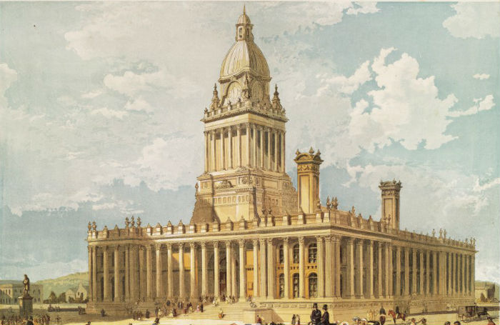
Neoclassicism was yet another return to the Classical Orders of Greek and Roman Antiquity on a monumental level, except with the addition of development of all the engineering advances and new materials of the modern era. It was marked by large-scale structures, supported and/or decorated with columns, and enlarged Renaissance-style domes. Sometimes columns were multiplied and stacked, to create an impression of height, while facades were decorated with a combination of colonnades, rotundas and porticoes.

Leeds Town Hall

France

Neoclassicism was born in Italy, although it became especially active in France largely because of the presence of French designers trained at the French Academy in Rome. Classical features had begun appearing in architectural design at the end of Louis XVI’s reign, who began the building of the Palace of Versailles, one of the amazing masterpieces of architecture. This style was then adopted during the first Napoleonic empire: High Society employed it on their private homes, along with extras like faux ruins, follies, grottos, and fountains to decorate the landscape, while more experimental architects used it to design a range of civic structures.

Jacques Germain Soufflot

Jacques-Germain Soufflot was a French architect, a leader in the development of Neoclassical architecture and the designer of the Church of Sainte-Geneviève (the Panthéon) in Paris. He claimed to be self- taught but he lived in Rome for about 20 years and studied the classical monuments there as well as the Greek temples at Paestum. One of his most influential accomplishments was designing of Sainte-Geneviève, which was intended to be a church. However, because of the classical origins of the design, when the Revolution abolished religion, the church was secularized and renamed the Panthéon. Unfortunately, much of the decoration was removed. The effect of a light interior space was destroyed, resulting in the somewhat gloomy monument that the Panthéon is today.

Pantheon

Sources:

http://www.visual-arts-cork.com/history-of-art/neoclassical-architecture.htm#neoclassicism

https://www.britannica.com/biography/Jacques-Germain-Soufflot

https://www.architecture.com/knowledge-and-resources/knowledge-landing-page/classical-classical-revival-neo-classical


Neoclassicism 1750 – 1850 – Survey 4

Jean-Baptiste-Siméon Chardin – Neoclassicism, Romanticism & Rococo

Jean-Baptiste-Siméon Chardin (November 2, 1699 – December 6, 1779) was a French painter. He is considered a master of still life. He lived on the Left Bank near Saint-Sulpice until 1757, when Louis XV granted him a studio and living quarters in the Louvre.

Chardin’s Self Portrait

Some of his earlier work has pretty minimal, almost boring composition. For example, in his painting Glass of Water and A Coffee Pot, the title pretty much sums up the whole composition. However, I find this painting beautiful because of the luminosity of the glass of water. It’s fascinating how such a small detail can bring so much life into the painting.

Glass Of Water And A Coffee Pot

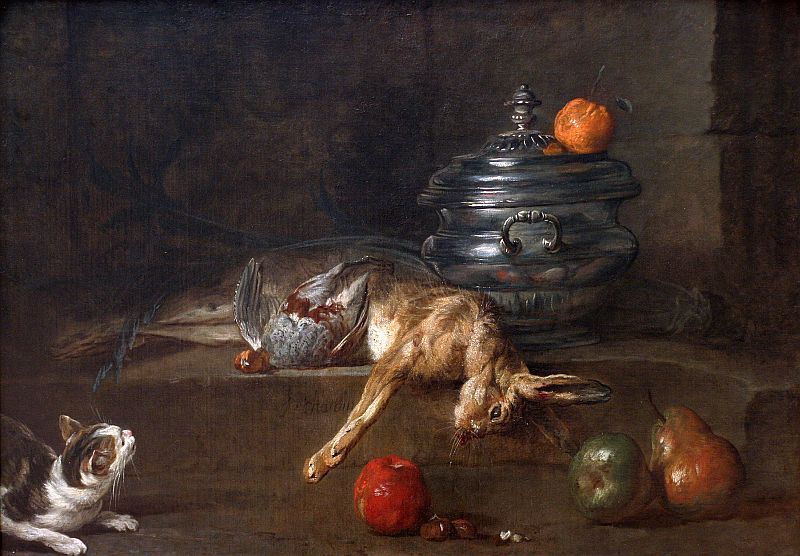
Chardin has also done some work that has a more original and creative composition. A lot of his work involves animals(dead or alive) which is another one of the reasons I chose to write a blog post about him. For example, in Still Life With Cat And Fish the way he painted the cat tells you the whole story of the painting. Its pose shows its desire for the fish, as well as the fear that it might get caught stealing someone else’s food.

Still Life With Cat And Fish
The Silver Tureen

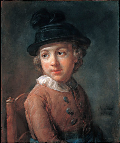
In his older years, Chardin did a lot of pastel portraits which are just as amazing as his early oil paintings.

Portrait Of A Boy

Sources:

http://www.jean-baptiste-simeon-chardin.org/


Jean-Baptiste-Siméon Chardin – Neoclassicism, Romanticism & Rococo

Johannes Vermeer – Baroque

The only supposed portrait of Jan Vermeer.

Johannes (Jan) Vermeer was a Dutch artist who created some of the most valuable and remarkable paintings in the art history. Although only about 36 of his paintings survived, these works are remarkable for their purity of light and form, qualities that convey a serene, timeless sense of dignity.

Like most artists of his time, he started off his career as an artist by painting biblical scenes, but his most valuable artworks show the daily life of people in interior settings.
According to Arthur K. Wheelock, “technical examinations have demonstrated that Vermeer generally applied a gray or ochre ground layer over his canvas or panel support to establish the colour harmonies of his composition”.

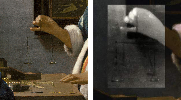
For example, in Woman Holding a Balance, it occurs at the fingertip of the hand holding the balance, thus enhancing his overall philosophical message.

https://en.wikipedia.org/wiki/Woman_Holding_a_Balance#/media/File:Johannes_Vermeer_-_Woman_Holding_a_Balance_-_Google_Art_Project.jpg
Woman Holding a Balance
Infrared reflectography reveals that Vermeer changed the position and increased the size of the balance.

Such attention to detail explains the small size of Vermeer’s creative output, even during his most fertile period. He must have worked slowly, carefully thinking through the character of his composition and the manner in which he wanted to execute it.

Another one of Vermeer’s masterpieces is The Milkmaid. I find it very visually pleasing because of the feeling it conveys. The viewer can almost feel the weight of the weight of the woman and the table.

The Milkmaid

Vermeer’s most famous painting is Girl with a Pearl Earring. It depicts a European girl wearing an exotic dress, an oriental turban, and an improbably large pearl earring. I love this painting because of its pleasing colour scheme, and the intimacy of the girl’s gaze towards the viewer.

Meisje met de parel.jpg

Sources:

https://www.nga.gov/features/slideshows/johannes-vermeer-woman-holding-a-balance.html#slide_13

https://www.britannica.com/biography/Johannes-Vermeer#ref233669

https://en.wikipedia.org

Johannes Vermeer – Baroque

Parmigianino – High Renaissance and Mannerism

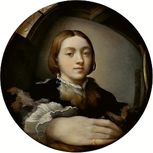
Self Portrait in a Convex Mirror

Parmigianino

Girolamo Francesco Maria Mazzola was an Italian Mannerist painter and printmaker active in Florence, Rome, Bologna, and his native city of Parma.
His major inspiration was Corregio, who is also from the city of Parma. In his day Correggio became famous for creating magical effects of light and shadow in his paintings and drawings, and especially for his technique of sfumato (the seamless blending of tones in the manner of smoke). Emerging from Correggio’s legacy, Parmigianino came into his own as a master of elegant figure drawing and as a leading artist of Mannerism.
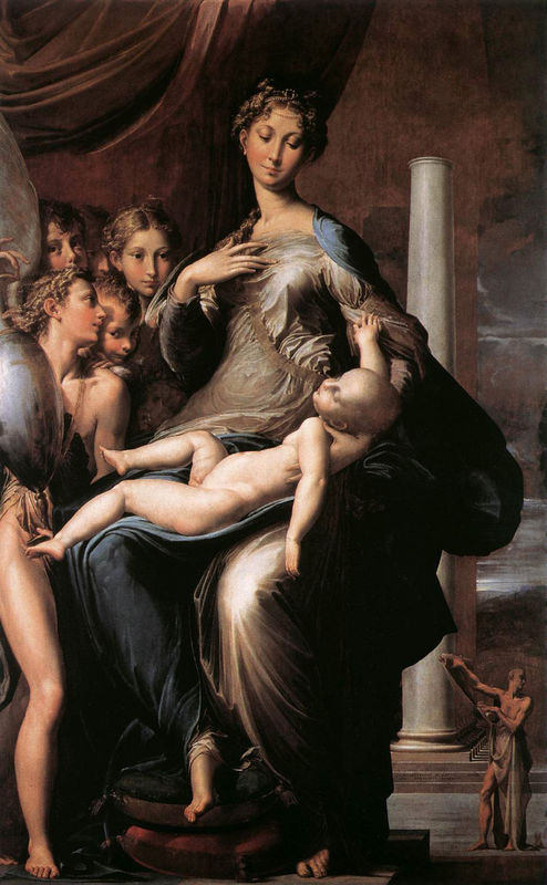
One of Parmigianino’s most famous paintings is Madonna with the Long Neck. It was originally named Madonna and Child with Angels and St Jerome, but earned the name because of Madonna’s curiously long neck. The subject of this piece is derived from medieval hymns which compared the Virgin’s neck to a great ivory tower or column (in the background).


Madonna with the Long Neck or Madonna and Child with Angels and St Jerome
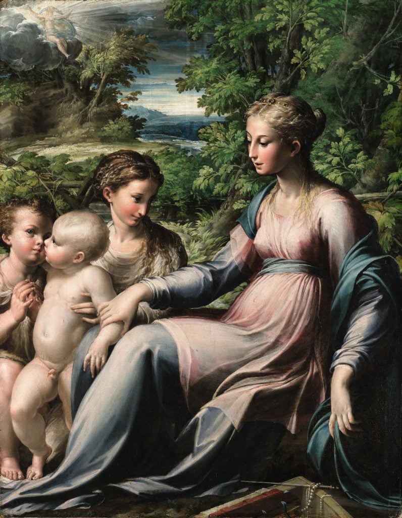
Virgin and Child With Saint Mary Magdalene and the Infant Saint John the Baptist
Madonna and Child with Saints


Parmigianino – High Renaissance and Mannerism