How to Get The Best Fonts Without Purchasing Adobe Typekit (Survey 3)

Lecture Summary: Today’s lecture was about the discoveries people made back in 15th – 18th centuries. There was a great number of changes- cultural, scientific, communicational – all happened within a relatively short period of time. One of the reasons for such drastic rate of development was the birth of humanism. Humanists were people that did not believe everything that the Bible and the Church were telling them. They looked for scientific and logical explanations for everything that surrounded them. Such passion for science led to scientists writing more books to pass on their knowledge to the generations to come. That, of course, inspired those of creative mind to develop new fonts and ways to illustrate and brighten up what was written on the pages of dry textbooks.

DESIGN & ILLUSTRATIONS

During the 15th century printing evolved from hand-printed fabrics to the production of books. The term incunable is used to refer to all books printed with metal type from the beginning of Gutenberg’s movable type printing press, around 1455, to the end of 1500. Most of the incunabula had very detailed illustrations that supported the message of the books. However, only the wealthiest people could afford to buy or print their own books. People of average income had block books instead, that had handmade watercolour illustrations.

A printed illustration from an incunable.

TYPOGRAPHY

In the 1400’s books were made using handwritten Gothic style, until Gutenberg’s first carved typeface was developed. His font was based on the hand-lettered Gothic style, the technique, however, was completely different. After the movable type printing became popular across Europe, more fonts were created, most of which are still used to this day.
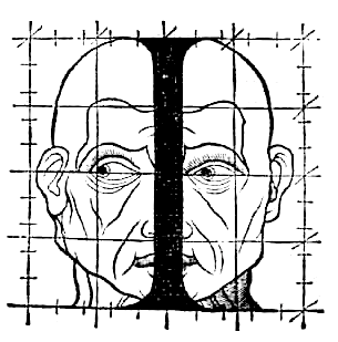
GEOFFROY TORY

He was a French humanist and an engraver, best known for adding accents on letters in French. In Champ-fleury, auquel est contenu l’art et science de la vraie proportion des lettres antiques selon le corps et visage humain (Gilles de Gourmond, Paris, 1529), Geoffroy Tory compared the proportions in letters to proportions in the human body. In his book, Tory talks about Roman capitals and criticizes Durer’s work.
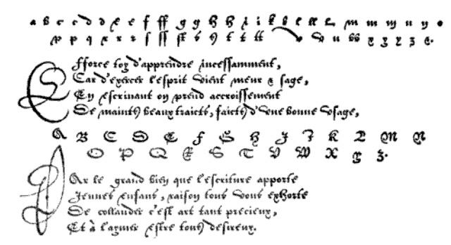
Troy’s sketch


ROBERT GRANJON

Robert Granjon was a French type designer and printer. He is best known for introducing the typeface Civilité and for his italic type form, the design of which in modern days is used in Garamond Italic. He started his career as a punch cutter which was a craft used in traditional typography to cut letter punches in steel as the first stage of making metal type. During his lifetime Granjon created 9 typefaces and a set of musical symbols. Whilst working as a punch cutter, Granjon designed c. 50 different alphabets, for which he cut c. 6,000 punches.

The Gothic Italic Typeface Civilité


sources:

https://stjohnscollegelibrary.wordpress.com/2016/06/01/do-we-need-pictures-illustration-of-the-earliest-printed-books/

https://blog.spoongraphics.co.uk/articles/a-history-of-typeface-styles-type-classification

http://luc.devroye.org/fonts-32678.html


How to Get The Best Fonts Without Purchasing Adobe Typekit (Survey 3)

Johannes Vermeer – Baroque

The only supposed portrait of Jan Vermeer.

Johannes (Jan) Vermeer was a Dutch artist who created some of the most valuable and remarkable paintings in the art history. Although only about 36 of his paintings survived, these works are remarkable for their purity of light and form, qualities that convey a serene, timeless sense of dignity.

Like most artists of his time, he started off his career as an artist by painting biblical scenes, but his most valuable artworks show the daily life of people in interior settings.
According to Arthur K. Wheelock, “technical examinations have demonstrated that Vermeer generally applied a gray or ochre ground layer over his canvas or panel support to establish the colour harmonies of his composition”.

For example, in Woman Holding a Balance, it occurs at the fingertip of the hand holding the balance, thus enhancing his overall philosophical message.

https://en.wikipedia.org/wiki/Woman_Holding_a_Balance#/media/File:Johannes_Vermeer_-_Woman_Holding_a_Balance_-_Google_Art_Project.jpg
Woman Holding a Balance
Infrared reflectography reveals that Vermeer changed the position and increased the size of the balance.

Such attention to detail explains the small size of Vermeer’s creative output, even during his most fertile period. He must have worked slowly, carefully thinking through the character of his composition and the manner in which he wanted to execute it.

Another one of Vermeer’s masterpieces is The Milkmaid. I find it very visually pleasing because of the feeling it conveys. The viewer can almost feel the weight of the weight of the woman and the table.

The Milkmaid

Vermeer’s most famous painting is Girl with a Pearl Earring. It depicts a European girl wearing an exotic dress, an oriental turban, and an improbably large pearl earring. I love this painting because of its pleasing colour scheme, and the intimacy of the girl’s gaze towards the viewer.

Meisje met de parel.jpg

Sources:

https://www.nga.gov/features/slideshows/johannes-vermeer-woman-holding-a-balance.html#slide_13

https://www.britannica.com/biography/Johannes-Vermeer#ref233669

https://en.wikipedia.org

Johannes Vermeer – Baroque

0-1400 Fashion (Europe)

Lecture Summary(Sept.26, 2018): During today’s lecture, we talked about the significance of God and Gutenberg on the way people communicated in ca. 0-1400. There were countless inventions in that period of time, including typography and codex. I find those two inventions the most crucial as they made a huge difference in the way people communicated – they now had the ability to print books which made the process much faster compared to before when people would write books by hand. Book of Hours was a popular book in the medieval times as almost all people were religious back then. In my opinion, this was a significant event because it introduced the concept of a book to regular working people, most of whom were illiterate.

By the end of the 1400’s both men’s and women’s fashion had evolved a great deal. Even some of today’s fashion trends had first started in that period and gradually transformed into what we wear nowadays. For example, in 1300’s female hem-lines progressively reduced in the course of the century. And by the end of the century it was fashionable for men to omit the long loose over-garment of previous centuries (whether called tunic, kirtle, or other names) altogether, putting the emphasis on a tailored top that fell a little below the waist—a silhouette that is still reflected in men’s costume today.

Image result for 1400 europe fashionImage result for mens and womens fashion

However, since there was still centuries until photography would be invented, there aren’t a lot of artifacts that show us what regular people wore. So, most paintings only show people that would dress up specifically for the artist to paint them. For instance, a famous painting by Jan van Eyck, called “The Arnolfini Portrait” from 1434, shows a couple getting married. The man wears a fur-lined tappert over a black cotehardie and a wide-brimmed hat.  The woman wears a wimple over her hair as well as a green, fur-lined, high-waisted gown with slashed sleeves over a blue cotehardie.

Image result for The Arnolfini Portrait

Many textiles, fabrics, and materials were invented in that period which also affected people’s fashion choices. Wool was the most important material for clothing, due to its numerous favorable qualities, such as the ability to take dye and it being a good insulator. Embroidery in wool, and silk or gold thread for the rich was used for decoration. Checkered and plaid fabrics were occasionally seen. Fur was mostly worn as an inner lining for warmth; a fur-lined coat (rabbit, or the more expensive cat) was one of the most common garments. Vair, the fur of the squirrel, white on the belly and grey on the back, was particularly popular through most of the 15th century and can be seen in many illuminated manuscript illustrations.

Image result for illuminated manuscript illustrations 1400 Sources:

https://en.wikipedia.org/wiki/1300%E2%80%931400_in_European_fashion

rootfun.net

http://www.fashionencyclopedia.com/fashion_costume_culture/European-Culture-15th-Century/Fifteenth-Century-Clothing.html

Laver, James. Costume and Fashion: A Concise History. 4th ed. London, England: Thames and Hudson, 2002


0-1400 Fashion (Europe)

Parmigianino – High Renaissance and Mannerism

Self Portrait in a Convex Mirror

Parmigianino

Girolamo Francesco Maria Mazzola was an Italian Mannerist painter and printmaker active in Florence, Rome, Bologna, and his native city of Parma.
His major inspiration was Corregio, who is also from the city of Parma. In his day Correggio became famous for creating magical effects of light and shadow in his paintings and drawings, and especially for his technique of sfumato (the seamless blending of tones in the manner of smoke). Emerging from Correggio’s legacy, Parmigianino came into his own as a master of elegant figure drawing and as a leading artist of Mannerism.
One of Parmigianino’s most famous paintings is Madonna with the Long Neck. It was originally named Madonna and Child with Angels and St Jerome, but earned the name because of Madonna’s curiously long neck. The subject of this piece is derived from medieval hymns which compared the Virgin’s neck to a great ivory tower or column (in the background).


Madonna with the Long Neck or Madonna and Child with Angels and St Jerome
Virgin and Child With Saint Mary Magdalene and the Infant Saint John the Baptist
Madonna and Child with Saints


Parmigianino – High Renaissance and Mannerism

Jean Fouquet – Late Gothic Artist

Jean (or Jehan) Fouquet (1420–1481) was a preeminent French painter of the 15th century, a master of both panel painting and manuscript illumination, and the apparent inventor of the portrait miniature. He was

the first French artist to travel to Italy and experience first-hand the early Italian Renaissance.

Jean Fouquet, self-portrait (1450). The earliest portrait miniature, and possibly the earliest formal self-portrait.

Jean Fouquet seems to be using a lot of royal blues and red, which makes his paintings looks neat. My personal favourite piece by him is Virgin and Child Surrounded by Angels. I love the way he used bright colours for the background and the clothes which makes the skin tones of the virgin and the child look extremely pale. I also like the story behind it – the woman in the painting is King Charles VII’s mistress Agnès Sorel, who was the first officially recognized royal mistress.

Virgin and Child
Left wing of the Melun Diptych depicts Etienne Chevalier with his patron saint St. Stephen, Berlin


Marriage of Charles IV and Marie of Luxembourg
Portrait of the Chancellor of France, Guillaume Jouvenel des Ursins, Musée du Louvre, Paris

Fun Facts!

  • Jean Fouquet worked for the French court, including Charles VII, the treasurer Étienne Chevalier, and the chancellor Guillaume Jouvenel des Ursins. Near the end of his career, he became court painter to Louis XI.
  • His self-portrait miniature would be the earliest sole self-portrait surviving in Western art, if the 1433 portrait by Jan van Eyck—usually called Portrait of a Man or Portrait of a Man in a Turban—is not in fact a self-portrait, as some art historians believe.
Jean Fouquet – Late Gothic Artist

Pre – Columbian Art

Pre-Columbian art refers to the visual arts of indigenous peoples of the Caribbean, North, Central, and South Americas until the late 15th and early 16th centuries, and the time period marked by Christopher Columbus’ arrival in the Americas. Hunters and gatherers developed tools, traditions, and art that helped them survive and develop as a unique culture. For centuries, before the European invasion in the sixteenth century, they were creating amazing architectural monuments and everyday subjects (mainly by hand). Their work reflects their life and different belief systems that existed during that period of time. Most of their work includes metal, textiles, and, most importantly, sculptures.

Image result for pre-columbian arthttps://www.invaluable.com/buy-now/a-large-pre-columbian-nayarit-seated-male-figure-4904179880

Image result for pre-columbian arthttps://fineartamerica.com/featured/gold-mask-pre-columbian-art-jewelry-everett.html

The Pre-classic period was dominated by the highly developed Olmec civilization, which flourished around 1200–400 BCE. The Olmecs were the earliest known major civilization in Mexico following a progressive development in Soconusco. The Olmecs produced jade figurines, and created heavy-featured, colossal heads, up to 2 meters (8 ft) high. The Mesoamerican tradition of building large ceremonial centres appears to have begun under the Olmecs.

Image result for olmec figurineshttp://www.abovetopsecret.com/forum/thread992421/pg1

Most of the sculptures were found buried with the people they belonged to. Pre- Columbian Americans believed in the afterlife – a transition into a different world after one’s death. They also believed that during that transition people needed their belongings. Therefore, burying sculptures, images, and symbols that the person could use in the following life was a common practice in the Pre- Columbian time.

During the Classic period the dominant Civilization was the Maya. Maya royalty commissioned artwork that honoured their achievements and secured their place in time. Maya script, also known as Maya glyphs, was the writing system of the Maya civilization of Mesoamerica and is the only Mesoamerican writing system that has been found. The earliest inscriptions found which are identifiably Maya date to the 3rd century BCE in San Bartolo, Guatemala. Maya script is extremely different from most other cultures. It is far more visually interesting than English writing, for example (see image below). It included images and symbols that only the Maya royalty was able to write and read.

Image result for maya writing

Scenes depicting various rituals and historical events are embedded with hieroglyphic text to enable the viewer to identify the important figures, times and places instead of relying upon physical features that could be forgotten over time. The interpretation of the actions represented in the artwork goes hand in hand with understanding the decorative text that is woven into the picture. Unlocking this hieroglyphic text is vital as it removes anonymity and mystery from the scenes and reveals detailed records of those who held power throughout the timeline of the civilization.

https://www.youtube.com/watch?v=qi8nqmqIoqM

https://en.m.wikipedia.org/wiki/Pre-Columbian_art

http://www.ancientscripts.com/maya.html

https://design.tutsplus.com/articles/art-history-indigenous-south-america–cms-28629


Pre – Columbian Art